MEET YOUR FONT PAIRING MATCH
This page is your custom breakdown of the font pairing you were matched with from the Find Your Font Quiz. You’ll discover the history, personality, and style of each font—and see how they can come to life in your personal brand.
If you're a Personal Branding Studio member:
Bookmark this page. We’ll return to it in Part 2 when it’s time to use your font pairing to design your logo and create branded Canva graphics.
Not loving this particular combo? No problem. Explore all 100+ font pairings inside PBS - Part 1, Module 4: Design - to find one that feels just right. Click the button below to go there now.
Not yet a Personal Branding Studio member?
(And wondering what Personal Branding Studio even is?)
Start by scrolling through your results below. At the bottom of this page, you’ll find out how to go deeper with your personal brand through my full Personal Branding Studio program.
And your aligned font pairing match is…


HISTORY
-
HISTORY -
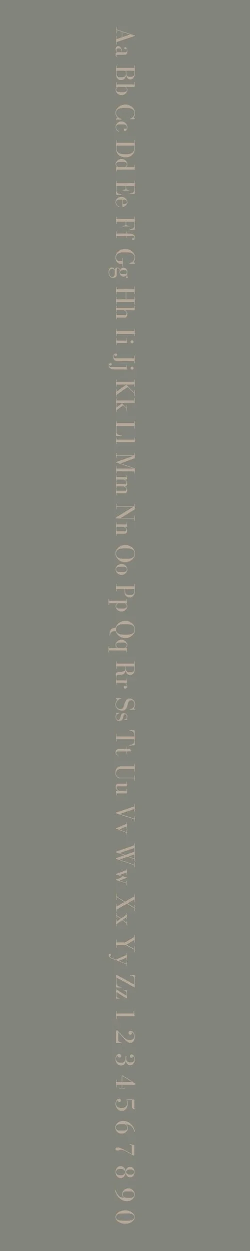
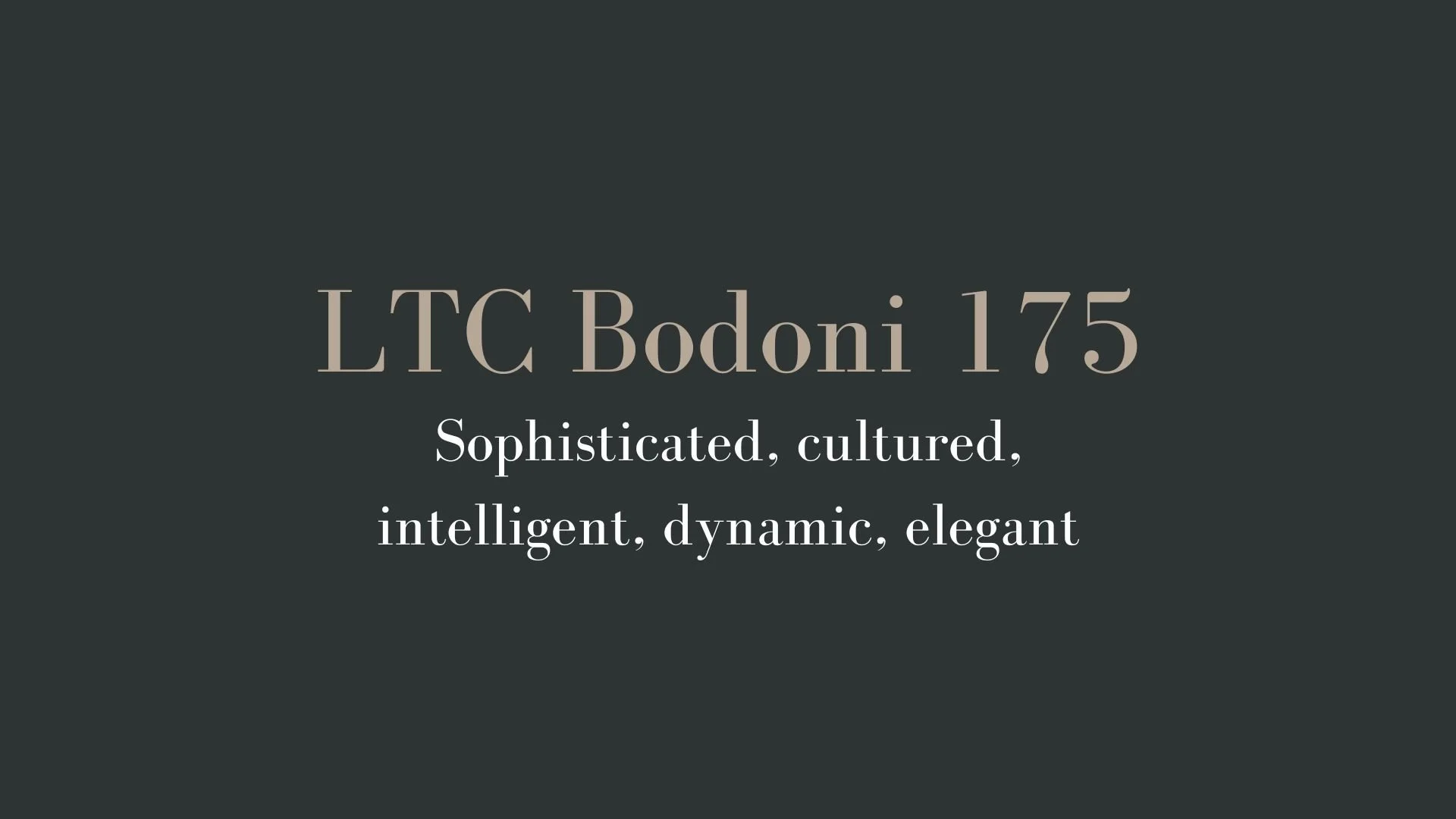
LTC Bodoni 175
Overview:
LTC Bodoni 175 is a refined serif typeface that showcases the elegance and precision of classic Italian typography. It’s a modern take on the Bodoni family, designed to maintain its timeless sophistication while offering greater legibility and versatility for contemporary use.
History:
LTC Bodoni 175 was designed by the type foundry Lanston Type Company (LTC) and released in 1990 as part of their extensive Bodoni revival. This version of Bodoni is based on the iconic designs of Giambattista Bodoni, an 18th-century Italian typographer known for his high-contrast letterforms and meticulous attention to detail. The "175" refers to the typeface’s release, commemorating 175 years since Bodoni's death in 1813. LTC Bodoni 175 was crafted to honor Bodoni’s legacy, offering a more refined version of his design that could be used in both print and digital contexts with improved functionality.
Characteristics:
Design: Bodoni 175 features sharp contrasts between thick and thin strokes, a hallmark of the Bodoni style. The serifs are flat and unbracketed, contributing to a geometric yet refined feel. The letterforms are tall, with a vertical stress and graceful curves, making it a highly recognizable and sophisticated serif font.
Usage: This font excels in high-end print designs such as books, editorial layouts, luxury branding, and fashion magazines. It's particularly effective in headlines, titles, and any instance requiring a stylish and authoritative presence.
Attributes: The typeface is characterized by its high contrast, elegant proportions, and strong vertical stress. It offers a formal and sophisticated aesthetic, ideal for designs where elegance, readability, and impact are needed. The refined design gives it a modern edge, making it a versatile choice for both traditional and contemporary applications.
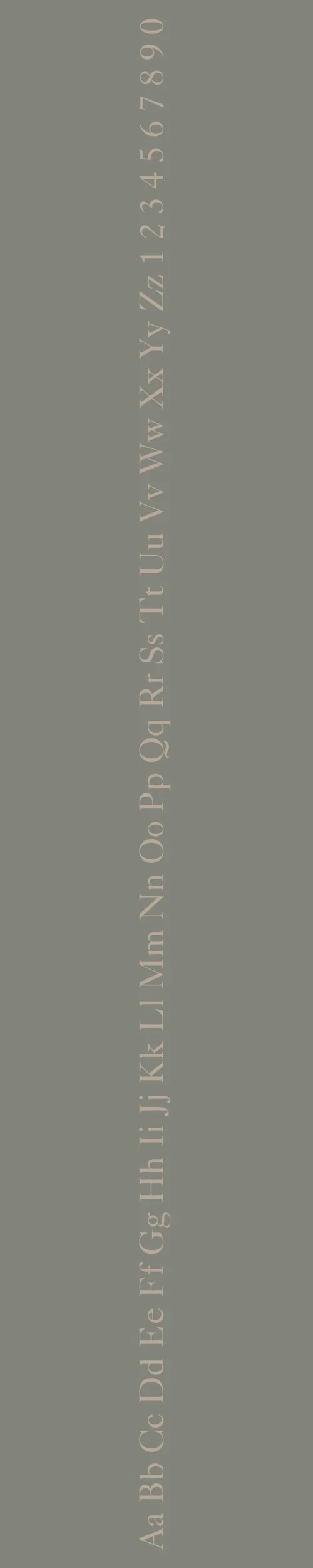
Adobe Caslon Pro
Overview:
Adobe Caslon Pro is a serif typeface that exudes classic elegance and sophistication. Known for its timeless appeal, it is a modern revival of the original Caslon, designed for both print and digital applications. Its readability and distinct style make it ideal for high-quality typography in books, magazines, and corporate design.
History:
Adobe Caslon Pro was designed by Carol Twombly in 1990 for Adobe Systems. It is based on the work of William Caslon, an English type designer from the 18th century. Caslon’s original typefaces became widely popular in England and the American colonies. Carol Twombly, an accomplished type designer at Adobe, sought to create a digital revival that captured the spirit and elegance of Caslon’s original designs while adapting them for modern usage. Adobe Caslon Pro aimed to offer a refined version of the classic serif typeface, with enhanced legibility and versatility for digital environments.
Characteristics:
Design: Adobe Caslon Pro features a classic serif structure with a strong vertical stress and open apertures. The letterforms are balanced with well-defined strokes, giving it both a traditional and refined aesthetic. The Pro version includes multiple weights and optical sizes for versatility in digital and print design.
Usage: Perfect for long-form text such as books, journals, and editorial design. It is also widely used in branding, advertising, and high-end print materials where sophistication is required. Its clear legibility makes it a reliable choice for both print and digital media.
Attributes: Timeless, highly legible, and versatile with elegant serifs that balance tradition and modernity. Adobe Caslon Pro's design allows it to work across different media, from body text to headings, making it a staple for professional typography.

FONT PERSONALITY
-
FONT PERSONALITY -

Why LTC Bodoni 175 and Adobe Caslon Pro are a Match Made in Heaven:
The combination of LTC Bodoni 175 and Adobe Caslon Pro creates a stunning contrast of sophistication and warmth, resulting in a dynamic yet grounded font pairing. LTC Bodoni 175, with its high contrast and elegant lines, adds a touch of refinement and intellectual depth, perfect for making headlines or key branding elements stand out with boldness and style. Adobe Caslon Pro, on the other hand, balances the pairing with its warm, approachable nature and timeless charm. This pairing works beautifully because it blends the vibrant energy of Bodoni with the stable, reliable presence of Caslon, allowing both fonts to shine in their respective roles without overpowering one another.
This font pairing would appeal to someone who is both sophisticated and approachable—an individual with a sharp intellect who enjoys luxury and culture but also values authenticity and reliability. The person who chooses this combination might be an entrepreneur or professional in the creative or academic fields, someone who seeks to present themselves as both elegant and dependable. They could be an established writer, an art curator, or a brand strategist who embodies a classic, well-rounded persona while also embracing modernity and high standards in their work.

CELEBRITY MATCH
-
CELEBRITY MATCH -

The font pairing of LTC Bodoni 175 and Adobe Caslon Pro aligns perfectly with the character of Scarlett O'Hara, as portrayed by Vivien Leigh in the movie "Gone with the Wind".
Summary: Vivien Leigh as Scarlett O'Hara in Gone with the Wind perfectly matches this font's traits. Scarlett, with her sophisticated, intelligent, and dynamic personality, embodies the elegance and sharpness of the font, a powerful, aristocratic presence in every scene. Blanche’s complex balance of vulnerability, charm, and fragility reflects the font’s stable, dependable, and universally appealing nature.

HIERARCHY
-
HIERARCHY -
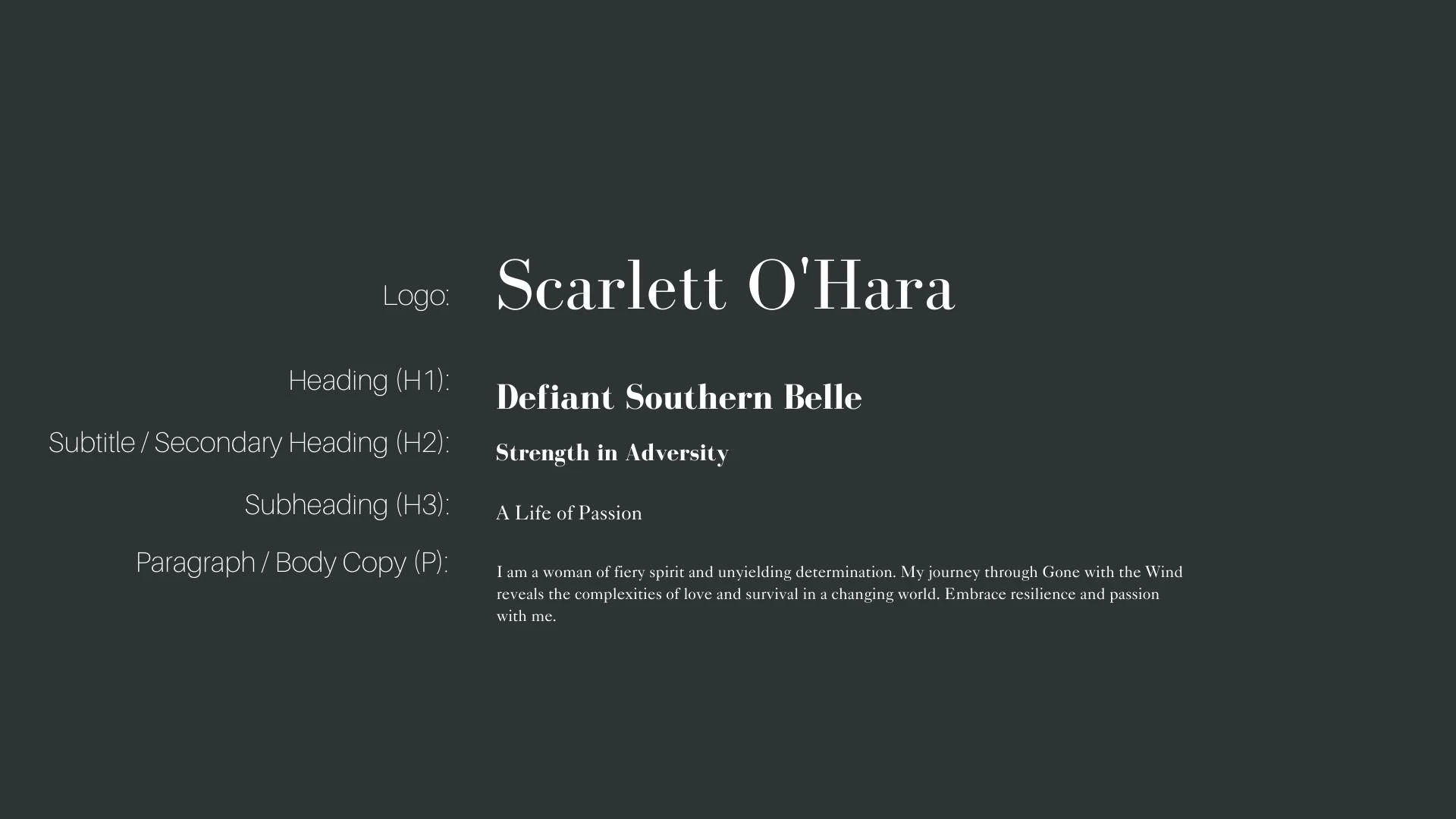
Font Hierarchy for LTC Bodoni 175 and Adobe Caslon Pro:
Logo
Usage: Primary logo text, initials, brand name
LTC Bodoni 175, Regular, 72pt (Canva), 36px (Squarespace)
Heading (H1)
Usage: Main headings on pages, prominent titles
LTC Bodoni 175, Bold, 36 pt (Canva), 24px (Squarespace)
Subtitle / Secondary Heading (H2)
Usage: Section titles, important subtitles
LTC Bodoni 175, Regular, 24pt (Canva), 18px (Squarespace)
Subheading (H3)
Usage: Subsection headings, less prominent titles
Adobe Caslon Pro, Regular, 18pt (Canva), 16px (Squarespace)
Paragraph / Body Copy (P)
Usage: Main body text, paragraphs, descriptions
Adobe Caslon Pro, Regular, 14pt (Canva), 14px (Squarespace)