MEET YOUR FONT PAIRING MATCH
This page is your custom breakdown of the font pairing you were matched with from the Find Your Font Quiz. You’ll discover the history, personality, and style of each font—and see how they can come to life in your personal brand.
If you're a Personal Branding Studio member:
Bookmark this page. We’ll return to it in Part 2 when it’s time to use your font pairing to design your logo and create branded Canva graphics.
Not loving this particular combo? No problem. Explore all 100+ font pairings inside PBS - Part 1, Module 4: Design - to find one that feels just right. Click the button below to go there now.
Not yet a Personal Branding Studio member?
(And wondering what Personal Branding Studio even is?)
Start by scrolling through your results below. At the bottom of this page, you’ll find out how to go deeper with your personal brand through my full Personal Branding Studio program.
And your aligned font pairing match is…

HISTORY
-
HISTORY -
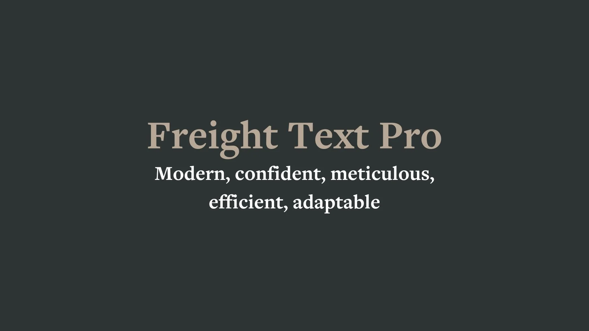
Freight Text Pro
Overview:
Freight Text Pro is a highly legible, modern serif typeface designed for long-form reading, making it ideal for both print and digital mediums. With its elegant yet functional design, it is often used for editorial and book publishing, offering a perfect balance of readability and style.
History:
Freight Text Pro was designed by Joshua Darden and released in 2005 by the Darden Studio. It was created with the goal of providing a versatile serif typeface that could work well in both body text and display settings. The Freight family includes multiple variations, but the Text version was specifically optimized for print and digital reading, with careful attention to detail to ensure clarity in smaller sizes. Its open and spacious design made it a favorite for publications and academic work.
Characteristics:
Design: Freight Text Pro features elegant, moderate contrast between thick and thin strokes, with soft, rounded serifs that lend the typeface a humanist quality. The letterforms are wide with generous spacing, giving the text a clean and open feel that enhances legibility.
Usage: Perfect for book layouts, editorial content, websites, and print media where legibility and readability are key. It is particularly suited for long passages of text, offering a comfortable reading experience without sacrificing style.
Attributes: Elegant, readable, and versatile. Freight Text Pro is known for its balance between sophistication and clarity, making it a great choice for both high-end publishing and everyday print and digital projects. Its professional appearance and readability at various sizes are its defining strengths.

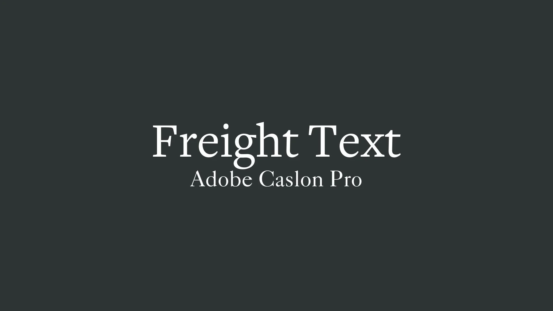
Adobe Caslon Pro
Overview:
Adobe Caslon Pro is a serif typeface that exudes classic elegance and sophistication. Known for its timeless appeal, it is a modern revival of the original Caslon, designed for both print and digital applications. Its readability and distinct style make it ideal for high-quality typography in books, magazines, and corporate design.
History:
Adobe Caslon Pro was designed by Carol Twombly in 1990 for Adobe Systems. It is based on the work of William Caslon, an English type designer from the 18th century. Caslon’s original typefaces became widely popular in England and the American colonies. Carol Twombly, an accomplished type designer at Adobe, sought to create a digital revival that captured the spirit and elegance of Caslon’s original designs while adapting them for modern usage. Adobe Caslon Pro aimed to offer a refined version of the classic serif typeface, with enhanced legibility and versatility for digital environments.
Characteristics:
Design: Adobe Caslon Pro features a classic serif structure with a strong vertical stress and open apertures. The letterforms are balanced with well-defined strokes, giving it both a traditional and refined aesthetic. The Pro version includes multiple weights and optical sizes for versatility in digital and print design.
Usage: Perfect for long-form text such as books, journals, and editorial design. It is also widely used in branding, advertising, and high-end print materials where sophistication is required. Its clear legibility makes it a reliable choice for both print and digital media.
Attributes: Timeless, highly legible, and versatile with elegant serifs that balance tradition and modernity. Adobe Caslon Pro's design allows it to work across different media, from body text to headings, making it a staple for professional typography.

FONT PERSONALITY
-
FONT PERSONALITY -

Why Freight Text Pro and Adobe Caslon Pro are a Match Made in Heaven:
When Freight Text Pro and Adobe Caslon Pro come together, they create a pairing that seamlessly blends modern efficiency with timeless elegance. Freight Text Pro’s sleek, confident, and adaptable nature lends the pairing a sense of professionalism and forward-thinking appeal, perfect for dynamic, cutting-edge brands. In contrast, Adobe Caslon Pro adds a layer of warmth, grace, and historical depth, balancing out the modernity with a sense of trustworthiness and tradition. The result is a pairing that is both refined and approachable, sophisticated yet grounded, perfect for any brand that wants to appear both innovative and rooted in history.
This pairing would be ideal for a person who values both progress and tradition—a modern professional who is deeply connected to their heritage but also embraces innovation and change. Someone in the world of design, literature, or even luxury branding, who seeks to convey a sense of reliability, sophistication, and a strong personal identity. They could be a creative entrepreneur, a luxury brand founder, or a writer who wants to balance the forward-thinking with the tried-and-true values that inspire trust and admiration in their audience.

CELEBRITY MATCH
-
CELEBRITY MATCH -

The font pairing of Freight Text Pro and Adobe Caslon Pro aligns perfectly with the character of Martha, as portrayed by Elizabeth Taylor in the movie "Who's Afraid of Virginia Woolf?"
Summary: The combination of Freight Text Pro and Adobe Caslon Pro perfectly encapsulates Martha in Who's Afraid of Virginia Woolf? Freight Text Pro’s modern, efficient, and confident traits mirror Martha’s sharpness, control, and unyielding nature in her battle of wits with her husband. Meanwhile, Adobe Caslon Pro’s timeless, graceful, and sentimental personality aligns with Martha’s more vulnerable, emotional side—her nostalgia and longing for the past. Together, these fonts represent the full spectrum of Martha's personality: a modern, controlling force juxtaposed with a woman longing for something deeper and more meaningful in her life. In summary, this font pairing reflects Martha’s intricate balance between modernity and tradition, her confidence and vulnerability, and her emotional complexity. Both fonts complement the character's multifaceted nature, highlighting her as both an emotionally grounded figure and a sharp, calculating presence. The dynamic of the pairing mirrors Martha’s inner conflict between control and emotional honesty, making it the perfect representation of her character in the film.

HIERARCHY
-
HIERARCHY -
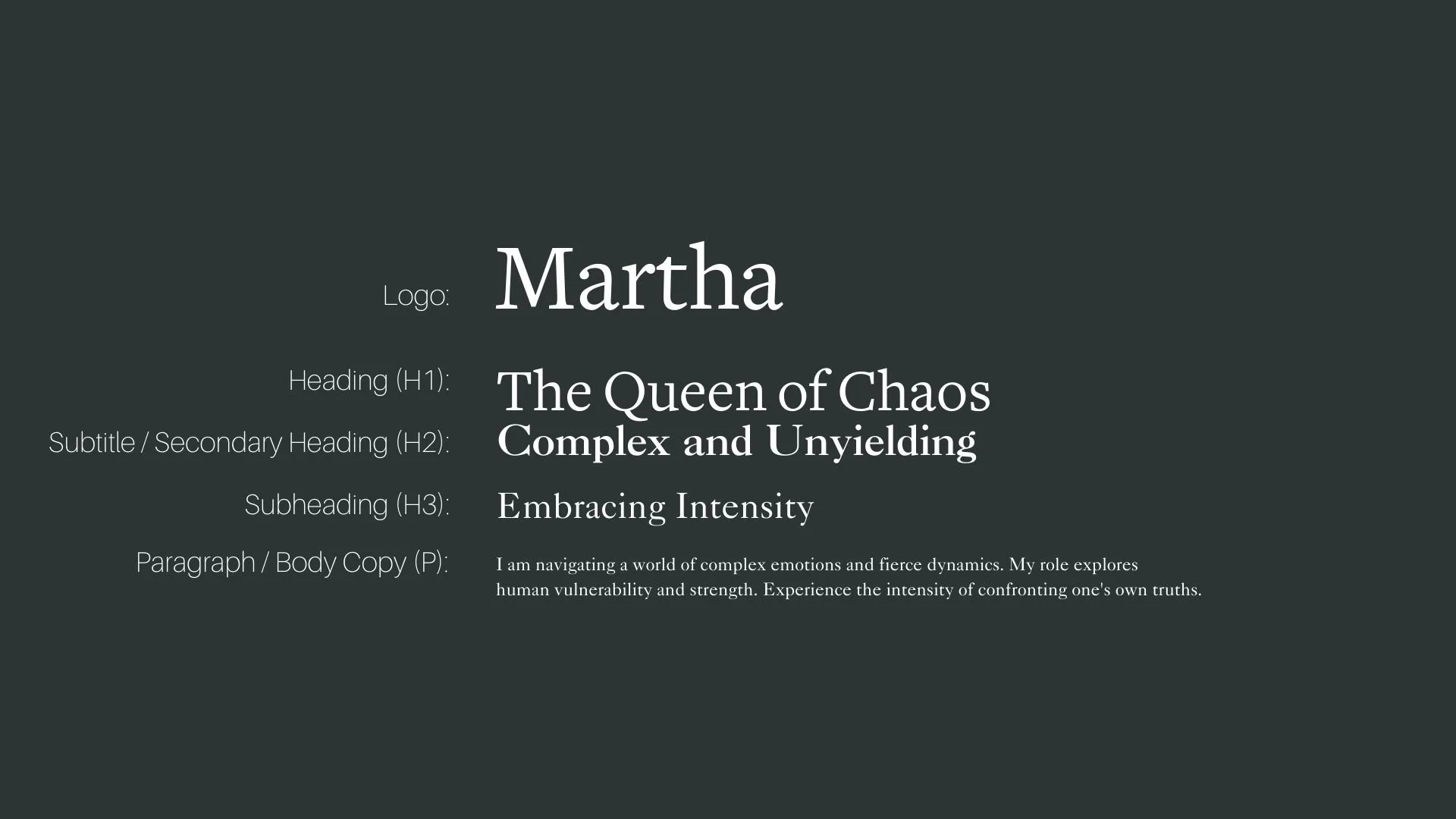
Font Hierarchy for Freight text Pro and Adobe Caslon Pro:
Logo
Usage: Primary logo text, initials, brand name
Freight Text Pro, Regular, 72pt - 100pt (Canva), 72px - 90px (Squarespace)
Heading (H1)
Usage: Main headings on pages, prominent titles
Freight Text Pro, Bold, 50pt - 72pt (Canva), 48px - 64px (Squarespace)
Subtitle / Secondary Heading (H2)
Usage: Section titles, important subtitles
Adobe Caslon Pro, Regular, 36pt - 50pt (Canva), 32px - 44px (Squarespace)
Subheading (H3)
Usage: Subsection headings, less prominent titles
Adobe Caslon Pro, Italic, 24pt - 36pt (Canva), 24px - 32px (Squarespace)
Paragraph / Body Copy (P)
Usage: Main body text, paragraphs, descriptions
Adobe Caslon Pro, Regular, 14pt - 18pt(Canva), 16px - 18px (Squarespace)