MEET YOUR FONT PAIRING MATCH
This page is your custom breakdown of the font pairing you were matched with from the Find Your Font Quiz. You’ll discover the history, personality, and style of each font—and see how they can come to life in your personal brand.
If you're a Personal Branding Studio member:
Bookmark this page. We’ll return to it in Part 2 when it’s time to use your font pairing to design your logo and create branded Canva graphics.
Not loving this particular combo? No problem. Explore all 100+ font pairings inside PBS - Part 1, Module 4: Design - to find one that feels just right. Click the button below to go there now.
Not yet a Personal Branding Studio member?
(And wondering what Personal Branding Studio even is?)
Start by scrolling through your results below. At the bottom of this page, you’ll find out how to go deeper with your personal brand through my full Personal Branding Studio program.
And your aligned font pairing match is…


HISTORY
-
HISTORY -
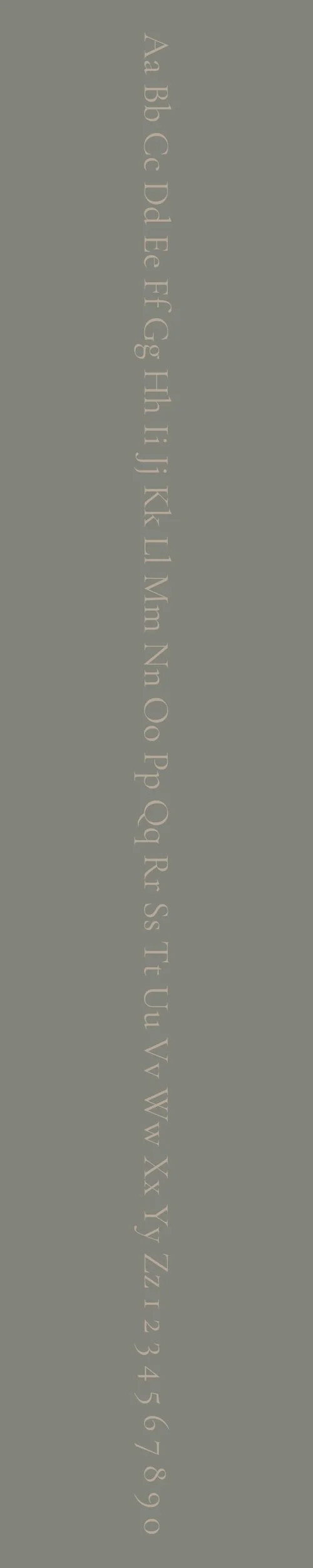
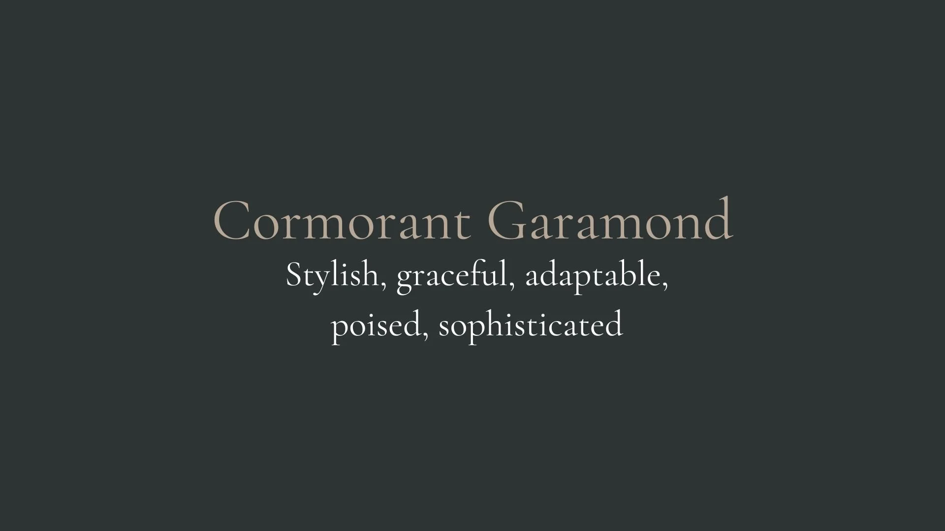
Cormorant Garamond
Overview:
Cormorant Garamond is an elegant serif typeface with classic, timeless appeal. Its design evokes the refined aesthetics of historical typography while offering a modern twist. This font is highly adaptable for both digital and print applications, offering a sophisticated yet approachable look.
History:
Cormorant Garamond was designed by Christian Thalmann, a Swiss typographer, and was released in 2013 as part of the Google Fonts library. It is an interpretation of the Garamond family, specifically inspired by the classic designs of Claude Garamond, a French printer from the 16th century. Thalmann sought to create a revival that honors Garamond’s elegant forms but with enhanced legibility for modern usage, particularly for digital environments. Cormorant Garamond is part of a broader movement of reviving traditional typefaces for contemporary use, bringing a touch of history into modern design projects.
Characteristics:
Design: The typeface features high-contrast letterforms, with sharp serifs and thin strokes. Its elegant, flowing curves are reminiscent of traditional Garamond fonts, but Cormorant Garamond incorporates subtle adjustments that make it more suitable for modern screens. It includes a rich set of ligatures and stylistic alternates to add further refinement.
Usage: Ideal for editorial design, book publishing, branding, and luxury products. The font's elegant and timeless style makes it perfect for long-form text, such as in body copy, as well as high-end logos and invitations. Its versatility also allows it to be used in display typography for headlines.
Attributes: Cormorant Garamond is highly legible, with its balanced proportions and classic proportions. It balances the delicate and the sturdy, making it both a graceful and reliable choice. It is often described as both elegant and functional, carrying the heritage of historical Garamond while being tailored for contemporary needs.
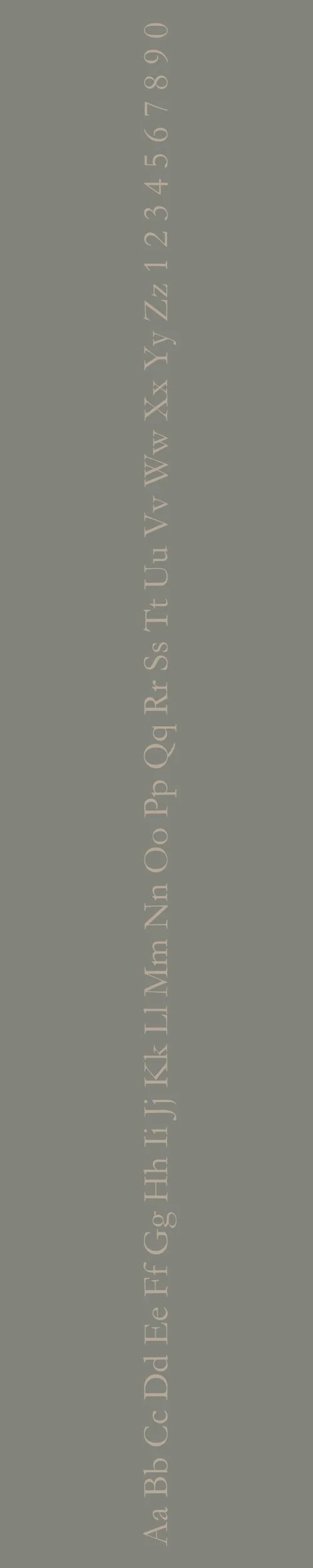
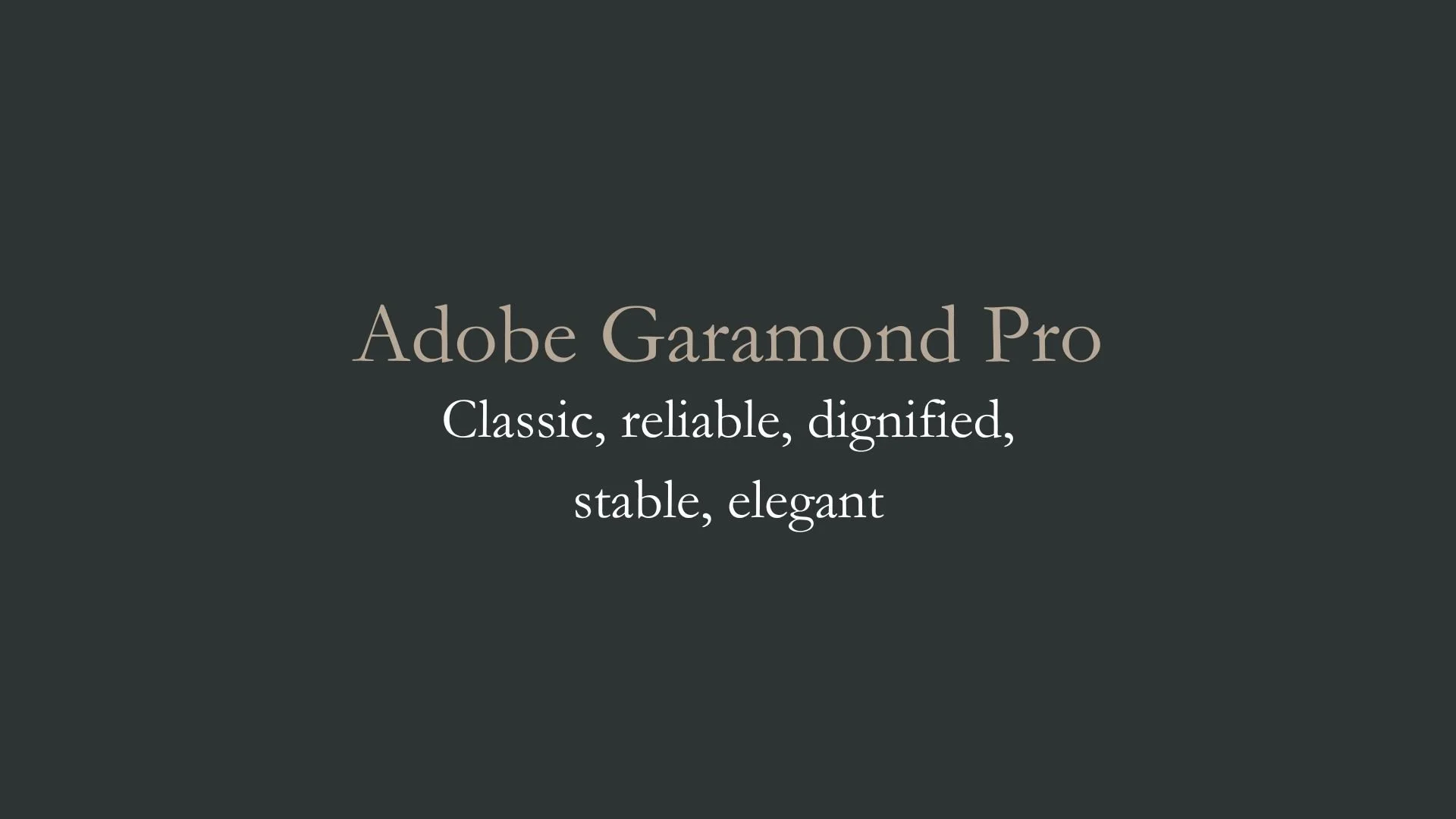
Adobe Garamond Pro
Overview:
Adobe Garamond Pro is a classic and refined serif typeface known for its elegance, readability, and historical significance. Drawing from the Renaissance period, it offers a timeless design with sophisticated detailing, making it ideal for print and digital use.
History:
Adobe Garamond Pro is based on the designs of Claude Garamond, one of the most influential type designers of the 16th century. It was released by Adobe in 1989, adapted from Garamond's original typefaces, which were among the first to feature proportions that balanced readability with aesthetic beauty. The Pro version, specifically, is a digital adaptation that retains the authenticity of Garamond’s design while offering advanced typographic features such as extended language support and OpenType functionality. The typeface was created to serve as an elegant and highly legible font suitable for modern publishing, typesetting, and graphic design.
Characteristics:
Design: Adobe Garamond Pro has a graceful and classical design, characterized by its high contrast between thick and thin strokes, slight curvature in the serifs, and rounded letterforms. The font's proportions are slightly condensed, lending it a compact yet airy quality. Its small x-height and long ascenders contribute to a refined, sophisticated appearance.
Usage: It is widely used for body text in books, academic publications, and high-end print materials. The font also works well for logos, invitations, and formal branding, where a touch of elegance is needed. It is especially effective in print due to its legibility in longer texts.
Attributes: Adobe Garamond Pro is elegant, legible, and timeless, with a refined, classical look. The Pro version includes additional characters and OpenType features, making it versatile for modern typesetting, supporting both Western and Eastern European languages, small caps, and ligatures.

FONT PERSONALITY
-
FONT PERSONALITY -
Why Cormorant Garamond and Adobe Garamond Pro are a Match Made in Heaven:
The pairing of Cormorant Garamond and Adobe Garamond Pro creates a harmonious blend of modern sophistication and timeless elegance. Cormorant Garamond, with its stylish, graceful, and adaptable personality, brings a contemporary flair, while Adobe Garamond Pro provides a classic, reliable foundation. Together, they strike the perfect balance between the old and the new, with Cormorant Garamond offering a refined yet modern touch, and Adobe Garamond Pro adding a sense of steadiness and dignity. This combination ensures that any design feels both fresh and rooted in tradition, making it ideal for brands that want to convey a sense of refinement without feeling dated.
This font pairing would be perfect for someone who values sophistication and reliability in their personal brand. A person using this combination likely has a professional yet artistic sensibility, with an eye for quality and detail. They might be a creative professional with a strong sense of heritage, such as a designer, writer, or architect, who combines modern aesthetics with time-honored craftsmanship. This person’s brand communicates a refined, dependable, and elegant persona that appeals to those who appreciate both the past and the present.

CELEBRITY MATCH
-
CELEBRITY MATCH -

The font pairing of Cormorant Garamond and Adobe Garamond Pro aligns perfectly with the character of Annie Graham, as portrayed by Toni Collette in the movie "Hereditary (2018)".
Summary: Annie Graham’s complex personality—graceful, stylish, and composed on the outside, yet deeply troubled and spiraling internally—makes her an ideal match for the font pairing of Cormorant Garamond and Adobe Garamond Pro. These fonts reflect her dual nature: Cormorant Garamond embodies the modern adaptability and artistic sophistication she strives for, while Adobe Garamond Pro underscores her grounded, reliable presence, even as she unravels. Together, these fonts encapsulate the character's balance between the old and new , the polished exterior and the internal chaos , much like Annie’s struggle to maintain a sense of control over her life and her grief.

HIERARCHY
-
HIERARCHY -

Font Hierarchy for Cormorant Garamond and Adobe Garamond Pro:
Logo
Usage: Primary logo text, initials, brand name
Cormorant Garamond, Regular, 96 pt (Canva), 72 px (Squarespace)
Heading (H1)
Usage: Main headings on pages, prominent titles
Cormorant Garamond , Regular, 48 pt (Canva), 60 px (Squarespace)
Subtitle / Secondary Heading (H2)
Usage: Section titles, important subtitles
Adobe Garamond Pro, Bold, 36 pt (Canva), 48 px (Squarespace)
Subheading (H3)
Usage: Subsection headings, less prominent titles
Adobe Garamond Pro, Regular, 30 pt (Canva), 36 px (Squarespace)
Paragraph / Body Copy (P)
Usage: Main body text, paragraphs, descriptions
Adobe Garamond Pro, Regular, 16 pt (Canva), 18 px (Squarespace)