MEET YOUR FONT PAIRING MATCH
This page is your custom breakdown of the font pairing you were matched with from the Find Your Font Quiz. You’ll discover the history, personality, and style of each font—and see how they can come to life in your personal brand.
If you're a Personal Branding Studio member:
Bookmark this page. We’ll return to it in Part 2 when it’s time to use your font pairing to design your logo and create branded Canva graphics.
Not loving this particular combo? No problem. Explore all 100+ font pairings inside PBS - Part 1, Module 4: Design - to find one that feels just right. Click the button below to go there now.
Not yet a Personal Branding Studio member?
(And wondering what Personal Branding Studio even is?)
Start by scrolling through your results below. At the bottom of this page, you’ll find out how to go deeper with your personal brand through my full Personal Branding Studio program.
And your aligned font pairing match is…

HISTORY
-
HISTORY -
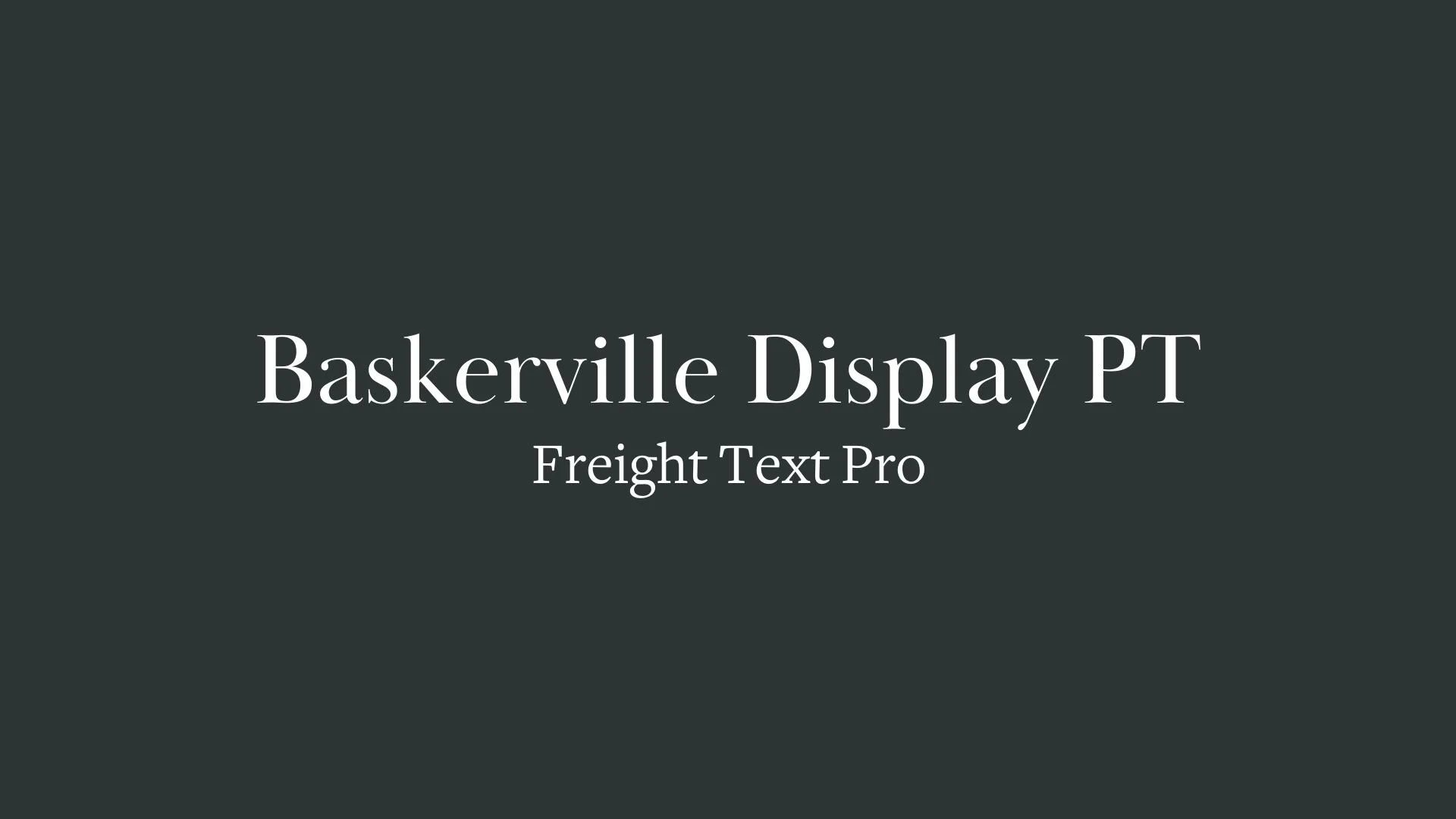
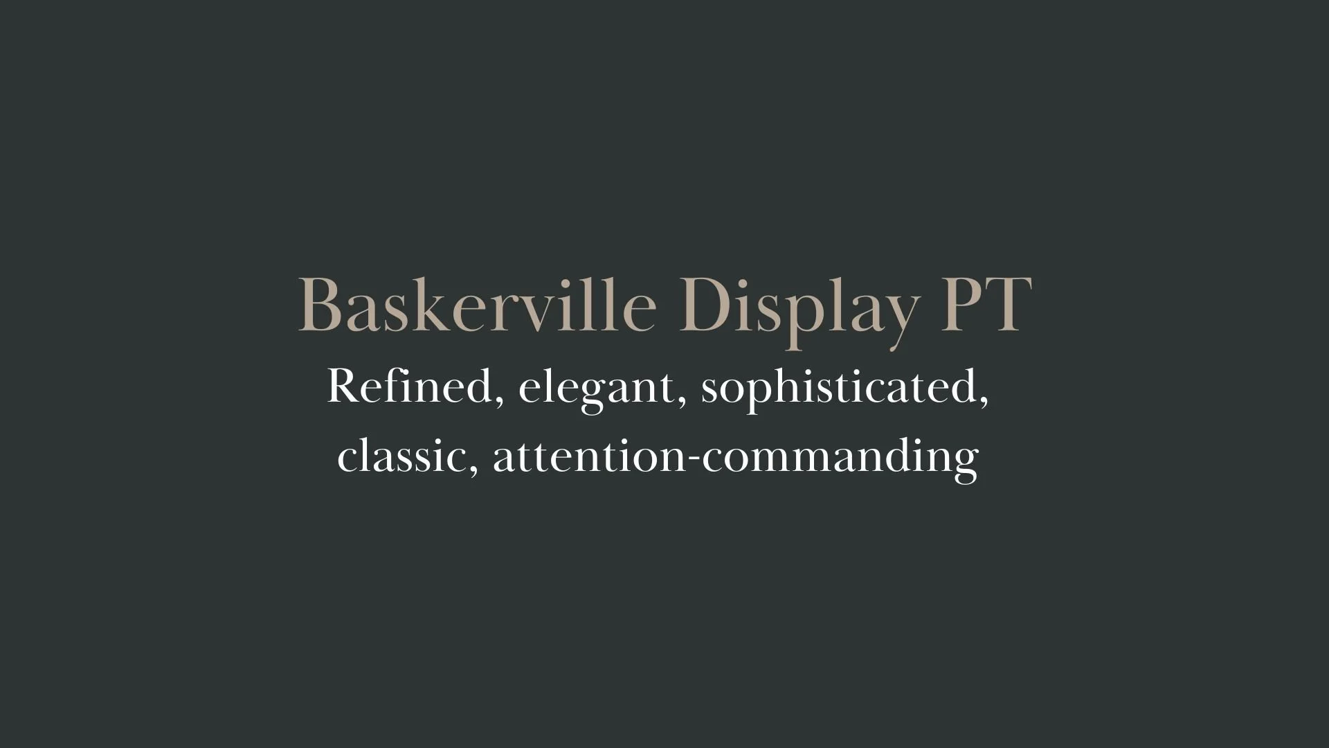
Baskerville Display PT
Overview:
Baskerville Display PT is a refined and sophisticated serif typeface that draws from the timeless elegance of the classic Baskerville font, designed for high-impact display use. It retains the graceful proportions and contrast of the original while providing enhanced legibility for modern digital and print applications.
History:
Baskerville Display PT was created by the type foundry Paratype, which specializes in both reviving classic typefaces and creating contemporary fonts. Released in 2014, Baskerville Display PT is an adaptation of the original Baskerville, designed by John Baskerville in the mid-18th century. The updated version was optimized for display use, offering sharper contrast and more pronounced features, making it ideal for headlines, posters, and other large-scale designs. The goal was to maintain the elegance and readability of the original while adapting it to modern typographic needs.
Characteristics:
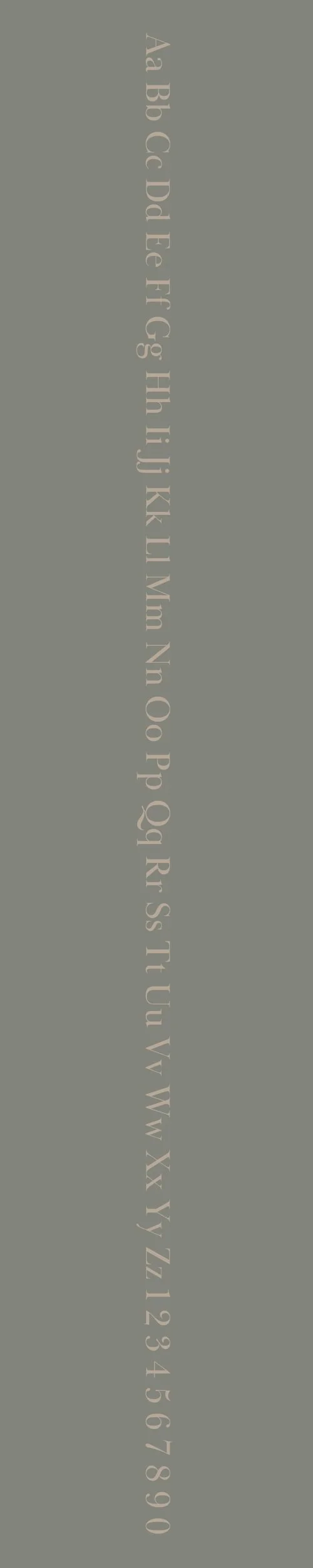
Design: Baskerville Display PT features strong contrast between thick and thin strokes, with sharp, refined serifs that emphasize elegance and sophistication. The font has a classic, upright posture with well-defined curves, giving it a sense of authority and style. The high contrast and wide apertures improve readability at larger sizes, making it suitable for display use.
Usage: Ideal for large headlines, posters, book titles, and other high-visibility applications. Its dramatic and elegant design makes it perfect for luxury branding, editorial layouts, and any design where a touch of refinement is needed.
Attributes: Elegant, sophisticated, and authoritative. Baskerville Display PT offers a modern interpretation of a classic design, combining timeless beauty with contemporary precision, making it highly effective for display purposes where impact and readability are both priorities.
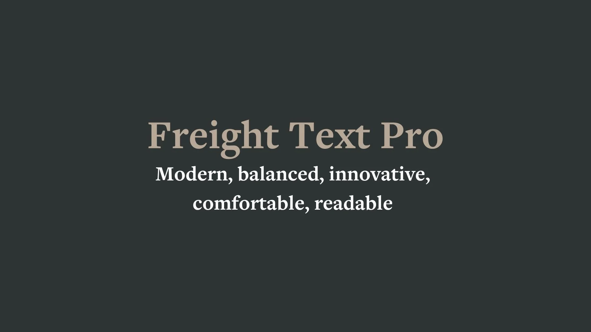
Freight Text Pro
Overview:
Freight Text Pro is a highly legible, modern serif typeface designed for long-form reading, making it ideal for both print and digital mediums. With its elegant yet functional design, it is often used for editorial and book publishing, offering a perfect balance of readability and style.
History:
Freight Text Pro was designed by Joshua Darden and released in 2005 by the Darden Studio. It was created with the goal of providing a versatile serif typeface that could work well in both body text and display settings. The Freight family includes multiple variations, but the Text version was specifically optimized for print and digital reading, with careful attention to detail to ensure clarity in smaller sizes. Its open and spacious design made it a favorite for publications and academic work.
Characteristics:
Design: Freight Text Pro features elegant, moderate contrast between thick and thin strokes, with soft, rounded serifs that lend the typeface a humanist quality. The letterforms are wide with generous spacing, giving the text a clean and open feel that enhances legibility.
Usage: Perfect for book layouts, editorial content, websites, and print media where legibility and readability are key. It is particularly suited for long passages of text, offering a comfortable reading experience without sacrificing style.
Attributes: Elegant, readable, and versatile. Freight Text Pro is known for its balance between sophistication and clarity, making it a great choice for both high-end publishing and everyday print and digital projects. Its professional appearance and readability at various sizes are its defining strengths.


FONT PERSONALITY
-
FONT PERSONALITY -
Why Baskerville Display PT and Freight Text Pro are a Match Made in Heaven:
The pairing of Baskerville Display PT and Freight Text Pro is a masterstroke in balancing elegance and modernity. Baskerville Display PT exudes a refined, classic charm, drawing attention with its sophisticated and graceful presence. It demands attention without being ostentatious, making it ideal for headlines or branding that requires a touch of prestige. Freight Text Pro, on the other hand, adds a layer of modern practicality, grounding the design with its clear, readable structure. Its balance and comfort make it perfect for body text or more detailed content, ensuring that the overall design remains sophisticated yet easy to digest. Together, these fonts create a harmonious blend of tradition and innovation, where timeless elegance meets contemporary simplicity.
This font pairing would be ideal for someone who values both tradition and forward-thinking aesthetics—someone who is accomplished, yet approachable. This person is likely to be a professional in a creative field, such as a writer, consultant, or entrepreneur, who presents themselves as knowledgeable and sophisticated, but also modern and relatable. They are someone who blends the wisdom of the past with an awareness of the present, curating a personal brand that speaks to both depth and accessibility, much like a luxury brand that feels welcoming and grounded.

CELEBRITY MATCH
-
CELEBRITY MATCH -

The font pairing of Baskerville Display PT and Freight Text Pro aligns perfectly with the character of Patience Phillips/Catwoman, as portrayed by Halle Berry in the movie "Catwoman (2004)"
Summary: Halle Berry’s portrayal of Patience Phillips in "Catwoman" (2004) fits the Baskerville Display PT and Freight Text Pro font pairing through her transformation from a refined, elegant, and shy individual into a more modern, confident, and assertive character. Baskerville Display PT reflects Patience’s refined, classic elegance and sophisticated, intellectual persona before her transformation into Catwoman. Her quiet grace and appreciation for beauty and tradition align with the "timeless" and "attention-commanding" traits of the font. Freight Text Pro , on the other hand, represents her modern, balanced, and comfortable evolution. As Catwoman, Patience becomes more innovative and adaptable, engaging in clear and direct communication and maintaining a sense of calm, despite the chaos around her. Together, these fonts symbolize the harmonious blend of Patience’s humble elegance and her eventual embrace of empowerment and modernity, creating a striking and balanced persona. The combination of Baskerville Display PT ’s classic sophistication with Freight Text Pro ’s modern, practical refinement mirrors Patience’s evolution into the iconic, powerful Catwoman.

HIERARCHY
-
HIERARCHY -
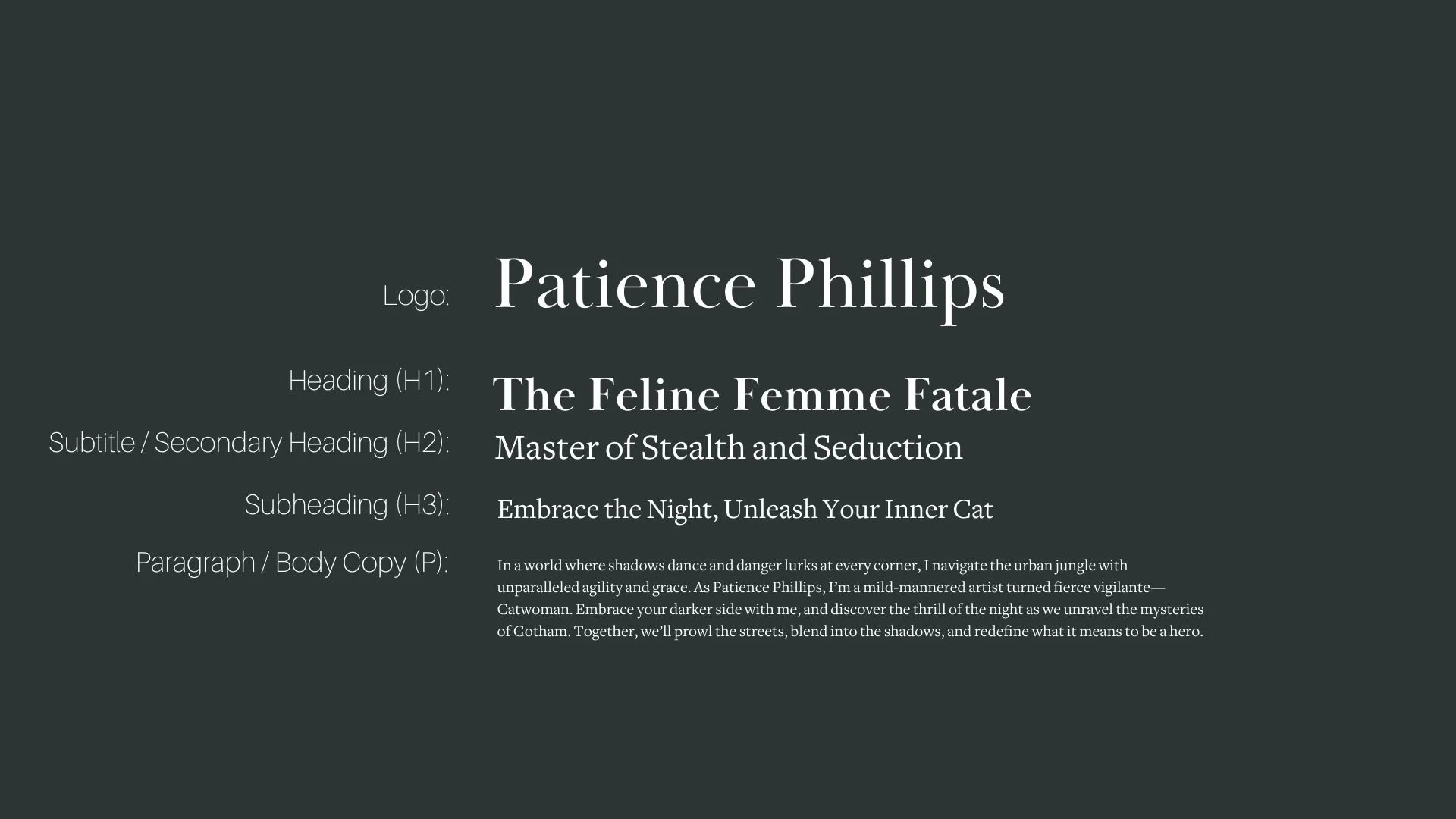
Font Hierarchy for Baskerville Display PT and Freight Text Pro:
Logo
Usage: Primary logo text, initials, brand name
Baskerville Display PT, Regular, 72 pt (Canva), 72 px (Squarespace)
Heading (H1)
Usage: Main headings on pages, prominent titles
Baskerville Display PT, Bold, 48 pt (Canva), 48 px (Squarespace)
Subtitle / Secondary Heading (H2)
Usage: Section titles, important subtitles
Freight Text Pro, Regular, 36 pt (Canva), 36 px (Squarespace)
Subheading (H3)
Usage: Subsection headings, less prominent titles
Freight Text Pro, Regular, 28 pt (Canva), 28 px (Squarespace)
Paragraph / Body Copy (P)
Usage: Main body text, paragraphs, descriptions
Freight Text Pro, Regular, 16 pt (Canva), 16 px (Squarespace)