MEET YOUR FONT PAIRING MATCH
This page is your custom breakdown of the font pairing you were matched with from the Find Your Font Quiz. You’ll discover the history, personality, and style of each font—and see how they can come to life in your personal brand.
If you're a Personal Branding Studio member:
Bookmark this page. We’ll return to it in Part 2 when it’s time to use your font pairing to design your logo and create branded Canva graphics.
Not loving this particular combo? No problem. Explore all 100+ font pairings inside PBS - Part 1, Module 4: Design - to find one that feels just right. Click the button below to go there now.
Not yet a Personal Branding Studio member?
(And wondering what Personal Branding Studio even is?)
Start by scrolling through your results below. At the bottom of this page, you’ll find out how to go deeper with your personal brand through my full Personal Branding Studio program.
And your aligned font pairing match is…


HISTORY
-
HISTORY -
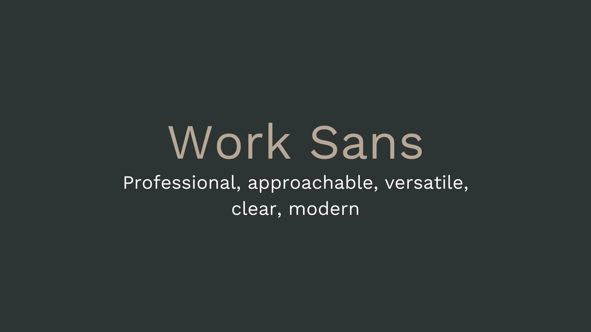
Work Sans
Overview:
Work Sans is a contemporary sans-serif typeface designed with a focus on clarity and versatility. Its clean and modern design makes it highly adaptable for both screen and print use, excelling in readability at a variety of sizes.
History:
Work Sans was designed by Wei Huang, an independent type designer based in New York. It was released in 2015 as an open-source typeface, with the intention of creating a modern sans-serif suitable for on-screen use, while maintaining excellent legibility in print. The design of Work Sans is influenced by early grotesque typefaces, but with a contemporary twist that incorporates geometric shapes and a relatively large x-height.
Characteristics:
Design: The typeface features a geometric structure with slightly rounded corners, giving it a friendly yet professional appearance. The letterforms are clean, with a low contrast between thick and thin strokes, which enhances readability.
Usage: Work Sans is ideal for a wide range of applications including websites, corporate branding, editorial design, and UI/UX. Its clear and open design makes it suitable for both large display sizes and small text for user interfaces.
Attributes: Work Sans is legible, neutral, and highly versatile. It offers excellent legibility at small sizes, especially on screens, while also working well for headers and body text in print. Its modern yet approachable design makes it a go-to choice for contemporary projects.


FONT PERSONALITY
-
FONT PERSONALITY -
Why Abel and Source Code Pro are a Match Made in Heaven:
When the personalities of Abel and Source Code Pro are combined, the result is a pairing that is both approachable and functional. Abel brings a modern and professional touch with a hint of warmth, making it suitable for headlines and logos that need to be both eye-catching and versatile. On the other hand, Source Code Pro’s precise and technical nature grounds the pairing, ensuring that the overall design remains clear and unambiguous, especially in detailed or complex content.
Together, these fonts would appeal to a person who is both practical and modern—a tech-savvy individual who values clarity and precision but also appreciates subtle design aesthetics. This person might be someone who works in a creative tech industry, blending innovation with functionality, such as a designer-developer hybrid who values both form and function in their work.

CELEBRITY MATCH
-
CELEBRITY MATCH -
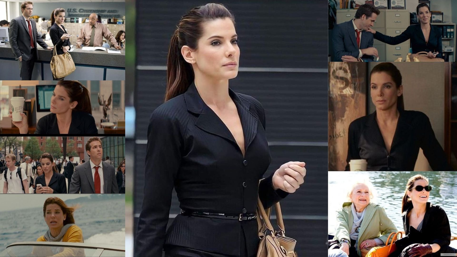
The font Work Sans aligns perfectly with the character of Margaret Tate, as portrayed by Sandra Bullock in the movie "The Proposal (2009)".
Summary: Sandra Bullock's portrayal of Margaret Tate in The Proposal perfectly embodies the traits of the "Work Sans" font. Margaret’s professionalism, adaptability, and clear communication align with the font’s clean, modern design and its ability to be both approachable and sophisticated. As Margaret evolves throughout the film, her journey from a rigid corporate figure to a more balanced and versatile person mirrors the flexibility and timeless quality of Work Sans. In essence, the character of Margaret Tate and the font "Work Sans" are both refined, adaptable, and designed to perform in any setting, making Sandra Bullock an ideal match for this font pairing.

HIERARCHY
-
HIERARCHY -
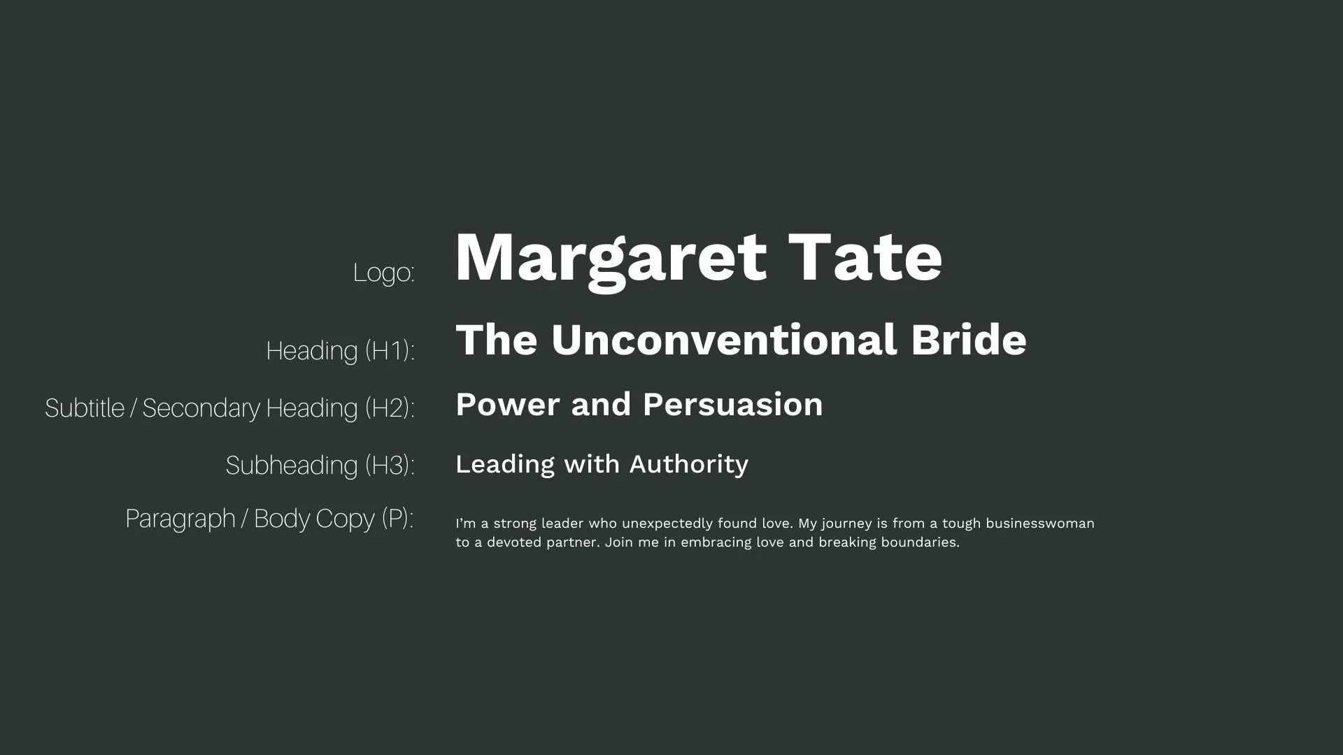
Font Hierarchy for Work Sans:
Logo
Usage: Primary logo text, initials, brand name
Work Sans, Bold, 72 pt (Canva), 72 pt (Squarespace)
Heading (H1)
Usage: Main headings on pages, prominent titles
Work Sans, Bold, 48 pt (Canva), 42 pt (Squarespace)
Subtitle / Secondary Heading (H2)
Usage: Section titles, important subtitles
Work Sans, Semi-Bold, 36 pt (Canva), 32 pt (Squarespace)
Subheading (H3)
Usage: Subsection headings, less prominent titles
Work Sans, Medium, 28 pt (Canva), 24 pt (Squarespace)
Paragraph / Body Copy (P)
Usage: Main body text, paragraphs, descriptions
Work Sans, Regular, 16 pt (Canva), 16 pt (Squarespace)