MEET YOUR FONT PAIRING MATCH
This page is your custom breakdown of the font pairing you were matched with from the Find Your Font Quiz. You’ll discover the history, personality, and style of each font—and see how they can come to life in your personal brand.
If you're a Personal Branding Studio member:
Bookmark this page. We’ll return to it in Part 2 when it’s time to use your font pairing to design your logo and create branded Canva graphics.
Not loving this particular combo? No problem. Explore all 100+ font pairings inside PBS - Part 1, Module 4: Design - to find one that feels just right. Click the button below to go there now.
Not yet a Personal Branding Studio member?
(And wondering what Personal Branding Studio even is?)
Start by scrolling through your results below. At the bottom of this page, you’ll find out how to go deeper with your personal brand through my full Personal Branding Studio program.
And your aligned font pairing match is…


HISTORY
-
HISTORY -
Omnes Pro
Overview:
Omnes Pro is a rounded sans-serif font celebrated for its friendly, approachable, and versatile aesthetic. Designed to be modern yet warm, Omnes Pro is suitable for branding, web design, and any application where readability and a personable tone are essential. Its rounded edges add a soft touch that distinguishes it from other sans-serifs, making it popular in tech, retail, and media contexts.
History:
Omnes was created by designer Joshua Darden and released through Darden Studio in 2006. It was initially developed to provide a rounded sans-serif with greater weight options and legibility than many existing fonts. Since its release, Omnes has expanded in functionality with multiple widths, weights, and italics, offering flexibility for diverse design applications. In 2018, the font family was updated and extended, reinforcing its place as a modern classic among designers.
Characteristics:
Design: Omnes Pro features rounded terminals and carefully balanced proportions, blending a geometric foundation with organic softness. It has a gentle, curved structure that adds warmth and a sense of openness, with clear letterforms that enhance readability.
Usage: Due to its friendly yet professional style, Omnes Pro works well in user interfaces, branding, advertising, and anywhere a contemporary, friendly tone is desired. Its range of weights and widths supports consistent use across different media and layouts.
Attributes: Omnes Pro is highly legible, versatile, and slightly playful due to its rounded edges. This combination of readability and personality has made it a favorite for branding projects that need to balance modernity with approachability.


FONT PERSONALITY
-
FONT PERSONALITY -

Why Abel and Source Code Pro are a Match Made in Heaven:
When the personalities of Abel and Source Code Pro are combined, the result is a pairing that is both approachable and functional. Abel brings a modern and professional touch with a hint of warmth, making it suitable for headlines and logos that need to be both eye-catching and versatile. On the other hand, Source Code Pro’s precise and technical nature grounds the pairing, ensuring that the overall design remains clear and unambiguous, especially in detailed or complex content.
Together, these fonts would appeal to a person who is both practical and modern—a tech-savvy individual who values clarity and precision but also appreciates subtle design aesthetics. This person might be someone who works in a creative tech industry, blending innovation with functionality, such as a designer-developer hybrid who values both form and function in their work.

CELEBRITY MATCH
-
CELEBRITY MATCH -

The font Omnes Pro aligns perfectly with the character of Vivian Ward, as portrayed by Julia Roberts in the movie "Pretty Woman (1990)".
Summary: Julia Roberts' portrayal of Vivian Ward in Pretty Woman aligns seamlessly with the Omnes Pro font. Both Vivian and Omnes Pro exude warmth, versatility, and clarity, while adapting to different environments with grace. Vivian's journey from streetwise outsider to a confident, graceful woman echoes Omnes Pro’s balance of modern and classic design elements, making this font pairing an ideal match for the beloved character. Just as Omnes Pro is a reliable choice for various design needs, Julia Roberts' performance in Pretty Woman remains an enduring example of charm, grace, and warmth.

HIERARCHY
-
HIERARCHY -
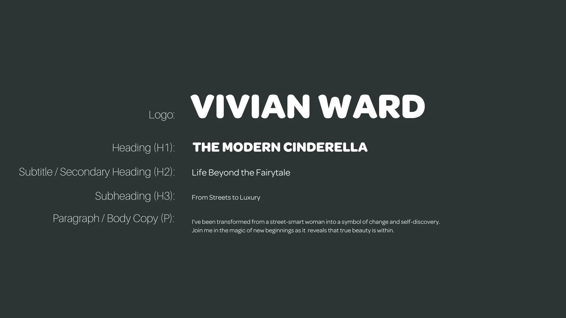
Font Hierarchy for Omnes Pro:
Logo
Usage: Primary logo text, initials, brand name
Omnes Pro, Bold, 36-72 pt (Canva), 24-36 pt (Squarespace)
Heading (H1)
Usage: Main headings on pages, prominent titles
Omnes Pro , Bold, 36 pt (Canva), 28-36 pt (Squarespace)
Subtitle / Secondary Heading (H2)
Usage: Section titles, important subtitles
Omnes Pro , Regular, 24 pt (Canva), 20-24 pt (Squarespace)
Subheading (H3)
Usage: Subsection headings, less prominent titles
Omnes Pro, Regular, 18 pt (Canva), 16-18 pt (Squarespace)
Paragraph / Body Copy (P)
Usage: Main body text, paragraphs, descriptions
Omnes Pro, Regular, 16 pt (Canva), 14-16 pt (Squarespace)