MEET YOUR FONT PAIRING MATCH
This page is your custom breakdown of the font pairing you were matched with from the Find Your Font Quiz. You’ll discover the history, personality, and style of each font—and see how they can come to life in your personal brand.
If you're a Personal Branding Studio member:
Bookmark this page. We’ll return to it in Part 2 when it’s time to use your font pairing to design your logo and create branded Canva graphics.
Not loving this particular combo? No problem. Explore all 100+ font pairings inside PBS - Part 1, Module 4: Design - to find one that feels just right. Click the button below to go there now.
Not yet a Personal Branding Studio member?
(And wondering what Personal Branding Studio even is?)
Start by scrolling through your results below. At the bottom of this page, you’ll find out how to go deeper with your personal brand through my full Personal Branding Studio program.
And your aligned font pairing match is…

HISTORY
-
HISTORY -
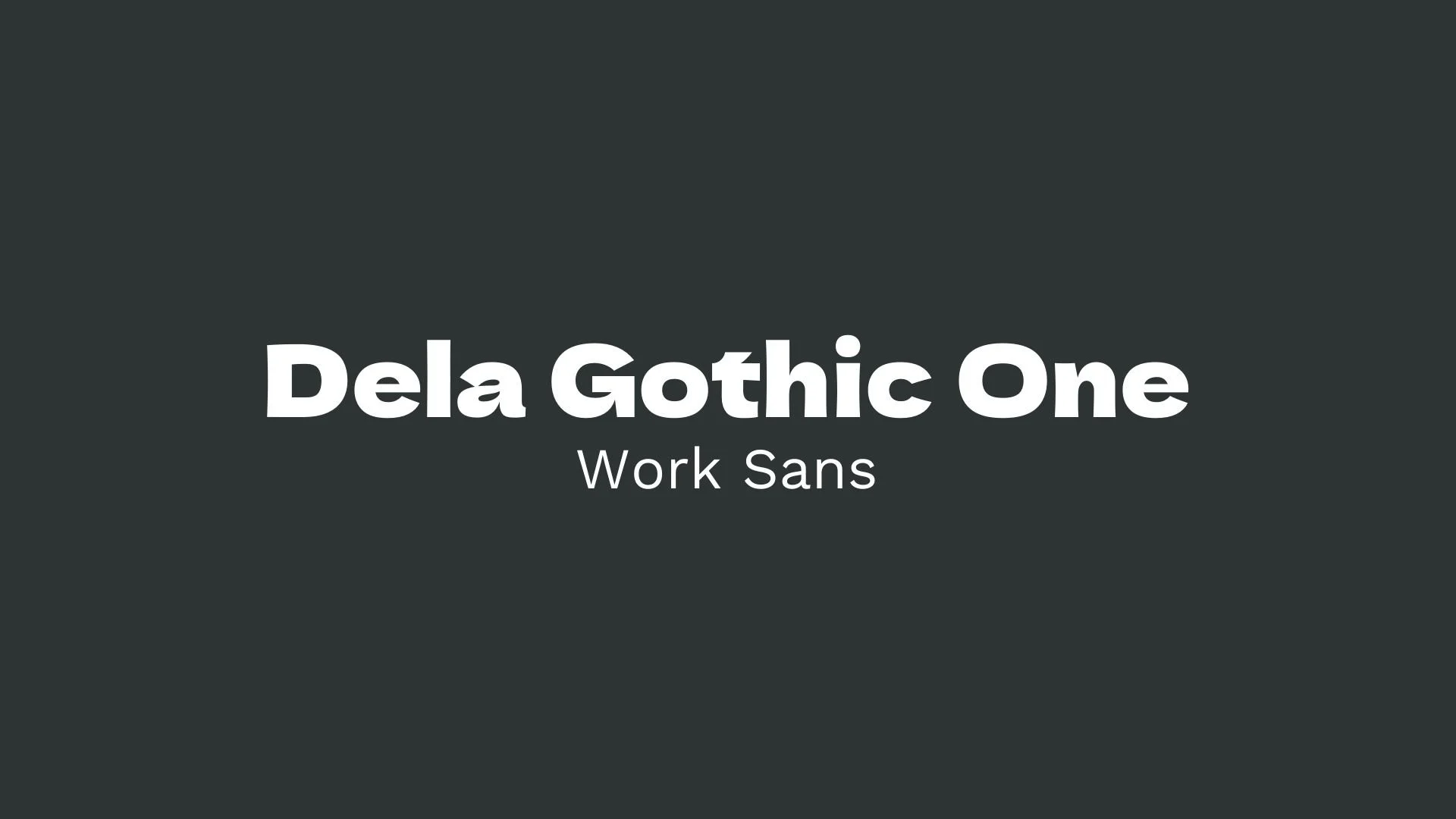
Dela Gothic One
Overview:
Dela Gothic One is a bold, modern display font with a clean and geometric style. Known for its strong visual impact, this sans-serif font is ideal for catching the viewer’s attention, making it suitable for headlines, logos, posters, and other design elements that require a commanding presence.
History:
Released under the Open Font License, Dela Gothic One is a project developed by The Dela Gothic Project team, with contributions that emphasize its Japanese-inspired design. The font was crafted with the intention of creating a versatile yet unique typeface that can seamlessly fit in contemporary design work.
Characteristics:
Design: Dela Gothic One features wide proportions and a large x-height, providing a sense of stability and readability even at smaller sizes. The font’s structure includes sharp angles, clean lines, and distinct geometric shapes, which create a modern aesthetic that aligns with current design trends.
Usage: Perfect for digital and print use in contexts where bold typography is needed, Dela Gothic One excels in applications like posters, website headers, and branding materials. Its single style (regular weight) emphasizes simplicity and boldness, making it easy to incorporate into a variety of design projects without overwhelming the viewer.
Attributes: Dela Gothic One supports multiple languages, including those requiring non-Latin characters, enhancing its adaptability across different global contexts. Its OpenType features, like kerning and ligatures, add to its professional appearance, ensuring text alignment and spacing appear polished in any layout.

Work Sans
Overview:
Work Sans is a versatile, modern sans-serif typeface designed for both display and text use. It is characterized by its open and clean letterforms, offering high readability and a contemporary aesthetic. The font is well-suited for digital media, making it a popular choice for user interfaces and websites.
History:
Work Sans was created by Australian designer Wei Huang and released in 2016. Inspired by early 20th-century grotesque sans-serifs, Work Sans was designed to provide a modern, web-friendly alternative for both headings and body text. The design aims to offer a balanced approach to legibility across different screen sizes, making it particularly suited to the needs of responsive web design.
Characteristics:
Design: Work Sans has a geometric, slightly humanist structure with open apertures and simple, clean lines. The design strikes a balance between modern minimalism and traditional sans-serif elements, making it both approachable and professional.
Usage: Its high legibility at small sizes and clean design make Work Sans ideal for websites, mobile interfaces, and digital applications. It works well for headlines, body text, and UI elements, and its simplicity makes it suitable for a wide range of design projects.
Attributes: Work Sans is clean, modern, and versatile. It features a balanced design with a neutral tone, making it highly adaptable to various contexts. Its clarity at small sizes and bold presence at larger sizes make it a practical choice for both web and print.


FONT PERSONALITY
-
FONT PERSONALITY -

Why Dela Gothic One and Work Sans are a Match Made in Heaven:
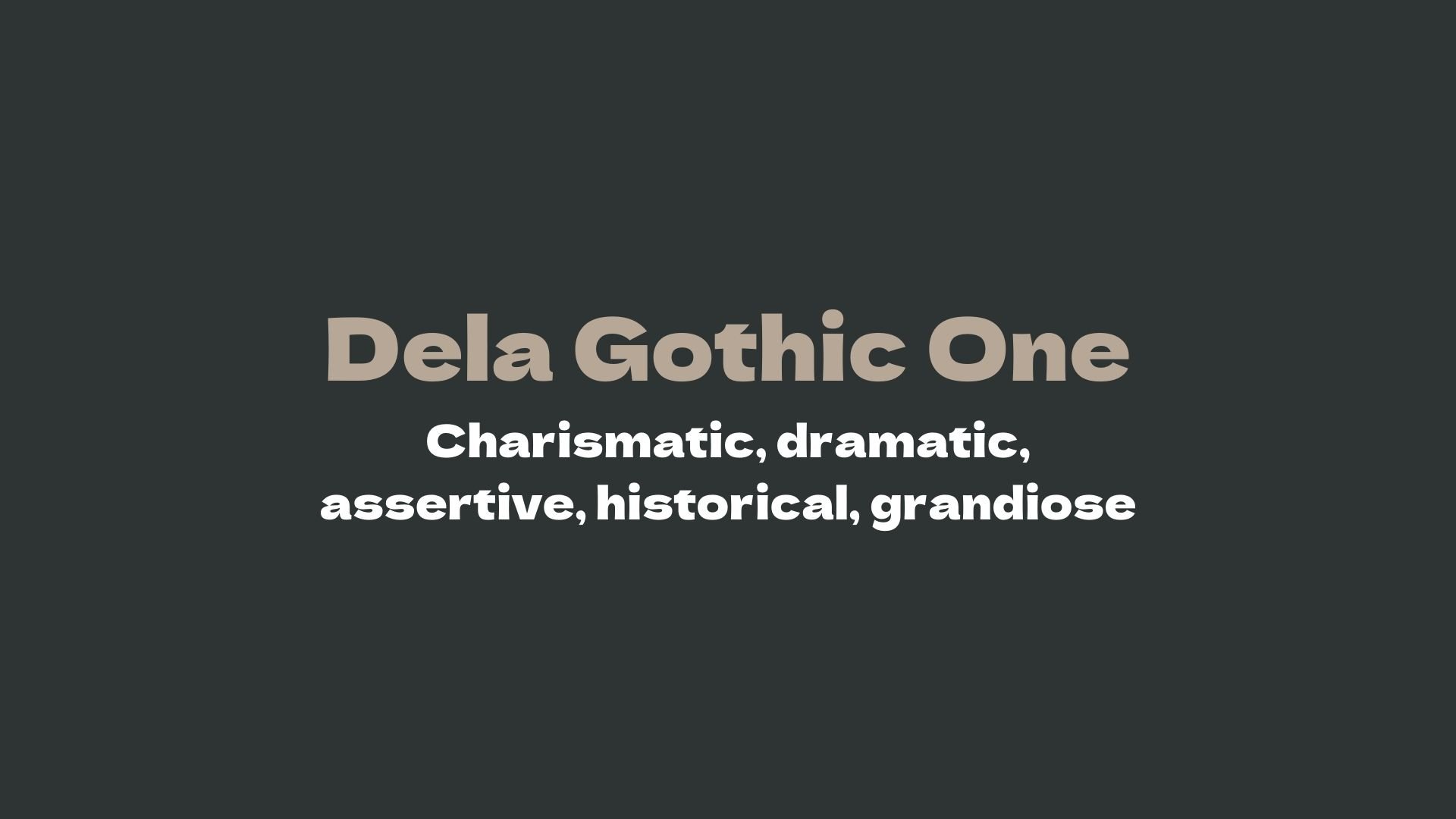
Dela Gothic One and Work Sans combine two contrasting yet complementary personalities to create a visually striking and balanced pairing. Dela Gothic One brings a bold and dramatic presence, exuding charisma and an air of grandeur. Its assertive and historical traits make it perfect for capturing attention in large headlines, branding, or logos that need to stand out. On the other hand, Work Sans, with its minimalist and approachable qualities, serves as the perfect counterbalance. It is reliable, contemporary, and clear, providing a sense of stability and simplicity that grounds the design, ensuring readability and harmony across different types of content. Together, this pairing marries the theatrical with the dependable, creating a design that is both captivating and easy to engage with.
This font pairing would appeal to an individual who embodies both confidence and reliability. They are someone who enjoys making a bold statement, whether through their career or personal style, but also values a sense of clarity and approachability in their communications. This person could be a visionary leader in a creative industry—someone with a strong, assertive personality who also prioritizes efficiency and accessibility. They might work in fields like branding, advertising, or public relations, where they need to project an impressive, authoritative image while maintaining a grounded, trustworthy demeanor.

CELEBRITY MATCH
-
CELEBRITY MATCH -

The font pairing of Dela Gothic One and Work Sans aligns perfectly with the character of Lana Winters, as portrayed by Sarah Paulson in the movie "American Horror Story: Asylum".
Summary: The font pairing of Dela Gothic One and Work Sans perfectly encapsulates Sarah Paulson’s portrayal of Lana Winters in American Horror Story: Asylum. Dela Gothic One captures the commanding, dramatic, and bold nature of Lana, who makes a powerful statement with her fierce determination to uncover the truth. Work Sans complements this with its modern, dependable, and clear qualities, reflecting Lana’s methodical approach to navigating the asylum’s horrors and her intellectual clarity in moments of chaos. Together, these fonts mirror the balanced combination of strength and clarity in Lana Winters’ character, making this pairing a perfect match for her complex and multi-dimensional role.

HIERARCHY
-
HIERARCHY -
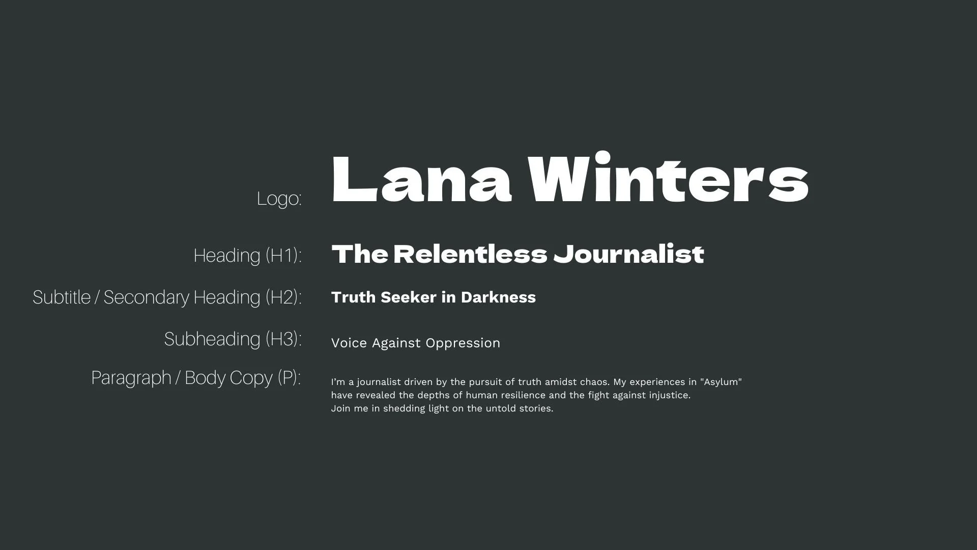
Font Hierarchy for Dela Gothic One and Work Sans:
Logo
Usage: Primary logo text, initials, brand name
Dela Gothic One, Regular, 48-60 pt (Canva), 36-48 px (Squarespace)
Heading (H1)
Usage: Main headings on pages, prominent titles
Dela Gothic One, Regular, 36-48 pt (Canva), 30-36 px (Squarespace)
Subtitle / Secondary Heading (H2)
Usage: Section titles, important subtitles
Work Sans, Bold, 24-30 pt (Canva), 20-24 px (Squarespace)
Subheading (H3)
Usage: Subsection headings, less prominent titles
Work Sans, Regular, 18-24 pt (Canva), 16-20 px (Squarespace)
Paragraph / Body Copy (P)
Usage: Main body text, paragraphs, descriptions
Work Sans, Regular, 12-16 pt (Canva), 14-16 px (Squarespace)