MEET YOUR FONT PAIRING MATCH
This page is your custom breakdown of the font pairing you were matched with from the Find Your Font Quiz. You’ll discover the history, personality, and style of each font—and see how they can come to life in your personal brand.
If you're a Personal Branding Studio member:
Bookmark this page. We’ll return to it in Part 2 when it’s time to use your font pairing to design your logo and create branded Canva graphics.
Not loving this particular combo? No problem. Explore all 100+ font pairings inside PBS - Part 1, Module 4: Design - to find one that feels just right. Click the button below to go there now.
Not yet a Personal Branding Studio member?
(And wondering what Personal Branding Studio even is?)
Start by scrolling through your results below. At the bottom of this page, you’ll find out how to go deeper with your personal brand through my full Personal Branding Studio program.
And your aligned font pairing match is…


HISTORY
-
HISTORY -
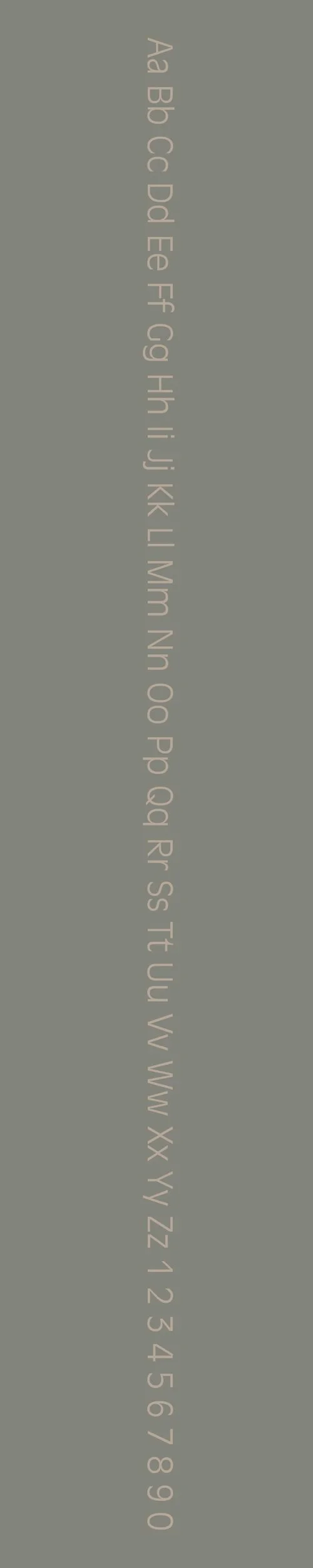
Antique Olive Nord
Overview:
Antique Olive Nord is a contemporary revival of the Antique Olive typeface, characterized by its robust, modern look with a unique geometric structure. Originally designed for high readability, it has been adapted for modern design needs, offering both sophistication and clarity.
History:
Antique Olive was originally created in 1962 by French type designer Roger Excoffon for the Fonderie Olive. It was designed as a versatile, sans-serif typeface with a focus on high legibility in large sizes, often used in advertising and signage. In 2010, the Nord version was created as a revival of the original Antique Olive, with more refined details and a modern twist while retaining the spirit of the original. It was designed by the font foundry Linotype, in collaboration with Excoffon's original design ethos. The purpose behind this new iteration was to offer a more versatile and slightly more geometric version, better suited for contemporary uses in both print and digital media.
Characteristics:
Design: Antique Olive Nord features a distinctive geometric sans-serif style with rounded letterforms and a slightly condensed structure. The strokes are uniform with subtle flaring at the terminals, giving it a dynamic and sophisticated feel.
Usage: It is well-suited for headlines, branding, and editorial design, where clarity and legibility are crucial. The font works well for both large-scale print materials like posters and modern web design.
Attributes: Antique Olive Nord is modern and legible, offering a balance between elegance and utility. Its geometric nature, coupled with a slightly softer finish, makes it highly versatile for various design needs while maintaining a sense of authority and sophistication.
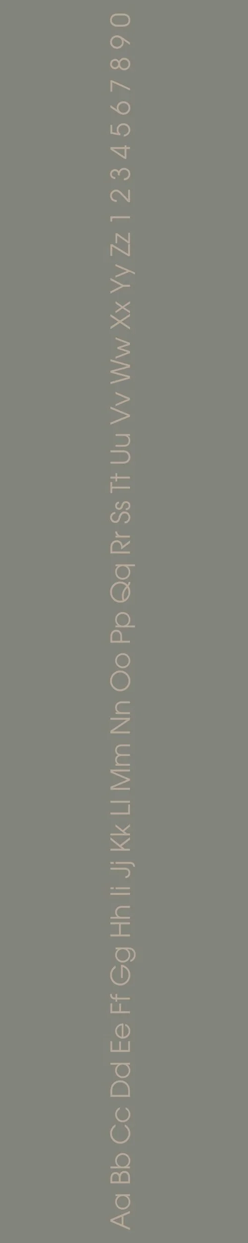
ITC Avant Garde Gothic Pro
Overview:
ITC Avant Garde Gothic Pro is a geometric sans-serif typeface known for its modern, clean, and stylish design. With its sharp, straight lines and distinctive letterforms, it exudes a sense of modernism, making it ideal for high-impact design projects that need a bold, yet approachable typeface.
History:
Designed by Herb Lubalin and Tom Carnase in 1970, ITC Avant Garde Gothic was originally created for the avant-garde magazine *Avant Garde*. The typeface was a reflection of the modernist ideals of the late 1960s and early 1970s, emphasizing simplicity and geometric purity. The font was intended to represent the future of typography, with its bold and distinctive style. In 2002, ITC (International Typeface Corporation) released the Pro version, which included extended character sets and improvements in weight and spacing, making it more suitable for modern digital use.
Characteristics:
Design: ITC Avant Garde Gothic Pro is a highly geometric sans-serif with clean, sharp lines and an even, consistent structure. It features distinctive letterforms with unique touches, such as the “A” and “R” with rounded corners and sharp cuts. The Pro version includes additional weights and support for a wider range of languages.
Usage: Ideal for use in headlines, logos, and branding, ITC Avant Garde Gothic Pro excels in high-visibility applications. It’s often seen in fashion, technology, and editorial design, as well as advertising and packaging, where a bold, modern look is desired.
Attributes: With its modern, minimalist aesthetic and geometric precision, ITC Avant Garde Gothic Pro is bold and eye-catching while maintaining legibility. It is perfect for projects that require a statement typeface with a contemporary edge. The font conveys a sense of modernity and sophistication while remaining approachable and versatile.

FONT PERSONALITY
-
FONT PERSONALITY -


Why Antique Olive Nord and ITC Avant Garde Gothic Pro are a Match Made in Heaven:
The combination of Antique Olive Nord and ITC Avant Garde Gothic Pro creates a perfect balance between elegance and bold innovation. Antique Olive Nord offers a sophisticated and timeless charm, with its classic, refined feel bringing an element of tradition and grace to the pairing. Meanwhile, ITC Avant Garde Gothic Pro injects a dynamic, modern edge with its geometric, bold forms and forward-thinking design. Together, they create a seamless contrast—Antique Olive Nord’s polished elegance is anchored by the cutting-edge, energetic nature of ITC Avant Garde Gothic Pro, making them complementary without clashing. This pairing is versatile enough to be used for both high-end branding and modern, creative applications, with each font bringing out the best in the other.
This font pairing would appeal to a person who values both tradition and innovation, someone who is forward-thinking yet grounded in strong, classic principles. This could be a creative professional—perhaps a luxury brand consultant, an architect, or an interior designer—who wants to convey both sophistication and modernity in their personal brand. They are someone who balances timeless style with cutting-edge trends, always looking to push boundaries while maintaining an air of elegance and refinement.

CELEBRITY MATCH
-
CELEBRITY MATCH -

The font pairing of Antique Olive Nord and ITC Avant Garde Gothic Pro aligns perfectly with the character of Eleanor Shellstrop, as portrayed by Kristen Bell in the movie "The Good Place".
Summary: Kristen Bell’s portrayal of Eleanor Shellstrop in "The Good Place" perfectly captures the essence of the Antique Olive Nord and ITC Avant Garde Gothic Pro font pairing. Antique Olive Nord symbolizes Eleanor’s refined moral growth, resilience, and the blending of her rough, modern edges with timeless ethical values. ITC Avant Garde Gothic Pro reflects Eleanor’s bold, dynamic, and unapologetically modern beginnings, showcasing her innovative and boundary-pushing personality. Together, these fonts illustrate Eleanor’s character arc: a journey from a brash, self-serving individual to a resilient, ethically grounded, and elegantly composed individual, much like the harmonious pairing of these contrasting yet complementary typefaces.

HIERARCHY
-
HIERARCHY -
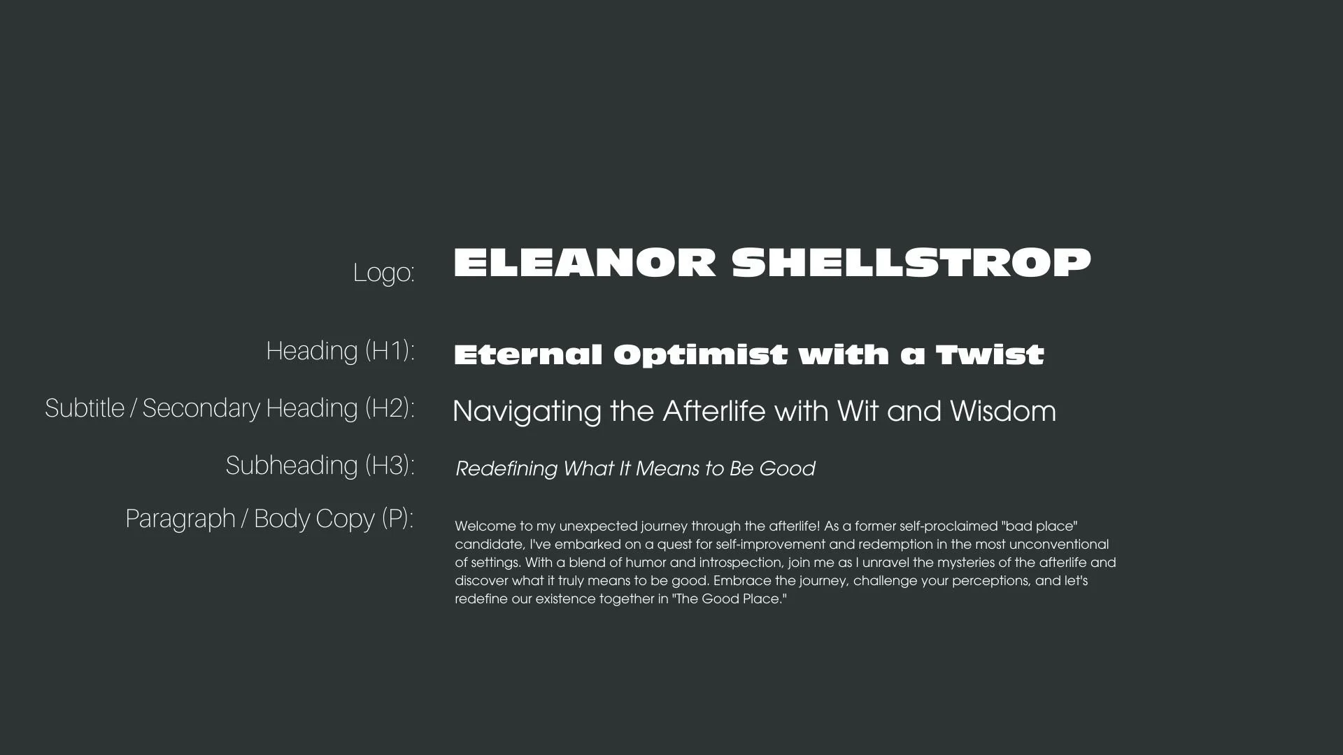
Font Hierarchy for Antique Olive Nord and ITC Avant Garde Gothic Pro:
Logo
Usage: Primary logo text, initials, brand name
Antique Olive Nord, Regular, 72pt (Canva), 48px (Squarespace)
Heading (H1)
Usage: Main headings on pages, prominent titles
Antique Olive Nord, Regular, 36pt (Canva), 24px (Squarespace)
Subtitle / Secondary Heading (H2)
Usage: Section titles, important subtitles
ITC Avant Garde Gothic Pro, Regular, 30pt (Canva), 18px (Squarespace)
Subheading (H3)
Usage: Subsection headings, less prominent titles
ITC Avant Garde Gothic Pro, Italics, 20pt (Canva), 16px (Squarespace)
Paragraph / Body Copy (P)
Usage: Main body text, paragraphs, descriptions
ITC Avant Garde Gothic Pro, Regular, 14pt (Canva), 14px (Squarespace)