MEET YOUR FONT PAIRING MATCH
This page is your custom breakdown of the font pairing you were matched with from the Find Your Font Quiz. You’ll discover the history, personality, and style of each font—and see how they can come to life in your personal brand.
If you're a Personal Branding Studio member:
Bookmark this page. We’ll return to it in Part 2 when it’s time to use your font pairing to design your logo and create branded Canva graphics.
Not loving this particular combo? No problem. Explore all 100+ font pairings inside PBS - Part 1, Module 4: Design - to find one that feels just right. Click the button below to go there now.
Not yet a Personal Branding Studio member?
(And wondering what Personal Branding Studio even is?)
Start by scrolling through your results below. At the bottom of this page, you’ll find out how to go deeper with your personal brand through my full Personal Branding Studio program.
And your aligned font pairing match is…

HISTORY
-
HISTORY -
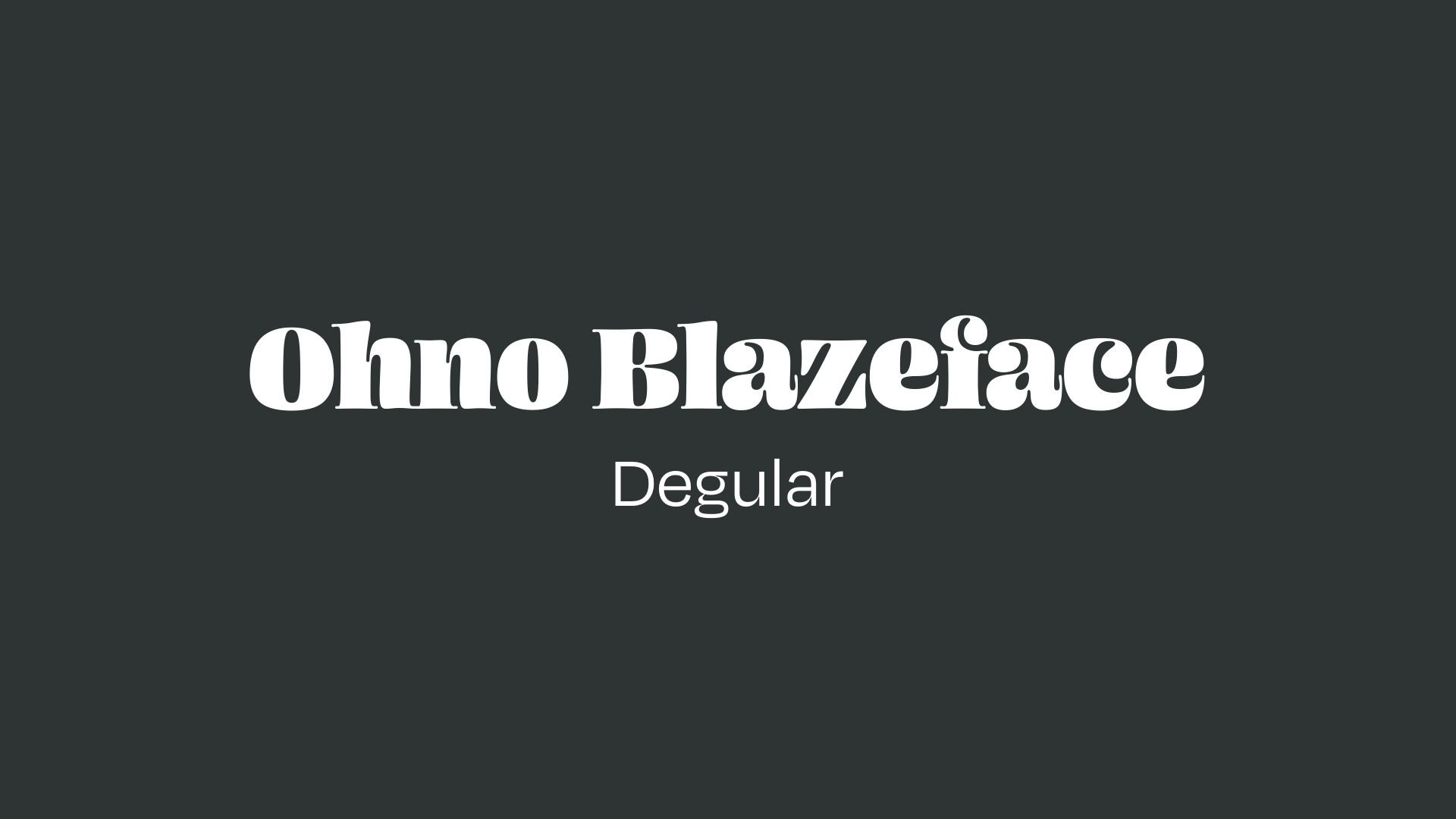
Ohno Blazeface
Overview:
Ohno Blazeface is a distinctive serif typeface known for its high contrast and bold appearance. It combines both playful and serious elements, making it a versatile choice for contemporary design projects. Its visual presence is strong, making it well-suited for large-scale headlines, posters, and branding materials.
History:
Ohno Blazeface was designed by James Edmondson, a well-known type designer. Initially released in a single italic style in 2018 on Future Fonts, the typeface was expanded into a complete family and released by OH no Type Co. in 2019. Edmondson's goal with Blazeface was to create a font that blended the qualities of traditional serif fonts with modern sensibilities, suitable for expressive design applications while maintaining clarity and legibility.
Characteristics:
Design: The font exhibits a high contrast between thick and thin strokes, characteristic of classic serif styles but with modern quirks. The design features sharp, angular serifs and distinctive letterforms that create a bold, eye-catching effect. The font comes in various optical sizes, from 12pt to 72pt, ensuring versatility across different media.
Usage: Best used in large displays, headlines, and branding where a striking presence is required. Its bold character works well in print media, signage, and advertising, providing a strong visual impact.
Attributes: Ohno Blazeface is highly legible at large sizes and offers a modern twist on traditional serif designs. Its high contrast makes it stand out, especially in contexts that demand attention-grabbing typography.

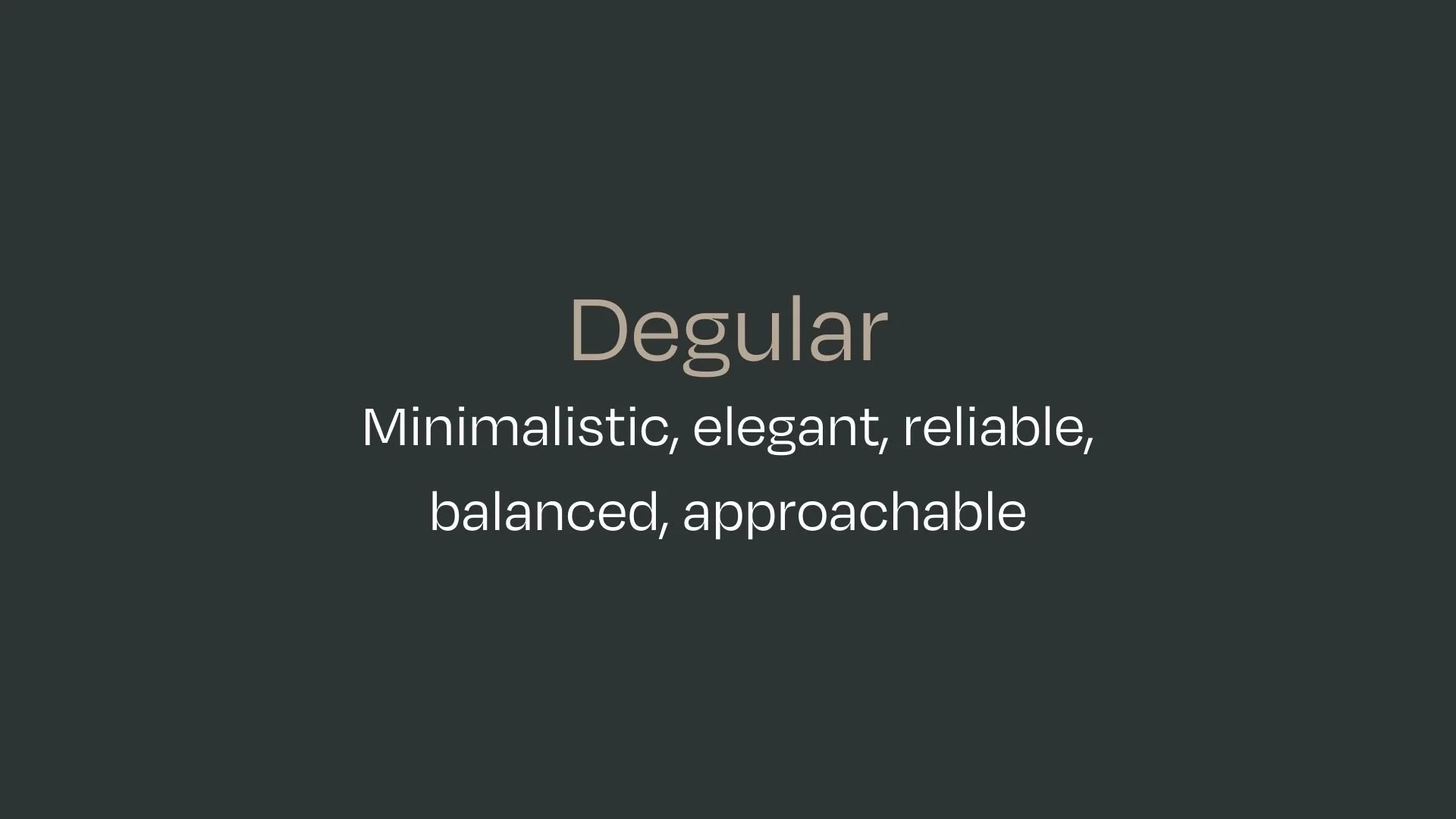
Degular
Overview:
Degular is a geometric sans-serif typeface known for its modern and elegant design, combining functional minimalism with a sophisticated appearance. It is designed to be versatile and highly readable, making it suitable for both print and digital media across various design applications.
History:
Degular was designed by German type designer Daniel Götz and was released in 2018. It was created with the intent to blend clean lines and geometric structure with subtle humanist touches, making it both neutral and approachable. The font's primary aim was to offer a modern alternative to traditional sans-serifs while maintaining legibility and aesthetic versatility for diverse contexts.
Characteristics:
Design: Degular is built on geometric forms but features slight humanist influences, which soften its overall appearance. It has rounded corners and open apertures, creating a friendly yet professional feel. The family includes various weights, offering flexibility for different design needs.
Usage: This typeface is ideal for a wide range of applications, including branding, editorial design, advertising, and digital platforms. Its clean lines make it suitable for both body text and headlines.
Attributes: Degular stands out for its balanced proportions and legibility at various sizes. Its modern, neutral appearance allows it to fit seamlessly into diverse contexts, while the subtle geometric influences give it a contemporary edge. It’s highly adaptable, working well in both minimalistic and more intricate layouts.


FONT PERSONALITY
-
FONT PERSONALITY -

Why Ohno Blazeface and Degular are a Match Made in Heaven:
The combination of Ohno Blazeface and Degular creates a dynamic and striking contrast that works beautifully together. Ohno Blazeface is assertive, confident, and intense, delivering boldness and energy to the design. It commands attention with its sharp-witted and powerful presence, making it perfect for headlines and focal points that need to captivate. On the other hand, Degular offers a sleek, minimalist elegance that grounds the pairing. Its clean, geometric form and balanced proportions provide stability and readability, creating a seamless visual flow that complements the strong impact of Ohno Blazeface.
This pairing is ideal for someone who values both impact and elegance in their personal brand. The individual using this combination is likely a high-energy, forward-thinking person who wants to convey confidence, innovation, and sophistication. They might work in a creative or leadership role, such as an entrepreneur, designer, or consultant, where they are expected to make a powerful impression while maintaining a professional and approachable demeanor. This pairing reflects their dynamic personality, capable of making bold moves while remaining grounded and reliable.

CELEBRITY MATCH
-
CELEBRITY MATCH -

The font pairing of Ohno Blazeface and Degular aligns perfectly with the character of Jinx Johnson, as portrayed by Halle Berry in the movie "Die Another Day (2002)".
Summary: Halle Berry’s portrayal of Jinx Johnson in Die Another Day is a perfect match for the font pairing of Ohno Blazeface and Degular. Both Jinx and this pairing exude confidence, assertiveness, and intensity, while maintaining a sense of balance and elegance. Just as Jinx dominates the screen with a bold, energetic presence, Ohno Blazeface makes a bold impact with its striking contrast. Degular complements this by adding sophistication and approachability, mirroring Jinx’s ability to remain composed in high-pressure moments. Both the character and the font are dynamic, engaging, and unforgettable.

HIERARCHY
-
HIERARCHY -

Font Hierarchy for Ohno Blazeface and Degular:
Logo
Usage: Primary logo text, initials, brand name
Ohno Blazeface , Regular, 48-72 pt depending on design constraints (Canva)
Heading (H1)
Usage: Main headings on pages, prominent titles
Ohno Blazeface, Bold, 32-96 pt (Canva)
Subtitle / Secondary Heading (H2)
Usage: Section titles, important subtitles
Ohno Blazeface , Thin, 24-48 pt. (Canva)
Subheading (H3)
Usage: Subsection headings, less prominent titles
Degular, Regular, 30pt (Canva)
Paragraph / Body Copy (P)
Usage: Main body text, paragraphs, descriptions
Degular, Regular, 18 pt (Canva)