MEET YOUR FONT PAIRING MATCH
This page is your custom breakdown of the font pairing you were matched with from the Find Your Font Quiz. You’ll discover the history, personality, and style of each font—and see how they can come to life in your personal brand.
If you're a Personal Branding Studio member:
Bookmark this page. We’ll return to it in Part 2 when it’s time to use your font pairing to design your logo and create branded Canva graphics.
Not loving this particular combo? No problem. Explore all 100+ font pairings inside PBS - Part 1, Module 4: Design - to find one that feels just right. Click the button below to go there now.
Not yet a Personal Branding Studio member?
(And wondering what Personal Branding Studio even is?)
Start by scrolling through your results below. At the bottom of this page, you’ll find out how to go deeper with your personal brand through my full Personal Branding Studio program.
And your aligned font pairing match is…

HISTORY
-
HISTORY -
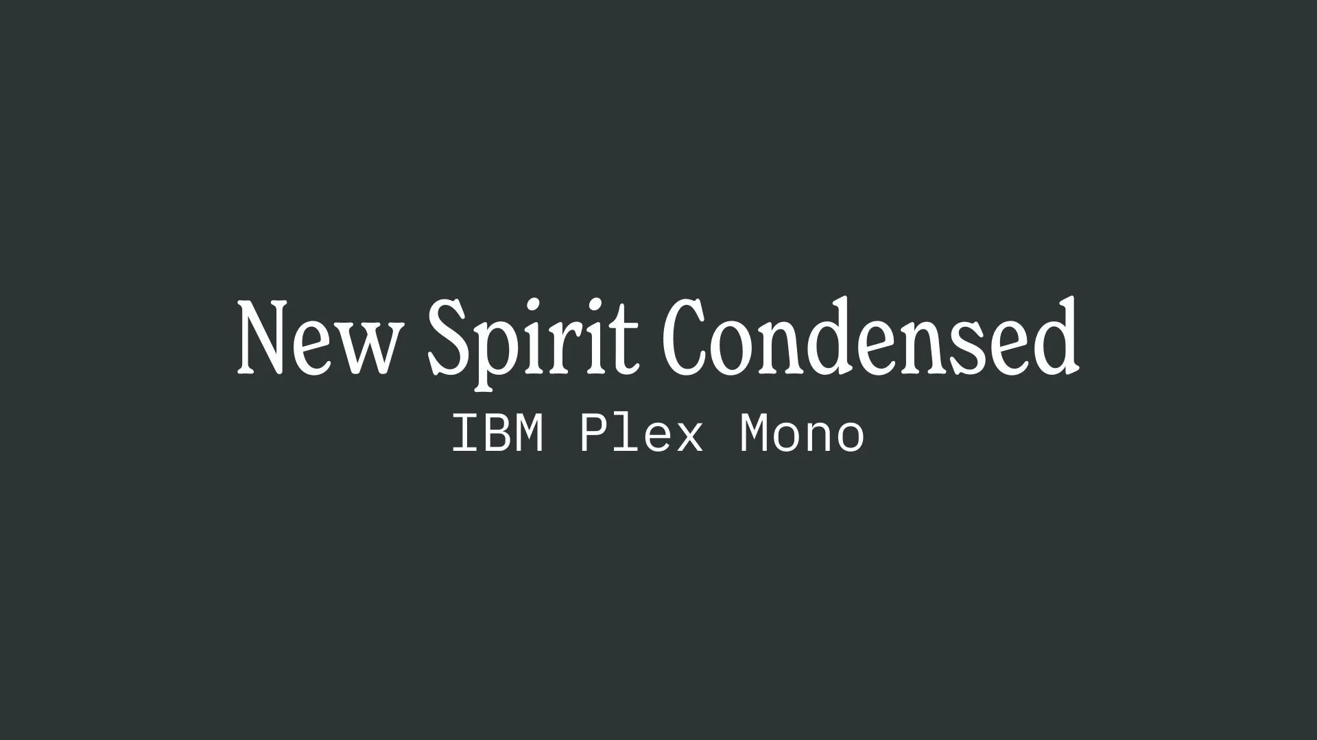
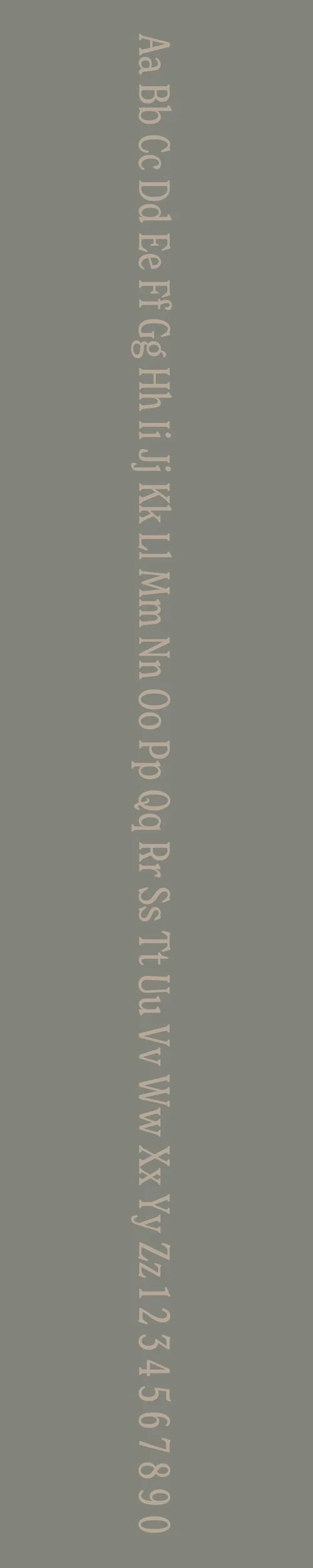
New Spirit Condensed
Overview:
New Spirit Condensed is a refined and modern sans-serif typeface designed for high readability and a sleek, condensed look. Its clean lines and minimalistic approach make it a versatile font for both contemporary digital and print designs.
History:
New Spirit Condensed was created by the type designer André Gürtler and released in 2008 through the Swiss-based type foundry, Typofonderie. The font is a condensed variant of the original New Spirit family, which was designed with a contemporary touch while maintaining legibility in various display sizes. Gürtler’s goal with New Spirit Condensed was to create a modern typeface with a strong visual impact, suitable for use in tight spaces like headlines, subheadings, and signage.
Characteristics:
Design: New Spirit Condensed features tight letter spacing, narrow proportions, and a strong, geometric structure with slightly rounded edges. Its condensed form gives it a compact, efficient feel while maintaining clarity at various sizes. The font balances modernist sans-serif principles with a subtle humanist influence, offering a contemporary and approachable design.
Usage: Ideal for headlines, posters, branding, and advertisements, New Spirit Condensed is well-suited for situations where space is limited, but readability remains paramount. It is also great for creating impactful, visually-striking text in both print and digital media.
Attributes: Highly legible, clean, and modern with a sleek condensed form. Its ability to maintain clarity in tight spaces while offering a contemporary and stylish look makes it perfect for a wide range of applications where space and readability are essential.
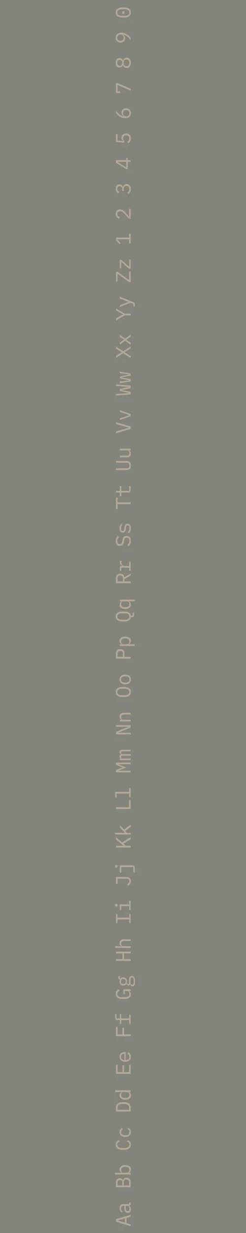
IBM Plex Mono
Overview:
IBM Plex Mono is a modern monospaced typeface that combines functional legibility with a clean, geometric design. Part of the larger IBM Plex family, it is specifically crafted for programming, technical documentation, and other contexts where a consistent character width is essential.
History:
IBM Plex Mono was developed by IBM as part of the broader IBM Plex typeface family, which was released in 2017. The IBM Plex family was created to represent the brand’s core values of innovation and openness, with IBM Plex Mono designed to provide a robust, functional typeface for coding and technical work. The monospaced design ensures that each character occupies the same amount of horizontal space, making it ideal for use in programming environments, terminal applications, and other technical fields where alignment and precision are critical.
Characteristics:
Design: IBM Plex Mono features a clean and geometric structure, with sharp, straight lines and distinctive curves. Its monospaced nature ensures that all characters take up the same width, which enhances alignment and readability in code. The typeface is characterized by slightly rounded corners, adding a modern, approachable feel while maintaining clarity and precision.
Usage: IBM Plex Mono is primarily used in programming, web development, and technical documentation. Its clean, legible design makes it ideal for coding editors, command-line interfaces, and any setting where monospaced text is required. It is also suitable for branding and creative applications that seek to evoke a technical, digital aesthetic.
Attributes: Highly legible, functional, and precise. The monospaced design allows for perfect character alignment, making it an essential tool for coding and technical environments. Its modern yet neutral style ensures it is versatile across a range of applications, from technical work to graphic design projects.

FONT PERSONALITY
-
FONT PERSONALITY -


Why New Spirit Condensed and IBM Plex Mono are a Match Made in Heaven:
The pairing of New Spirit Condensed and IBM Plex Mono creates a striking harmony between sophistication and practicality, offering a balanced mix of elegance and reliability. New Spirit Condensed stands tall with its bold and polished nature, making a statement that demands attention while maintaining an aura of refinement. In contrast, IBM Plex Mono’s methodical, minimalistic approach ensures that the pairing maintains clarity and consistency, adding a grounded, logical element to the design. Together, these fonts complement each other by balancing a strong visual presence with intelligent, systematic structure, resulting in a well-rounded, dynamic look.
This font pairing would appeal to a person who embodies both elegance and precision—a modern professional who values both style and substance. This individual is likely to be someone in a high-level role, such as an executive, consultant, or entrepreneur, where attention to detail and sophistication are key. They are strategic thinkers who approach challenges with methodical efficiency but also appreciate the power of making a strong, polished impression. A personal brand using this combination would project confidence, reliability, and a commitment to excellence.

CELEBRITY MATCH
-
CELEBRITY MATCH -
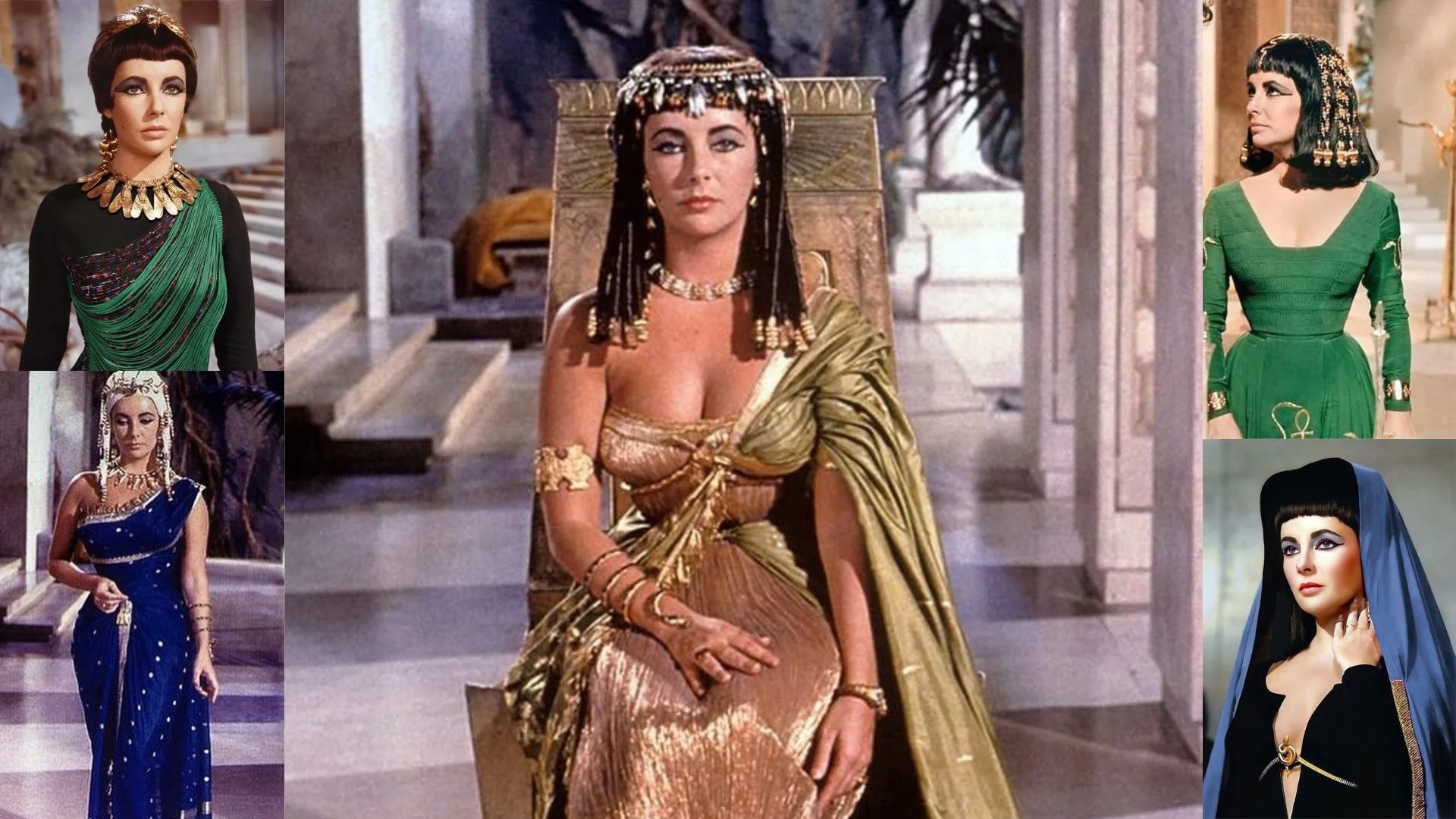
The font pairing of New Spirit Condensed and IBM Plex Mono aligns perfectly with the character of Cleopatra, as portrayed by Elizabeth Taylor in the movie "Cleopatra (1963)" .
Summary: Elizabeth Taylor's portrayal of Cleopatra in the 1963 epic film perfectly embodies the characteristics of New Spirit Condensed and IBM Plex Mono. Her depiction as a confident, bold, and sophisticated ruler aligns with the font's sleek modernity and refined elegance. Both Taylor as an actress and Cleopatra as a character command attention and leave a lasting impression, much like the typeface does in bold display settings.

HIERARCHY
-
HIERARCHY -

Font Hierarchy for New Spirit and IBM Plex Mono:
Logo
Usage: Primary logo text, initials, brand name
New Spirit Condensed, Regular, 72pt (Canva), 48px (Squarespace)
Heading (H1)
Usage: Main headings on pages, prominent titles
New Spirit Condensed, Regular, 36pt (Canva), 24px (Squarespace)
Subtitle / Secondary Heading (H2)
Usage: Section titles, important subtitles
New Spirit Condensed, Regular, 24pt (Canva), 18px (Squarespace)
Subheading (H3)
Usage: Subsection headings, less prominent titles
IBM Plex Mono, Regular, 18pt (Canva), 16px (Squarespace)
Paragraph / Body Copy (P)
Usage: Main body text, paragraphs, descriptions
IBM Plex Mono, Regular, 14pt (Canva), 14px (Squarespace)