MEET YOUR FONT PAIRING MATCH
This page is your custom breakdown of the font pairing you were matched with from the Find Your Font Quiz. You’ll discover the history, personality, and style of each font—and see how they can come to life in your personal brand.
If you're a Personal Branding Studio member:
Bookmark this page. We’ll return to it in Part 2 when it’s time to use your font pairing to design your logo and create branded Canva graphics.
Not loving this particular combo? No problem. Explore all 100+ font pairings inside PBS - Part 1, Module 4: Design - to find one that feels just right. Click the button below to go there now.
Not yet a Personal Branding Studio member?
(And wondering what Personal Branding Studio even is?)
Start by scrolling through your results below. At the bottom of this page, you’ll find out how to go deeper with your personal brand through my full Personal Branding Studio program.
And your aligned font pairing match is…

HISTORY
-
HISTORY -
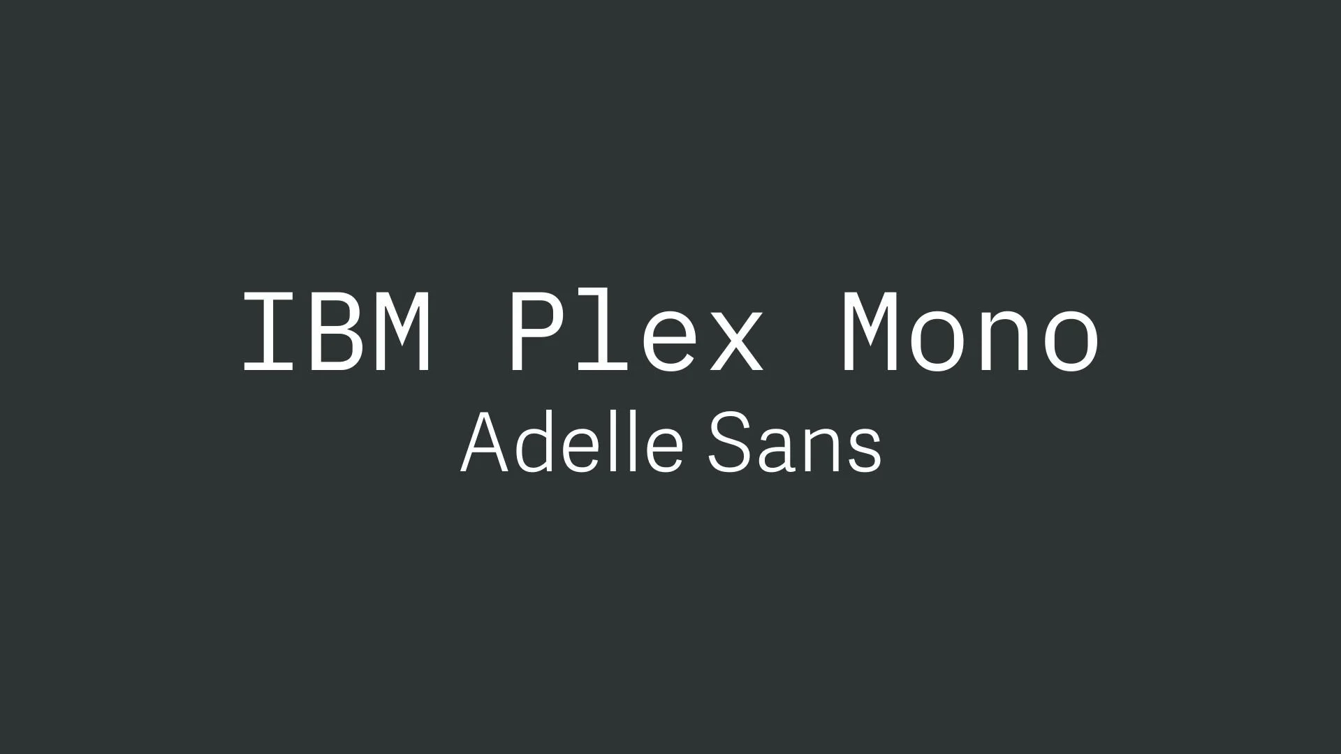
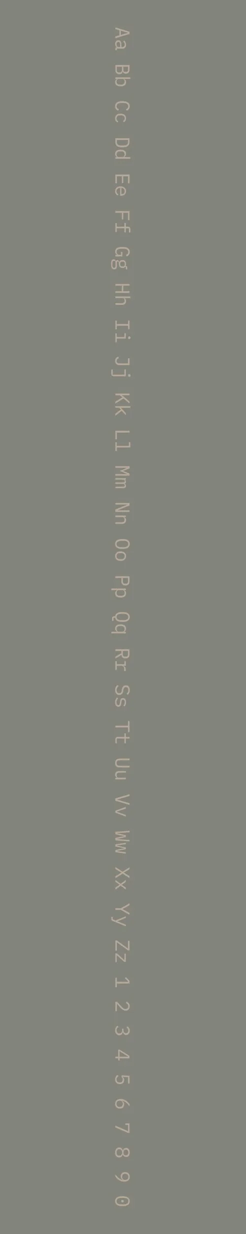
IBM Plex Mono
Overview:
IBM Plex Mono is a modern monospaced typeface designed for versatility and clarity, particularly in code and technical environments. It is part of the IBM Plex family, which includes a wide range of typefaces suited for various applications, from digital interfaces to print media. Its clean, geometric design makes it ideal for use in programming, user interfaces, and editorial layouts that require a consistent, readable font.
History:
IBM Plex Mono was created by the global design team at IBM as part of the broader IBM Plex type family, which was designed to reflect IBM’s brand values of innovation and design-forward thinking. Released in 2017, IBM Plex Mono was developed to provide a more humanistic approach to monospaced typefaces, offering a balance between functionality and aesthetics. It was created in response to the need for a modern, open-source typeface that could be used in technical applications such as programming and data visualization, while still maintaining a friendly and approachable design.
Characteristics:
Design: IBM Plex Mono has a clean, geometric structure with slightly rounded corners, giving it a friendly and approachable look while maintaining the precision needed for monospaced typefaces. Its consistent stroke weight and open apertures contribute to excellent readability, especially at smaller sizes. The typeface has a technical feel but avoids being overly sterile, offering a warm and human touch compared to many other monospaced fonts.
Usage: Primarily used in coding, programming, and technical writing, IBM Plex Mono is perfect for any application that requires a monospaced font, such as terminal windows, software interfaces, and data tables. It is also well-suited for design work that requires uniformity and alignment, such as tabular information or code documentation. Additionally, it can be used in editorial layouts, particularly in publications that focus on technology or programming.
Attributes: Legible, modern, and adaptable, IBM Plex Mono stands out for its approachability compared to other more rigid monospaced fonts. Its balance of precision and warmth makes it ideal for both technical environments and more creative, design-oriented uses. The font is open-source, which has contributed to its widespread use across a variety of platforms and projects.
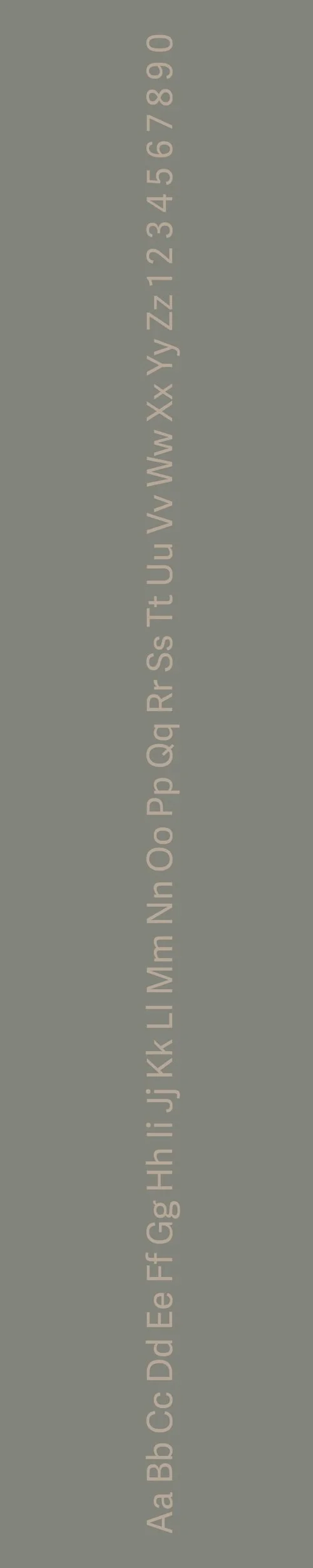
Adelle Sans
Overview:
Adelle Sans is a contemporary and highly versatile sans-serif typeface designed for clarity and readability. Known for its balanced proportions and modern, geometric structure, it’s a functional and elegant typeface that can be used across a wide variety of design projects, both digital and print.
History:
Adelle Sans was created by the renowned typographer, Veronika Burian, and the type foundry TypeTogether. It was released in 2011 as part of the Adelle family, which also includes the serif counterpart, Adelle. The design of Adelle Sans was driven by the need for a legible, modern sans-serif that could serve in both body text and headlines, making it a perfect fit for editorial use, web design, and branding. The font family was developed with versatility in mind, offering a comprehensive range of weights and styles to suit different typographic needs.
Characteristics:
Design: Adelle Sans features a clean and modern design with geometric influences, giving it a contemporary and functional appearance. The font has slightly rounded edges, making it approachable without losing its sharpness and clarity. It balances both humanist and geometric elements, which gives it a refined yet friendly look.
Usage: This typeface is highly versatile, excelling in editorial designs, corporate branding, web content, and user interfaces. Its legibility and neutral aesthetic make it ideal for body text, while its bold weights can also be used effectively for headings and logos.
Attributes: Adelle Sans is characterized by its clean lines, readability, and modern appeal. It’s versatile, with a wide range of weights and widths, making it adaptable to different contexts. Its simplicity and legibility make it well-suited for both print and digital applications.

FONT PERSONALITY
-
FONT PERSONALITY -


Why IBM Plex Mono and Adelle Sans are a Match Made in Heaven:
The pairing of IBM Plex Mono and Adelle Sans brings together two distinct yet complementary personalities that create a balance between precision and warmth. IBM Plex Mono, with its technical and structured nature, offers a grounded and reliable foundation, perfect for conveying clarity and functionality, especially in detailed or complex contexts. Meanwhile, Adelle Sans adds a layer of friendliness and approachability with its rounded, modern forms. This combination ensures that the overall design remains professional, yet approachable—modern and efficient, without sacrificing warmth and versatility.
This font pairing would appeal to a person who values both innovation and human connection in their personal brand. A professional in a field such as technology, design, or engineering, who seeks to balance the analytical with the personal, would be drawn to this combination. They would likely be someone who works in a space where clear communication and reliability are key, but who also wants to convey approachability and warmth—ideal for an individual who wants their brand to feel both modern and welcoming, such as a creative tech consultant or a user experience designer.

CELEBRITY MATCH
-
CELEBRITY MATCH -

The font pairing of IBM Plex Mono and Adelle Sans aligns perfectly with the character of Natalie Cook, as portrayed by Cameron Diaz in the movie "Charlie's Angels".
Summary: Cameron Diaz’s portrayal of Natalie Cook in Charlie's Angels embodies the characteristics of IBM Plex Mono and Adelle Sans perfectly. Natalie is precise, modern, and adaptable, yet warm and approachable, much like the balanced, functional, and professional qualities of this font pairing. The combination of precision, modernity, and warmth in both the fonts and the character highlights how dynamic and approachable professionalism can be, making them a perfect match.

HIERARCHY
-
HIERARCHY -
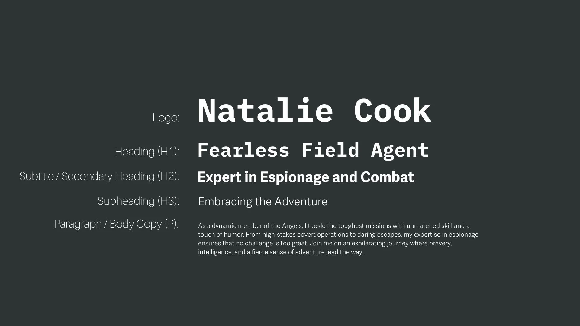
Font Hierarchy for IBM Plex Mono and Adelle Sans:
Logo
Usage: Primary logo text, initials, brand name
IBM Plex Mono, Bold, 96 pt (Canva), 70 px (Squarespace)
Heading (H1)
Usage: Main headings on pages, prominent titles
IBM Plex Mono, Bold, 48 pt (Canva), 48 px (Squarespace)
Subtitle / Secondary Heading (H2)
Usage: Section titles, important subtitles
Adelle Sans, Bold, 36 pt (Canva), 36 px (Squarespace)
Subheading (H3)
Usage: Subsection headings, less prominent titles
Adelle Sans, Regular, 28 pt (Canva), 28 px (Squarespace)
Paragraph / Body Copy (P)
Usage: Main body text, paragraphs, descriptions
Adelle Sans, Regular, 16 pt (Canva), 16 px (Squarespace)