MEET YOUR FONT PAIRING MATCH
This page is your custom breakdown of the font pairing you were matched with from the Find Your Font Quiz. You’ll discover the history, personality, and style of each font—and see how they can come to life in your personal brand.
If you're a Personal Branding Studio member:
Bookmark this page. We’ll return to it in Part 2 when it’s time to use your font pairing to design your logo and create branded Canva graphics.
Not loving this particular combo? No problem. Explore all 100+ font pairings inside PBS - Part 1, Module 4: Design - to find one that feels just right. Click the button below to go there now.
Not yet a Personal Branding Studio member?
(And wondering what Personal Branding Studio even is?)
Start by scrolling through your results below. At the bottom of this page, you’ll find out how to go deeper with your personal brand through my full Personal Branding Studio program.
And your aligned font pairing match is…


HISTORY
-
HISTORY -
Young Serif
Overview:
Young Serif is a contemporary serif typeface with a modern, yet classic feel. Designed for readability and elegance, it combines traditional serif elements with a fresh, youthful twist, making it suitable for a variety of design contexts, from editorial to branding.
History:
Young Serif was created by the design studio, TypeUnion, a foundry known for producing modern typefaces that balance functionality with creativity. Released in 2014, the font was designed by Luca D’Amico. The motivation behind Young Serif was to create a serif typeface that felt fresh and approachable, while still maintaining a sense of tradition. The goal was to design a typeface that would work well in both print and digital spaces, offering high readability while appealing to contemporary sensibilities.
Characteristics:
Design: Young Serif is characterized by its clean and open letterforms, with moderate contrast between thick and thin strokes. The serifs are sharp yet subtly tapered, giving it a modern appearance without losing the warmth and sophistication of traditional serif designs. The design features slightly rounded corners, which provide a more friendly and youthful appearance.
Usage: Young Serif is highly versatile, making it perfect for both display and body text. It’s commonly used in editorial design, websites, and branding materials. Its clarity makes it ideal for reading in long passages, while its refined aesthetic suits headings, logos, and advertisements.
Attributes: Elegant, legible, and modern with a classical influence. The typeface is highly adaptable, offering excellent legibility for both small and large text sizes, and is designed for use in a wide range of print and digital environments.

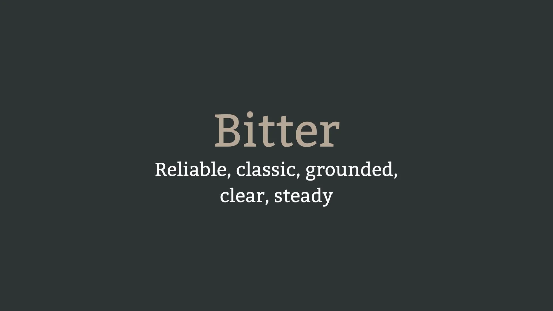
Bitter
Overview:
Bitter is a contemporary serif typeface designed for clarity and readability, particularly in digital environments. With its strong, clean lines and classic yet modern appeal, it is well-suited for long-form text as well as headlines, offering a balanced design that performs well both on screen and in print.
History:
Bitter was designed by Sol Matas, an Argentine type designer, and was released in 2010 through the Google Fonts library. Matas designed Bitter with a focus on improving readability for long texts, particularly for digital devices. The typeface was developed as part of an effort to offer a well-designed serif font that could provide a comfortable reading experience on screens, where many traditional serif fonts struggle with clarity. Bitter became part of the open-source font movement and was intended for use in both web and print applications.
Characteristics:
Design: Bitter features sturdy, well-defined serifs, with a large x-height and open apertures that make it highly legible. Its letterforms have a slightly condensed structure, which helps conserve space while maintaining a classical and formal appearance. The serifs are sharp and the overall design maintains a modern yet timeless feel.
Usage: Ideal for use in body text, long-form articles, blogs, and books. Its high legibility makes it especially effective in digital media, such as on websites or e-books, but it also works well in print, especially in editorial and publishing contexts.
Attributes: Bitter is clean, legible, and versatile. Its serif design provides a sense of stability and tradition, while its modern proportions ensure it remains highly readable, particularly in digital formats. It's a practical, user-friendly font that bridges the gap between modern digital design and classic typographic tradition.


FONT PERSONALITY
-
FONT PERSONALITY -

Why Young Serif and Bitter are a Match Made in Heaven:
When combined, Young Serif and Bitter create a harmonious pairing that blends trendsetting elegance with timeless stability. Young Serif’s energetic and playful nature brings a contemporary, fashion-forward vibe that makes it perfect for capturing attention in headlines and logos. Its sophisticated yet dynamic flair ensures that it stands out with confidence. Bitter, on the other hand, grounds this pairing with its classic, reliable personality. Its clear and steady design offers a sense of stability, providing a balanced contrast to Young Serif’s lively presence. Together, these fonts create a versatile, striking design that feels both fresh and enduring.
This font pairing would be perfect for someone who is a forward-thinking individual with an appreciation for both modern trends and traditional values. The person using this combination would likely be a creative professional who enjoys making bold statements but values consistency and reliability. They might be a modern entrepreneur or creative director—someone who operates in the fashion, design, or lifestyle industry, exuding confidence and sophistication while remaining grounded and dependable in their approach to business and branding.

CELEBRITY MATCH
-
CELEBRITY MATCH -

The font pairing of Young Serif and Bitter aligns perfectly with the character of Mikaela Banes, as portrayed by Megan Fox in the movie "Transformers (2007)".
Summary: The font pairing of Young Serif and Bitter mirrors the dynamic blend of traits embodied by Megan Fox’s portrayal of Mikaela Banes in Transformers. Young Serif’s modern, stylish edge complements Mikaela’s trendsetting, confident persona, making her unforgettable in her scenes. Bitter, with its dependable and steady presence, represents Mikaela’s grounded nature and reliability, ensuring that she remains a strong pillar throughout the film. Together, these fonts create a harmonious balance of youthful energy and timeless reliability, much like Mikaela, who effortlessly combines the best of both worlds—fashion-forward yet grounded, confident yet steady. This combination is perfect for projects that require a balance of flair and dependability.

HIERARCHY
-
HIERARCHY -

Font Hierarchy for Young Serif and Bitter:
Logo
Usage: Primary logo text, initials, brand name
Young Serif, Regular, 48-60 px (Canva), 36-48 px (Squarespace)
Heading (H1)
Usage: Main headings on pages, prominent titles
Young Serif, Regular, 36-48 px (Canva), 28-36 px (Squarespace)
Subtitle / Secondary Heading (H2)
Usage: Section titles, important subtitles
Young Serif, Regular, 24-36 px (Canva), 20-28 px (Squarespace)
Subheading (H3)
Usage: Subsection headings, less prominent titles
Bitter, Regular, 18-24 px (Canva), 16-20 px (Squarespace)
Paragraph / Body Copy (P)
Usage: Main body text, paragraphs, descriptions
Bitter, Regular, 14-18 px (Canva), 12-16 px (Squarespace)