MEET YOUR FONT PAIRING MATCH
This page is your custom breakdown of the font pairing you were matched with from the Find Your Font Quiz. You’ll discover the history, personality, and style of each font—and see how they can come to life in your personal brand.
If you're a Personal Branding Studio member:
Bookmark this page. We’ll return to it in Part 2 when it’s time to use your font pairing to design your logo and create branded Canva graphics.
Not loving this particular combo? No problem. Explore all 100+ font pairings inside PBS - Part 1, Module 4: Design - to find one that feels just right. Click the button below to go there now.
Not yet a Personal Branding Studio member?
(And wondering what Personal Branding Studio even is?)
Start by scrolling through your results below. At the bottom of this page, you’ll find out how to go deeper with your personal brand through my full Personal Branding Studio program.
And your aligned font pairing match is…


HISTORY
-
HISTORY -
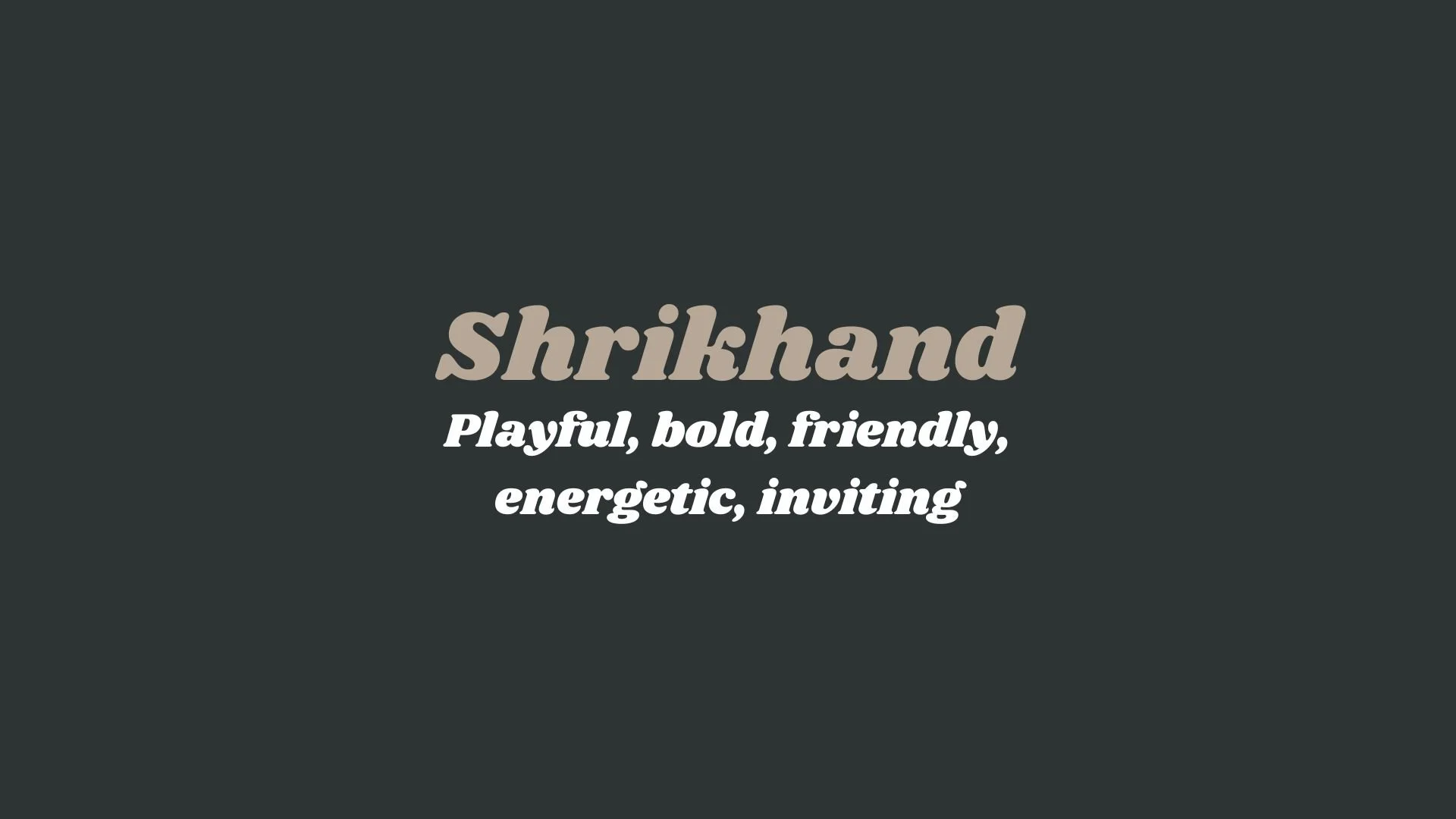
Shrikhand
Overview:
Shrikhand is a distinctive, bold typeface with a lively and playful design that draws inspiration from traditional Indian calligraphy. Its thick strokes and unique letterforms give it a strong personality, making it ideal for projects that require attention-grabbing, cultural flair.
History:
Shrikhand was designed by Indian type designer, Jonas D. Schudel, and was released by Google Fonts in 2015. The font was created as part of an effort to bring more Indian regional scripts into digital typography. Inspired by the Shrikhand style of lettering, a popular form of calligraphy seen in Gujarat, India, the font was designed to capture the essence of the regional writing while adapting it for modern use. Schudel's goal was to create a typeface that could be used in a variety of contemporary applications while retaining the distinctiveness of traditional Indian lettering.
Characteristics:
Design: Shrikhand features thick, rounded strokes with heavy, exaggerated curves that give it a warm and friendly appearance. Its playful, informal style is inspired by the fluidity of hand-lettering, with open apertures and a rounded structure that enhance readability while making a bold statement.
Usage: Shrikhand works best in larger sizes, making it ideal for use in headlines, posters, logos, and branding that require a fun and expressive font. Its strong, vibrant design makes it well-suited for cultural, celebratory, or festive contexts.
Attributes: The font is bold, energetic, and distinctive with a unique cultural touch. Its playful and approachable nature gives it high visibility, and it’s particularly useful in settings where a more whimsical, expressive type is needed. It’s best used sparingly to ensure its impact is not lost in a design.

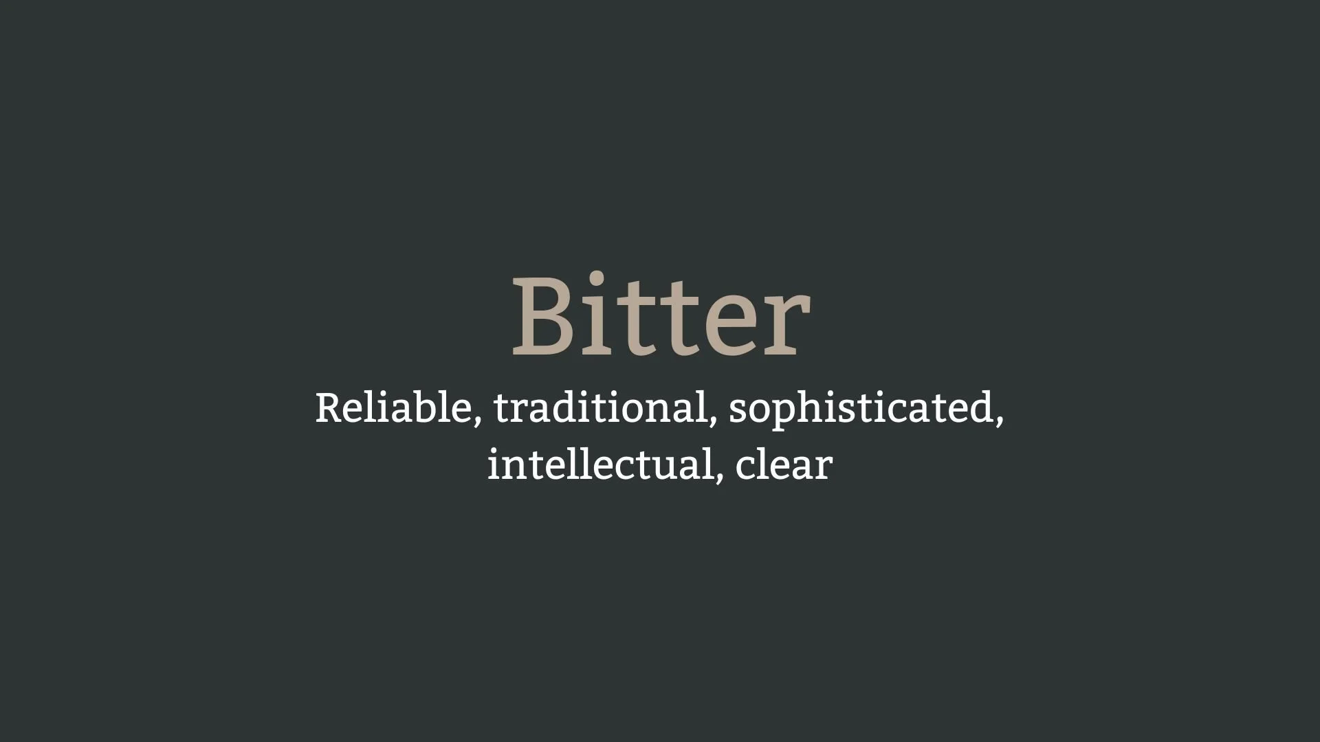
Bitter
Overview:
Bitter is a contemporary serif typeface designed for clarity and readability, particularly in digital environments. With its strong, clean lines and classic yet modern appeal, it is well-suited for long-form text as well as headlines, offering a balanced design that performs well both on screen and in print.
History:
Bitter was designed by Sol Matas, an Argentine type designer, and was released in 2010 through the Google Fonts library. Matas designed Bitter with a focus on improving readability for long texts, particularly for digital devices. The typeface was developed as part of an effort to offer a well-designed serif font that could provide a comfortable reading experience on screens, where many traditional serif fonts struggle with clarity. Bitter became part of the open-source font movement and was intended for use in both web and print applications.
Characteristics:
Design: Bitter features sturdy, well-defined serifs, with a large x-height and open apertures that make it highly legible. Its letterforms have a slightly condensed structure, which helps conserve space while maintaining a classical and formal appearance. The serifs are sharp and the overall design maintains a modern yet timeless feel.
Usage: Ideal for use in body text, long-form articles, blogs, and books. Its high legibility makes it especially effective in digital media, such as on websites or e-books, but it also works well in print, especially in editorial and publishing contexts.
Attributes: Bitter is clean, legible, and versatile. Its serif design provides a sense of stability and tradition, while its modern proportions ensure it remains highly readable, particularly in digital formats. It's a practical, user-friendly font that bridges the gap between modern digital design and classic typographic tradition.


FONT PERSONALITY
-
FONT PERSONALITY -
Why Shrikhand and Bitter are a Match Made in Heaven:
Shrikhand and Bitter create an ideal balance between energy and sophistication, blending playfulness with reliability. Shrikhand’s bold, energetic, and inviting personality shines in attention-grabbing headlines or logos, bringing a sense of fun and warmth to the design. Its playful curves and bold forms make it approachable and lively. On the other hand, Bitter grounds the pairing with its traditional, intellectual qualities, ensuring that the overall message is clear, reliable, and sophisticated. The clean, serif forms of Bitter complement the more casual, sans-serif style of Shrikhand, creating a harmonious contrast that feels both welcoming and established.
This font pairing would be perfect for someone whose personal brand embodies both creativity and professionalism. The individual would likely be someone who works in a field that blends tradition with innovation, such as a creative professional or consultant who combines fun, approachable energy with a foundation of expertise and reliability. They might be someone in the education, publishing, or creative industries who wants to project a sense of clarity and intellectual depth, while also remaining accessible and approachable.

CELEBRITY MATCH
-
CELEBRITY MATCH -

The font pairing of Shrikhand and Bitter aligns perfectly with the character of Ling Woo, as portrayed by Lucy Liu in the movie "Ally McBeal".
Summary: The pairing of Shrikhand and Bitter embodies the dynamic nature of Ling Woo, portrayed by Lucy Liu. Shrikhand reflects Ling’s playful, bold, and charismatic side, while Bitter represents her intellectual, reliable, and sophisticated qualities. Just as Shrikhand and Bitter create a harmonious balance of energy and clarity, Lucy Liu’s portrayal of Ling Woo combines boldness with intellect, creating a memorable and engaging character in Ally McBeal.

HIERARCHY
-
HIERARCHY -

Font Hierarchy for Shrikhand and Bitter:
Logo
Usage: Primary logo text, initials, brand name
Shrikhand, Regular, 60–80 px (Canva), 48–60 pt (Squarespace)
Heading (H1)
Usage: Main headings on pages, prominent titles
Shrikhand, Regular, 48–60 px (Canva), 36–48 pt (Squarespace)
Subtitle / Secondary Heading (H2)
Usage: Section titles, important subtitles
Bitter, Bold, 36–48 px (Canva), 24–36 pt (Squarespace)
Subheading (H3)
Usage: Subsection headings, less prominent titles
Bitter, Regular, 24–36 px (Canva), 18–24 pt (Squarespace)
Paragraph / Body Copy (P)
Usage: Main body text, paragraphs, descriptions
Bitter, Regular, 16–20 px (Canva), 14–18 pt (Squarespace)