MEET YOUR FONT PAIRING MATCH
This page is your custom breakdown of the font pairing you were matched with from the Find Your Font Quiz. You’ll discover the history, personality, and style of each font—and see how they can come to life in your personal brand.
If you're a Personal Branding Studio member:
Bookmark this page. We’ll return to it in Part 2 when it’s time to use your font pairing to design your logo and create branded Canva graphics.
Not loving this particular combo? No problem. Explore all 100+ font pairings inside PBS - Part 1, Module 4: Design - to find one that feels just right. Click the button below to go there now.
Not yet a Personal Branding Studio member?
(And wondering what Personal Branding Studio even is?)
Start by scrolling through your results below. At the bottom of this page, you’ll find out how to go deeper with your personal brand through my full Personal Branding Studio program.
And your aligned font pairing match is…


HISTORY
-
HISTORY -
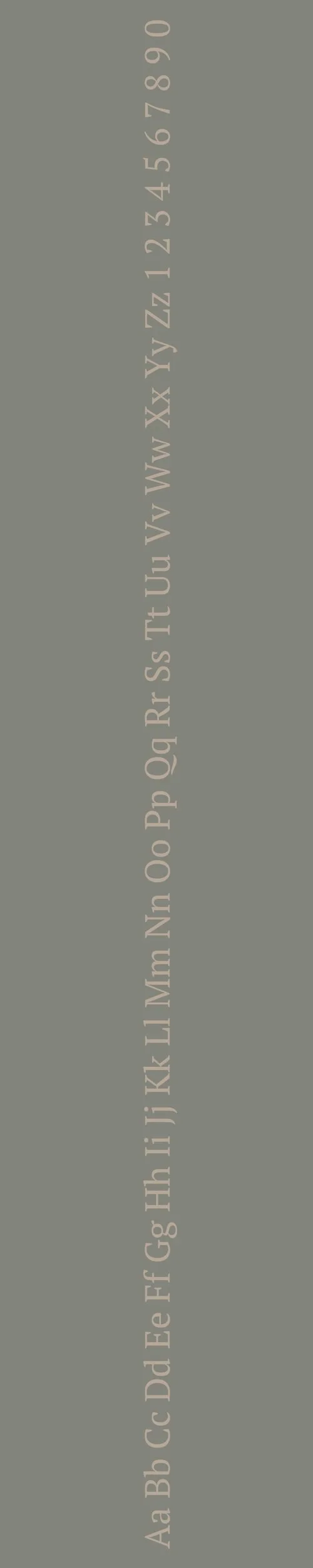
Neuton
Overview:
Neuton is a contemporary serif typeface known for its clean, legible design and versatility. It features a balanced and refined style, making it well-suited for both body text and display purposes. With its clear structure and elegant proportions, Neuton brings a modern sensibility to traditional serif forms.
History:
Neuton was created by Matthew Butterick and released in 2010 as an open-source typeface. The design of Neuton was inspired by the need for a functional, readable serif font with a traditional feel that could be used in a variety of media. Butterick sought to create a typeface that would work well for both print and digital use, especially in contexts where readability was crucial, like in books, newspapers, and websites.
Characteristics:
Design: Neuton features classic serif shapes with a slightly condensed structure. It has clear, open letterforms and moderate contrast between thick and thin strokes, providing excellent readability in small sizes while maintaining a refined look. The serifs are subtle but defined, offering a more contemporary approach to the traditional serif style.
Usage: Neuton is perfect for long-form text, such as books and articles, as well as display uses like headlines and posters. Its readability and classic look make it a great choice for editorial design, websites, and any project that requires a sophisticated serif typeface.
Attributes: Elegant, readable, and versatile. Neuton maintains a classic feel with modern refinement, making it suitable for a wide range of uses. It is particularly effective in print and digital applications that require a clean, sophisticated typeface with excellent legibility.

PT Serif
Overview:
PT Serif is a transitional serif typeface designed for clarity and versatility. It combines traditional serif characteristics with modern proportions, making it an excellent choice for both digital and print media, particularly in long-form text and editorial layouts.
History:
PT Serif was created by Alexandra Korolkova, Olga Umpeleva, and Vladimir Yefimov as part of the "PT" (Public Types) project initiated by the Russian government in 2009. The aim was to develop a comprehensive type system that could support the diverse typographic needs of the Russian-speaking population while also being accessible to global audiences. The project sought to revive and enhance the cultural heritage of typography in Russia, promoting readability and elegance in text.
Characteristics:
Design: PT Serif features classic serif forms with a modern touch, characterized by moderate contrast between thick and thin strokes. The serifs are sharp yet not overly aggressive, providing a harmonious balance that enhances readability.
Usage: PT Serif excels in both body text and display settings. Its legibility makes it suitable for books, newspapers, and online content, while its refined appearance allows it to shine in branding and editorial design.
Attributes: Highly legible and versatile, PT Serif conveys a sense of reliability and professionalism. Its blend of traditional and contemporary elements allows it to adapt seamlessly across various design contexts, making it a popular choice for designers seeking a trustworthy serif typeface.

FONT PERSONALITY
-
FONT PERSONALITY -


Why Neuton and PT Serif are a Match Made in Heaven:
The combination of Neuton and PT Serif creates a beautiful balance between contemporary elegance and timeless reliability. Neuton’s sleek, sophisticated, and versatile design brings a modern touch, making it ideal for refined branding or headlines that require both style and flexibility. PT Serif, with its robust and dependable nature, complements Neuton by offering a grounded, classic feel that enhances readability. The pairing achieves a harmonious blend of forward-thinking elegance with a solid, comfortable foundation, making it perfect for conveying professionalism while retaining warmth and approachability.
This font pairing would be ideal for someone who values both modern sophistication and enduring reliability in their personal brand. The individual who would gravitate toward Neuton and PT Serif is likely someone who is poised, professional, and elegant but also grounded and dependable. They may work in fields like consulting, finance, or luxury goods, where clarity, professionalism, and timeless appeal are key to their brand identity. This person is someone who blends innovation with tradition, creating a lasting impression that is both stylish and trustworthy.

CELEBRITY MATCH
-
CELEBRITY MATCH -

The font pairing of Neuton and PT Serif aligns perfectly with the character of Jenny Curran, as portrayed by Robin Wright in the movie "Forrest Gump (1994)".
Summary: The font pairing of Neuton and PT Serif reflects the duality of Robin Wright’s portrayal of Jenny Curran in Forrest Gump. Neuton, with its sleek, modern, and professional character, mirrors Jenny's independent, sophisticated moments, while PT Serif, with its timeless and dependable nature, parallels her grounding, unassuming qualities, especially in her relationship with Forrest. Together, these fonts encapsulate Jenny’s evolution as a character—someone who navigates a complex, often turbulent life, yet remains fundamentally reliable and graceful, just like the complementary dynamics of this font pairing.

HIERARCHY
-
HIERARCHY -

Font Hierarchy for Neuton and PT Serif:
Logo
Usage: Primary logo text, initials, brand name
Neuton, Bold, 48-60 pt (Canva), 40-50 px (Squarespace)
Heading (H1)
Usage: Main headings on pages, prominent titles
Neuton, Bold, 36-48 pt (Canva), 30-40 px (Squarespace)
Subtitle / Secondary Heading (H2)
Usage: Section titles, important subtitles
Neuton, Regular, 24-30 pt (Canva), 20-24 px (Squarespace)
Subheading (H3)
Usage: Subsection headings, less prominent titles
PT Serif, Regular, 18-24 pt (Canva), 16-20 px (Squarespace)
Paragraph / Body Copy (P)
Usage: Main body text, paragraphs, descriptions
PT Serif, Regular, 12-16 pt (Canva), 14-18 px (Squarespace)