MEET YOUR FONT PAIRING MATCH
This page is your custom breakdown of the font pairing you were matched with from the Find Your Font Quiz. You’ll discover the history, personality, and style of each font—and see how they can come to life in your personal brand.
If you're a Personal Branding Studio member:
Bookmark this page. We’ll return to it in Part 2 when it’s time to use your font pairing to design your logo and create branded Canva graphics.
Not loving this particular combo? No problem. Explore all 100+ font pairings inside PBS - Part 1, Module 4: Design - to find one that feels just right. Click the button below to go there now.
Not yet a Personal Branding Studio member?
(And wondering what Personal Branding Studio even is?)
Start by scrolling through your results below. At the bottom of this page, you’ll find out how to go deeper with your personal brand through my full Personal Branding Studio program.
And your aligned font pairing match is…


HISTORY
-
HISTORY -
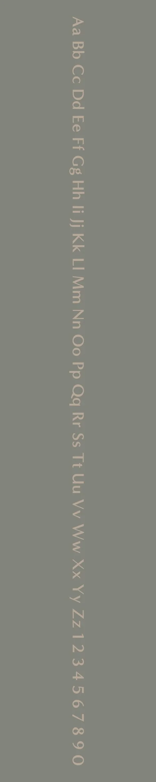
Minerva Modern
Overview:
Minerva Modern is a contemporary serif typeface designed to offer a perfect balance of elegance and readability. Its geometric shapes combined with classical proportions give it a refined, timeless quality, making it a versatile choice for both digital and print media.
History:
Minerva Modern was created by Italian type designer Cosimo Lorenzo Pancini and was released in 2015 by the type foundry Fontsmith. The design was inspired by the historical Minerva font, but with a modern twist, aiming to bring a contemporary touch to the classic, traditional serif style. The goal was to develop a typeface that maintained legibility at various sizes and in a variety of media while offering a sophisticated, high-end feel that could be used in a wide range of design contexts.
Characteristics:
Design: Minerva Modern blends modern and classic elements, featuring sharp serifs, slightly condensed letterforms, and refined curves. It has a clean, geometric structure with a touch of warmth, providing both elegance and legibility.
Usage: This typeface is highly versatile, making it suitable for editorial design, branding, luxury websites, and high-end print materials. It shines in both body text and headlines, and works especially well in large sizes where its sharp details can be fully appreciated.
Attributes: Elegant, sophisticated, and highly legible with a contemporary look that retains some classical influence. Minerva Modern combines the traditional qualities of serif fonts with the clarity of modern typography, making it ideal for premium and luxury branding.
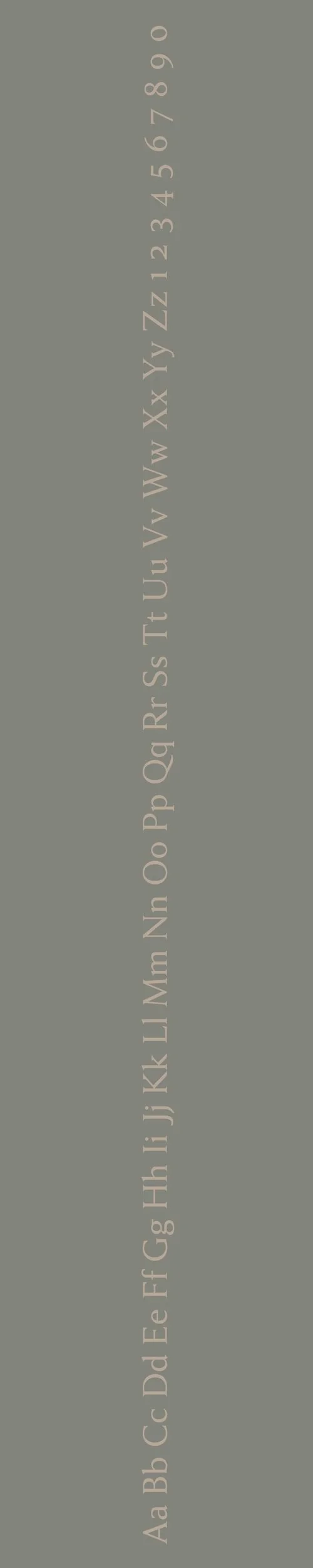
Anziano
Overview:
Anziano is a distinctive serif typeface that exudes a sense of warmth and elegance, with vintage-inspired design elements. It combines classical influences with modern readability, making it a refined choice for design projects that seek a timeless yet contemporary aesthetic.
History:
Anziano was designed by Giuseppe Salerno and released by the type foundry TypeTogether in 2012. The goal behind Anziano was to create a serif typeface with a strong personality, drawing inspiration from early 20th-century lettering while ensuring high legibility and versatility for modern design use. It was developed to provide a typeface with a sophisticated and slightly antique flavor, suitable for both print and digital media.
Characteristics:
Design: Anziano features soft, rounded serifs, making it feel approachable and warm. Its letterforms are slightly condensed, giving it a compact and balanced look. The curves of the characters are elegant and the contrast in stroke weights adds to the font's refined and timeless feel.
Usage: Ideal for editorial design, branding, and luxury projects, Anziano shines in both headlines and body text. Its unique character set and vintage appeal make it an excellent choice for invitations, high-end advertisements, and any project that calls for a sophisticated yet friendly serif typeface.
Attributes: Elegant, timeless, and versatile with a slight vintage flair. Anziano combines readability with personality, making it well-suited for projects that require a touch of classic sophistication without sacrificing modern legibility.

FONT PERSONALITY
-
FONT PERSONALITY -
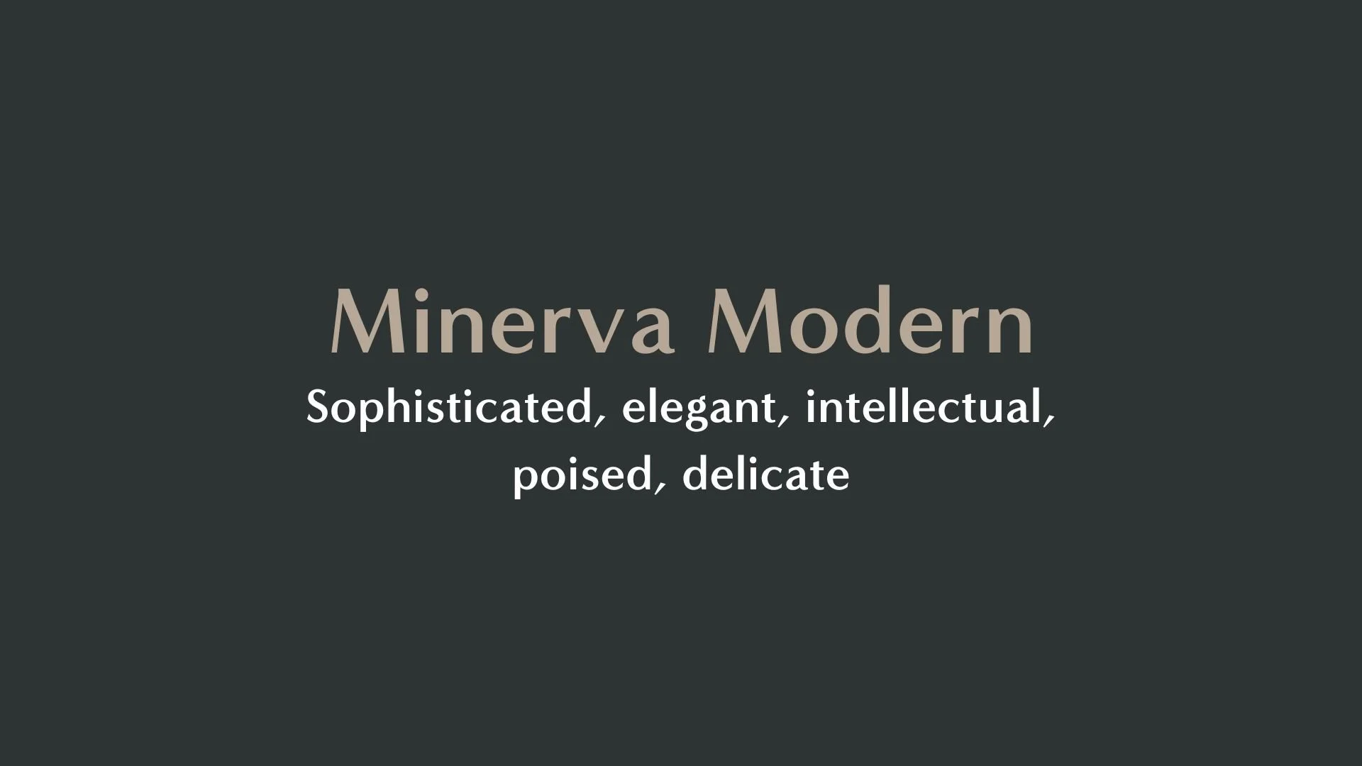

Why Minerva Modern and Anziano are a Match Made in Heaven:
When paired together, Minerva Modern and Anziano create a harmonious balance between sophistication and approachability. Minerva Modern exudes elegance, refinement, and intellectual poise, making it ideal for attention-grabbing headers and logos that require a sense of timeless beauty and cultural awareness. On the other hand, Anziano's grounded, reliable, and friendly nature offers a stable, welcoming foundation. The sturdy serifs and mentor-like qualities of Anziano balance Minerva Modern’s sharp contrasts with a sense of reliability, ensuring the overall design feels both distinguished and accessible.
This pairing would appeal to a person who is sophisticated yet approachable—someone who values both intellectual depth and personal connection. They would be someone with a refined sense of style, such as a cultural curator, educator, or consultant, who wants their personal brand to reflect a blend of timeless authority and genuine warmth. This individual likely thrives in environments where tradition and modernity meet, offering guidance and insight with a poised yet friendly demeanor.

CELEBRITY MATCH
-
CELEBRITY MATCH -
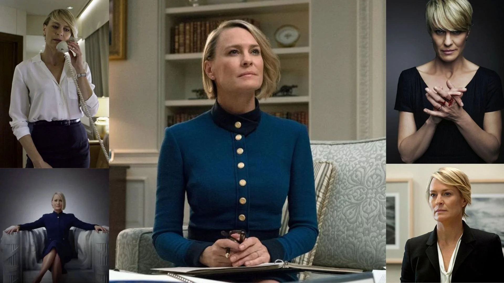
The font pairing of Minerva Modern and Anziano aligns perfectly with the character of Claire Underwood, as portrayed by Robin Wright in the movie "House of Cards".
Summary: The combination of Minerva Modern and Anziano perfectly represents Claire Underwood , as played by Robin Wright in House of Cards. Minerva Modern captures Claire's elegance, intellectual sharpness, and poise, as she gracefully maneuvers through the political landscape with a calm, calculated demeanor. The sophisticated and intellectual nature of the font mirrors Claire’s precise decision-making and strong presence. Anziano embodies Claire’s grounded and mentor-like qualities, showing that underneath her tough exterior, she is reliable and approachable. She demonstrates a harmonious blend of traditional political wisdom and modern, strategic thinking, much like how Anziano balances classic and contemporary elements. Together, these fonts showcase Claire’s complex nature: a blend of power, sophistication, and the quiet strength that comes from experience and intelligence.

HIERARCHY
-
HIERARCHY -

Font Hierarchy for Minerva Modern and Anziano:
Logo
Usage: Primary logo text, initials, brand name
Minerva Modern, Regular, 60 pt (Canva), 36 px (Squarespace)
Heading (H1)
Usage: Main headings on pages, prominent titles
Minerva Modern, Bold, 36 pt (Canva), 24 px (Squarespace)
Subtitle / Secondary Heading (H2)
Usage: Section titles, important subtitles
Anziano, Regular, 24 pt (Canva), 18 px (Squarespace)
Subheading (H3)
Usage: Subsection headings, less prominent titles
Anziano, Regular, 18 pt (Canva), 16 px (Squarespace)
Paragraph / Body Copy (P)
Usage: Main body text, paragraphs, descriptions
Anziano, Regular, 16 pt (Canva), 14 px (Squarespace)