MEET YOUR FONT PAIRING MATCH
This page is your custom breakdown of the font pairing you were matched with from the Find Your Font Quiz. You’ll discover the history, personality, and style of each font—and see how they can come to life in your personal brand.
If you're a Personal Branding Studio member:
Bookmark this page. We’ll return to it in Part 2 when it’s time to use your font pairing to design your logo and create branded Canva graphics.
Not loving this particular combo? No problem. Explore all 100+ font pairings inside PBS - Part 1, Module 4: Design - to find one that feels just right. Click the button below to go there now.
Not yet a Personal Branding Studio member?
(And wondering what Personal Branding Studio even is?)
Start by scrolling through your results below. At the bottom of this page, you’ll find out how to go deeper with your personal brand through my full Personal Branding Studio program.
And your aligned font pairing match is…

HISTORY
-
HISTORY -
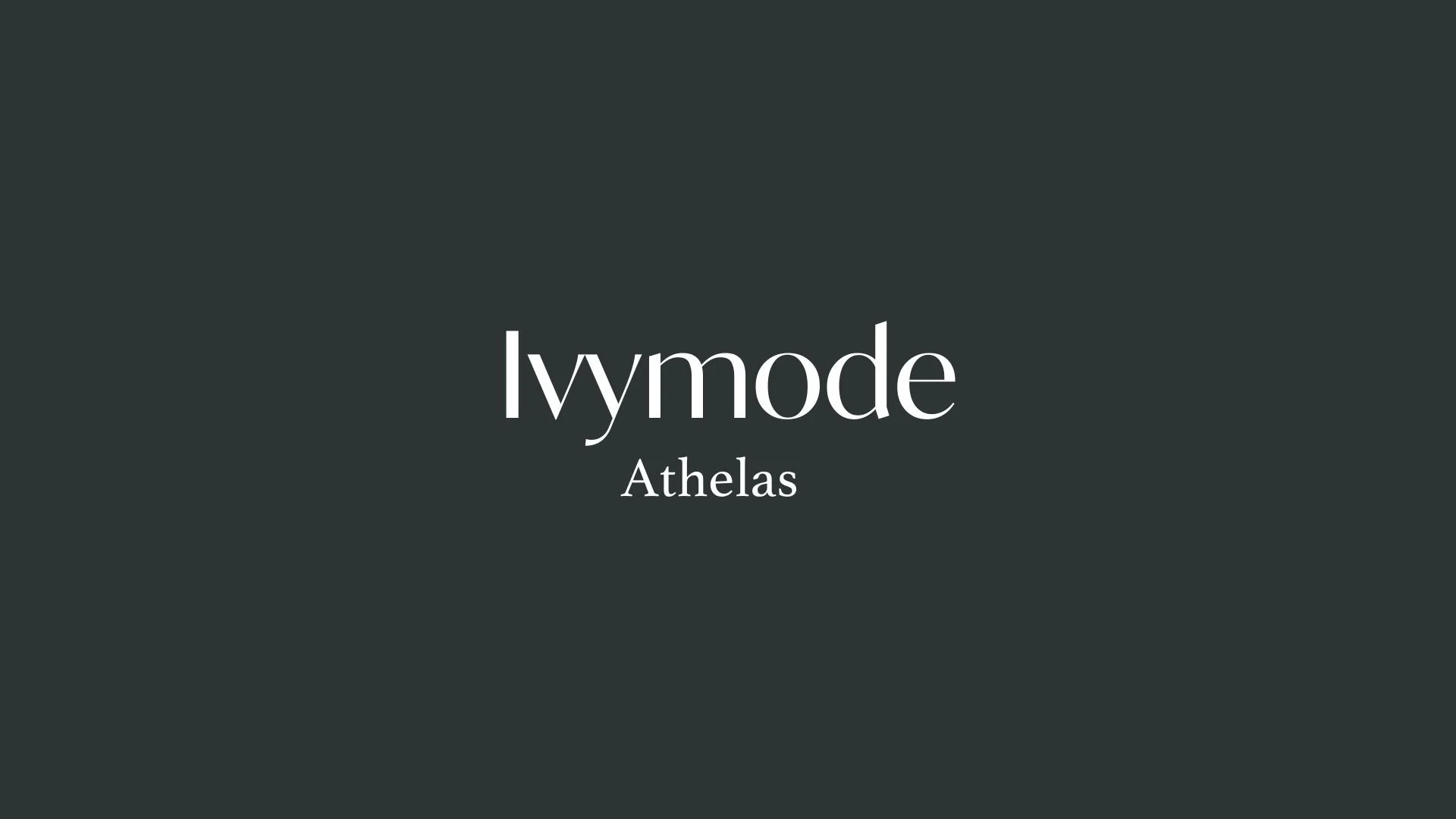
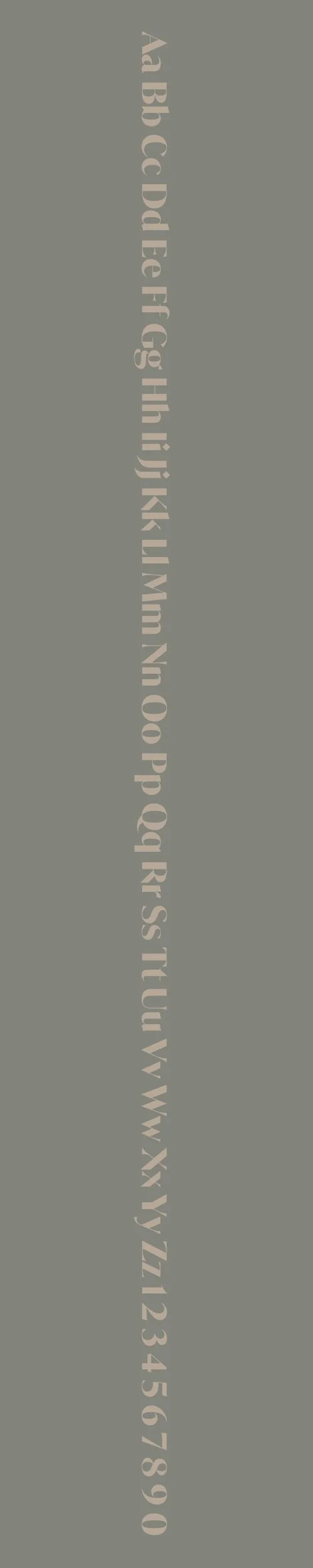
Ivymode
Overview:
Ivymode is a contemporary serif typeface designed with an elegant, high-contrast structure that combines classic letterforms with modern touches. Its refined curves and distinctive style make it ideal for sophisticated and luxury branding, while still maintaining readability.
History:
Ivymode was designed by Italian type designer Andrea Tartarelli and released through the digital type foundry Tartarelli Type in 2019. The typeface was conceived to create a refined yet functional serif option, blending traditional influences with a more modern and minimalist approach. Ivymode’s creation was inspired by a desire to offer a typeface that could exude elegance and timeless sophistication without compromising on clarity and versatility.
Characteristics:
Design: Ivymode features a high-contrast structure with slender serifs and wide apertures, giving it a clean, polished look. The curves are smooth and the proportions balanced, making it suitable for both text and display purposes. It includes both sharp and rounded elements, creating an elegant yet dynamic appearance.
Usage: Ideal for branding, editorial layouts, and luxury design. Its versatility extends from large headlines to smaller text, making it effective for both print and digital media. It works well for fashion, lifestyle brands, and high-end publications where readability and elegance are crucial.
Attributes: A sophisticated serif typeface with high contrast, a refined aesthetic, and a modern touch, offering elegance without sacrificing legibility.
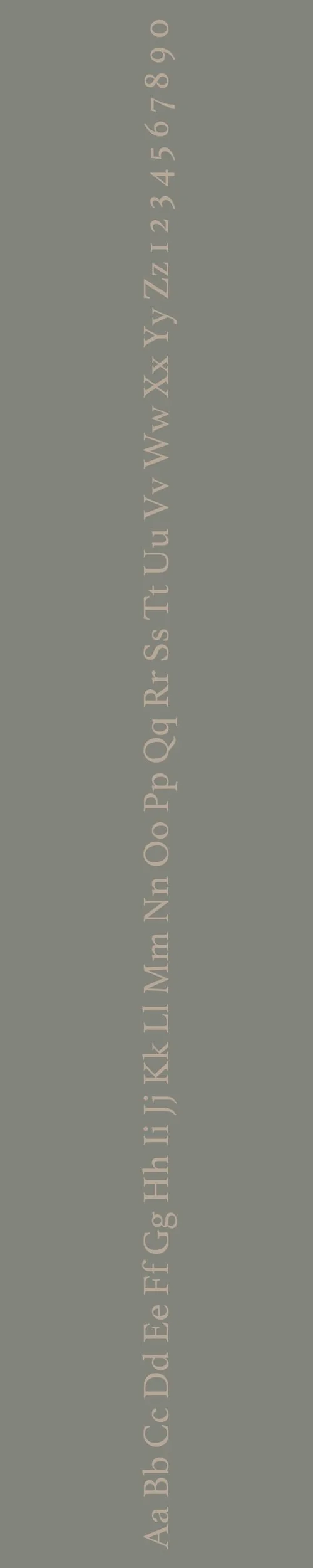
Athelas
Overview:
Athelas is a serif typeface known for its classic, elegant design and high readability. With roots in traditional typography, it combines the refined qualities of older serif fonts with contemporary proportions, making it suitable for both print and digital use, particularly in body text and long-form content.
History:
Athelas was designed by the British type designer Joel Makower in 2009. The typeface was commissioned by The Guardian, a leading British newspaper, to be used for its print and digital publications. Makower sought to create a typeface that could provide a sense of tradition and seriousness while still feeling fresh and modern. Athelas was designed with readability in mind, particularly for news articles and other editorial content, and it became the signature typeface of The Guardian's print editions.
Characteristics:
Design: Athelas features sharp, refined serifs and high contrast between thick and thin strokes. The letters have a slightly condensed structure with open counters, making it highly legible even at small sizes. The overall look is traditional yet modern, with subtle quirks that give it character.
Usage: Ideal for editorial content, newspapers, and books. Its readability at small sizes and elegant appearance make it a popular choice for long-form text and professional communications.
Attributes: Clean, sophisticated, and highly legible with a strong presence. Its serif details add a sense of authority and formality, while its modern proportions make it versatile for both digital and print applications.

FONT PERSONALITY
-
FONT PERSONALITY -


Why Ivymode and Athelas are a Match Made in Heaven:
When Ivymode and Athelas come together, they form a pairing that exudes both timeless sophistication and contemporary innovation. Ivymode’s elegance and adaptability bring a modern flair that complements Athelas’s traditional refinement. While Ivymode speaks to a sharp attention to detail and an articulate, forward-thinking sensibility, Athelas grounds the combination with its rich classical heritage and serene, cultured presence. The pairing creates a sense of balance, where modern sophistication meets old-world charm, offering a seamless blend of grace and innovation for any design.
This font pairing would appeal to a person who is both intellectually inclined and forward-thinking, someone who appreciates the beauty of tradition but is not afraid to adapt and innovate. This individual may be a creative professional, perhaps a writer or designer, with an eye for fine details and a deep respect for the classics. They would likely embrace a personal brand that speaks to a refined, yet dynamic personality—someone who values culture and elegance while staying relevant in a modern world.

CELEBRITY MATCH
-
CELEBRITY MATCH -

The font pairing of Ivymode and Athelas aligns perfectly with the character of Elizabeth Bennet, as portrayed by Keira Knightley in the movie "Pride & Prejudice (2005)".
Summary: Keira Knightley’s portrayal of Elizabeth Bennet in Pride & Prejudice perfectly embodies the characteristics of the Ivymode & Athelas font pairing. Elizabeth’s sophisticated, articulate nature aligns with Ivymode's modern elegance and clear communication. At the same time, her traditional values, cultured intellect, and serene grace reflect Athelas’ timeless refinement. This pairing encapsulates a blend of classic beauty with modern sensibilities, just as Elizabeth Bennet gracefully navigates the expectations of her time while embracing her own evolving sense of self. The Ivymode & Athelas pairing showcases a timeless, meticulous, and articulate individual, much like Elizabeth herself—graceful, refined, but ever-innovative.

HIERARCHY
-
HIERARCHY -

Font Hierarchy for Ivymode and Athelas:
Logo
Usage: Primary logo text, initials, brand name
Ivymode, Regular, 96 pt (Canva), 3 em (Squarespace)
Heading (H1)
Usage: Main headings on pages, prominent titles
Ivymode, Bold, 48 pt (Canva), 2.5 em (Squarespace)
Subtitle / Secondary Heading (H2)
Usage: Section titles, important subtitles
Ivymode, Regular, 36 pt (Canva), 2 em (Squarespace)
Subheading (H3)
Usage: Subsection headings, less prominent titles
Athelas, Italic, 30 pt (Canva), 1.75 em (Squarespace)
Paragraph / Body Copy (P)
Usage: Main body text, paragraphs, descriptions
Athelas, Regular, 18 pt (Canva), 1 em (Squarespace)