MEET YOUR FONT PAIRING MATCH
This page is your custom breakdown of the font pairing you were matched with from the Find Your Font Quiz. You’ll discover the history, personality, and style of each font—and see how they can come to life in your personal brand.
If you're a Personal Branding Studio member:
Bookmark this page. We’ll return to it in Part 2 when it’s time to use your font pairing to design your logo and create branded Canva graphics.
Not loving this particular combo? No problem. Explore all 100+ font pairings inside PBS - Part 1, Module 4: Design - to find one that feels just right. Click the button below to go there now.
Not yet a Personal Branding Studio member?
(And wondering what Personal Branding Studio even is?)
Start by scrolling through your results below. At the bottom of this page, you’ll find out how to go deeper with your personal brand through my full Personal Branding Studio program.
And your aligned font pairing match is…

HISTORY
-
HISTORY -
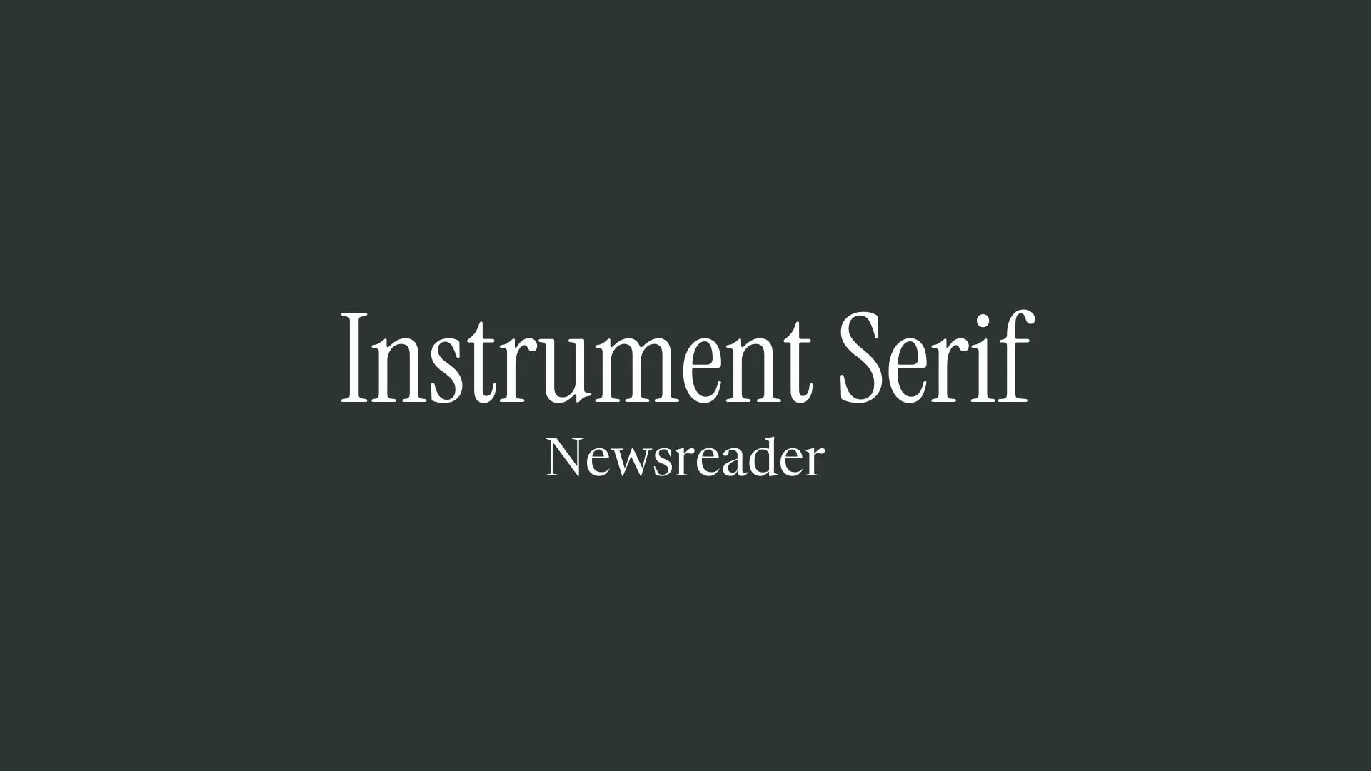
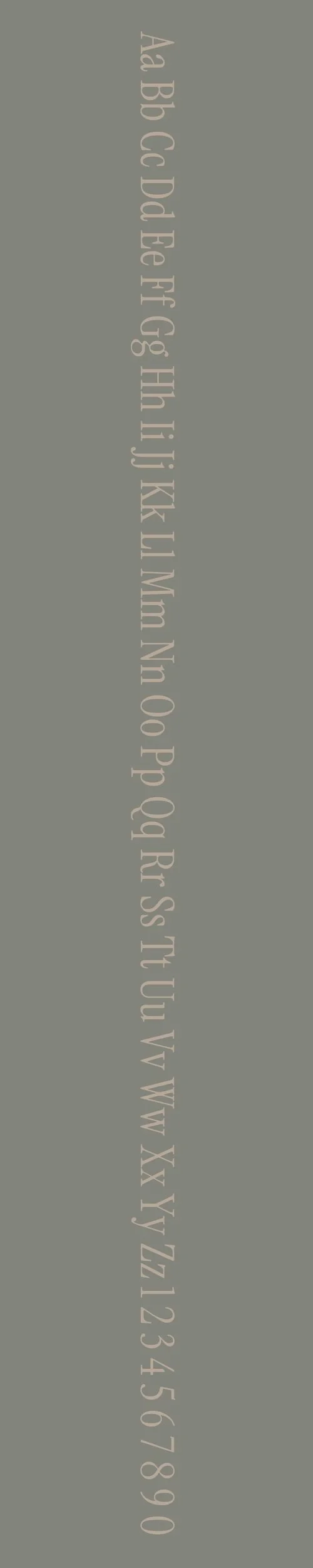
Instrument Serif
Overview:
Instrument Serif is a refined serif typeface that merges modernity with classical elegance. Known for its high legibility and versatility, it is suitable for a range of applications, from editorial design to branding and digital interfaces.
History:
Instrument Serif was designed by the type foundry Formist, led by Australian type designer David Jonathan Ross. Released in 2017, the typeface was developed as a part of the broader Instrument family, which aims to create typefaces that balance legibility with expressive design. Instrument Serif was specifically crafted to offer a more formal, text-based alternative to the family’s more geometric counterparts, making it well-suited for both print and screen use.
Characteristics:
Design: Instrument Serif combines clean, sharp lines with subtle curves, offering a sophisticated yet contemporary look. The serifs are relatively moderate in size, adding to its legibility, while the letterforms themselves have a geometric foundation that gives the typeface a modern appeal.
Usage: Instrument Serif is ideal for both body text and display use. It works beautifully in editorial layouts, branding, websites, and even in large-scale signage, where readability and a touch of elegance are required.
Attributes: Legible, versatile, and modern with a balanced structure. The font has a subtle, refined personality, making it a perfect choice for professional settings while maintaining an approachable aesthetic.
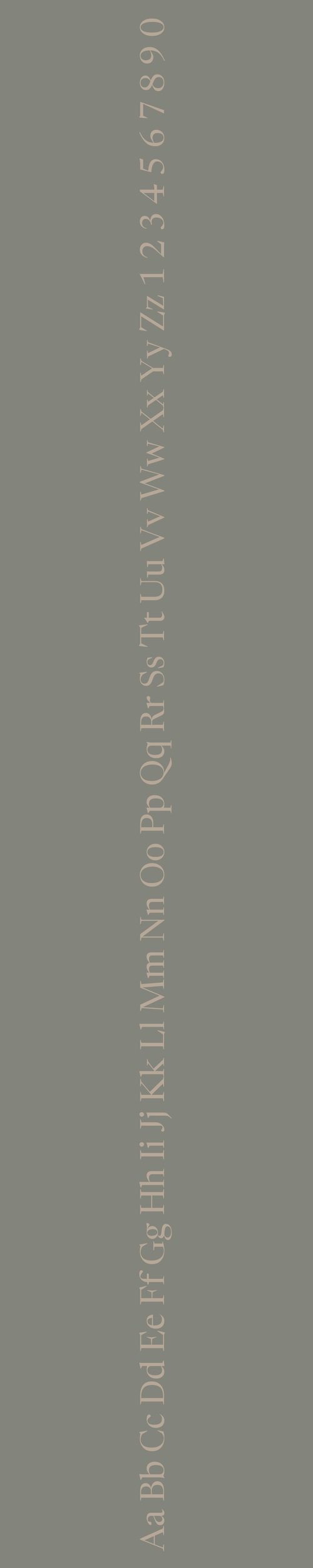
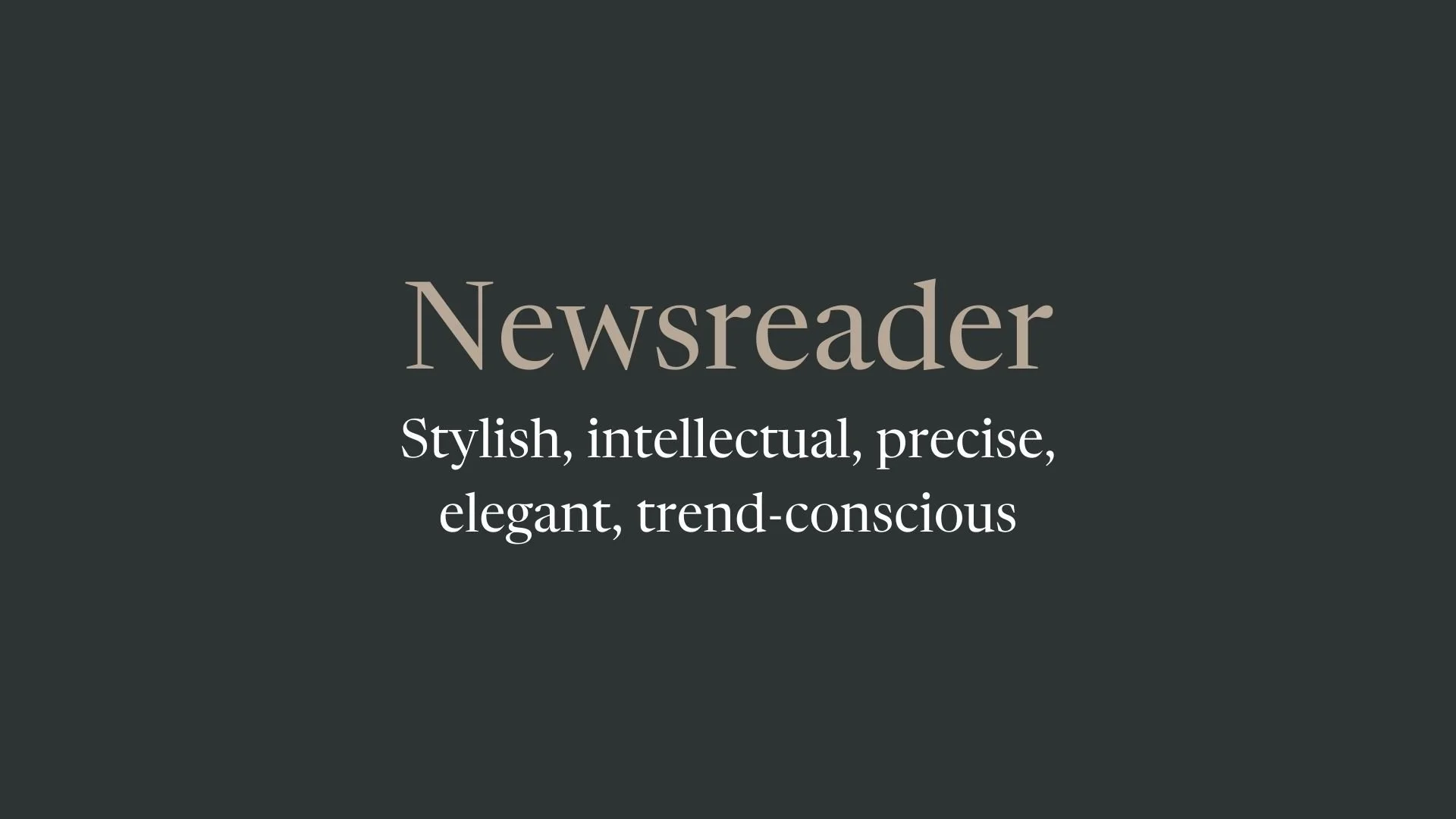
Newsreader
Overview:
Newsreader is a highly legible serif typeface designed for digital reading, making it especially suited for online news and content-heavy environments. Its timeless, classic design and high readability make it a reliable choice for both screen and print applications.
History:
Newsreader was created by the acclaimed type designer David Jonathan Ross and released by his foundry, the Font Bureau, in 2017. The typeface was specifically designed to address the needs of long-form reading on digital screens, a challenge that emerged as online reading became more prevalent. Ross sought to create a serif typeface that would offer the readability of traditional print fonts while adapting to modern digital screens. Newsreader was thus conceived to balance traditional characteristics with the flexibility needed for digital typography.
Characteristics:
Design: Newsreader blends classic serif features with contemporary sensibilities. Its slightly condensed letterforms and strong contrast in stroke weights enhance readability, while its moderate serifs provide a touch of tradition. The design is grounded in legibility, with open apertures and a generously spaced structure.
Usage: Newsreader is ideal for body text in online publications, articles, and blogs. Its design makes it a great choice for any content where prolonged reading is necessary, such as news websites or long-form digital content. It also works well for print materials such as newspapers and magazines, where clarity and legibility are essential.
Attributes: The font is highly legible, with a strong, readable presence across both small and large text sizes. Its design ensures clarity on screen, even at smaller sizes, making it well-suited for digital use. Newsreader's refined, traditional serif design is paired with a modern touch, giving it a versatile, professional, and approachable quality.

FONT PERSONALITY
-
FONT PERSONALITY -
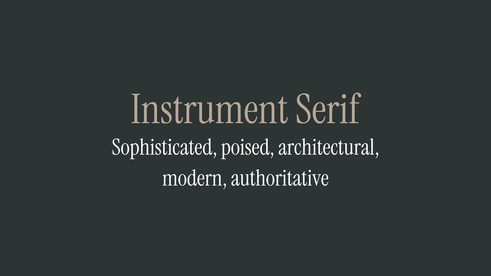
Why Instrument Serif and Newsreader are a Match Made in Heaven:
When Instrument Serif and Newsreader come together, they form a perfect balance of sophistication and approachability. Instrument Serif’s sharp, architectural lines and poised, authoritative tone lend a sense of elegance and modernity, ideal for high-end branding and impactful headlines. Meanwhile, Newsreader complements this precision with a friendly, down-to-earth feel that ensures the design remains inviting and clear. Newsreader’s traditional yet adaptable nature balances out Instrument Serif’s authority, creating a harmonious pairing that speaks to both refinement and relatability.
This font pairing would be ideal for a person who values both leadership and approachability—someone with a strong sense of style who also understands the importance of clear communication. This individual may be a professional in a leadership role, such as an entrepreneur, executive, or consultant, who wants to project both authority and approachability in their personal brand. They likely work in an industry where trust and clarity are paramount but are also forward-thinking enough to embrace modern design aesthetics.

CELEBRITY MATCH
-
CELEBRITY MATCH -

The font pairing of Instrument Serif and Newsreader aligns perfectly with the character of Dorothy Vaughan, as portrayed by Janelle Monáe in the movie "Hidden Figures (2016)".
Summary: The pairing of Instrument Serif and Newsreader aligns seamlessly with Janelle Monáe's portrayal of Dorothy Vaughan in Hidden Figures. Dorothy’s combination of authority, sophistication, and clarity mirrors the dynamic between Instrument Serif's polished, commanding presence and Newsreader’s approachable, reliable nature. Dorothy is the leader who combines sharp intellect with the ability to educate and connect with others—just as this font pairing blends modern elegance with timeless clarity, resulting in a harmonious balance between sophistication and approachability. Both the character and the font pairing exemplify professionalism, precision, and the power of effective communication in any setting.

HIERARCHY
-
HIERARCHY -
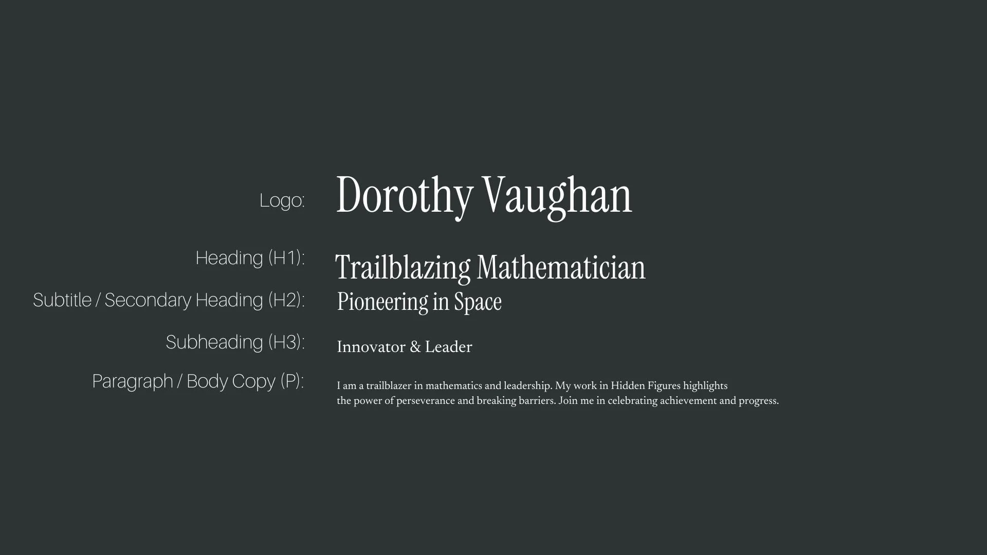
Font Hierarchy for Instrument Serif and Newsreader:
Logo
Usage: Primary logo text, initials, brand name
Instrument Serif, Regular, 60-80 pt (Canva), 48-60 pt (Squarespace)
Heading (H1)
Usage: Main headings on pages, prominent titles
Instrument Serif, Regular, 36-48 pt (Canva), 32-40 pt (Squarespace)
Subtitle / Secondary Heading (H2)
Usage: Section titles, important subtitles
Instrument Serif, Regular, 24-36 pt (Canva), 24-32 pt (Squarespace)
Subheading (H3)
Usage: Subsection headings, less prominent titles
Newsreader, Regular, 18-24 pt (Canva), 18-22 pt (Squarespace)
Paragraph / Body Copy (P)
Usage: Main body text, paragraphs, descriptions
Newsreader, Regular, 12-14 pt (Canva), 14-16 pt (Squarespace)