MEET YOUR FONT PAIRING MATCH
This page is your custom breakdown of the font pairing you were matched with from the Find Your Font Quiz. You’ll discover the history, personality, and style of each font—and see how they can come to life in your personal brand.
If you're a Personal Branding Studio member:
Bookmark this page. We’ll return to it in Part 2 when it’s time to use your font pairing to design your logo and create branded Canva graphics.
Not loving this particular combo? No problem. Explore all 100+ font pairings inside PBS - Part 1, Module 4: Design - to find one that feels just right. Click the button below to go there now.
Not yet a Personal Branding Studio member?
(And wondering what Personal Branding Studio even is?)
Start by scrolling through your results below. At the bottom of this page, you’ll find out how to go deeper with your personal brand through my full Personal Branding Studio program.
And your aligned font pairing match is…


HISTORY
-
HISTORY -
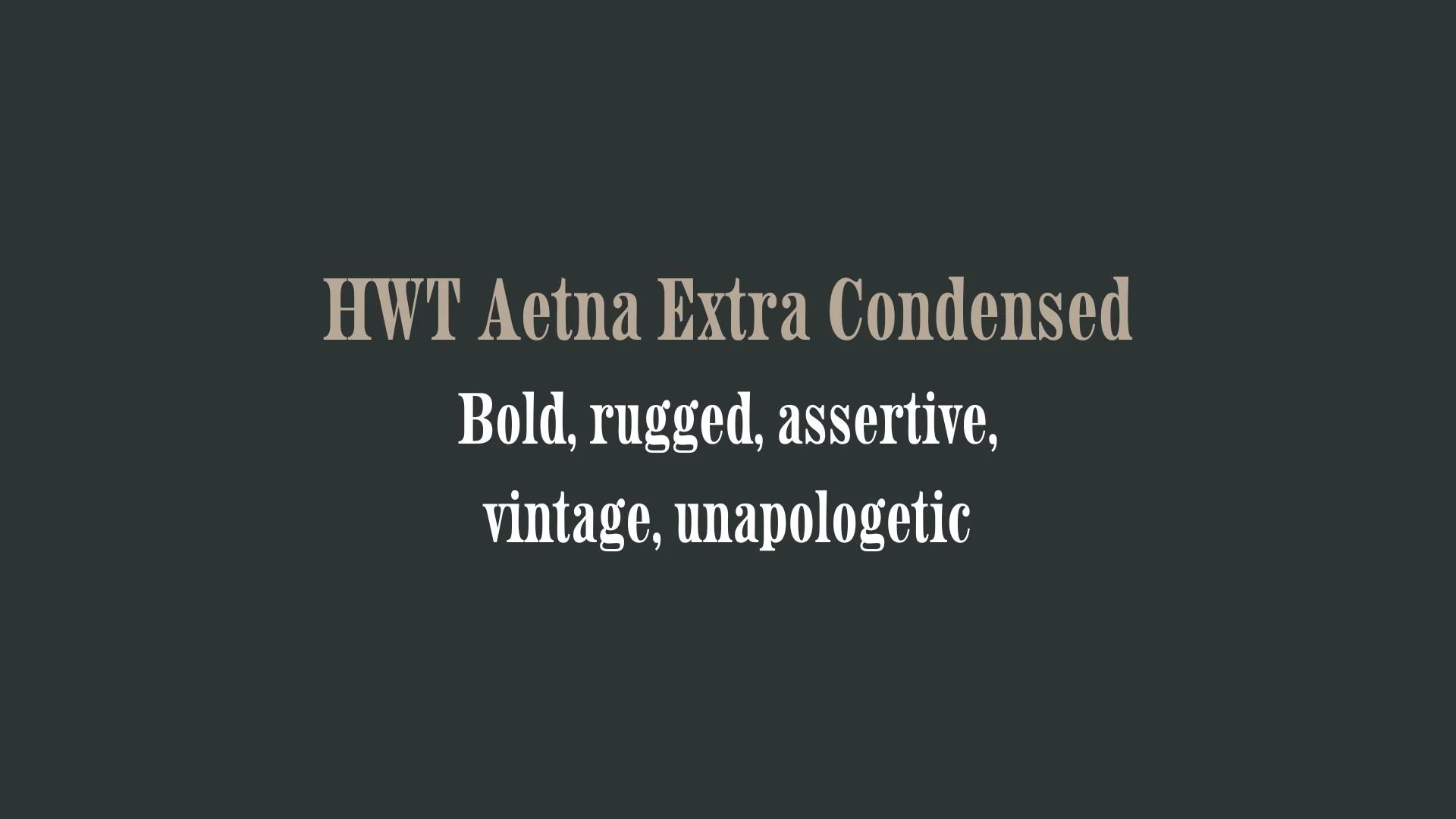
HWT Aetna Extra Condensed
Overview:
HWT Aetna Extra Condensed is a distinctive and compact sans-serif typeface, part of the Aetna family, known for its strong, condensed structure and geometric style. This font is particularly valued for its bold presence in tight spaces and works well for designs that require an assertive, modern aesthetic.
History:
HWT Aetna Extra Condensed was designed by Cyrus Highsmith and released in 2007 through the renowned digital foundry, the Hamilton Wood Type & Printing Museum (HWT). The Aetna family was inspired by early 20th-century wood type designs, particularly those used for large advertising posters and signage. The condensed version was created to accommodate space constraints while maintaining readability and impact. HWT Aetna was designed to offer a modern update to the classic American wood type styles, combining utility with a sleek, contemporary flair.
Characteristics:
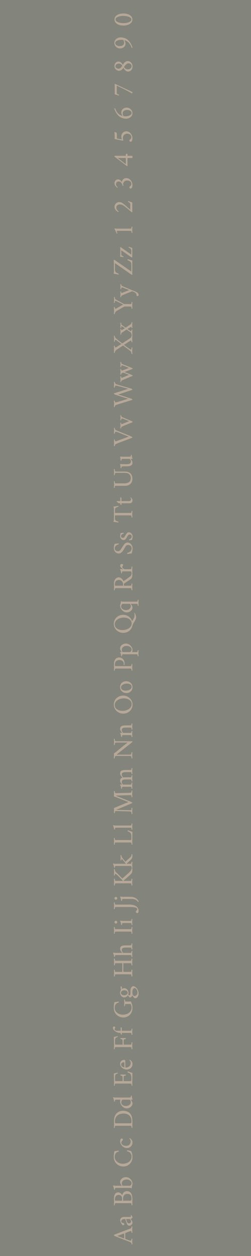
Design: The font features sharp, geometric letterforms with tight letterspacing, creating a compact and efficient appearance. Its narrow width and high x-height ensure it remains legible even at small sizes, with a strong, bold stance.
Usage: HWT Aetna Extra Condensed is ideal for headlines, posters, and signage, especially in applications where space is limited but a bold typographic statement is required. Its condensed design allows it to pack a punch without taking up too much room.
Attributes: Strong, condensed, and modern, HWT Aetna Extra Condensed balances readability with an assertive, impactful style. The geometric shapes and compact proportions give it a structured, no-nonsense quality, making it perfect for bold branding and marketing materials.

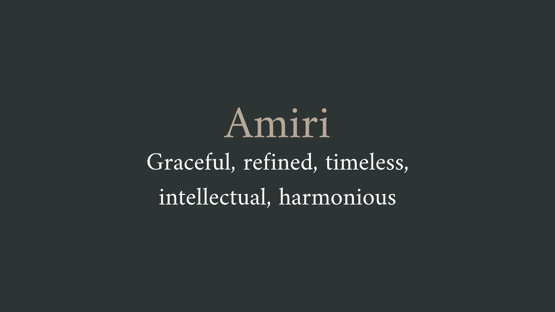
Amiri
Overview:
Amiri is a contemporary serif typeface that combines traditional and modern elements, inspired by the calligraphic forms of Arabic typography. It is designed to work well both in print and on screen, with an emphasis on readability and elegance.
History:
Amiri was created by Baha' H. Othman, a type designer from Palestine. The font was released in 2015 as an open-source typeface, with the aim of offering a high-quality Arabic font that maintains the beauty and sophistication of classical Arabic calligraphy while being practical for modern digital use. It was designed to fill the gap in the market for a serif Arabic font that could be used for everything from body text to display use, offering both aesthetic appeal and functional legibility.
Characteristics:
Design: Amiri features traditional Arabic calligraphic influences, particularly drawing from the Naskh script, with a balanced and harmonious design. It incorporates classic serif elements that give it a timeless, elegant look while maintaining clear and legible letterforms for modern use.
Usage: Perfect for editorial design, books, websites, and other forms of media that require an elegant yet highly readable Arabic font. Its versatility allows it to work well in both long-form text and large headlines.
Attributes: Elegant, readable, and balanced with classic serif features, Amiri is a versatile typeface that pairs well with other fonts for multilingual projects, particularly when both Latin and Arabic text need to coexist seamlessly.

FONT PERSONALITY
-
FONT PERSONALITY -
Why HWT Aetna Extra Condensed and Amiri are a Match Made in Heaven:
The combination of HWT Aetna Extra Condensed and Amiri is a beautiful juxtaposition of boldness and refinement, creating a pairing that is both powerful and graceful. HWT Aetna Extra Condensed commands attention with its rugged, assertive presence, offering a vintage charm that speaks of history and authenticity. It grabs the viewer’s focus immediately, making it ideal for bold headlines and attention-grabbing elements. In contrast, Amiri’s elegant and refined personality balances the pairing with its timeless sophistication, intellectual depth, and harmonious design. The contrast between Aetna’s raw strength and Amiri’s poised grace results in a visually striking, yet balanced design that effortlessly blends tradition with modernity.
This font pairing would resonate with a person who exudes confidence while maintaining an air of sophistication. They are likely someone who appreciates both strength and grace in their personal and professional life—perhaps a creative entrepreneur or cultural leader who blends a rugged, no-nonsense attitude with a refined, intellectual sensibility. This person is not afraid to stand out, yet values timeless elegance, and they would use this pairing to convey a personal brand that is both bold and thoughtful, commanding respect while remaining graceful and approachable.

CELEBRITY MATCH
-
CELEBRITY MATCH -

The font pairing of HWT Aetna Extra Condensed and Amiri aligns perfectly with the character of Selina Kyle/Catwoman, as portrayed by Michelle Pfeiffer in the movie "Batman Returns".
Summary: Michelle Pfeiffer’s portrayal of Selina Kyle/Catwoman in Batman Returns encapsulates the essence of both HWT Aetna Extra Condensed and Amiri. As Catwoman, she exudes boldness, authenticity, and a vintage yet modern flair, which corresponds to HWT Aetna Extra Condensed’s commanding presence and rugged charm. At the same time, her sophisticated and graceful side aligns with Amiri’s timeless elegance. Together, these two fonts reflect the dynamic and multifaceted nature of Catwoman, making Michelle Pfeiffer’s performance a perfect match for this font pairing.

HIERARCHY
-
HIERARCHY -
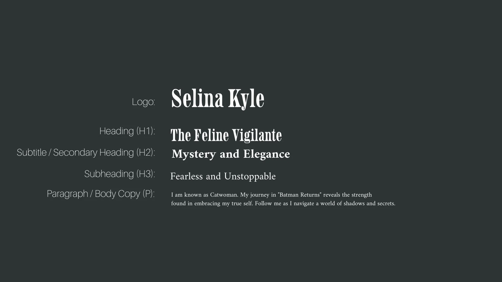
Font Hierarchy for HWT Aetna Extra Condensed and Amiri:
Logo
Usage: Primary logo text, initials, brand name
HWT Aetna Extra Condensed, Regular, 72px (Canva), 60px (Squarespace)
Heading (H1)
Usage: Main headings on pages, prominent titles
HWT Aetna Extra Condensed, Regular, 48px (Canva), 42px (Squarespace)
Subtitle / Secondary Heading (H2)
Usage: Section titles, important subtitles
Amiri, Bold, 36px (Canva), 32px (Squarespace)
Subheading (H3)
Usage: Subsection headings, less prominent titles
Amiri, Regular, 30px (Canva), 28px (Squarespace)
Paragraph / Body Copy (P)
Usage: Main body text, paragraphs, descriptions
Amiri, Regular, 18px (Canva), 16px (Squarespace)