MEET YOUR FONT PAIRING MATCH
This page is your custom breakdown of the font pairing you were matched with from the Find Your Font Quiz. You’ll discover the history, personality, and style of each font—and see how they can come to life in your personal brand.
If you're a Personal Branding Studio member:
Bookmark this page. We’ll return to it in Part 2 when it’s time to use your font pairing to design your logo and create branded Canva graphics.
Not loving this particular combo? No problem. Explore all 100+ font pairings inside PBS - Part 1, Module 4: Design - to find one that feels just right. Click the button below to go there now.
Not yet a Personal Branding Studio member?
(And wondering what Personal Branding Studio even is?)
Start by scrolling through your results below. At the bottom of this page, you’ll find out how to go deeper with your personal brand through my full Personal Branding Studio program.
And your aligned font pairing match is…

HISTORY
-
HISTORY -
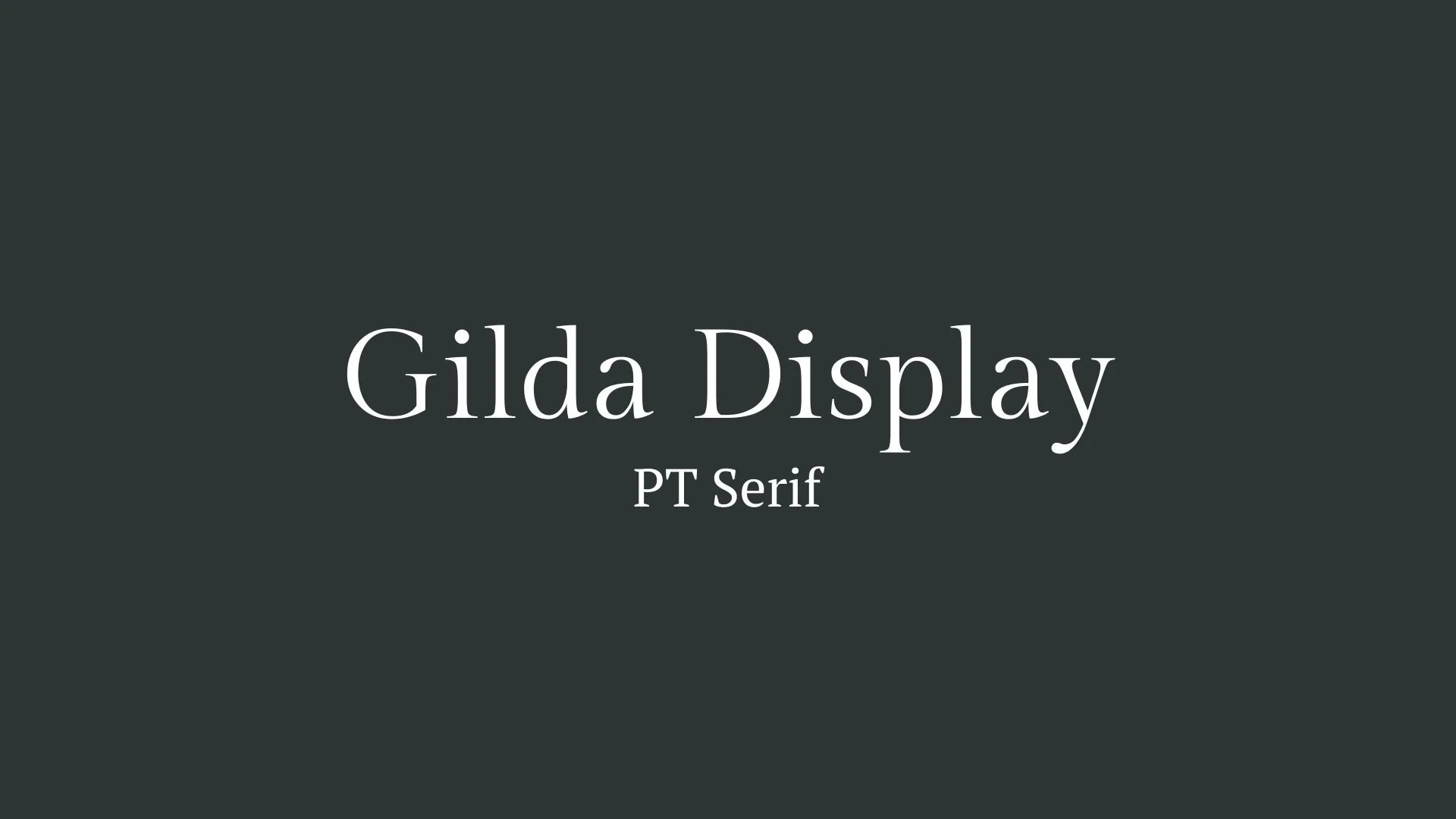
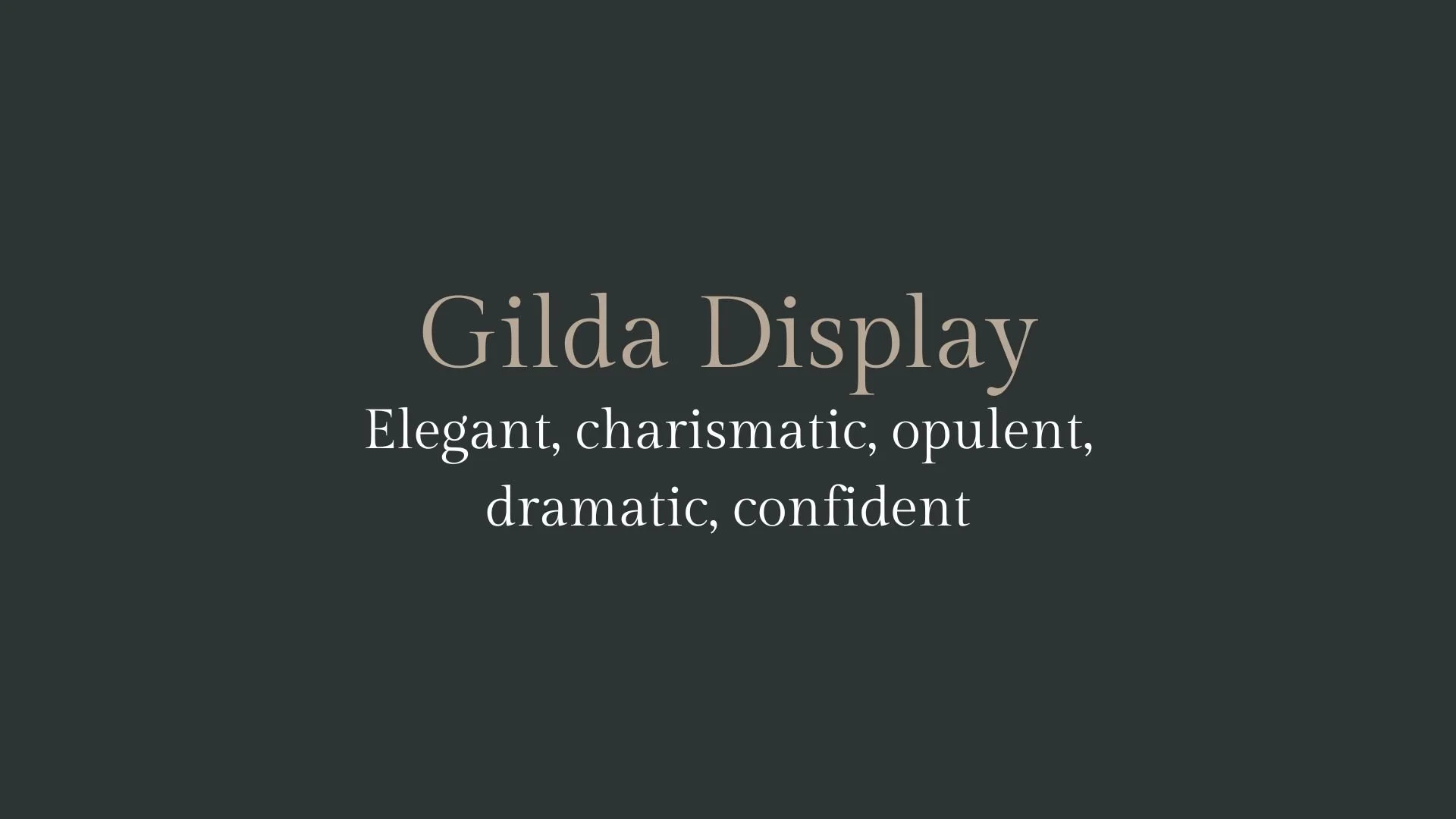
Gilda Display
Overview:
Gilda Display is an elegant serif typeface designed specifically for use in high-impact display settings. With its refined details and sophisticated proportions, Gilda Display brings a modern touch to classic typography, making it a popular choice for titles, branding, and editorial work.
History:
Gilda Display was designed by Argentine type designer, Mariana Rodríguez, and released by the type foundry Emtype in 2012. It was created as part of a broader family, meant to blend traditional serif forms with modern sensibilities. Rodríguez aimed to craft a typeface that would maintain readability while being visually striking, with a personality that could shine in both small and large sizes. Its design was inspired by early 20th-century display typefaces but was refined to suit contemporary design needs.
Characteristics:
Design: Gilda Display features sharp contrasts between thick and thin strokes, with high contrast in the serif shapes, giving it a sophisticated and dynamic look. It has a modern, yet timeless feel with slightly elongated proportions. The serifs are graceful but sturdy, which enhances its impact at larger sizes.
Usage: Perfect for headlines, posters, book covers, and any other high-visibility applications. Its design shines in large display sizes, making it ideal for use in editorial design and branding projects where elegance and clarity are key.
Attributes: Elegant, refined, and highly readable in larger formats. Gilda Display stands out with its strong personality and classic yet modern appeal, making it ideal for luxury branding and fashion-related design.
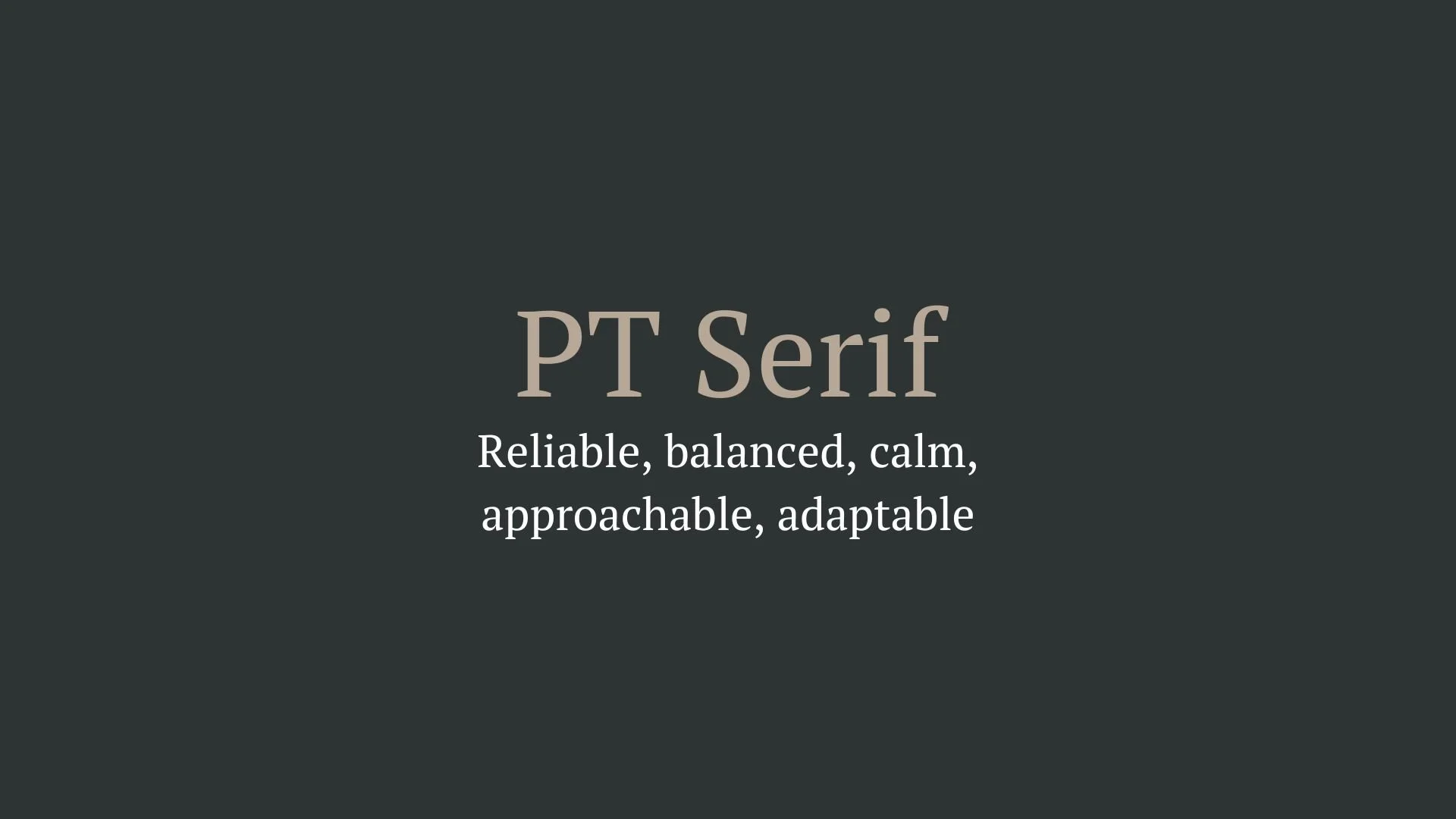
PT Serif
Overview:
PT Serif is a transitional serif typeface designed for clarity and versatility. It combines traditional serif characteristics with modern proportions, making it an excellent choice for both digital and print media, particularly in long-form text and editorial layouts.
History:
PT Serif was created by Alexandra Korolkova, Olga Umpeleva, and Vladimir Yefimov as part of the "PT" (Public Types) project initiated by the Russian government in 2009. The aim was to develop a comprehensive type system that could support the diverse typographic needs of the Russian-speaking population while also being accessible to global audiences. The project sought to revive and enhance the cultural heritage of typography in Russia, promoting readability and elegance in text.
Characteristics:
Design: PT Serif features classic serif forms with a modern touch, characterized by moderate contrast between thick and thin strokes. The serifs are sharp yet not overly aggressive, providing a harmonious balance that enhances readability.
Usage: PT Serif excels in both body text and display settings. Its legibility makes it suitable for books, newspapers, and online content, while its refined appearance allows it to shine in branding and editorial design.
Attributes: Highly legible and versatile, PT Serif conveys a sense of reliability and professionalism. Its blend of traditional and contemporary elements allows it to adapt seamlessly across various design contexts, making it a popular choice for designers seeking a trustworthy serif typeface.


FONT PERSONALITY
-
FONT PERSONALITY -
Why Gilda Display and PT Serif are a Match Made in Heaven:
Gilda Display and PT Serif create a stunning balance between bold elegance and dependable readability, making them a perfect pairing. Gilda Display commands attention with its sophisticated, opulent, and dramatic style—ideal for high-impact headings or logos that need to exude confidence. It carries an air of luxury and refinement. On the other hand, PT Serif provides a calming, balanced contrast with its steady, reliable nature. Its classic design ensures clarity and ease of reading, making it perfect for supporting the striking presence of Gilda Display in body text or longer content. Together, they form a harmonious combination of glamour and practicality, ensuring that the message remains both captivating and accessible.
This font pairing would be ideal for someone who values both sophistication and clarity in their personal brand. The person who chooses Gilda Display and PT Serif is likely a visionary with a strong sense of style, someone who works in a creative or professional field where first impressions matter, such as a luxury brand consultant or a high-end creative director. They are bold, confident, and not afraid to stand out, but they also understand the importance of clarity and approachability, aiming to make a lasting impression without losing the trust of their audience.

CELEBRITY MATCH
-
CELEBRITY MATCH -

The font pairing of Gilda Display and PT Serif aligns perfectly with the character of Snow White, as portrayed by Lily Collins in the movie "Mirror Mirror (2012)".
Summary: The combination of Gilda Display and PT Serif is a perfect match for Snow White in Mirror Mirror . The Gilda Display element channels the dramatic, opulent, and confident side of Snow White—particularly as she steps into her role as the kingdom’s leader, commanding attention and inspiring those around her. The bold and elegant nature of Gilda Display reflects Snow White’s transformation from a passive princess into a dynamic figure of authority. On the other hand, PT Serif complements Snow White’s quieter, more grounded qualities. It reflects her steady and reliable nature as a leader, her calm under pressure, and her ability to connect with others. PT Serif helps balance out the dramatic flair of Gilda Display , ensuring that Snow White’s leadership feels both sophisticated and practical, approachable yet authoritative. Together, these fonts represent Snow White’s arc perfectly: Gilda Display embodies her regal, confident transformation, while PT Serif speaks to the balance, clarity, and approachability that makes her an effective and beloved leader. This pairing mirrors her journey of growth, from sheltered princess to a leader who inspires and uplifts her kingdom.

HIERARCHY
-
HIERARCHY -
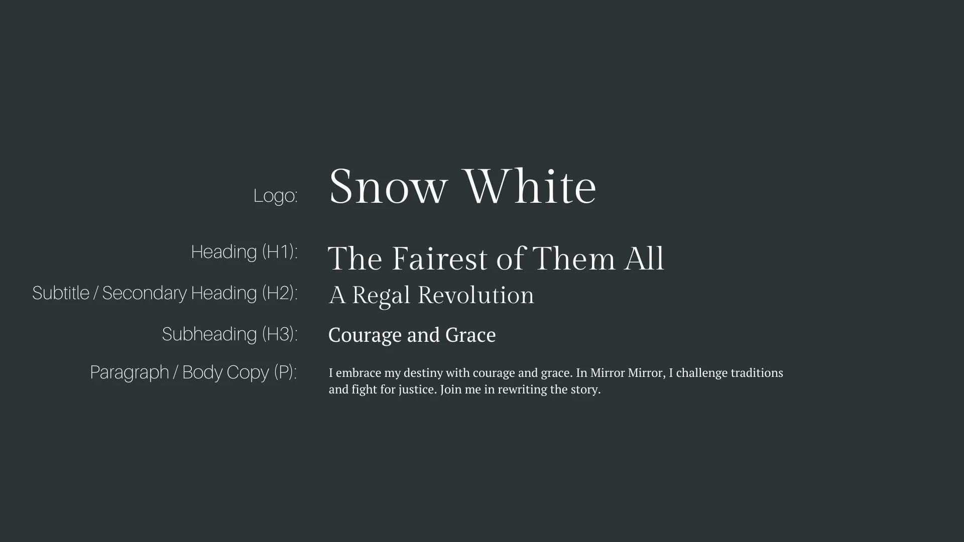
Font Hierarchy for Gilda Display and PT Serif:
Logo
Usage: Primary logo text, initials, brand name
Gilda Display, Regular, 72pt to 150pt (Canva), 120px to 200px (Squarespace)
Heading (H1)
Usage: Main headings on pages, prominent titles
Gilda Display, Bold or Regular, 40pt to 60pt (Canva), 48px to 72px (Squarespace)
Subtitle / Secondary Heading (H2)
Usage: Section titles, important subtitles
PT Serif, Regular, 30pt to 40pt (Canva), 32px to 48px (Squarespace)
Subheading (H3)
Usage: Subsection headings, less prominent titles
PT Serif, Italic or Regular, 24pt to 30pt (Canva), 24px to 32px (Squarespace)
Paragraph / Body Copy (P)
Usage: Main body text, paragraphs, descriptions
PT Serif, Regular, 14pt to 18pt (Canva), 16px to 18px (Squarespace)