MEET YOUR FONT PAIRING MATCH
This page is your custom breakdown of the font pairing you were matched with from the Find Your Font Quiz. You’ll discover the history, personality, and style of each font—and see how they can come to life in your personal brand.
If you're a Personal Branding Studio member:
Bookmark this page. We’ll return to it in Part 2 when it’s time to use your font pairing to design your logo and create branded Canva graphics.
Not loving this particular combo? No problem. Explore all 100+ font pairings inside PBS - Part 1, Module 4: Design - to find one that feels just right. Click the button below to go there now.
Not yet a Personal Branding Studio member?
(And wondering what Personal Branding Studio even is?)
Start by scrolling through your results below. At the bottom of this page, you’ll find out how to go deeper with your personal brand through my full Personal Branding Studio program.
And your aligned font pairing match is…


HISTORY
-
HISTORY -
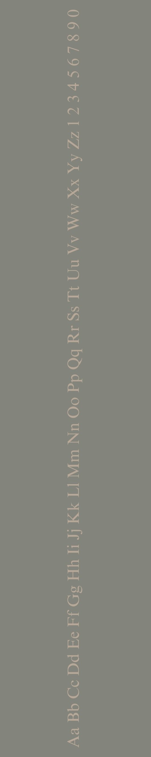
Georgia
Overview:
Georgia is a classic serif typeface designed for clarity and readability, particularly on screens. It combines traditional serif elements with modern proportions, making it a highly versatile font for both digital and print applications. Its warm, inviting design has made it a popular choice for websites, body text, and editorial design.
History:
Georgia was created by designer Matthew Carter in 1993 for Microsoft. It was commissioned as part of a group of fonts designed specifically for the Microsoft Windows platform to improve readability on low-resolution screens. Carter’s goal was to create a serif typeface that would be legible even at small sizes, a key consideration for early web design. Released alongside the release of Internet Explorer 4.0, Georgia quickly became a go-to typeface for web use, offering a balance between formality and friendliness.
Characteristics:
Design: Georgia features wide proportions, open counters, and round serifs that give it a soft, approachable appearance. It is designed with high contrast between thick and thin strokes, giving it a traditional yet modern look. The letterforms are well-balanced, with ample spacing that enhances legibility, especially at smaller sizes.
Usage: Primarily used for body text, Georgia is ideal for web design, blogs, online articles, and any content where readability is essential. It is also widely used in print for books, brochures, and advertisements. Its strong presence and versatility make it suitable for both casual and formal applications.
Attributes: Highly legible, elegant, and versatile, Georgia is characterized by its ability to maintain clarity in various sizes and media. The typeface offers a timeless, approachable quality, making it a favorite for text-heavy content, both on-screen and in print.

Times New Roman
Overview:
Times New Roman is a serif typeface known for its formal and traditional appearance. Originally designed for high legibility and compactness, it has become one of the most recognized and widely used fonts in both print and digital media. Its classic design makes it ideal for professional and academic uses.
History:
Times New Roman was created by British typographer Stanley Morison in 1931 for The Times newspaper in London. The newspaper sought a more legible and space-efficient typeface for its text-heavy pages. Morison worked with the typographic foundry Monotype to design the font, drawing inspiration from earlier serif fonts but with a more modern and refined approach. Released in 1932, Times New Roman quickly gained popularity due to its clarity and functionality, becoming one of the most commonly used fonts in publishing, academia, and the corporate world.
Characteristics:
Design: Times New Roman features classical serifs with a high contrast between thick and thin strokes. The font’s vertical stress and compact proportions give it a formal, structured appearance. It has open counters and slightly rounded curves, making it legible even at small sizes. The design was optimized for newspaper printing, which contributed to its sharp, clean lines and balanced structure.
Usage: Times New Roman is widely used in academic papers, books, formal documents, and newspapers. It is the default typeface for many word processing applications, such as Microsoft Word. Its readability and professional appearance make it ideal for long-form text, formal communication, and legal or official documentation.
Attributes: Traditional, highly legible, and functional, Times New Roman is characterized by its clear, straightforward design and efficient use of space. Its enduring presence across print and digital media is a testament to its timeless appeal and versatility in various professional contexts.

FONT PERSONALITY
-
FONT PERSONALITY -


Why Georgia and Times New Roman are a Match Made in Heaven:
Georgia and Times New Roman create a sophisticated yet balanced pairing that combines timeless elegance with a sense of authority. Georgia’s charm and adaptability bring a refined warmth to the table, making it a versatile and welcoming choice for any design. Times New Roman, with its commanding presence and structured, formal nature, complements Georgia by adding a sense of order and tradition. Together, they create a harmonious blend of timeless grace and dependable reliability, perfect for projects that require both beauty and structure.
This pairing would be ideal for someone whose personal brand values tradition, reliability, and elegance. The person using this combination might be a professional in a more conservative field—such as law, education, or finance—who wants their brand to exude both class and authority. They likely appreciate the balance of modern sensibility with a nod to classical design, ensuring their message is both trustworthy and refined.

CELEBRITY MATCH
-
CELEBRITY MATCH -

The font pairing of Georgia and Times New Roman aligns perfectly with the character of Katniss Everdeen, as portrayed by Jennifer Lawrence in the movie "The Hunger Games".
Summary: Jennifer Lawrence’s portrayal of Katniss Everdeen in The Hunger Games series encapsulates the traits of the Georgia and Times New Roman font pairing perfectly. Katniss’s bravery, resilience, resourcefulness, and leadership are mirrored in Georgia's grounded, adaptable elegance and Times New Roman's authoritative, reliable presence. The combination of these fonts—timeless yet modern, practical yet authoritative—captures Katniss’s journey from a survivor to a symbol of hope, embodying both tradition and evolution.

HIERARCHY
-
HIERARCHY -

Font Hierarchy for Georgia and Times New Roman:
Logo
Usage: Primary logo text, initials, brand name
Georgia, Bold, 48px-72px (Canva), 60px-80px (Squarespace)
Heading (H1)
Usage: Main headings on pages, prominent titles
Georgia, Regular or Bold, 36px-48px (Canva), 50px-60px (Squarespace)
Subtitle / Secondary Heading (H2)
Usage: Section titles, important subtitles
Times New Roman, Regular or Italic, 28px-36px (Canva), 36px-50px (Squarespace)
Subheading (H3)
Usage: Subsection headings, less prominent titles
Times New Roman, Regular, 20px-28px (Canva), 28px-36px (Squarespace)
Paragraph / Body Copy (P)
Usage: Main body text, paragraphs, descriptions
Times New Roman, Regular, 14px-18px (Canva), 16px-18px (Squarespace)