MEET YOUR FONT PAIRING MATCH
This page is your custom breakdown of the font pairing you were matched with from the Find Your Font Quiz. You’ll discover the history, personality, and style of each font—and see how they can come to life in your personal brand.
If you're a Personal Branding Studio member:
Bookmark this page. We’ll return to it in Part 2 when it’s time to use your font pairing to design your logo and create branded Canva graphics.
Not loving this particular combo? No problem. Explore all 100+ font pairings inside PBS - Part 1, Module 4: Design - to find one that feels just right. Click the button below to go there now.
Not yet a Personal Branding Studio member?
(And wondering what Personal Branding Studio even is?)
Start by scrolling through your results below. At the bottom of this page, you’ll find out how to go deeper with your personal brand through my full Personal Branding Studio program.
And your aligned font pairing match is…

HISTORY
-
HISTORY -
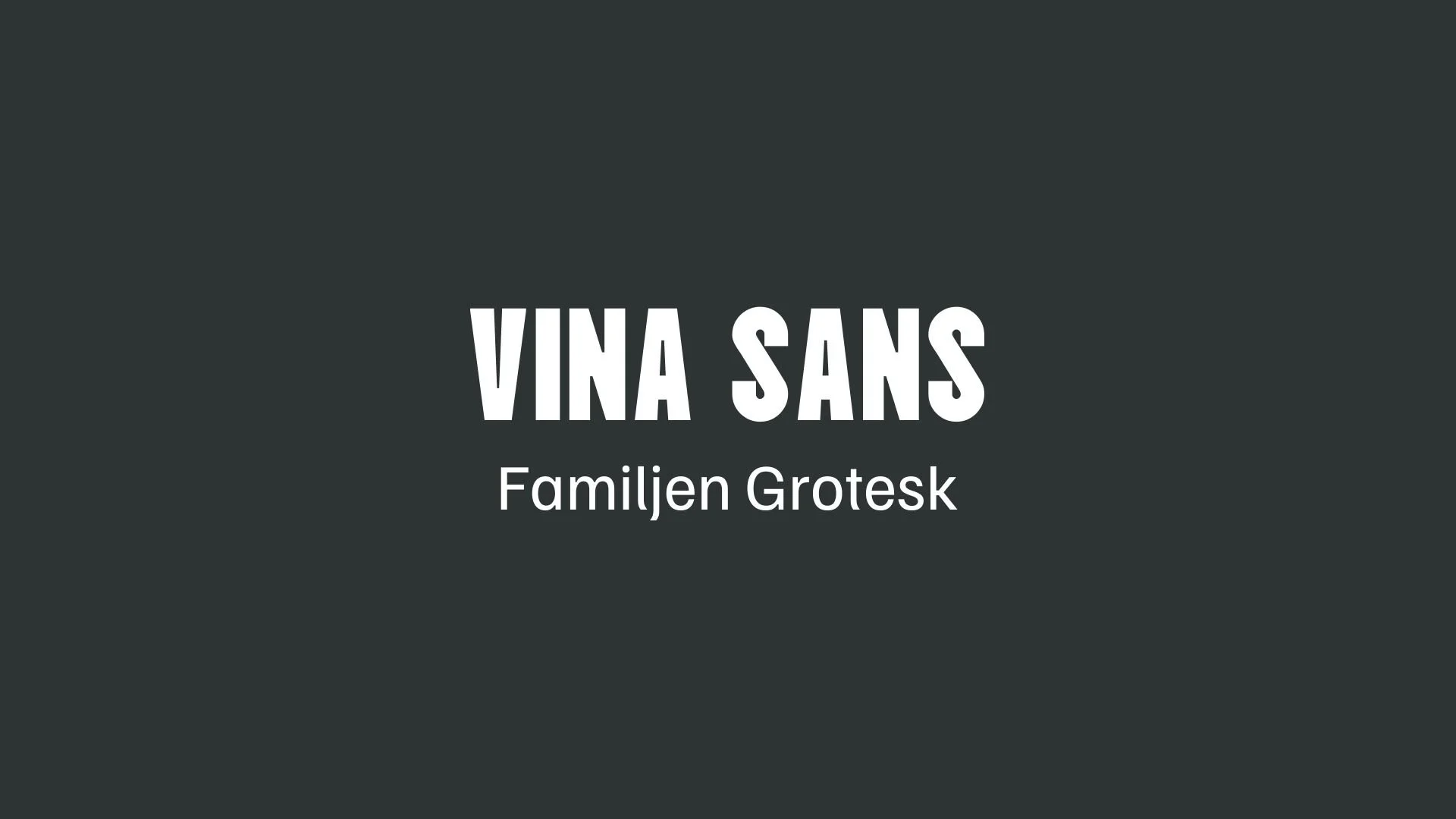
Vina Sans
Overview:
Vina Sans is a modern, geometric sans-serif typeface that draws inspiration from the vibrant street typography of Vietnam. It reflects the local vernacular, with elements seen in signage, posters, and informal publications. Designed to be both functional and aesthetically appealing, this typeface aims to address the growing need for comprehensive Vietnamese language support in digital and print media.
History:
Vina Sans was designed by Andree Nguyen and released in 2020. It emerged during a period of significant growth for Vietnamese typography, where there was an increased focus on supporting the Vietnamese language across a wide array of fonts. The design is a blend of clean, geometric lines, with slight imperfections, capturing the essence of everyday communication in Vietnam's streetscape. The typeface was created to ensure better typographic representation of the Vietnamese language and provide a modern alternative to traditional Vietnamese fonts.
Characteristics:
Design: The font features clean, geometric shapes with slight curves, making it approachable yet structured. Its urban, industrial feel is complemented by wide proportions that enhance legibility across different mediums.
Usage: Vina Sans is suitable for a wide range of applications, from branding to advertising, as well as digital interfaces. Its versatility makes it effective for both headlines and body text, with the added benefit of supporting Vietnamese characters.
Attributes: Vina Sans is characterized by its simplicity, neutrality, and a touch of urban rawness, making it highly legible and adaptable to modern design needs.

Familjen Grotesk
Overview:
Familjen Grotesk is a contemporary sans-serif typeface that stands out for its unique blend of geometric structure and organic details. It balances neutral, functional design with subtle liveliness, making it suitable for both display and text use. The font is versatile, offering a modern, approachable feel, ideal for a wide range of applications.
History:
Familjen Grotesk was designed by the Swedish design studio Familjen, led by Anders Wikström, Jonas Bäckman, Matilda Gysing, and Kristian Möller. Released in 2021, it was developed to offer a fresh take on the traditional grotesque genre. The font family includes a range of weights and italics, providing flexibility for both headlines and body text. The team focused on creating a design that could serve as a neutral, functional typeface while also incorporating subtle quirks that set it apart from more restrained grotesque designs like Helvetica.
Characteristics:
Design: Familjen Grotesk is characterized by its clean, geometric forms mixed with softer, organic details. Features like softly bent stems and subtle ink traps provide a playful contrast to the otherwise restrained structure. Its rounded shapes, including the single-storey "a" and "g," add warmth to its appearance.
Usage: This font works well in a variety of contexts, from headlines to user interfaces and long-form text. Its legibility and versatility make it ideal for modern digital and print design. However, its distinct letter shapes make it better suited for display purposes rather than extended reading.
Attributes: Familjen Grotesk has a large x-height and low contrast, contributing to its legibility. It's available as a variable font with two axes (weight and italic), offering even more design flexibility.


FONT PERSONALITY
-
FONT PERSONALITY -


Why Vina Sans and Familjen Grotesk are a Match Made in Heaven:
The combination of Vina Sans and Familjen Grotesk creates a harmonious balance between modernity and warmth, making it a perfect pairing for both bold statements and approachable communication. Vina Sans, with its innovative, confident, and sleek design, demands attention and asserts its presence, while Familjen Grotesk complements this with its warm, approachable, and reliable nature. The two fonts work together seamlessly by merging Vina Sans’ cutting-edge boldness with Familjen Grotesk’s friendly, calm demeanor, ensuring that the overall design feels both sophisticated and welcoming. This pairing is ideal for brands that want to make an impact while still maintaining a sense of trustworthiness and relatability.
A person who would choose this pairing for their personal brand is someone who wants to project both confidence and approachability. This might be a modern entrepreneur or creative professional—someone who is assertive and innovative but also values relationships and clarity. They could be a leader in a fast-paced industry like tech or design, where boldness and forward-thinking are key, but they also value creating a warm and welcoming environment for their clients or collaborators. This individual understands the importance of being both influential and relatable, crafting a brand that speaks to both authority and friendliness.

CELEBRITY MATCH
-
CELEBRITY MATCH -

The font pairing of Vina Sans and Familjen Grotesk aligns perfectly with the character of Inez, as portrayed by Rachel McAdams in the movie "Midnight in Paris (2011)".
Summary: Rachel McAdams' portrayal of Inez in Midnight in Paris perfectly embodies the characteristics of the Vina Sans and Familjen Grotesk font pairing. Both Inez and these fonts demonstrate a duality of boldness and warmth. Inez is the modern trendsetter who is assertive and confident, yet she also possesses an underlying ability to engage and connect with others in a controlled and approachable manner. This dynamic is captured perfectly by the combination of Vina Sans’ sleek, modern edge and Familjen Grotesk’s approachable warmth.

HIERARCHY
-
HIERARCHY -
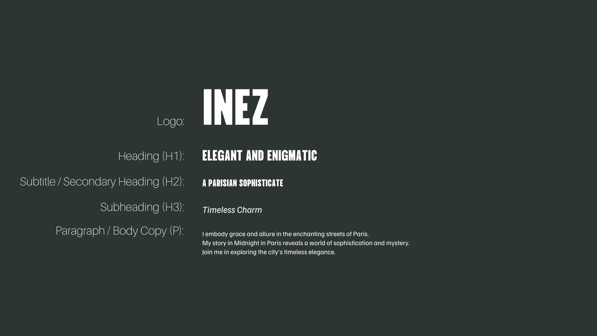
Font Hierarchy for Vina Sans and Familjen Grotesk:
Logo
Usage: Primary logo text, initials, brand name
Vina Sans, Regular, 48–72 pt (Canva), 36–48 px (Squarespace)
Heading (H1)
Usage: Main headings on pages, prominent titles
Vina Sans, Regular, 36–48 pt (Canva), 28–36 px (Squarespace)
Subtitle / Secondary Heading (H2)
Usage: Section titles, important subtitles
Vina Sans, Regular, 24–36 pt (Canva), 20–28 px (Squarespace)
Subheading (H3)
Usage: Subsection headings, less prominent titles
Familjen Grotesk, Italics, 18–24 pt (Canva), 16–20 px (Squarespace)
Paragraph / Body Copy (P)
Usage: Main body text, paragraphs, descriptions
Familjen Grotesk, Regular, 12–18 pt (Canva), 14–16 px (Squarespace)