MEET YOUR FONT PAIRING MATCH
This page is your custom breakdown of the font pairing you were matched with from the Find Your Font Quiz. You’ll discover the history, personality, and style of each font—and see how they can come to life in your personal brand.
If you're a Personal Branding Studio member:
Bookmark this page. We’ll return to it in Part 2 when it’s time to use your font pairing to design your logo and create branded Canva graphics.
Not loving this particular combo? No problem. Explore all 100+ font pairings inside PBS - Part 1, Module 4: Design - to find one that feels just right. Click the button below to go there now.
Not yet a Personal Branding Studio member?
(And wondering what Personal Branding Studio even is?)
Start by scrolling through your results below. At the bottom of this page, you’ll find out how to go deeper with your personal brand through my full Personal Branding Studio program.
And your aligned font pairing match is…


HISTORY
-
HISTORY -
Urbanist
Overview:
Urbanist is a contemporary sans-serif typeface designed with modern aesthetics and functionality in mind. Known for its clean, geometric lines and approachable design, Urbanist is highly versatile and works well across various mediums, particularly in digital spaces. The typeface maintains clarity and legibility even in smaller sizes, making it an ideal choice for both large headlines and body text.
History:
Urbanist was designed by Radomir Tinkov, a digital type designer, and was released in 2020. It was created as a free, open-source typeface that could be used across a variety of digital platforms. Tinkov aimed to design a modern and clean font that retained a friendly, welcoming appearance, with influences from geometric sans-serifs. Urbanist was intended to fill a gap in the market for a contemporary, neutral font that balances professionalism and readability.
Characteristics:
Design: Urbanist features clean, geometric letterforms with slightly rounded corners, contributing to a balanced and soft appearance. The typeface is open, with generous spacing that ensures readability and legibility even at smaller sizes.
Usage: Perfect for web design, user interfaces, branding, and editorial use, Urbanist works effectively for both large headings and text-heavy content. Its versatile style is well-suited for a wide range of design projects.
Attributes: Urbanist is clean, modern, and highly legible, with a subtle warmth due to its rounded details. It includes multiple weights and is adaptable to different design needs, from digital interfaces to print materials.

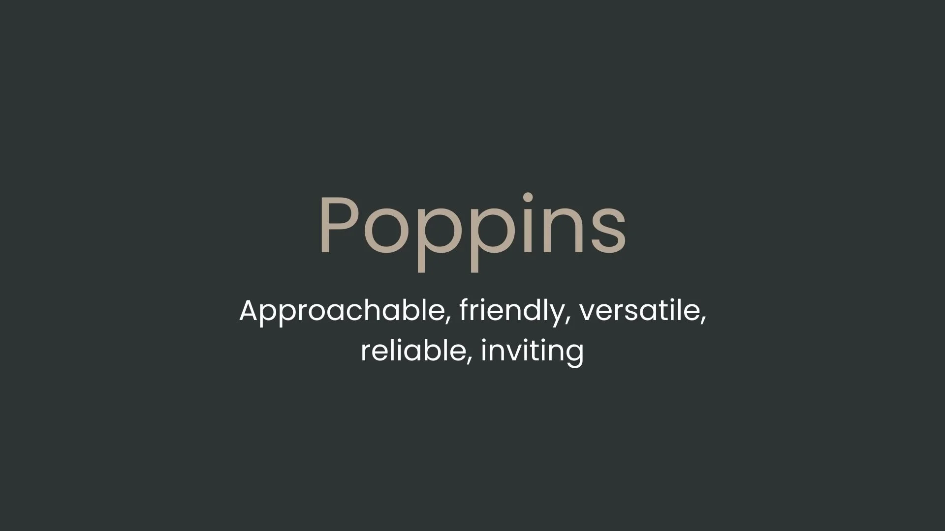
Poppins
Overview:
Poppins is a geometric sans-serif typeface known for its clean, rounded letterforms and modern aesthetic. With a bold and friendly character, it is widely used in digital and print applications. The font's balanced proportions and open structure make it versatile for both headlines and body text, especially in modern and minimalist designs.
History:
Poppins was designed by Indian Type Foundry (ITF), a prominent design studio specializing in multilingual fonts. The font was released in 2014 and was designed as a modern, geometric sans-serif that balances both elegance and legibility. One of its distinctive features is its support for Devanagari, allowing it to cater to a broader audience with different linguistic needs, especially in India. Its design was inspired by geometric sans-serifs like Futura, but with a more contemporary and approachable twist. The aim was to create a versatile typeface that could be used in a variety of contexts while maintaining a friendly yet professional look.
Characteristics:
Design: Poppins is characterized by its circular forms, minimalistic shapes, and consistent stroke widths. Its letterforms are modern, with open counters and geometric precision, but softened with rounded edges that give it a friendly, approachable feel.
Usage: Perfect for branding, websites, mobile interfaces, and advertising. It is particularly popular for projects that require a modern, clean look. Its versatility also makes it effective for use in logos, headlines, and user interfaces.
Attributes: Poppins offers a wide range of weights, from thin to bold, making it highly flexible for various design needs. It is legible at both small and large sizes, and its geometric nature gives it a clean, uncluttered appearance, suitable for contemporary design projects.


FONT PERSONALITY
-
FONT PERSONALITY -

Why Urbanist and Poppins are a Match Made in Heaven:
The pairing of Urbanist and Poppins is a harmonious balance of sophistication and approachability. Urbanist's sleek, modern design exudes refinement and precision, perfect for high-end brands or professional settings where innovation and cutting-edge appeal are key. Its contemporary flair is complemented by Poppins' warmth and versatility. Poppins' friendly, approachable nature adds a touch of accessibility, ensuring the combination remains relatable and inclusive while maintaining a polished, professional vibe. Together, these fonts create a dynamic contrast—Urbanist providing the modern edge and Poppins offering the human touch—which makes them a match made in heaven for brands seeking both elegance and connection.
This font pairing would appeal to an individual who is both forward-thinking and people-oriented. They are likely someone who works in a creative or professional space, where innovation and modernity are valued, yet they also prioritize building strong, trustworthy relationships. This person could be a brand strategist, a tech consultant, or a creative entrepreneur—someone who wants their personal brand to convey cutting-edge sophistication while still being warm, welcoming, and accessible. They are approachable and reliable but always have their finger on the pulse of the latest trends and developments.

CELEBRITY MATCH
-
CELEBRITY MATCH -

The font pairing of Urbanist and Poppins aligns perfectly with the character of Nina Sayers, as portrayed by Natalie Portman in the movie "Black Swan(2010)".
Summary: The combination of Urbanist and Poppins perfectly encapsulates the duality of Nina Sayers in Black Swan. Urbanist reflects Nina's modern, sophisticated, and highly precise approach to her ballet career, while Poppins embodies her emotional vulnerability and adaptability in personal relationships. Together, these fonts mirror Nina’s intricate balance between professional excellence and personal fragility, making the pairing an ideal representation of her character’s complexity.

HIERARCHY
-
HIERARCHY -

Font Hierarchy for Urbanist and Poppins:
Logo
Usage: Primary logo text, initials, brand name
Urbanist, Regular, 36-48 pt (Canva), 40-50 px (Squarespace)
Heading (H1)
Usage: Main headings on pages, prominent titles
Urbanist, Regular, 36-48 pt (Canva), 32-40 px (Squarespace)
Subtitle / Secondary Heading (H2)
Usage: Section titles, important subtitles
Urbanist, Regular, 24-36 pt (Canva), 24-32 px (Squarespace)
Subheading (H3)
Usage: Subsection headings, less prominent titles
Poppins, Semi-Bold, 18-24 pt (Canva), 18-24 px (Squarespace)
Paragraph / Body Copy (P)
Usage: Main body text, paragraphs, descriptions
Poppins, Regular, 12-16 pt (Canva), 14-18 px (Squarespace)