MEET YOUR FONT PAIRING MATCH
This page is your custom breakdown of the font pairing you were matched with from the Find Your Font Quiz. You’ll discover the history, personality, and style of each font—and see how they can come to life in your personal brand.
If you're a Personal Branding Studio member:
Bookmark this page. We’ll return to it in Part 2 when it’s time to use your font pairing to design your logo and create branded Canva graphics.
Not loving this particular combo? No problem. Explore all 100+ font pairings inside PBS - Part 1, Module 4: Design - to find one that feels just right. Click the button below to go there now.
Not yet a Personal Branding Studio member?
(And wondering what Personal Branding Studio even is?)
Start by scrolling through your results below. At the bottom of this page, you’ll find out how to go deeper with your personal brand through my full Personal Branding Studio program.
And your aligned font pairing match is…


HISTORY
-
HISTORY -
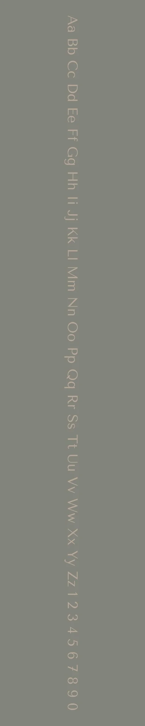
Tenor Sans
Overview:
Tenor Sans is a modern and elegant sans-serif typeface designed to offer both versatility and high legibility. With its clean lines and slightly condensed proportions, it provides a sophisticated yet approachable appearance, making it ideal for both digital and print use.
History:
Tenor Sans was designed by the type foundry, Zetafonts, and released in 2012. It was created with the goal of developing a typeface that was well-suited for contemporary branding, editorial design, and user interfaces. Tenor Sans was influenced by classic sans-serif fonts but with a fresh, modern twist, ensuring it would be highly legible in a variety of contexts. Its design was also aimed at providing a balanced, neutral tone suitable for professional and creative environments alike.
Characteristics:
Design: Tenor Sans features geometric, sans-serif letterforms with a slightly condensed structure, making it more space-efficient. The typeface has clean, straight lines, but the terminals are subtly rounded, adding a touch of warmth and friendliness. Its high x-height and open apertures ensure clarity and legibility, even at smaller sizes.
Usage: Ideal for body text, headlines, branding, and user interfaces, Tenor Sans works well in both print and digital environments. Its modern, neutral appearance makes it suitable for a variety of design contexts, from websites and apps to advertising and editorial layouts. Its versatility also allows it to perform well in both short and long text settings.
Attributes: Elegant, neutral, and legible. Tenor Sans combines clean, minimalistic letterforms with slight warmth, making it both professional and approachable. Its condensed proportions and high readability make it a strong candidate for a range of applications where clarity and space-saving are important.
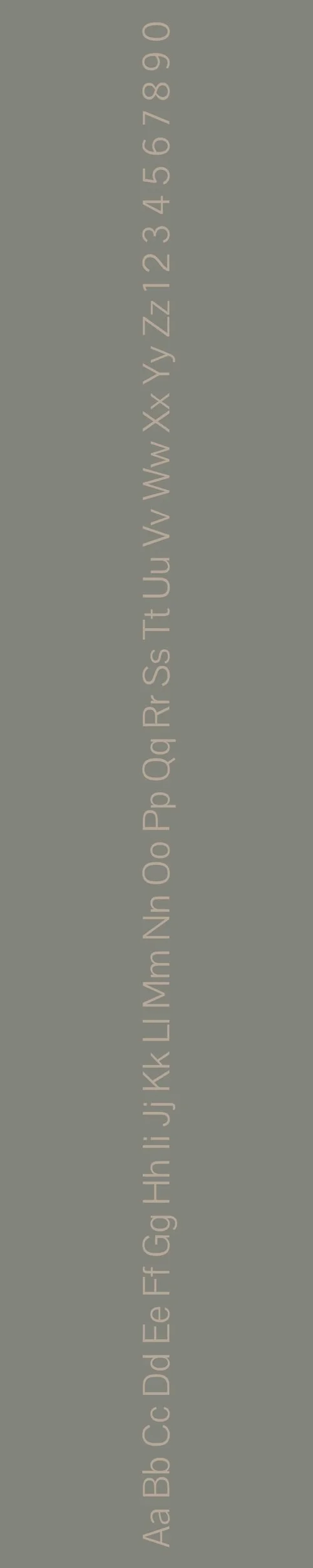
Pontano Sans
Overview:
Pontano Sans is a contemporary sans-serif typeface known for its clean, elegant, and approachable design. With its geometric shapes and slightly humanist curves, it offers high legibility and versatility, making it suitable for both print and digital environments.
History:
Pontano Sans was designed by the talented Italian type designer, Francesco Canovaro of the foundry Zetafonts. Released in 2013, the typeface was created with the aim of combining the simplicity of geometric sans-serifs with subtle humanistic qualities. The design was intended to be neutral, versatile, and modern, catering to a wide range of applications, from digital interfaces to branding and editorial work.
Characteristics:
Design: Pontano Sans features a geometric structure with clean, modern letterforms. It has open apertures and balanced proportions, making it highly legible at various sizes. The rounded corners and slightly humanist influence give it a warm, friendly appearance without compromising its professionalism. Its tall x-height adds to its clarity, making it ideal for both headlines and body text.
Usage: Perfect for use in logos, branding, websites, editorial layouts, and user interfaces. The clean, neutral design allows Pontano Sans to adapt to a variety of contexts, from formal corporate communications to more creative design projects. It’s suitable for both small and large text, offering excellent legibility in diverse applications.
Attributes: Versatile, modern, and highly legible. Pontano Sans is characterized by its minimalist aesthetic, yet its subtle curves and openness give it a friendly, approachable tone. It works well in both professional and creative settings, providing a perfect balance between function and form.

FONT PERSONALITY
-
FONT PERSONALITY -


Why Tenor Sans and Pontano Sans are a Match Made in Heaven:
The combination of Tenor Sans and Pontano Sans creates a harmonious contrast that blends assertive confidence with approachable warmth. Tenor Sans, with its bold, geometric, and fashionable design, makes an immediate impression, exuding modernity and strength. Its clean lines and dynamic presence make it perfect for headlines and impactful statements. Meanwhile, Pontano Sans offers a friendly and reliable foundation, providing easy readability with a soft, adaptable touch that complements Tenor Sans’ sharpness. Together, they create a balanced pairing that is both attention-grabbing and welcoming, ideal for designs that require both visual impact and user-friendly readability.
This pairing would resonate with someone who wants to convey both confidence and warmth in their personal brand. A professional who is bold and dynamic yet values approachability and clear communication would be drawn to this combination. This might be a person in a leadership position, such as an entrepreneur or executive, who wants to establish a strong, contemporary brand while remaining accessible and relatable to their audience. Their personal brand could reflect a balance of ambition and genuine connection, appealing to both high-profile clients and everyday consumers.

CELEBRITY MATCH
-
CELEBRITY MATCH -

The font pairing of Tenor Sans and Pontano Sans aligns perfectly with the character of Bella Swan, as portrayed by Kristen Stewart in the movie "Twilight (2008)".
Summary: Kristen Stewart's portrayal of Bella Swan in Twilight embodies the key traits of Tenor Sans and Pontano Sans. Her journey of self-discovery and growth mirrors the boldness of Tenor Sans, while her approachable and relatable nature aligns with the welcoming, friendly tone of Pontano Sans. This dynamic combination of assertiveness and warmth makes Kristen Stewart's Bella Swan the perfect match for this font pairing.

HIERARCHY
-
HIERARCHY -

Font Hierarchy for Tenor Sans and Pontano Sans:
Logo
Usage: Primary logo text, initials, brand name
Tenor Sans, Regular, 48-60 pt (Canva), 36-48 px (Squarespace)
Heading (H1)
Usage: Main headings on pages, prominent titles
Tenor Sans, Regular, 36-48 pt (Canva), 28-36 px (Squarespace)
Subtitle / Secondary Heading (H2)
Usage: Section titles, important subtitles
Pontano Sans, Regular or Medium, 24-30 pt (Canva), 20-24 px (Squarespace)
Subheading (H3)
Usage: Subsection headings, less prominent titles
Pontano Sans, Regular, 18-24 pt (Canva), 16-20 px (Squarespace)
Paragraph / Body Copy (P)
Usage: Main body text, paragraphs, descriptions
Pontano Sans, Regular, 12-16 pt (Canva), 14-16 px (Squarespace)