MEET YOUR FONT PAIRING MATCH
This page is your custom breakdown of the font pairing you were matched with from the Find Your Font Quiz. You’ll discover the history, personality, and style of each font—and see how they can come to life in your personal brand.
If you're a Personal Branding Studio member:
Bookmark this page. We’ll return to it in Part 2 when it’s time to use your font pairing to design your logo and create branded Canva graphics.
Not loving this particular combo? No problem. Explore all 100+ font pairings inside PBS - Part 1, Module 4: Design - to find one that feels just right. Click the button below to go there now.
Not yet a Personal Branding Studio member?
(And wondering what Personal Branding Studio even is?)
Start by scrolling through your results below. At the bottom of this page, you’ll find out how to go deeper with your personal brand through my full Personal Branding Studio program.
And your aligned font pairing match is…
HISTORY
-
HISTORY -
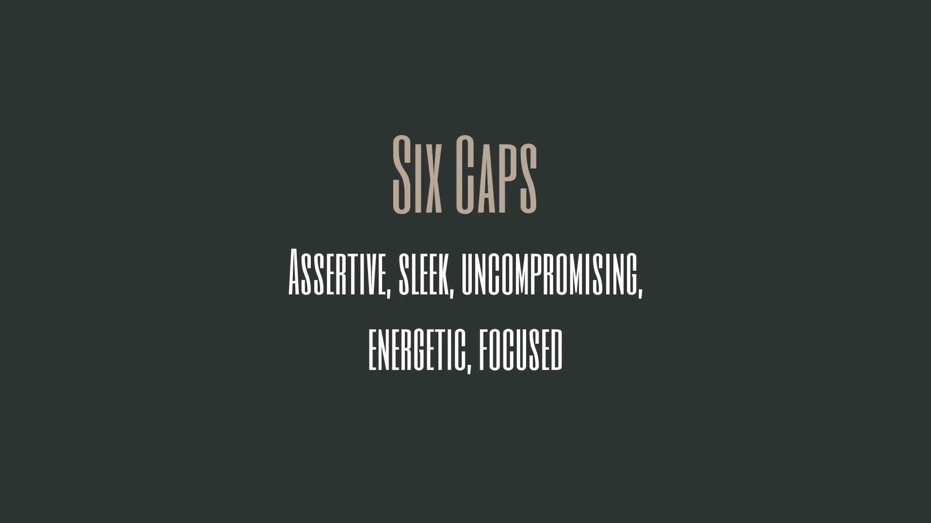
Six Caps
Overview:
Six Caps is a distinctive, all-caps sans-serif typeface known for its bold, geometric structure and high impact. It has a modern and somewhat industrial feel, making it ideal for designs that require a strong, authoritative presence.
History:
Six Caps was designed by the Canadian type designer, Ralph du Carrois, and released through the type foundry, Typotheque, in 2010. Du Carrois created Six Caps with the aim of providing a typeface that works well for short texts, headlines, and branding. The font is characterized by its clean, angular forms and geometric approach, and it was developed as a solution for strong typographic statements that still maintain legibility.
Characteristics:
Design: Six Caps features a geometric sans-serif design with a focus on sharp, clean lines and well-defined shapes. The typeface only includes uppercase letters, contributing to its bold, impactful presence. The letterforms are characterized by minimal curves and straight edges, which give the font a mechanical, modern appearance.
Usage: Ideal for headlines, posters, branding, and signage, Six Caps excels in situations where emphasis and strong visual impact are necessary. Its all-caps structure makes it perfect for short phrases, titles, and logos, and it works particularly well in environments where boldness is a priority.
Attributes: Highly legible at large sizes, Six Caps is clean, bold, and modern. It is best used for attention-grabbing applications such as headlines, logos, and posters, where its minimalist, angular design can shine. The font is best suited for projects that require a contemporary, structured, and direct typographic statement.
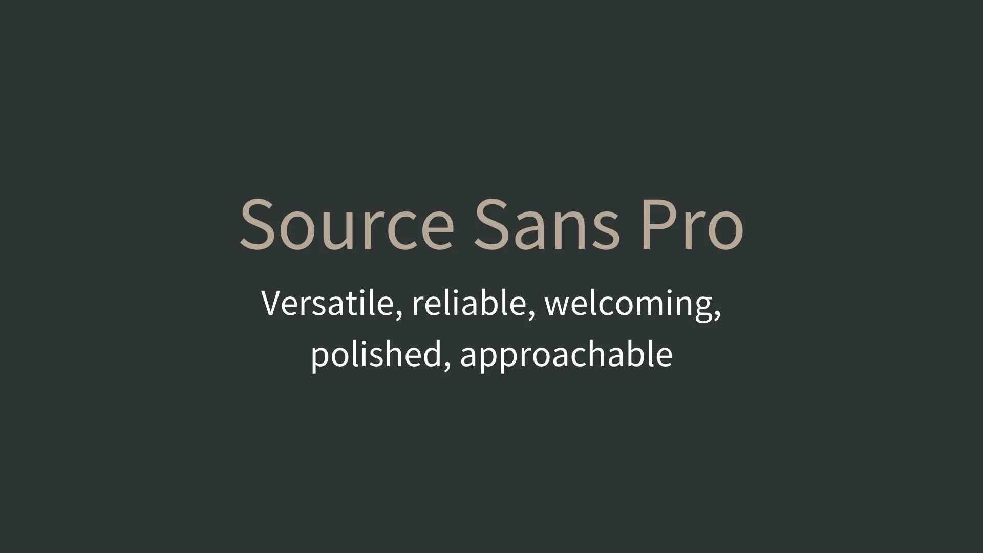
Source Sans Pro
Overview:
Source Sans Pro is a versatile, modern sans-serif typeface designed with clarity and legibility in mind. Its clean and straightforward design makes it an excellent choice for a wide range of digital and print applications, from user interfaces to editorial design.
History:
Source Sans Pro was designed by Paul D. Hunt for Adobe Systems and released in 2012 as the first open-source typeface family from Adobe. The project aimed to create a functional and highly legible typeface for user interfaces, websites, and other digital applications. Hunt drew on principles of clarity and neutrality, while giving the font a contemporary feel suitable for a wide range of uses. It was designed to be available for free, with an open-source license, allowing designers worldwide to integrate it into their projects without restrictions.
Characteristics:
Design: Source Sans Pro features a clean, geometric structure with a humanist touch. The letterforms are open and easily distinguishable, contributing to high legibility in both small and large sizes. The design includes subtle curves and a balanced x-height, giving the font a friendly and approachable appearance.
Usage: Perfect for user interfaces, websites, editorial design, and corporate branding, Source Sans Pro excels in both digital and print media. Its versatility makes it suitable for body text, captions, headlines, and user interface elements, offering high readability in a variety of contexts.
Attributes: Neutral, legible, and highly functional. Source Sans Pro’s open and balanced design makes it perfect for extended reading and smaller text sizes. Its clear, straightforward approach gives it a timeless quality, while its free availability ensures widespread use across many different platforms.
FONT PERSONALITY
-
FONT PERSONALITY -
Why Six Caps and Source Sans Pro are a Match Made in Heaven:
The combination of Six Caps and Source Sans Pro creates a balanced and dynamic duo that blends assertiveness with accessibility. Six Caps makes a bold, commanding statement with its geometric sharpness and high energy, demanding attention and creating a memorable presence. In contrast, Source Sans Pro provides a calming, reliable counterpart with its versatile, welcoming, and polished qualities. This creates a perfect harmony, as the boldness of Six Caps draws in the viewer, while Source Sans Pro ensures clarity and approachability, making the pairing both striking and functional.
This font pairing would be ideal for a person who is confident, direct, and unafraid to stand out, yet values reliability and inclusivity. The individual using this combination for their personal brand might be someone who is a leader in a creative or entrepreneurial field—perhaps a founder or a visionary who exudes energy and purpose, but also understands the importance of clear communication and approachability. They are likely someone who wants their brand to reflect both bold ambition and trustworthiness, appealing to a wide audience while maintaining an unmistakable presence.
CELEBRITY MATCH
-
CELEBRITY MATCH -
The font pairing of Six Caps and Source Sans Pro aligns perfectly with the character of Evelyn Salt, as portrayed by Angelina Jolie in the movie "Salt (2010)".
Summary: Angelina Jolie's portrayal of Evelyn Salt in Salt is the perfect embodiment of the Six Caps and Source Sans Pro font pairing. Like Six Caps, Salt is bold, assertive, and uncompromising, standing out in every scene with a commanding presence. Her energy, sleekness, and purposeful actions are mirrored in Six Caps' sharp, focused design. However, much like Source Sans Pro, Salt is adaptable, able to seamlessly transition between different roles and personas, and always maintains a calm, reliable, and approachable nature, even when the stakes are high. Together, Six Caps and Source Sans Pro are complementary, just like Salt’s duality of intensity and calm, strength and adaptability. This font pairing underscores Salt’s ability to grab attention, while also ensuring that her mission—and her personal integrity—are communicated with clarity and precision.
HIERARCHY
-
HIERARCHY -
Font Hierarchy for Six Caps and Source Sans Pro:
Logo
Usage: Primary logo text, initials, brand name
Six Caps , Regular, 120-150 pt (Canva), 72-90 px (Squarespace)
Heading (H1)
Usage: Main headings on pages, prominent titles
Six Caps, Regular, 48-60 pt (Canva), 36-48 px (Squarespace)
Subtitle / Secondary Heading (H2)
Usage: Section titles, important subtitles
Source Sans Pro, Bold, 36-48 pt (Canva), 30-36 px (Squarespace)
Subheading (H3)
Usage: Subsection headings, less prominent titles
Source Code Pro, Regular, 24-30 pt (Canva), 24-30 px (Squarespace)
Paragraph / Body Copy (P)
Usage: Main body text, paragraphs, descriptions
Source Sans Pro, Regular, 16-18 pt (Canva), 16-18 px (Squarespace)


