MEET YOUR FONT PAIRING MATCH
This page is your custom breakdown of the font pairing you were matched with from the Find Your Font Quiz. You’ll discover the history, personality, and style of each font—and see how they can come to life in your personal brand.
If you're a Personal Branding Studio member:
Bookmark this page. We’ll return to it in Part 2 when it’s time to use your font pairing to design your logo and create branded Canva graphics.
Not loving this particular combo? No problem. Explore all 100+ font pairings inside PBS - Part 1, Module 4: Design - to find one that feels just right. Click the button below to go there now.
Not yet a Personal Branding Studio member?
(And wondering what Personal Branding Studio even is?)
Start by scrolling through your results below. At the bottom of this page, you’ll find out how to go deeper with your personal brand through my full Personal Branding Studio program.
And your aligned font pairing match is…

HISTORY
-
HISTORY -
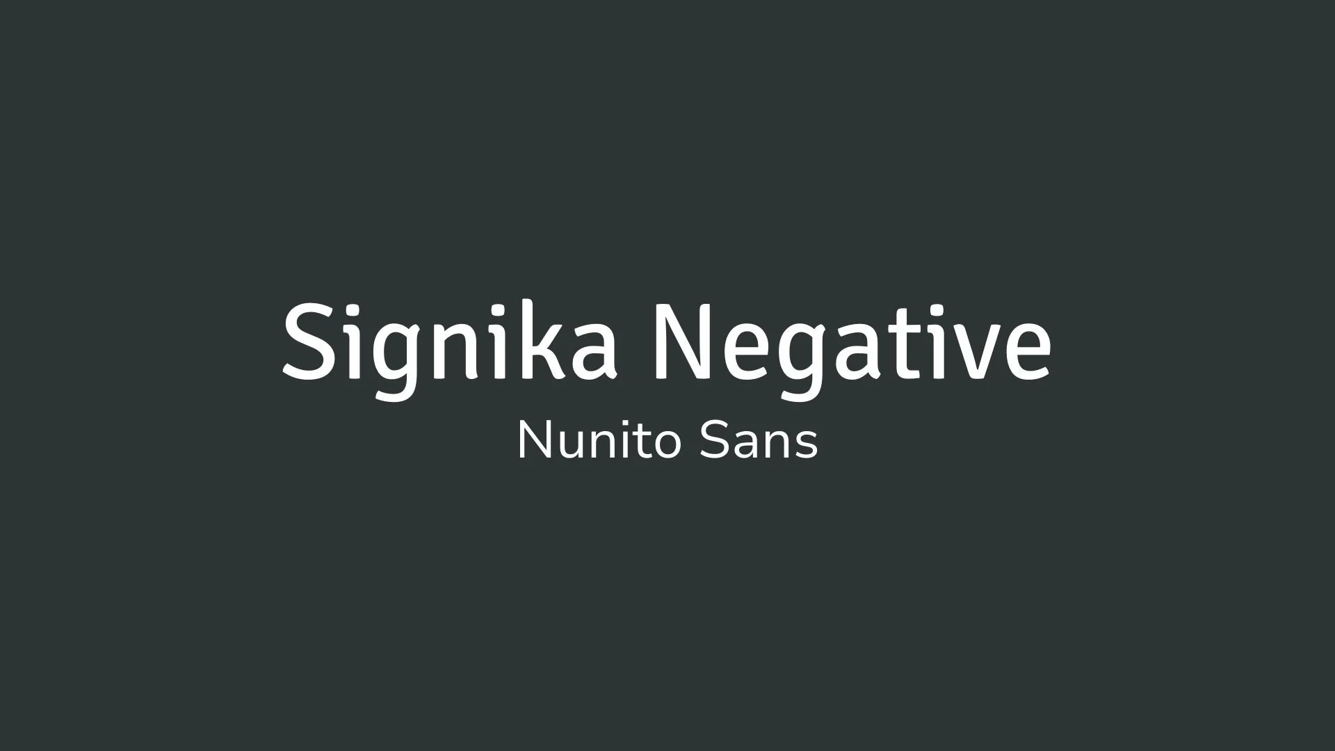
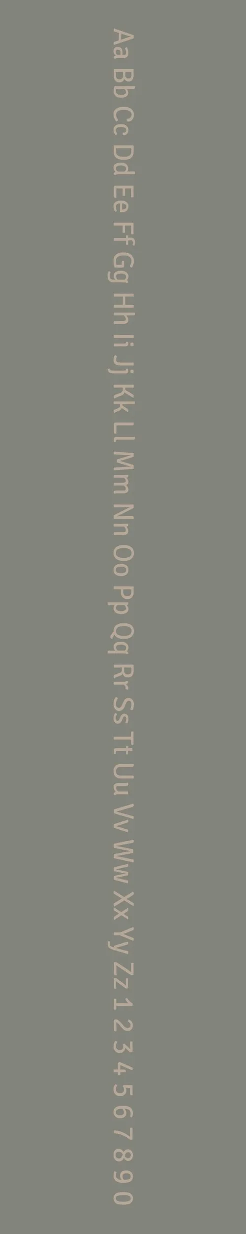
Signika Negative
Overview:
Signika Negative is a contemporary sans-serif typeface known for its strong legibility and modern, clean lines. It is part of the Signika family, designed specifically for use in signage and wayfinding systems, offering clarity and readability in both small and large sizes.
History:
Signika Negative was designed by the Croatian type designer Indira Paliy for the type foundry TPTQ Arabic. Released in 2015, it is a companion to the original Signika, which was first developed for signs and wayfinding systems. The Negative version was created with the intention of offering a versatile, highly legible font with more robust contrast, making it suitable for use in various digital and print environments where high visibility is important, such as public signage and user interfaces.
Characteristics:
Design: Signika Negative has clean, geometric letterforms with a slightly condensed structure. The "Negative" version features higher contrast between thick and thin strokes, which enhances legibility, particularly in low-contrast or smaller sizes. The font's rounded corners and open apertures contribute to its clarity and approachable aesthetic.
Usage: Perfect for signage, user interfaces, and any environment where clear communication is crucial, Signika Negative excels in both digital and print formats. Its versatile design makes it a great choice for websites, apps, headlines, and wayfinding systems, particularly in environments with high foot traffic or varying lighting conditions.
Attributes: Highly legible, modern, and functional. Its increased contrast makes it stand out in challenging conditions, while its geometric and rounded forms provide a friendly, approachable appearance. With a variety of weights and styles, Signika Negative is a versatile choice for a wide range of design needs.
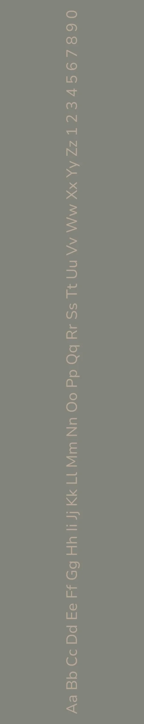
Nunito Sans
Overview:
Nunito Sans is a modern, friendly sans-serif typeface known for its round, smooth curves and balanced proportions. With its highly legible design, Nunito Sans is ideal for both digital and print use, offering a clean, approachable style that maintains readability across various media.
History:
Nunito Sans was designed by Vernon Adams and released in 2014 as part of the Google Fonts library. Originally, the Nunito typeface was a rounded version of the classic sans-serif, designed to be highly legible in digital environments. Nunito Sans emerged as an extension of this original font, with more refined proportions and a comprehensive range of weights to cater to a variety of design needs. Its primary goal was to offer a versatile, contemporary sans-serif typeface that could work across multiple languages and user interfaces while maintaining a warm, friendly tone.
Characteristics:
Design: Nunito Sans features rounded terminals and a clean, geometric structure. Its soft curves and well-balanced proportions give it an approachable, friendly appearance. The design is simple yet functional, making it suitable for a wide range of applications.
Usage: Ideal for user interfaces, websites, apps, and branding, Nunito Sans is also well-suited for headings, body text, and even print materials. Its clean and readable design works well in both small and large sizes, making it versatile for a variety of contexts.
Attributes: Highly legible, modern, and neutral, with a subtle warmth from its rounded forms. Its comprehensive range of weights and excellent legibility make it suitable for both text-heavy and display designs, while its friendly appearance ensures it remains approachable in any context.

FONT PERSONALITY
-
FONT PERSONALITY -


Why Signika Negative and Nunito Sans are a Match Made in Heaven:
The pairing of Signika Negative and Nunito Sans strikes the perfect balance between bold energy and approachable warmth. Signika Negative, with its dynamic and assertive nature, injects a vibrant, modern presence that grabs attention. It sets a strong tone in headlines and calls to action, while Nunito Sans brings a supportive, balanced touch that softens the boldness and adds a sense of harmony. The adaptability of Nunito Sans ensures that it complements Signika Negative beautifully, making the overall design both striking and easy to engage with. Together, they create a duo that is not only eye-catching but also comfortable, ensuring that the message is communicated clearly and confidently.
This font pairing would appeal to someone with a bold yet approachable personal brand—a professional who stands out in a crowd but values warmth and connection. The person using this combination is likely energetic and forward-thinking, someone who thrives in a modern, fast-paced environment, such as a startup founder, a creative consultant, or a digital marketer. They are confident and assertive in their approach but also highly attuned to building strong, inviting relationships, making them perfect for an industry where communication and connection are key to success.

CELEBRITY MATCH
-
CELEBRITY MATCH -

The font pairing of Signika Negative and Nunito Sans aligns perfectly with the character of Julia Sullivan, as portrayed by Drew Barrymore in the movie "Never Been Kissed (1999)".
Summary: Drew Barrymore’s portrayal of Julia Sullivan in Never Been Kissed embodies the complementary dynamics of Signika Negative and Nunito Sans. Julia is energetic, confident, and trendsetting (like Signika Negative), while also being warm, approachable, and supportive (like Nunito Sans). Together, these qualities create a character who is both impactful and relatable, much like how the font pairing balances boldness with warmth. The pairing of these fonts reflects Julia's journey from an outsider to a confident, loving woman who finds balance in her personal and professional life.

HIERARCHY
-
HIERARCHY -

Font Hierarchy for Signika Negative and Nunito Sans:
Logo
Usage: Primary logo text, initials, brand name
Signika Negative, Bold, 48-60 pt (Canva), 36-48 px (Squarespace)
Heading (H1)
Usage: Main headings on pages, prominent titles
Signika Negative, Regular, 36-48 pt (Canva), 24-36 px (Squarespace)
Subtitle / Secondary Heading (H2)
Usage: Section titles, important subtitles
Signika Negative, Regular, 28-36 pt (Canva), 20-24 px (Squarespace)
Subheading (H3)
Usage: Subsection headings, less prominent titles
Nunito Sans, Regular, 22-28 pt (Canva), 18-20 px (Squarespace)
Paragraph / Body Copy (P)
Usage: Main body text, paragraphs, descriptions
Nunito Sans, Regular, 12-16 pt (Canva), 14-16 px (Squarespace)