MEET YOUR FONT PAIRING MATCH
This page is your custom breakdown of the font pairing you were matched with from the Find Your Font Quiz. You’ll discover the history, personality, and style of each font—and see how they can come to life in your personal brand.
If you're a Personal Branding Studio member:
Bookmark this page. We’ll return to it in Part 2 when it’s time to use your font pairing to design your logo and create branded Canva graphics.
Not loving this particular combo? No problem. Explore all 100+ font pairings inside PBS - Part 1, Module 4: Design - to find one that feels just right. Click the button below to go there now.
Not yet a Personal Branding Studio member?
(And wondering what Personal Branding Studio even is?)
Start by scrolling through your results below. At the bottom of this page, you’ll find out how to go deeper with your personal brand through my full Personal Branding Studio program.
And your aligned font pairing match is…


HISTORY
-
HISTORY -
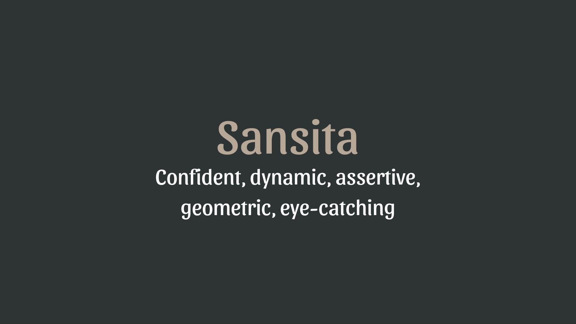
Sansita
Overview:
Sansita is a friendly and highly legible sans-serif typeface, combining geometric shapes with a humanist touch. Its playful yet functional design makes it perfect for both digital and print applications where clarity and modern aesthetics are key.
History:
Sansita was designed by Indian type designer and educator Satya Rajpurohit and released through the Indian type foundry (ITF) in 2013. It was created with the intention of providing a contemporary, accessible sans-serif font that worked well in both Latin and Devanagari scripts, reflecting Rajpurohit’s goal of creating typefaces that cater to diverse linguistic needs. The font was inspired by the need for a clean, legible typeface that could be used for user interfaces, branding, and editorial design, while also addressing the global need for fonts supporting Indian languages.
Characteristics:
Design: Sansita features a rounded, geometric structure with subtle curves that soften its otherwise modern and clean appearance. The typeface maintains an open and approachable feel, making it versatile across various design mediums.
Usage: Its clarity and legibility make Sansita suitable for a range of applications including web design, advertising, headlines, and branding, especially in contexts where a contemporary and friendly tone is desired. It’s also ideal for multilingual typography, particularly where both Latin and Devanagari are needed.
Attributes: Sansita is neutral yet warm, making it approachable and legible even at smaller sizes. Its clean lines, open counters, and balanced proportions enhance readability, while its geometric nature gives it a modern, professional look. The font also includes a wide range of weights, adding to its versatility.

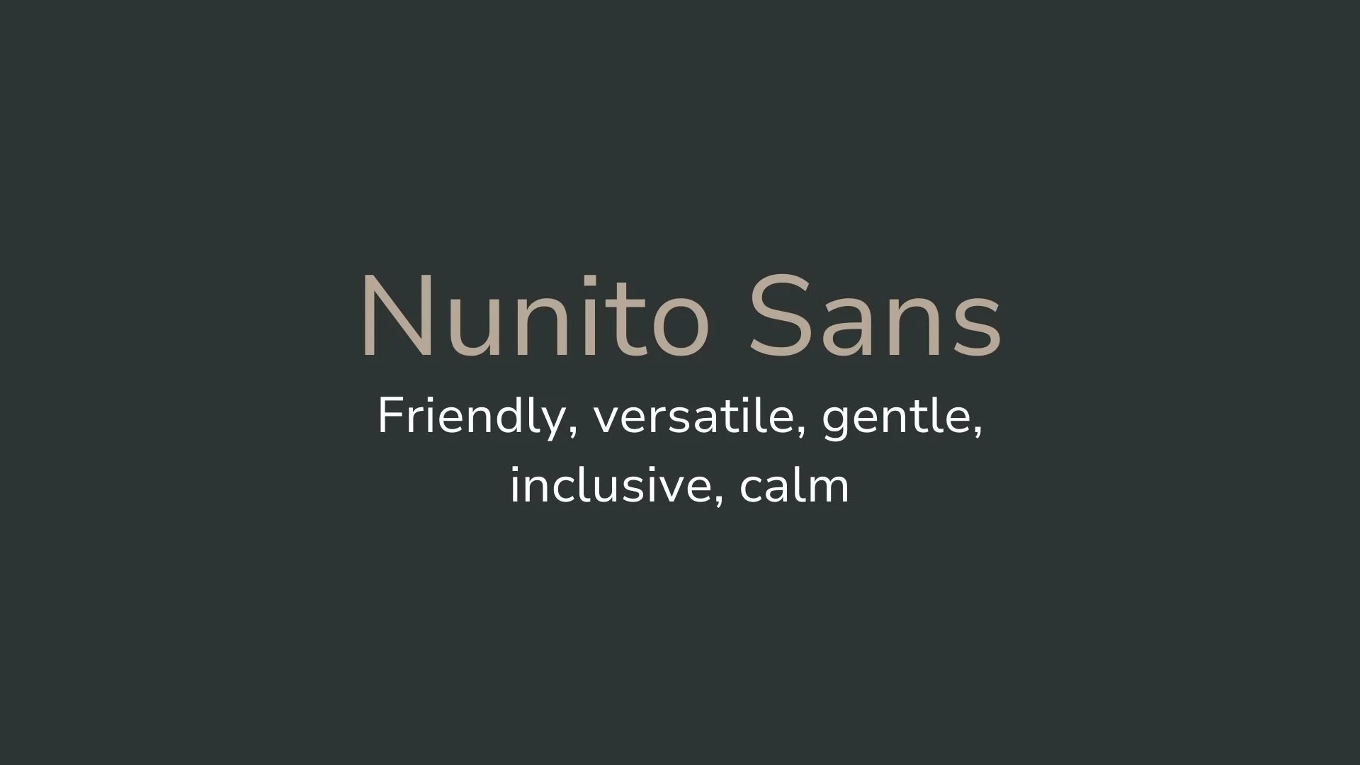
Nunito Sans
Overview:
Nunito Sans is a modern, friendly sans-serif typeface known for its round, smooth curves and balanced proportions. With its highly legible design, Nunito Sans is ideal for both digital and print use, offering a clean, approachable style that maintains readability across various media.
History:
Nunito Sans was designed by Vernon Adams and released in 2014 as part of the Google Fonts library. Originally, the Nunito typeface was a rounded version of the classic sans-serif, designed to be highly legible in digital environments. Nunito Sans emerged as an extension of this original font, with more refined proportions and a comprehensive range of weights to cater to a variety of design needs. Its primary goal was to offer a versatile, contemporary sans-serif typeface that could work across multiple languages and user interfaces while maintaining a warm, friendly tone.
Characteristics:
Design: Nunito Sans features rounded terminals and a clean, geometric structure. Its soft curves and well-balanced proportions give it an approachable, friendly appearance. The design is simple yet functional, making it suitable for a wide range of applications.
Usage: Ideal for user interfaces, websites, apps, and branding, Nunito Sans is also well-suited for headings, body text, and even print materials. Its clean and readable design works well in both small and large sizes, making it versatile for a variety of contexts.
Attributes: Highly legible, modern, and neutral, with a subtle warmth from its rounded forms. Its comprehensive range of weights and excellent legibility make it suitable for both text-heavy and display designs, while its friendly appearance ensures it remains approachable in any context.


FONT PERSONALITY
-
FONT PERSONALITY -
Why Sansita and Nunito Sans are a Match Made in Heaven:
The pairing of Sansita and Nunito Sans brings together the best of both boldness and warmth, creating a dynamic yet approachable visual experience. Sansita’s confident and assertive personality makes a strong first impression with its geometric structure and eye-catching style. It stands out boldly, making it perfect for headlines or key statements that need to grab attention. Meanwhile, Nunito Sans balances this with its gentle, friendly demeanor, ensuring that the overall design feels welcoming and inclusive. The smooth, rounded edges of Nunito Sans soften the strength of Sansita, making this pairing both striking and approachable, with a perfect harmony between confidence and comfort.
This font pairing would be ideal for someone who is confident, approachable, and values both impact and inclusivity in their personal brand. The individual using this combination is likely a leader who is not afraid to make bold moves but also knows the importance of creating an inviting and calm environment for others. This person might work in fields like creative entrepreneurship, marketing, or leadership roles where both the ability to capture attention and foster relationships are key. They could be a brand strategist, motivational speaker, or a founder of a company that prides itself on making big moves while staying grounded and approachable.

CELEBRITY MATCH
-
CELEBRITY MATCH -

The font pairing of Sansita and Nunito Sans aligns perfectly with the character of Jyn Erso, as portrayed by Felicity Jones in the movie "Rogue One: A Star Wars Story".
Summary: Felicity Jones as Jyn Erso in Rogue One perfectly embodies the traits of the Sansita and Nunito Sans font pairing. Sansita mirrors Jyn’s bold leadership, decisiveness, and impactful presence, while Nunito Sans reflects her approachable, inclusive, and calming demeanor. This pairing is ideal for projects that require both strong authority and welcoming accessibility, much like Jyn Erso's role in leading a diverse group to confront overwhelming odds. The combination of these fonts, like Jyn, creates a compelling balance of strength and warmth, ensuring both attention and connection.

HIERARCHY
-
HIERARCHY -
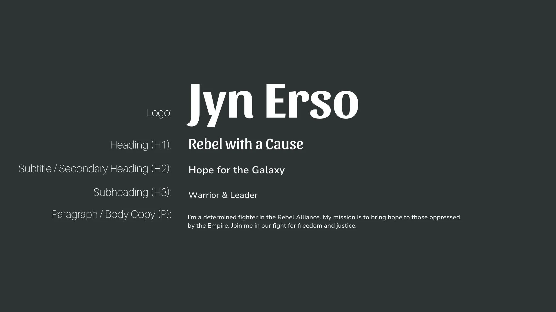
Font Hierarchy for Sansita and Nunito Sans:
Logo
Usage: Primary logo text, initials, brand name
Sansita, Bold, 48-60 px (Canva), 36-48 px (Squarespace)
Heading (H1)
Usage: Main headings on pages, prominent titles
Sansita, Regular, 36-48 px (Canva), 30-40 px (Squarespace)
Subtitle / Secondary Heading (H2)
Usage: Section titles, important subtitles
Nunito Sans, Semi-Bold, 24-36 px (Canva), 20-30 px (Squarespace)
Subheading (H3)
Usage: Subsection headings, less prominent titles
Nunito Sans, Regular, 18-24 px (Canva), 16-20 px (Squarespace)
Paragraph / Body Copy (P)
Usage: Main body text, paragraphs, descriptions
Nunito Sans, Regular, 12-16 px (Canva), 14-16 px (Squarespace)