MEET YOUR FONT PAIRING MATCH
This page is your custom breakdown of the font pairing you were matched with from the Find Your Font Quiz. You’ll discover the history, personality, and style of each font—and see how they can come to life in your personal brand.
If you're a Personal Branding Studio member:
Bookmark this page. We’ll return to it in Part 2 when it’s time to use your font pairing to design your logo and create branded Canva graphics.
Not loving this particular combo? No problem. Explore all 100+ font pairings inside PBS - Part 1, Module 4: Design - to find one that feels just right. Click the button below to go there now.
Not yet a Personal Branding Studio member?
(And wondering what Personal Branding Studio even is?)
Start by scrolling through your results below. At the bottom of this page, you’ll find out how to go deeper with your personal brand through my full Personal Branding Studio program.
And your aligned font pairing match is…

HISTORY
-
HISTORY -
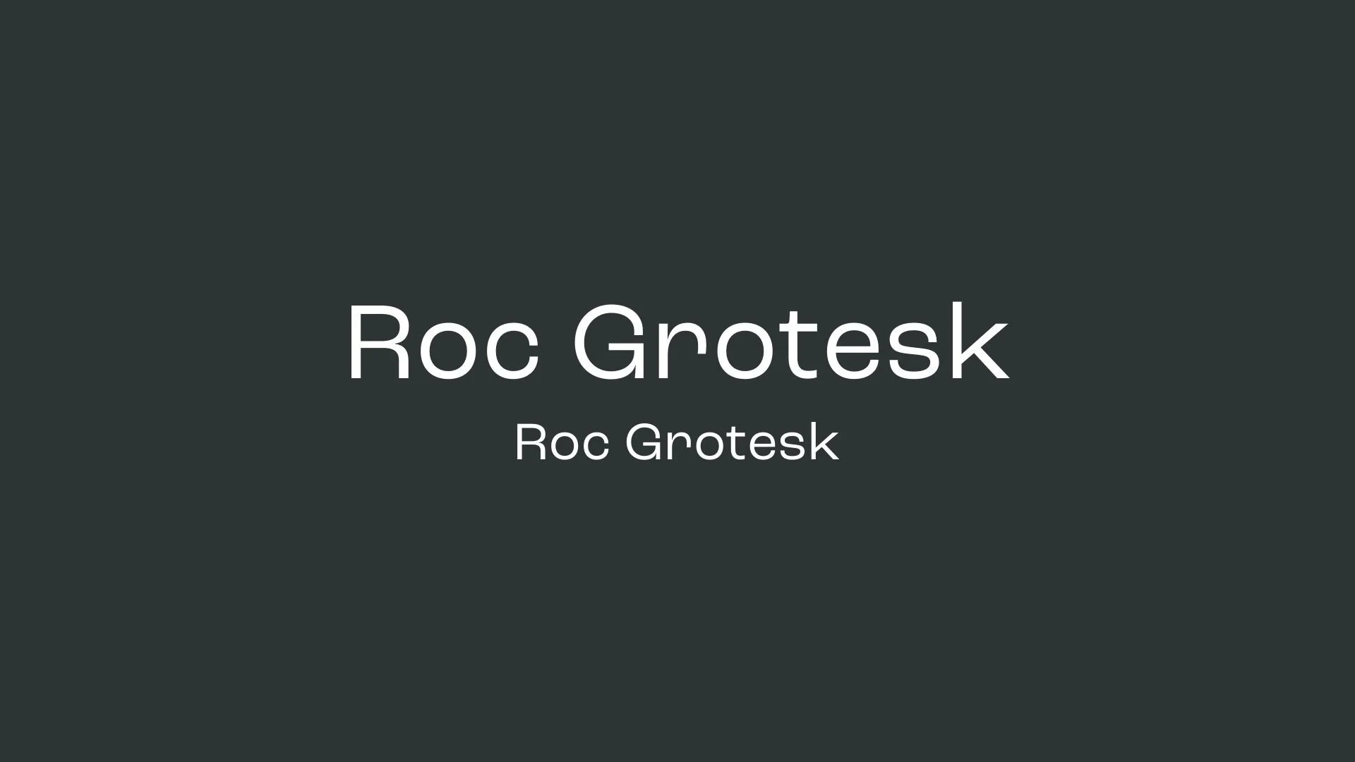
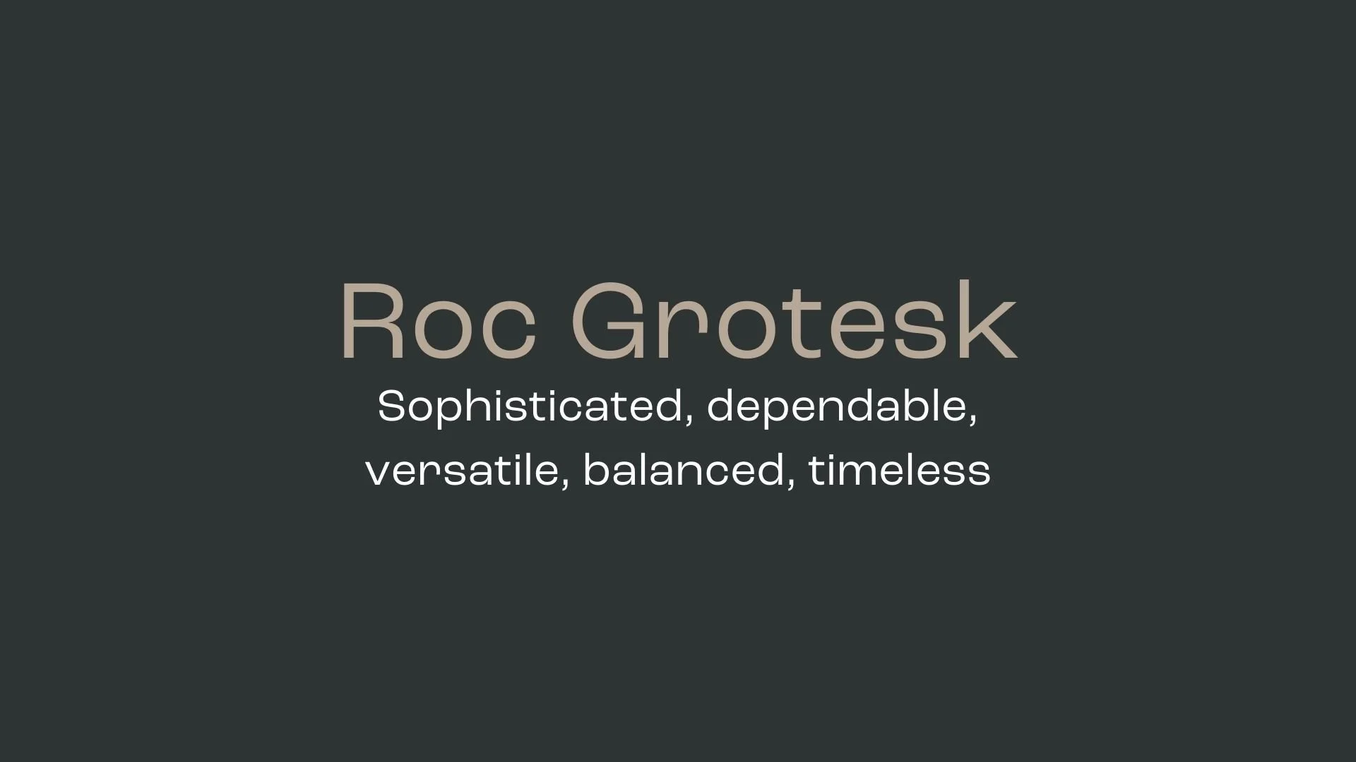
Roc Grotesk
Overview:
Roc Grotesk is a bold, versatile sans-serif typeface inspired by 19th-century American wood types. It captures a striking balance between industrial sturdiness and visual refinement, making it suitable for a broad range of creative applications, from editorial design to branding projects.
History:
Roc Grotesk was created by Nikolay Petroussenko and released through the independent type foundry Konstantynov Studio. Drawing influence from the distinct letterforms of historical grotesques, this font was designed to update the sturdy charm of wood type for the modern era, offering extensive flexibility through a diverse set of weights and widths.
Characteristics:
Design: Roc Grotesk features clean, geometrically shaped letterforms with a large x-height and a low contrast in its lighter weights. Heavier weights exhibit more pronounced contrast, lending them a dynamic, impactful look well-suited for display purposes.
Usage: The font’s range of widths—Compressed, Condensed, Normal, Wide, and ExtraWide—makes it ideal for both large-scale headings and compact designs. It works exceptionally well for editorial layouts, posters, and logos.
Attributes: With nine weights in five widths (45 styles in total), Roc Grotesk supports a broad character set including Western and Central European languages, providing a strong sense of functionality across various settings and design needs. The design also includes stylistic alternates, such as a single-story “g” and a cut-off “r,” giving designers flexibility to achieve the ideal look in grotesque typography.


FONT PERSONALITY
-
FONT PERSONALITY -
Why Abel and Source Code Pro are a Match Made in Heaven:
When the personalities of Abel and Source Code Pro are combined, the result is a pairing that is both approachable and functional. Abel brings a modern and professional touch with a hint of warmth, making it suitable for headlines and logos that need to be both eye-catching and versatile. On the other hand, Source Code Pro’s precise and technical nature grounds the pairing, ensuring that the overall design remains clear and unambiguous, especially in detailed or complex content.
Together, these fonts would appeal to a person who is both practical and modern—a tech-savvy individual who values clarity and precision but also appreciates subtle design aesthetics. This person might be someone who works in a creative tech industry, blending innovation with functionality, such as a designer-developer hybrid who values both form and function in their work.

CELEBRITY MATCH
-
CELEBRITY MATCH -

The font Roc Grotesk aligns perfectly with the character of Linda Tripp, as portrayed by Sarah Paulson in the movie "American Crime Story: Impeachment".
Summary: Sarah Paulson's portrayal of Linda Tripp in American Crime Story: Impeachment aligns seamlessly with the characteristics of the Roc Grotesk font. Both Tripp and Roc Grotesk exhibit clean, modern, and balanced traits, with a timeless appeal that bridges past and present. Paulson’s ability to portray a versatile, pragmatic character whose actions remain relevant speaks to the flexibility and creative yet practical nature of Roc Grotesk. This makes her the perfect fit for this font.

HIERARCHY
-
HIERARCHY -
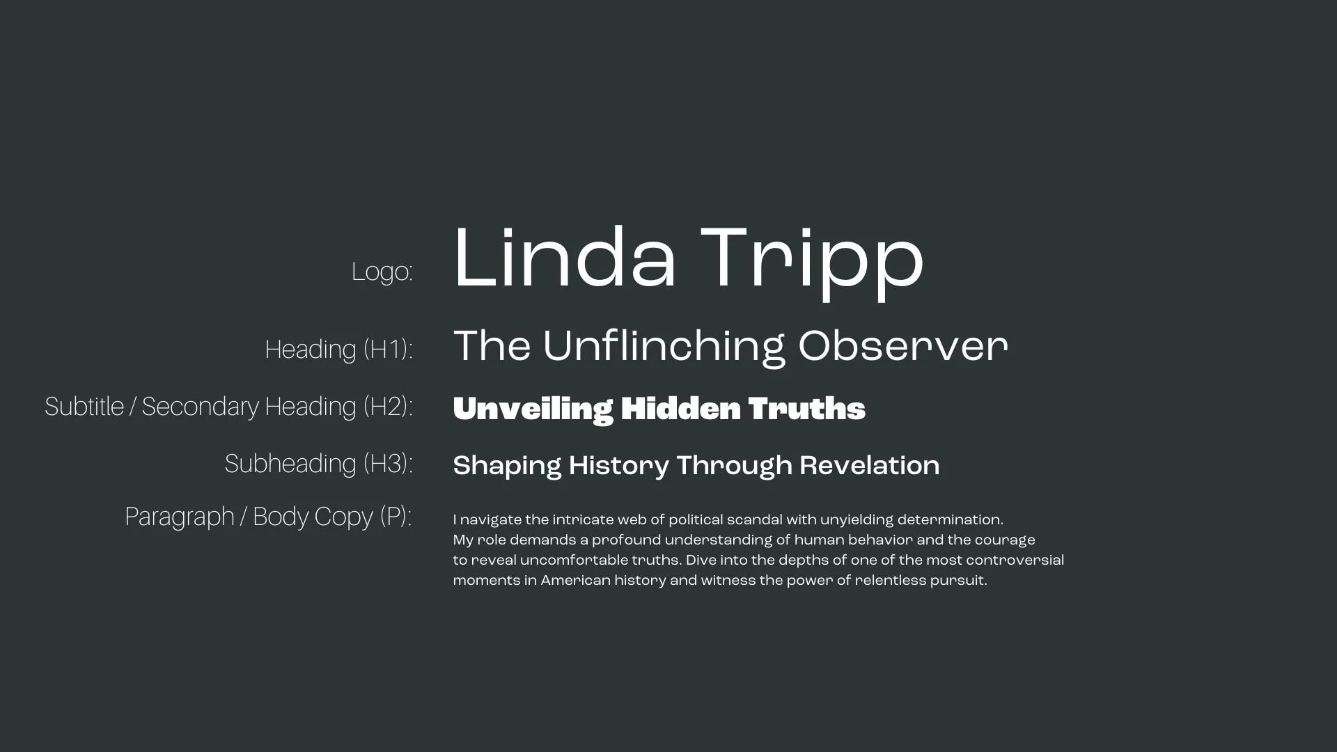
Font Hierarchy for Roc Grotesk:
Logo
Usage: Primary logo text, initials, brand name
Roc Grotesk , Regular, 60pt (Canva), 60pt (Squarespace)
Heading (H1)
Usage: Main headings on pages, prominent titles
Roc Grotesk , Regular, 48pt (Canva), 48pt (Squarespace)
Subtitle / Secondary Heading (H2)
Usage: Section titles, important subtitles
Roc Grotesk, Black, 36pt (Canva), 36pt (Squarespace)
Subheading (H3)
Usage: Subsection headings, less prominent titles
Roc Grotesk, Medium, 28pt (Canva), 28pt (Squarespace)
Paragraph / Body Copy (P)
Usage: Main body text, paragraphs, descriptions
Roc Grotesk, Regular, 16pt (Canva), 16pt (Squarespace)