MEET YOUR FONT PAIRING MATCH
This page is your custom breakdown of the font pairing you were matched with from the Find Your Font Quiz. You’ll discover the history, personality, and style of each font—and see how they can come to life in your personal brand.
If you're a Personal Branding Studio member:
Bookmark this page. We’ll return to it in Part 2 when it’s time to use your font pairing to design your logo and create branded Canva graphics.
Not loving this particular combo? No problem. Explore all 100+ font pairings inside PBS - Part 1, Module 4: Design - to find one that feels just right. Click the button below to go there now.
Not yet a Personal Branding Studio member?
(And wondering what Personal Branding Studio even is?)
Start by scrolling through your results below. At the bottom of this page, you’ll find out how to go deeper with your personal brand through my full Personal Branding Studio program.
And your aligned font pairing match is…

HISTORY
-
HISTORY -
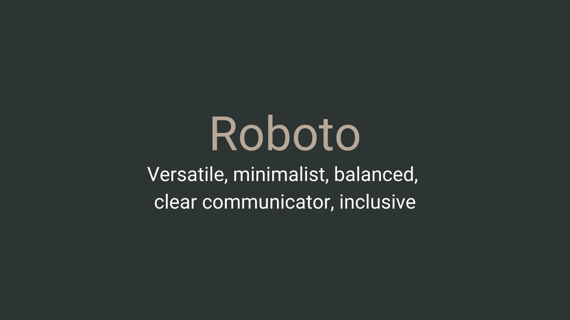
Roboto
Overview:
Roboto is a popular sans-serif typeface known for its clean, modern, and geometric appearance, making it ideal for digital interfaces and mobile applications. It strikes a balance between mechanical structure and friendly readability, widely adopted by Google and Android platforms.
History:
Roboto was created by Christian Robertson, a Google designer, and released in 2011 as part of Android’s Ice Cream Sandwich update. It was developed to be the default system font for Android, emphasizing readability and versatility on small screens. Over time, Roboto has expanded beyond Android, becoming available for free on Google Fonts, where it’s a top choice for designers due to its open-source nature and wide range of styles.
Characteristics:
Design: Roboto combines geometric shapes with a humanistic feel, giving it a professional yet accessible aesthetic. The font has smooth, open curves and slightly rounded terminals, lending warmth to its otherwise clean lines.
Usage: Roboto is ideal for UI/UX design, websites, and mobile apps due to its excellent legibility on screens of all sizes. Its adaptability also makes it suitable for various applications in print and digital media.
Attributes: Roboto is highly versatile, featuring a broad family of weights and styles (e.g., Roboto Regular, Light, Bold, and Condensed). This range allows designers to create cohesive layouts and typographic hierarchies without switching font families, ensuring consistent brand presentation across platforms.


FONT PERSONALITY
-
FONT PERSONALITY -
Why Abel and Source Code Pro are a Match Made in Heaven:
When the personalities of Abel and Source Code Pro are combined, the result is a pairing that is both approachable and functional. Abel brings a modern and professional touch with a hint of warmth, making it suitable for headlines and logos that need to be both eye-catching and versatile. On the other hand, Source Code Pro’s precise and technical nature grounds the pairing, ensuring that the overall design remains clear and unambiguous, especially in detailed or complex content.
Together, these fonts would appeal to a person who is both practical and modern—a tech-savvy individual who values clarity and precision but also appreciates subtle design aesthetics. This person might be someone who works in a creative tech industry, blending innovation with functionality, such as a designer-developer hybrid who values both form and function in their work.

CELEBRITY MATCH
-
CELEBRITY MATCH -
The font Roboto aligns perfectly with the character of Claire Sudbrook, as portrayed by Laura Dern in the movie "Big Little Lies".
Summary: Laura Dern’s portrayal of Claire Sudbrook in Big Little Lies embodies the versatile, balanced, and clear communicator traits that define the Roboto font. Just as Roboto’s clean, neutral, and adaptable design ensures clarity and global appeal, Claire Sudbrook’s ability to navigate multiple roles and handle complex situations with calm efficiency mirrors these characteristics. Both the font and the character display a minimalist elegance, clarity in communication, and a broad, inclusive reach, making Laura Dern’s Claire Sudbrook a perfect fit for this font pairing.

HIERARCHY
-
HIERARCHY -
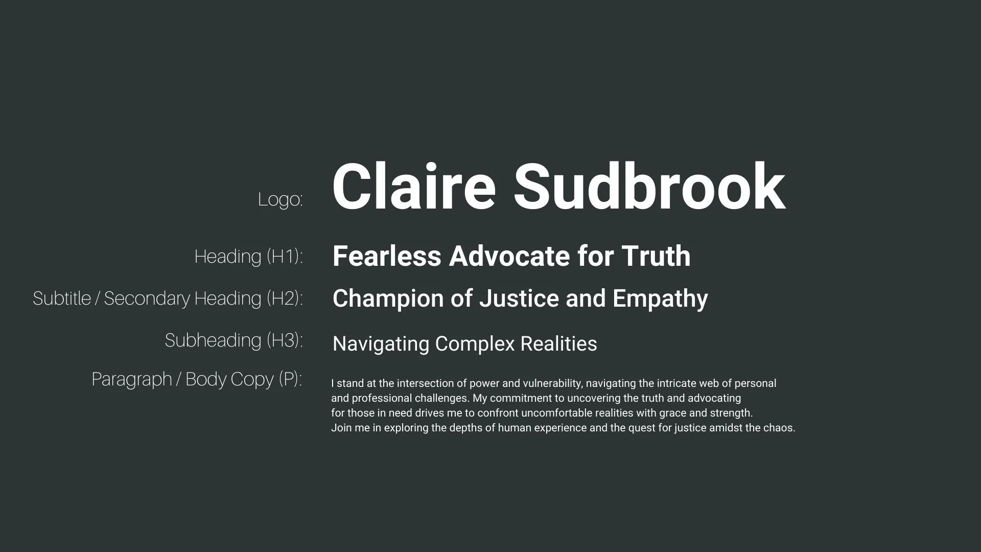
Font Hierarchy for Roboto:
Logo
Usage: Primary logo text, initials, brand name
Roboto, Bold, 72 pt or larger (Canva), 48-72 px (Squarespace)
Heading (H1)
Usage: Main headings on pages, prominent titles
Roboto, Bold, 42 pt (Canva), 36-48 px (Squarespace)
Subtitle / Secondary Heading (H2)
Usage: Section titles, important subtitles
Roboto, Medium, 36 pt (Canva), 30-36 px (Squarespace)
Subheading (H3)
Usage: Subsection headings, less prominent titles
Roboto, Regular, 30 pt (Canva), 24-30 px (Squarespace)
Paragraph / Body Copy (P)
Usage: Main body text, paragraphs, descriptions
Roboto, Regular, 16-18 pt (Canva), 16-18 px (Squarespace)