MEET YOUR FONT PAIRING MATCH
This page is your custom breakdown of the font pairing you were matched with from the Find Your Font Quiz. You’ll discover the history, personality, and style of each font—and see how they can come to life in your personal brand.
If you're a Personal Branding Studio member:
Bookmark this page. We’ll return to it in Part 2 when it’s time to use your font pairing to design your logo and create branded Canva graphics.
Not loving this particular combo? No problem. Explore all 100+ font pairings inside PBS - Part 1, Module 4: Design - to find one that feels just right. Click the button below to go there now.
Not yet a Personal Branding Studio member?
(And wondering what Personal Branding Studio even is?)
Start by scrolling through your results below. At the bottom of this page, you’ll find out how to go deeper with your personal brand through my full Personal Branding Studio program.
And your aligned font pairing match is…

HISTORY
-
HISTORY -
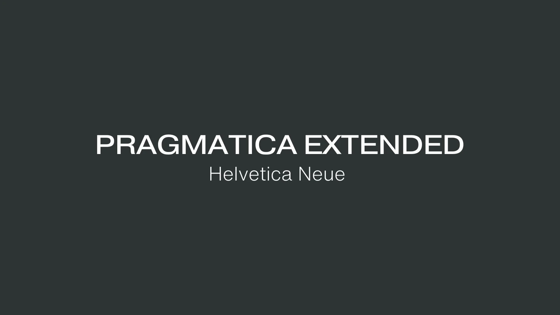
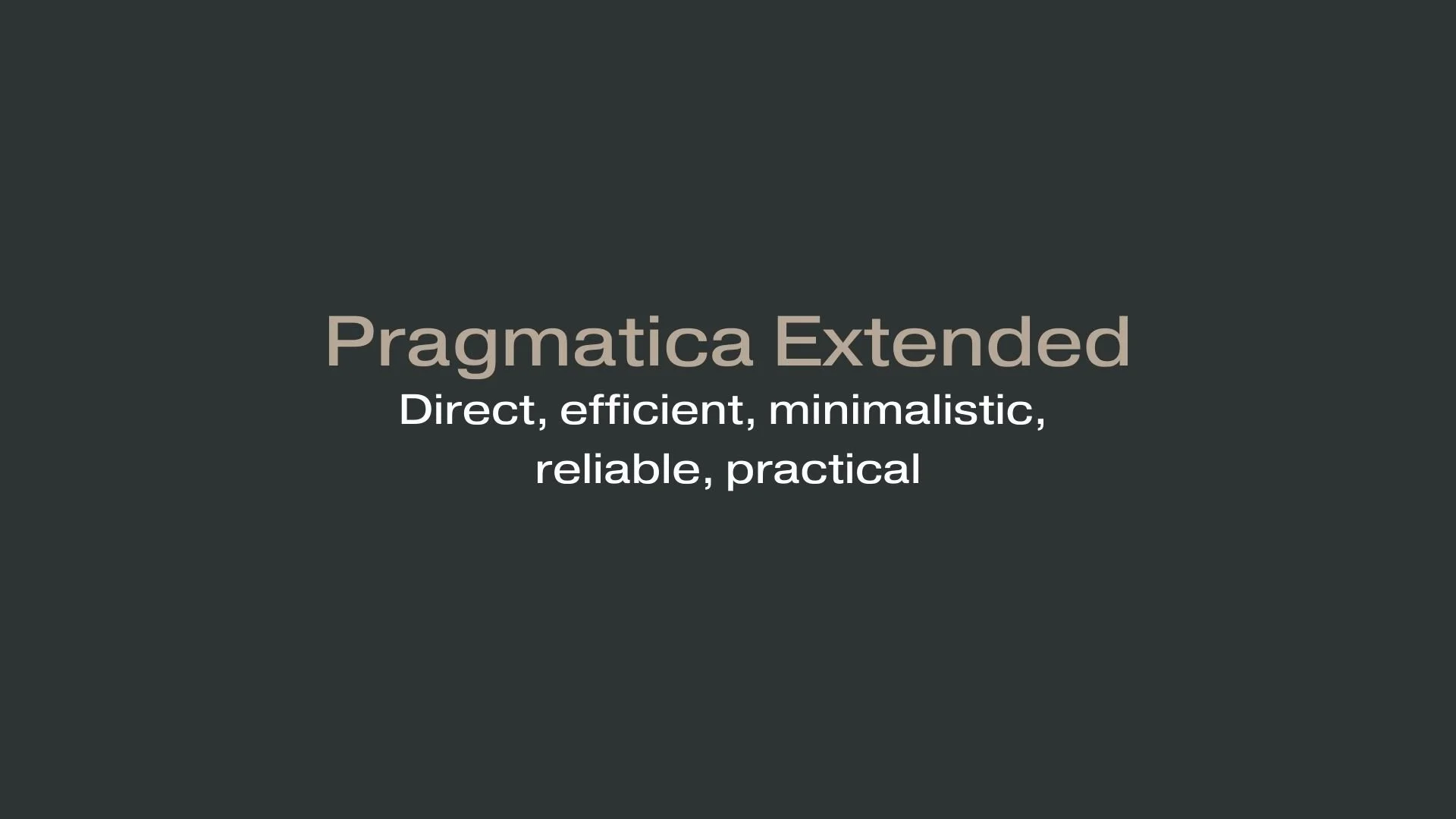
Pragmatica Extended
Overview:
Pragmatica Extended is a sans-serif typeface that blends clean, functional aesthetics with a broader, extended character set. It’s known for its modern, utilitarian design, which provides excellent readability across digital and print mediums, making it ideal for professional and technical applications.
History:
Pragmatica was developed in the Soviet Union in the late 1980s by designers from ParaType, a Russian type foundry known for creating typefaces that blend Western and Cyrillic typographic traditions. Its design was inspired by Helvetica but sought to address unique readability and stylistic needs for both Cyrillic and Latin alphabets. Pragmatica Extended is part of a larger Pragmatica family that includes multiple weights and styles, allowing for versatile usage in various visual environments.
Characteristics:
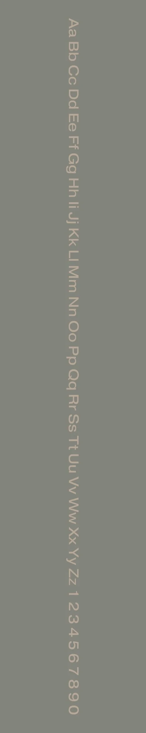
Design: Pragmatica Extended features a spacious design with extended proportions, making it look wide and balanced, which enhances legibility. The font includes geometric shapes and precise, minimalistic letterforms, with slight humanistic details that soften its appearance.
Usage: Due to its high readability and versatility, it’s commonly used for corporate design, websites, editorial work, and any text-heavy projects requiring clarity and a modern feel. Its extended width makes it especially effective in applications where a sense of openness and stability is desired.
Attributes: Pragmatica Extended is reliable, professional, and neutral, combining the functional qualities of classic sans-serif fonts with a distinct expanded form, ideal for settings that prioritize accessibility and readability in both digital and print formats.
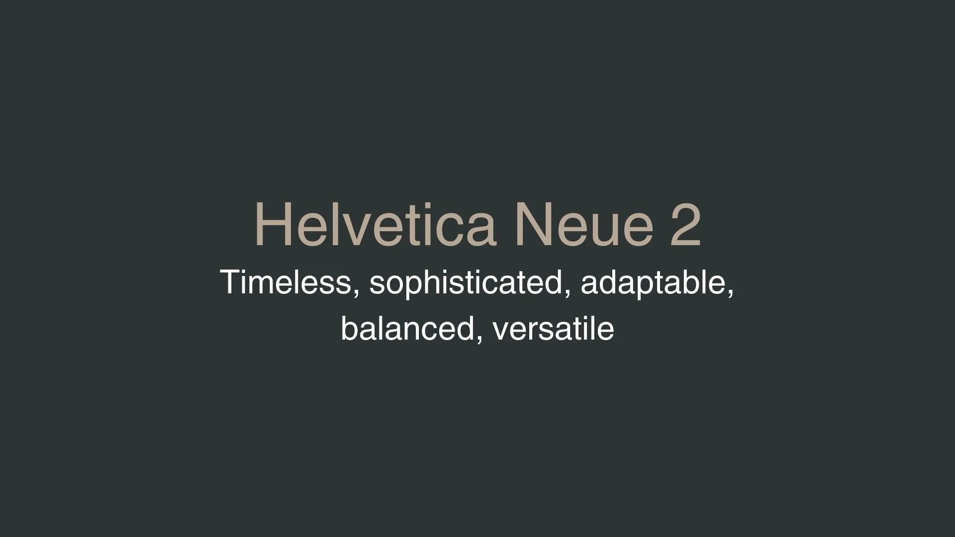
Helvetica Neue 2
Overview:
Helvetica Neue 2 is a refined iteration of the classic Helvetica typeface, prized for its sleek modernity and balance between simplicity and adaptability. It’s frequently used in branding, UI design, and publications due to its clarity and timeless aesthetic. Helvetica Neue 2 builds on Helvetica's legacy by enhancing legibility and offering a broader range of styles, making it an industry-standard sans-serif for digital and print environments alike.
History:
Helvetica Neue 2 traces its roots back to Helvetica, originally designed in 1957 by Swiss type designer Max Miedinger, with additional input from Eduard Hoffmann. In 1983, Helvetica Neue was created by Linotype as a comprehensive update, streamlining Helvetica’s structure for improved consistency across weights and styles. Helvetica Neue 2 further refines this classic, making subtle adjustments to optimize it for modern screens and digital interfaces, maintaining its versatile appeal while improving functionality for contemporary use cases.
Characteristics:
Design: Helvetica Neue 2 retains the clean, neutral lines of its predecessors with improved spacing and subtle structural tweaks that enhance legibility, especially in smaller text sizes. The font's modern simplicity, wide letterforms, and careful spacing make it highly readable.
Usage: Due to its sleek versatility, Helvetica Neue 2 is ideal for UI design, digital interfaces, and large-scale branding. Designers commonly use it for both headings and body text, especially in digital platforms, as it maintains readability across devices and scales seamlessly in responsive layouts.
Attributes: Helvetica Neue 2 is celebrated for its professionalism, clarity, and flexibility, with various weights to suit different design contexts. Its design accommodates contrast well, making it effective for both dark and light themes and ensuring visual appeal on diverse screen sizes. However, its ubiquity can sometimes make it feel overused, especially in branding where originality is prioritized.


FONT PERSONALITY
-
FONT PERSONALITY -
Why Pragmatica Extended and Helvetica Neue 2 are a Match Made in Heaven:
Pragmatica Extended and Helvetica Neue 2 make a perfect pairing by blending straightforward efficiency with timeless elegance. Pragmatica Extended brings a clean, direct approach, ideal for conveying clear, no-nonsense messaging. Its minimalist design ensures that content remains visually uncluttered, promoting productivity and practicality. In contrast, Helvetica Neue 2 adds a touch of sophistication with its balanced, adaptable nature. It elevates the overall design, offering a level of refinement that ensures versatility across various contexts. Together, these fonts create a pairing that is both functional and stylish, with an enduring quality that works seamlessly in a range of applications.
This pairing would appeal to a person who values efficiency without sacrificing style—someone who is both practical and refined. The ideal user for this font combination is likely a professional who demands clarity and reliability but also appreciates sophistication in their personal brand. This individual could be an entrepreneur, consultant, or creative professional, someone who is confident, adaptable, and values timeless design elements that elevate their work while maintaining a strong sense of functionality.

CELEBRITY MATCH
-
CELEBRITY MATCH -

The font pairing of Pragmatica Extended and Helvetica Neue aligns perfectly with the character of Annie Walker, as portrayed by Kristin Wiig in the movie "Bridesmaids (2011)".
Summary: The pairing of Pragmatica Extended and Helvetica Neue works well with Annie Walker in Bridesmaids because it reflects the duality of her character. She is the practical, grounded friend who can hold things together even when life feels like a series of unfortunate events (Pragmatica Extended), but she’s also someone who has the sophistication, adaptability, and charm that makes her relatable and likable (Helvetica Neue ). The contrast between her messy personal life and her ability to still function and perform her role as a friend, a bridesmaid, and a businesswoman aligns perfectly with this font pairing.

HIERARCHY
-
HIERARCHY -

Font Hierarchy for Pragmatica Extended and Helvetica Neue 2 :
Logo
Usage: Primary logo text, initials, brand name
Pragmatica Extende, Regular, 48-72 pt (Canva), 48-60 px (Squarespace)
Heading (H1)
Usage: Main headings on pages, prominent titles
Pragmatica Extended, Bold, 36-48 pt (Canva), 36-44 px (Squarespace)
Subtitle / Secondary Heading (H2)
Usage: Section titles, important subtitles
Helvetica Neue, Bold, 30-36 pt (Canva), 28-36 px (Squarespace)
Subheading (H3)
Usage: Subsection headings, less prominent titles
Helvetica Neue, Regular, 24-30 pt (Canva), 22-28 px (Squarespace)
Paragraph / Body Copy (P)
Usage: Main body text, paragraphs, descriptions
Helvetica Neue, Regular, 14-16 pt (Canva), 16-18 px (Squarespace)