MEET YOUR FONT PAIRING MATCH
This page is your custom breakdown of the font pairing you were matched with from the Find Your Font Quiz. You’ll discover the history, personality, and style of each font—and see how they can come to life in your personal brand.
If you're a Personal Branding Studio member:
Bookmark this page. We’ll return to it in Part 2 when it’s time to use your font pairing to design your logo and create branded Canva graphics.
Not loving this particular combo? No problem. Explore all 100+ font pairings inside PBS - Part 1, Module 4: Design - to find one that feels just right. Click the button below to go there now.
Not yet a Personal Branding Studio member?
(And wondering what Personal Branding Studio even is?)
Start by scrolling through your results below. At the bottom of this page, you’ll find out how to go deeper with your personal brand through my full Personal Branding Studio program.
And your aligned font pairing match is…


HISTORY
-
HISTORY -
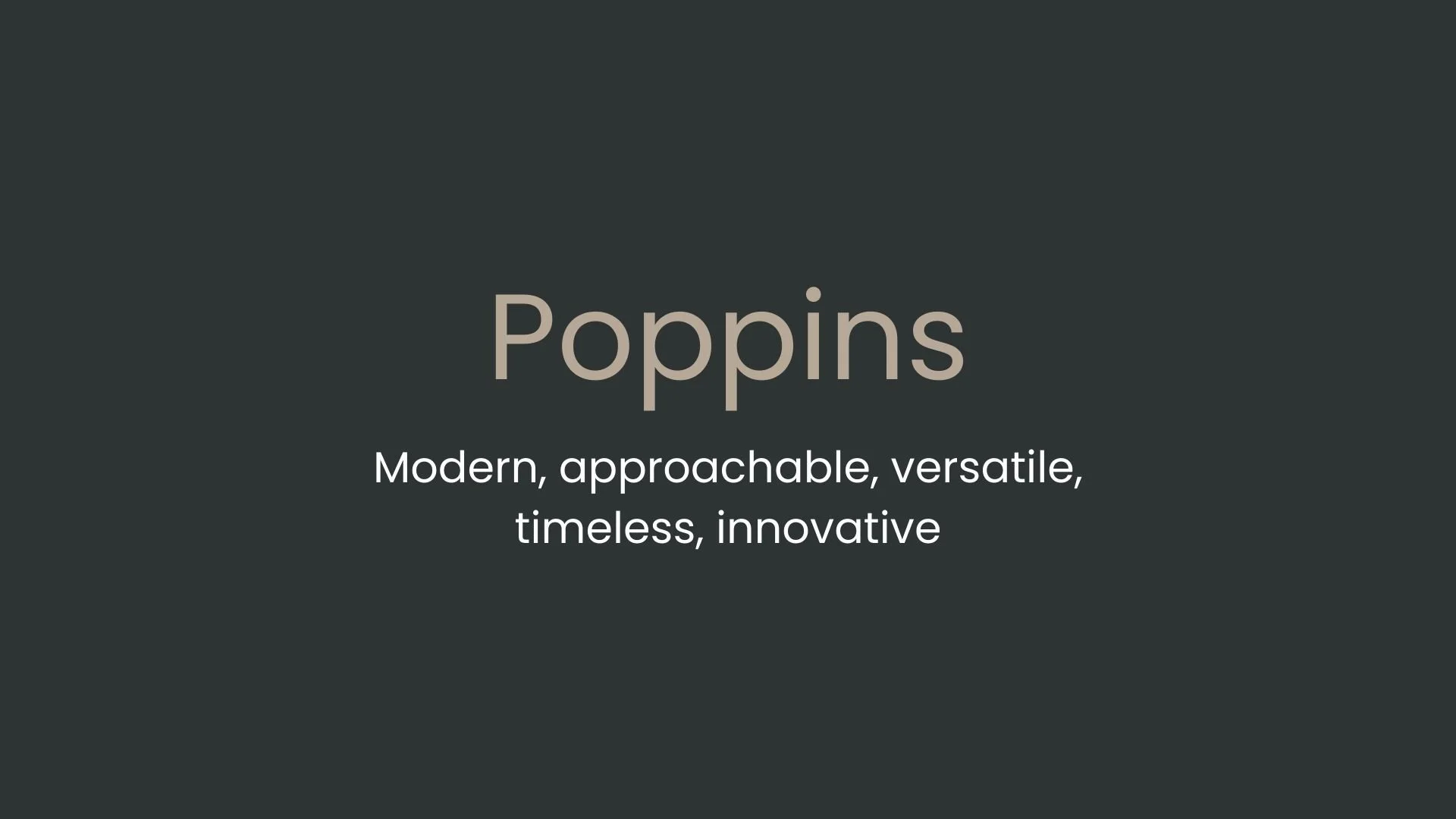
Poppins
Overview:
Poppins is a contemporary geometric sans-serif typeface distinguished by its clean lines, simplicity, and versatility. It combines a modern aesthetic with readability, making it highly effective for both digital interfaces and print media.
History:
Poppins was created by the Indian Type Foundry (ITF) and launched on Google Fonts in 2014. ITF designed it with the intention of providing a typeface that could reflect modern design sensibilities while catering to a global audience. Poppins stands out for its extensive language support, including Devanagari, which makes it especially popular in South Asian contexts. Its geometric construction is inspired by classic sans-serifs like Futura, yet it offers a fresh, more modern appeal.
Characteristics:
Design: Poppins is built on a geometric foundation with monolinear strokes, uniform counters, and rounded forms. The font features nine weights, from Thin to Black, each with matching italics. Its rounded terminals and consistent stroke widths lend it a friendly, approachable appearance while maintaining geometric precision.
Usage: Due to its legibility and clean aesthetic, Poppins is widely used for branding, web design, and interfaces. Its versatility across weights and styles makes it suitable for headlines, body text, and even UI elements in applications, creating a cohesive look in multi-platform projects.
Attributes: Poppins is neutral yet vibrant, with a warm modernity that resonates across cultural contexts. Its support for both Latin and Devanagari scripts makes it adaptable for multilingual settings. The font's balanced proportions and simplicity enhance readability, even at smaller sizes.


FONT PERSONALITY
-
FONT PERSONALITY -
Why Abel and Source Code Pro are a Match Made in Heaven:
When the personalities of Abel and Source Code Pro are combined, the result is a pairing that is both approachable and functional. Abel brings a modern and professional touch with a hint of warmth, making it suitable for headlines and logos that need to be both eye-catching and versatile. On the other hand, Source Code Pro’s precise and technical nature grounds the pairing, ensuring that the overall design remains clear and unambiguous, especially in detailed or complex content.
Together, these fonts would appeal to a person who is both practical and modern—a tech-savvy individual who values clarity and precision but also appreciates subtle design aesthetics. This person might be someone who works in a creative tech industry, blending innovation with functionality, such as a designer-developer hybrid who values both form and function in their work.

CELEBRITY MATCH
-
CELEBRITY MATCH -

The font Poppins aligns perfectly with the character of Erin Brockovich, as portrayed by Julia Roberts in the movie "Erin Brockovich (2000)".
Summary: Julia Roberts' portrayal of Erin Brockovich embodies the qualities of the Poppins font with remarkable alignment. Erin’s modernity, approachability, versatility, timeless appeal, and innovative spirit parallel Poppins' clean, adaptable, and forward-thinking design. Just as Poppins effortlessly adapts to various design contexts, Erin navigates complex situations with ease, inspiring those around her. Therefore, Julia Roberts as Erin Brockovich is a perfect match for the persona of the Poppins font, making this pairing an apt reflection of both the character's and the font's dynamic nature.

HIERARCHY
-
HIERARCHY -

Font Hierarchy for Poppins:
Logo
Usage: Primary logo text, initials, brand name
Poppins, Bold, 60 pt (Canva), 48 px (Squarespace)
Heading (H1)
Usage: Main headings on pages, prominent titles
Poppins, Bold, 36 pt (Canva), 32 px (Squarespace)
Subtitle / Secondary Heading (H2)
Usage: Section titles, important subtitles
Poppins, Bold, 30 pt (Canva), 28 px (Squarespace)
Subheading (H3)
Usage: Subsection headings, less prominent titles
Poppins, Medium, 24 pt (Canva), 24 px (Squarespace)
Paragraph / Body Copy (P)
Usage: Main body text, paragraphs, descriptions
Poppins, Regular, 14 pt (Canva), 16px (Squarespace)