MEET YOUR FONT PAIRING MATCH
This page is your custom breakdown of the font pairing you were matched with from the Find Your Font Quiz. You’ll discover the history, personality, and style of each font—and see how they can come to life in your personal brand.
If you're a Personal Branding Studio member:
Bookmark this page. We’ll return to it in Part 2 when it’s time to use your font pairing to design your logo and create branded Canva graphics.
Not loving this particular combo? No problem. Explore all 100+ font pairings inside PBS - Part 1, Module 4: Design - to find one that feels just right. Click the button below to go there now.
Not yet a Personal Branding Studio member?
(And wondering what Personal Branding Studio even is?)
Start by scrolling through your results below. At the bottom of this page, you’ll find out how to go deeper with your personal brand through my full Personal Branding Studio program.
And your aligned font pairing match is…


HISTORY
-
HISTORY -
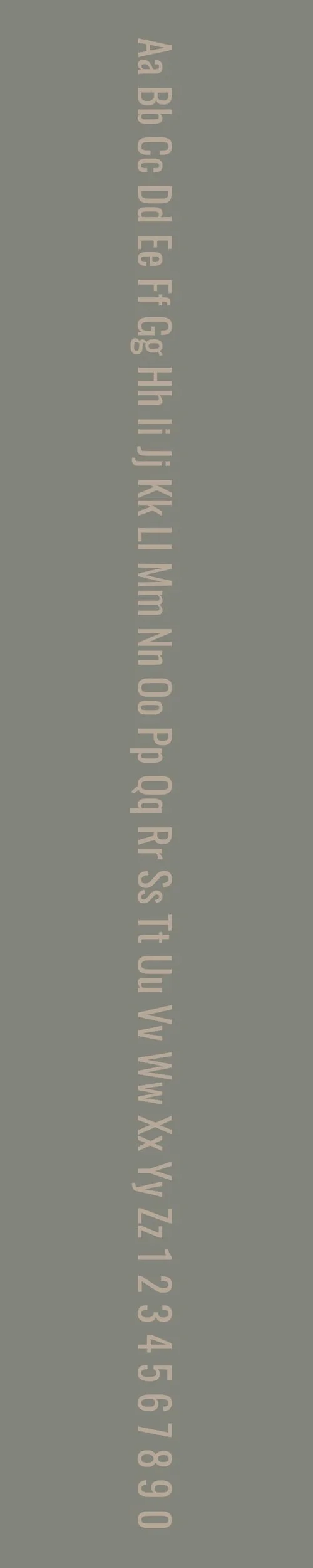
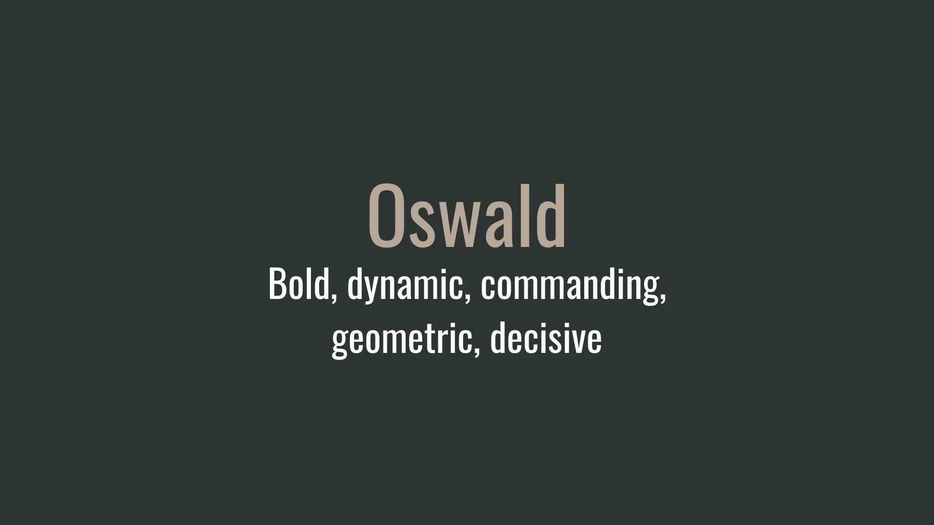
Oswald
Overview:
Oswald is a bold and modern sans-serif typeface, widely appreciated for its powerful and space-efficient design. Known for its high-impact style, Oswald is often selected for headline and display uses due to its commanding presence and sharp clarity, making it ideal for projects requiring a strong visual impact.
History:
Originally designed by Vernon Adams in 2011, Oswald was later expanded by Kalapi Gajjar and the team at Cyreal, becoming a collaborative project aimed at refining and optimizing it for digital usage. The font is part of the Google Fonts library, designed specifically to update classic gothic sans-serif styles from the late 19th century for contemporary applications. Oswald’s availability as an open-source font under the SIL Open Font License has made it accessible and popular across web and print media, especially for editorial and corporate designs.
Characteristics:
Design: Oswald’s condensed structure, geometric forms, and thick strokes give it a distinct, authoritative style. Its tall letterforms make it compact yet easily legible, ideal for filling limited space without sacrificing readability.
Usage: Due to its bold and structured appearance, Oswald is commonly used in headlines, banners, and logos, as well as in marketing materials and editorial layouts where a strong typographic identity is essential.
Attributes: Oswald’s modern aesthetic and straightforward forms create a sense of reliability and professionalism, making it versatile for branding, advertising, and corporate contexts. It pairs effectively with more neutral typefaces like Roboto or Lora for a balanced design that combines both impact and readability.
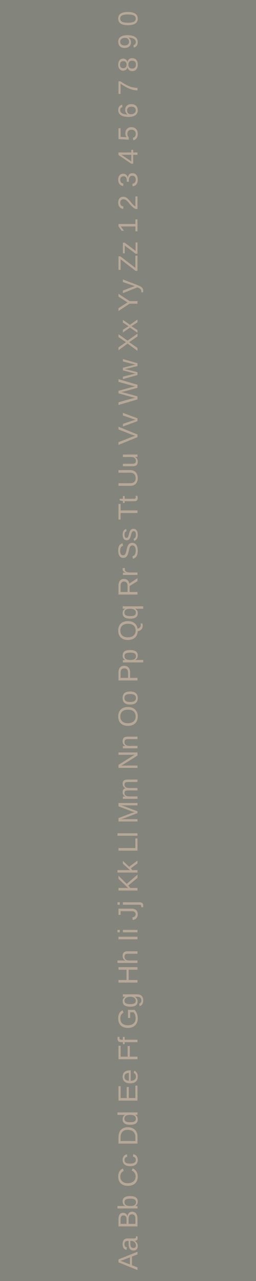
Arimo
Overview:
Arimo is a versatile, clean, and highly legible sans-serif typeface designed as a modern alternative to Arial, with slight humanistic touches to improve readability on digital screens. It aims to balance neutrality with accessibility, making it ideal for various applications where clarity is essential.
History:
Arimo was created by Steve Matteson in 2011 as part of Google’s initiative to offer web-optimized fonts that improve digital readability. Designed under Matteson’s direction at Ascender Corporation, Arimo was intended as a functional, visually consistent typeface compatible with Arial. It was created for Google’s library to enhance user experience on the web, providing an adaptable and accessible typeface for digital interfaces and online documents.
Characteristics:
Design: Arimo’s structure is precise and open, featuring wide, well-balanced characters that maintain clarity at small sizes. Its slightly rounded terminals give it a softer look than traditional sans-serifs, while the consistent stroke width preserves a contemporary feel. Arimo’s straightforward and unembellished design contributes to its modern, professional tone.
Usage: Arimo excels in user interface design, web body text, and digital documentation, where readability is a priority. Its neutral look suits both professional and casual settings, making it an excellent choice for digital platforms, corporate presentations, and any application requiring a legible and clean font.
Attributes: Known for its legibility, neutrality, and versatility, Arimo is popular in digital contexts where accessibility and readability are vital. It’s available in various weights and styles, including italic, enhancing its utility across different design needs.

FONT PERSONALITY
-
FONT PERSONALITY -

Why Oswald and Arimo are a Match Made in Heaven:
When Oswald and Arimo are paired together, they form a balanced dynamic that’s both powerful and approachable. Oswald, with its bold, geometric design, makes a statement—perfect for headlines or branding that needs to grab attention. Its commanding presence ensures that it takes center stage, creating a strong first impression. Arimo, on the other hand, brings in the warmth and reliability needed to complement Oswald’s assertiveness. Its friendly and adaptable nature softens the pairing, making sure that longer body text remains clear and readable without losing the punch that Oswald provides. Together, they create a well-rounded combination that can capture attention while remaining accessible and easy to navigate.
This font pairing would suit someone who is confident, driven, and approachable—perhaps a brand owner who is both a leader and a collaborator. The person using this combination is likely an entrepreneur or professional in a competitive industry, such as tech or marketing, who needs to project authority and reliability while remaining personable. They are the type of individual who values structure and clarity in their communication but also understands the importance of being warm and inviting to foster strong relationships and trust with their audience.

CELEBRITY MATCH
-
CELEBRITY MATCH -
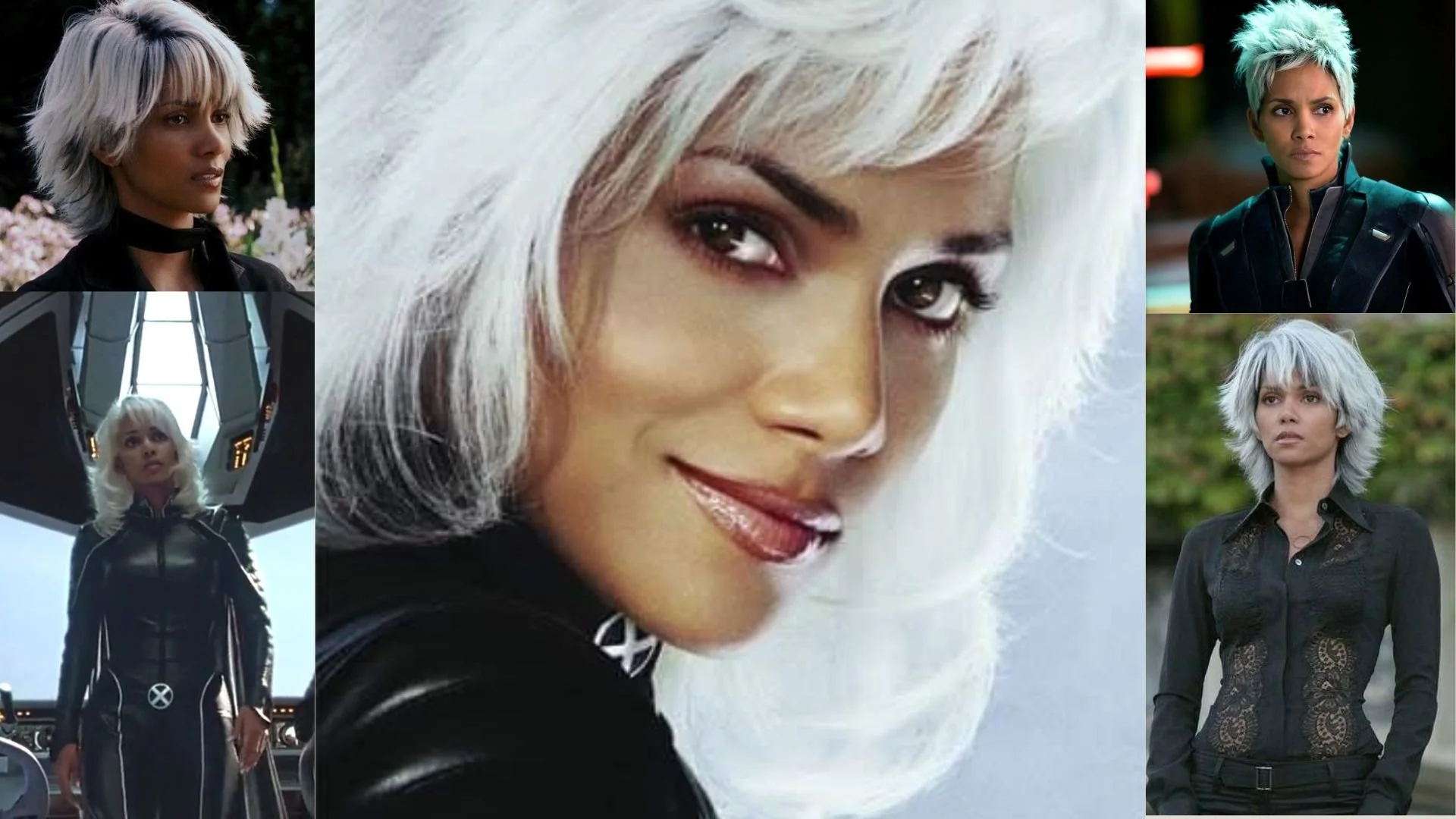
The font pairing of Oswald and Arimo aligns perfectly with the character of Storm, as portrayed by Halle Berry in the movie "X-Men(2000)".
Summary: Halle Berry’s portrayal of Storm in X-Men perfectly encapsulates the dynamic between Oswald and Arimo. Storm’s role as a powerful leader (Oswald) with a nurturing and dependable side (Arimo) mirrors the complementary nature of these fonts. Oswald's boldness and impact are complemented by Arimo's clarity and approachability, creating a harmonious balance in both typography and character traits. This alignment highlights how the striking presence of Oswald and the supportive nature of Arimo work together to achieve a well-rounded, effective communication style, much like Storm’s multifaceted role in her team.

HIERARCHY
-
HIERARCHY -

Font Hierarchy for Oswald and Arimo:
Logo
Usage: Primary logo text, initials, brand name
Oswald, Bold, 60-80 px (Canva), 45-60 pt (Squarespace)
Heading (H1)
Usage: Main headings on pages, prominent titles
Oswald, Bold, 48-60 px (Canva), 36-45 pt (Squarespace)
Subtitle / Secondary Heading (H2)
Usage: Section titles, important subtitles
Oswald, Regular, 36-48 px (Canva), 27-36 pt (Squarespace)
Subheading (H3)
Usage: Subsection headings, less prominent titles
Arimo, Regular, 24-36 px (Canva), 18-27 pt (Squarespace)
Paragraph / Body Copy (P)
Usage: Main body text, paragraphs, descriptions
Arimo, Regular, 14-18 px (Canva), 12-16 pt (Squarespace)