MEET YOUR FONT PAIRING MATCH
This page is your custom breakdown of the font pairing you were matched with from the Find Your Font Quiz. You’ll discover the history, personality, and style of each font—and see how they can come to life in your personal brand.
If you're a Personal Branding Studio member:
Bookmark this page. We’ll return to it in Part 2 when it’s time to use your font pairing to design your logo and create branded Canva graphics.
Not loving this particular combo? No problem. Explore all 100+ font pairings inside PBS - Part 1, Module 4: Design - to find one that feels just right. Click the button below to go there now.
Not yet a Personal Branding Studio member?
(And wondering what Personal Branding Studio even is?)
Start by scrolling through your results below. At the bottom of this page, you’ll find out how to go deeper with your personal brand through my full Personal Branding Studio program.
And your aligned font pairing match is…


HISTORY
-
HISTORY -
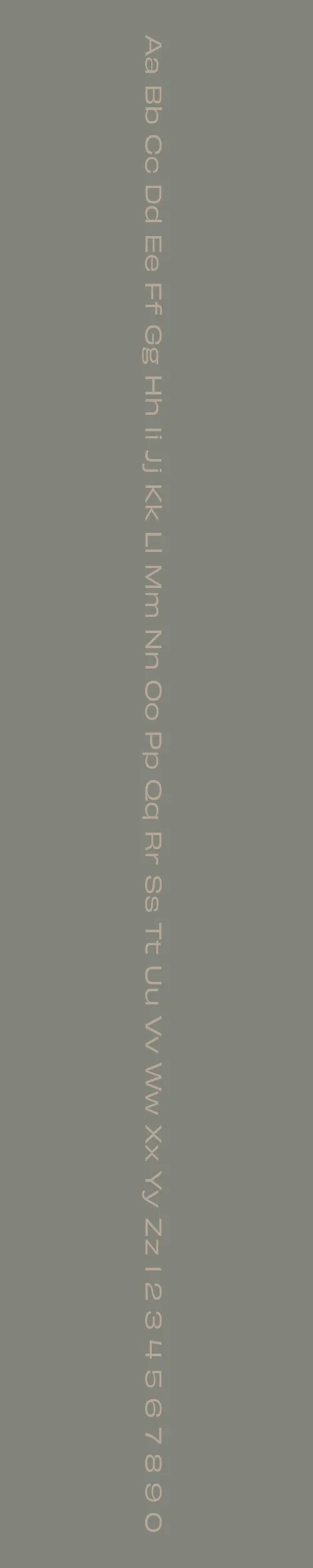
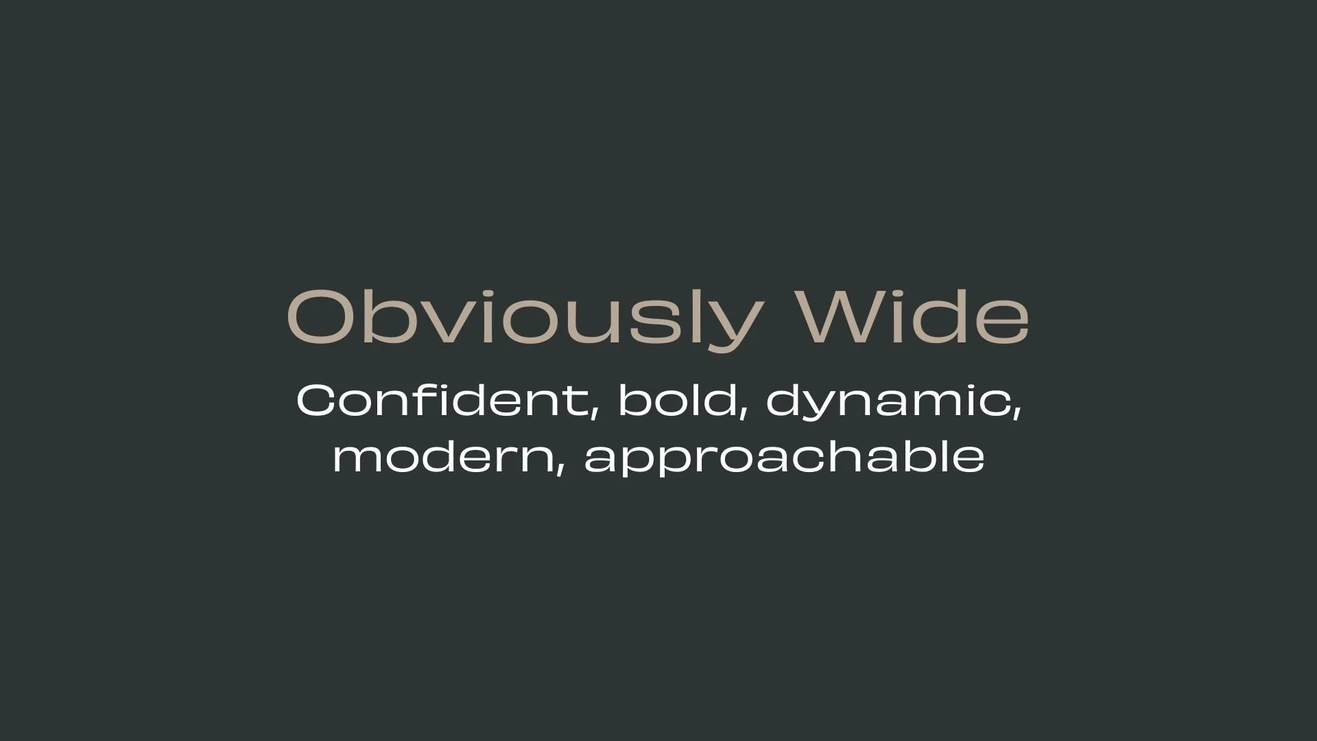
Obviously Wide
Overview:
Obviously Wide is a modern sans-serif display typeface with a bold, wide, and distinctive design. Its extended letterforms and sharp angles give it a strong visual presence, making it perfect for high-impact applications that need to stand out.
History:
Obviously Wide was created by Typodermic Fonts, led by Canadian type designer Ray Larabie. Released in 2016, the font was designed to be a versatile display typeface that could be used in larger sizes, such as headlines and logos. Its design was intended to offer an alternative to more conventional typefaces, with exaggerated width and a strong personality. It was crafted to capture attention in modern design contexts while still maintaining legibility.
Characteristics:
Design: Obviously Wide features wide, extended letterforms with geometric and angular shapes. Its sharp edges and open counters give it a contemporary, industrial feel, while its increased width adds to its boldness and makes it highly visible in large sizes.
Usage: Ideal for use in large-scale designs such as headlines, logos, and banners. The font performs well in spaces where readability and impact are key, particularly in advertising and promotional materials.
Attributes: Bold, angular, and highly distinctive. Obviously Wide is a font that demands attention, making it perfect for high-visibility design projects. Its wide proportions and strong shapes ensure that it stands out in any setting, while still maintaining clarity in display use.
Aktiv Grotesk
Overview:
Aktiv Grotesk is a contemporary sans-serif typeface that blends functional minimalism with a strong, clean design. Known for its legibility and versatility, it works equally well for both display and text applications, making it a popular choice for modern branding, editorial design, and digital interfaces.
History:
Aktiv Grotesk was designed by the Swiss type foundry, the Kero Type, and was released in 2014. The design of Aktiv Grotesk draws inspiration from the classic grotesque and neo-grotesque typefaces, aiming to create a more refined and contemporary version. It was developed to offer a clean, neutral, and highly adaptable sans-serif option for modern typography, with a focus on clarity and usability across various mediums.
Characteristics:
Design: Aktiv Grotesk features geometric proportions with a subtle humanist touch. Its clean, even stroke weight and slightly rounded corners give it a warm yet modern feel. The typeface's open apertures and vertical stress provide excellent legibility, while the balanced letterforms lend it versatility in both large and small sizes.
Usage: Ideal for branding, editorial, web design, and advertising. Aktiv Grotesk excels in both body text and headings, making it a strong candidate for corporate identities, user interfaces, and websites that require both clarity and personality.
Attributes: Clean, neutral, and highly legible. Aktiv Grotesk's adaptability and modern aesthetic make it suitable for a wide range of design applications, from minimalistic websites to bold print projects. Its balanced structure offers clarity and readability without sacrificing style.


FONT PERSONALITY
-
FONT PERSONALITY -

Why Obviously Wide and Aktiv Grotesk are a Match Made in Heaven:
The pairing of Obviously Wide and Aktiv Grotesk results in a harmonious blend of bold presence and dependable clarity. Obviously Wide leads with its confident, dynamic, and bold characteristics, making a statement with its modern design and welcoming energy. It commands attention, whether in large headlines or striking logos, drawing the viewer’s eye effortlessly. Aktiv Grotesk, on the other hand, brings balance and versatility to the table. Its clear and dependable nature ensures that the content maintains clarity and professionalism, grounding the boldness of Obviously Wide with its well-rounded, adaptable design. The pairing captures a perfect balance between expressive creativity and reliable communication.
This font pairing would be ideal for someone who is both bold and dependable in their personal brand—someone who stands out in their field with confidence but also values clarity and approachability. They are likely a professional in a creative industry, perhaps a modern entrepreneur or designer who blends dynamic innovation with a grounded, pragmatic approach. This person is not afraid to make bold moves but understands the importance of being versatile and clear in communication, whether in the design world, tech space, or any industry where creative energy needs to be balanced with dependability.

CELEBRITY MATCH
-
CELEBRITY MATCH -

The font pairing of Obviously Wide and Aktiv Grotesk aligns perfectly with the character of Maleficent, as portrayed by Angelina Jolie in the movie "Maleficent" .
Summary: Angelina Jolie’s portrayal of Maleficent is an ideal representation of the Obviously Wide and Aktiv Grotesk font pairing. Obviously Wide reflects Maleficent's bold, confident, and expressive traits, while Aktiv Grotesk mirrors her versatility, adaptability, and balanced approach to complex situations. Both the typefaces and the character share a strong presence, a clear sense of purpose, and an ability to navigate various challenges with grace, ensuring they leave a lasting impact, whether in design or storytelling.

HIERARCHY
-
HIERARCHY -

Font Hierarchy for Obviously Wide and Aktiv Grotesk:
Logo
Usage: Primary logo text, initials, brand name
Obviously Wide, Regular, 150 pt (Canva), 80-120 px (Squarespace)
Heading (H1)
Usage: Main headings on pages, prominent titles
Obviously Wide, Bold, 80 pt (Canva), 48-72 px (Squarespace)
Subtitle / Secondary Heading (H2)
Usage: Section titles, important subtitles
Aktiv Grotesk, Regular, 50 pt (Canva), 36-48 px (Squarespace)
Subheading (H3)
Usage: Subsection headings, less prominent titles
Aktiv Grotesk, Bold, 30 pt (Canva), 24-36 px (Squarespace)
Paragraph / Body Copy (P)
Usage: Main body text, paragraphs, descriptions
Aktiv Grotesk, Regular or Light, 18-22 pt (Canva), 16-18 px (Squarespace)