MEET YOUR FONT PAIRING MATCH
This page is your custom breakdown of the font pairing you were matched with from the Find Your Font Quiz. You’ll discover the history, personality, and style of each font—and see how they can come to life in your personal brand.
If you're a Personal Branding Studio member:
Bookmark this page. We’ll return to it in Part 2 when it’s time to use your font pairing to design your logo and create branded Canva graphics.
Not loving this particular combo? No problem. Explore all 100+ font pairings inside PBS - Part 1, Module 4: Design - to find one that feels just right. Click the button below to go there now.
Not yet a Personal Branding Studio member?
(And wondering what Personal Branding Studio even is?)
Start by scrolling through your results below. At the bottom of this page, you’ll find out how to go deeper with your personal brand through my full Personal Branding Studio program.
And your aligned font pairing match is…

HISTORY
-
HISTORY -
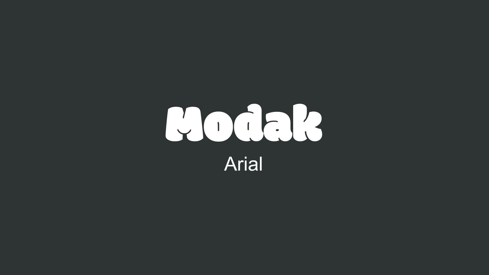
Modak
Overview:
Modak is a bold, geometric sans-serif typeface with a distinctive, playful design. Its large, rounded letterforms and thick strokes make it ideal for attention-grabbing applications, such as headlines, posters, and logos.
History:
Modak was created by Indian Type Foundry (ITF) and released in 2015. The goal behind Modak was to develop a typeface that blends geometric shapes with a friendly and whimsical style. Its creation was motivated by the need for a bold and modern display font that stands out while still maintaining legibility. Modak was designed to work across various languages, including Latin and Indian scripts, making it versatile for diverse markets.
Characteristics:
Design: Modak is characterized by large, bold letterforms with thick strokes and wide spacing. The font has a playful and distinctive appearance, with rounded edges and a slightly condensed structure. Its geometric shapes and uniform stroke weight give it a clean, modern feel.
Usage: Perfect for headlines, posters, branding, and logos. Due to its bold nature, Modak is well-suited for applications where attention is needed, especially for high-impact designs. It excels in large sizes and works best in contexts where readability from a distance is key.
Attributes: Bold, geometric, and highly impactful. Modak is designed to stand out, with a fun, friendly aesthetic that makes it ideal for modern advertising, branding, and promotional materials. Its legibility and strong presence make it a standout choice for display-type use.

Arial
Overview:
Arial is a widely-used sans-serif typeface known for its readability and versatility across digital and print media. With its clean, straightforward letterforms, Arial has become a popular choice for both professional and casual uses, from documents to web design.
History:
Arial was created in 1982 by Robin Nicholas and Patricia Saunders for Monotype. It was initially designed to serve as a substitute for Helvetica, primarily for the IBM and Microsoft ecosystems. Arial’s design made it metrically compatible with Helvetica, allowing users to switch fonts without layout adjustments. As Microsoft adopted Arial as a core font in its Windows operating system, it gained immense popularity and became one of the most recognizable and accessible fonts worldwide.
Characteristics:
Design: Arial has a humanist style with rounded, open letterforms, distinguishing it slightly from Helvetica’s more mechanical feel. The shapes of characters like “a” and “t” have a softer, more rounded appearance, contributing to its friendliness and approachability.
Usage: Arial’s clarity and neutrality make it suitable for a broad range of applications, from body text in documents to website headers. Its ubiquity and legibility have made it a common choice in corporate branding, software interfaces, and educational materials.
Attributes: Arial is known for being highly readable at various sizes and screen resolutions. It offers a range of styles, including regular, italic, bold, and black, which enhances its adaptability across digital and print media. Its availability on nearly all operating systems and devices has made Arial a global standard for general-purpose typography.


FONT PERSONALITY
-
FONT PERSONALITY -
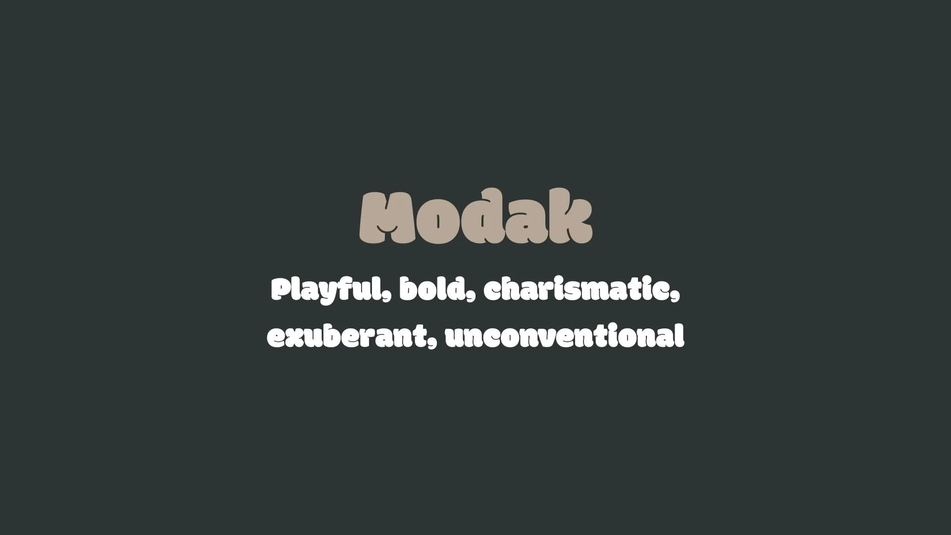

Why Modak and Arial Are a Match Made in Heaven:
The pairing of Modak and Arial is a celebration of contrast and balance, where exuberance meets reliability. Modak’s bold, playful, and charismatic personality steals the show with its chunky, unconventional letterforms that demand attention and spark joy. Arial, by contrast, provides a steady and neutral grounding, ensuring that Modak’s high-spirited energy doesn’t overwhelm the design. The adaptability and clarity of Arial create a harmonious backdrop, allowing Modak’s quirky charm to shine in headlines while Arial takes on the supporting role for body text, maintaining readability and professionalism. Together, they achieve a vibrant yet cohesive visual identity that feels both dynamic and dependable.
This pairing would appeal to someone who embraces individuality and creativity while valuing structure and reliability—a spirited entrepreneur or artist with a bold vision who also understands the importance of clear communication. This person might run a boutique creative agency, a vibrant lifestyle brand, or an unconventional consultancy. They are unafraid to stand out with their unique style but always ensure that their message is accessible and grounded, making this combination a perfect reflection of their lively yet practical personality.

CELEBRITY MATCH
-
CELEBRITY MATCH -

The font pairing of Modak and Arial aligns perfectly with the character of Beth Ann Stanton, as portrayed by Ginnifer Goodwin in the movie "Why Women Kill (2019)".
Summary: The pairing of Modak and Arial embodies Ginnifer Goodwin’s portrayal of Beth Ann Stanton in Why Women Kill. Modak captures the vivacious, charismatic, and bold moments of Beth Ann’s character, while Arial represents her grounded, reliable, and adaptable nature. The dynamic contrast between the two fonts mirrors the complexity of Beth Ann’s character—her desire for excitement and freedom juxtaposed with the weight of responsibility and societal expectations. This combination of fonts highlights the duality of Beth Ann’s personality and the tension between her external playful energy and internal struggle for personal autonomy.

HIERARCHY
-
HIERARCHY -
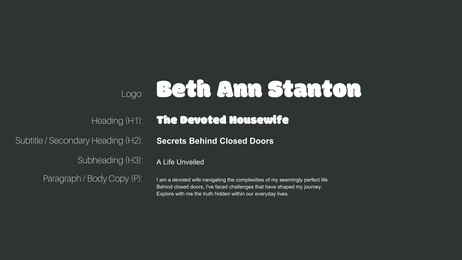
Font Hierarchy for Modak and Arial:
Logo
Usage: Primary logo text, initials, brand name
Modak, Regular, 48-60 pt (Canva), 40-50 px (Squarespace)
Heading (H1)
Usage: Main headings on pages, prominent titles
Modak, Regular, 36-48 pt (Canva), 30-40 px (Squarespace)
Subtitle / Secondary Heading (H2)
Usage: Section titles, important subtitles
Arial, Bold, 24-30 pt (Canva), 20-30 px (Squarespace)
Subheading (H3)
Usage: Subsection headings, less prominent titles
Arial, Regular, 18-24 pt (Canva), 16-20 px (Squarespace)
Paragraph / Body Copy (P)
Usage: Main body text, paragraphs, descriptions
Arial, Regular, 12-16 pt (Canva), 14-16 px (Squarespace)