MEET YOUR FONT PAIRING MATCH
This page is your custom breakdown of the font pairing you were matched with from the Find Your Font Quiz. You’ll discover the history, personality, and style of each font—and see how they can come to life in your personal brand.
If you're a Personal Branding Studio member:
Bookmark this page. We’ll return to it in Part 2 when it’s time to use your font pairing to design your logo and create branded Canva graphics.
Not loving this particular combo? No problem. Explore all 100+ font pairings inside PBS - Part 1, Module 4: Design - to find one that feels just right. Click the button below to go there now.
Not yet a Personal Branding Studio member?
(And wondering what Personal Branding Studio even is?)
Start by scrolling through your results below. At the bottom of this page, you’ll find out how to go deeper with your personal brand through my full Personal Branding Studio program.
And your aligned font pairing match is…


HISTORY
-
HISTORY -
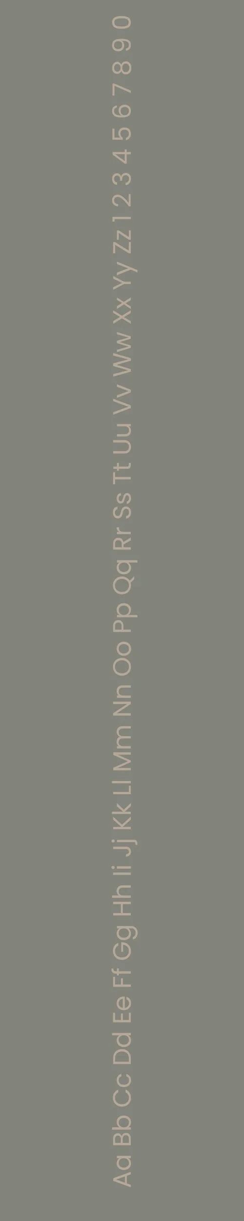
Manrope
Overview:
Manrope is a contemporary sans-serif typeface that combines geometric shapes with humanist influences. Its open, rounded letterforms and clean structure make it both modern and highly legible, ideal for use in digital design as well as print applications.
History:
Manrope was created by the Ukrainian designer Michael Tselishchev and released in 2019 under the Google Fonts library. Tselishchev designed Manrope as a versatile typeface that balances modernism and warmth, intended for use in a wide variety of design projects. Its creation was motivated by the need for a more functional and clean typeface suitable for user interfaces and digital environments, while also maintaining readability and personality.
Characteristics:
Design: Geometric with subtle humanist influences, featuring wide proportions and rounded terminals. The design strikes a balance between structure and warmth, making it approachable without sacrificing professionalism.
Usage: Perfect for UI/UX design, websites, headlines, and branding, where clarity and a contemporary aesthetic are crucial. Its clean and minimalist look also makes it suitable for large-scale prints and posters.
Attributes: Highly legible and versatile, with excellent readability on screens. Its neutral yet friendly appearance makes it a great choice for both formal and informal uses.

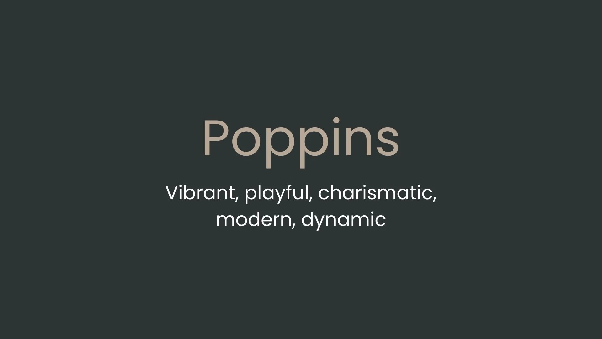
Poppins
Overview:
Poppins is a geometric sans-serif typeface known for its modern, clean, and balanced design. Featuring circular letterforms and a versatile range of weights, it is a highly legible and approachable font suitable for both digital and print use.
History:
Poppins was designed by Indian type designer, Indian Type Foundry (ITF), and released in 2014. The goal of creating Poppins was to provide a contemporary and geometric sans-serif typeface that could support multiple Indian languages in addition to Latin scripts. Its design is based on geometric forms, with a touch of warmth, making it suitable for various applications, especially in digital and branding contexts.
Characteristics:
Design: Poppins is characterized by its clean, circular letterforms and uniform stroke widths. Its geometric nature gives it a modern, minimalist feel, while the subtle curves in the letterforms soften its otherwise strict structure.
Usage: Ideal for branding, user interfaces, headlines, posters, and logos. The typeface performs well in both large and small text sizes, making it highly versatile for digital media and print design. Its uniformity and legibility make it especially suited for web and app design.
Attributes: Geometric and contemporary, Poppins is clean, highly legible, and versatile. Its round forms contribute to a friendly, approachable aesthetic, making it perfect for modern digital projects as well as branding materials.

FONT PERSONALITY
-
FONT PERSONALITY -

Why Manrope and Poppins Are a Match Made in Heaven:
The pairing of Manrope and Poppins strikes a perfect balance between sophistication and liveliness. Manrope’s minimalist, composed personality lays a strong foundation for clear communication, bringing a calm and professional tone that ensures readability and reliability. Poppins, on the other hand, injects vibrancy and charisma into the design, offering a playful counterpoint to Manrope’s restraint. Together, they create a dynamic yet harmonious relationship: Manrope provides structure and approachability, while Poppins adds energy and charm, making this pairing equally effective for formal presentations and creative branding.
This combination appeals to someone who is both steady and bold—a person who values balance in their personal brand. This individual might be a creative entrepreneur or a lifestyle influencer who seamlessly blends professionalism with a lively, modern edge. They are likely detail-oriented yet unafraid to showcase their personality, making them approachable yet unforgettable to their audience. Whether crafting a sleek website or a vibrant social media presence, this person uses the Manrope-Poppins duo to convey both confidence and warmth.

CELEBRITY MATCH
-
CELEBRITY MATCH -
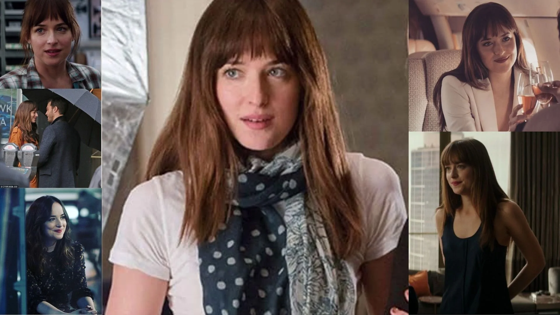
The font pairing of Manrope and Poppins aligns perfectly with the character of Anastasia Steele, as portrayed by Dakota Johnson in the movie "Fifty Shades of Grey".
Summary: Dakota Johnson’s portrayal of Anastasia Steele embodies both Manrope and Poppins . Manrope reflects her composed, reliable, and approachable nature, while Poppins mirrors her journey of personal growth into a more vibrant, dynamic, and bold individual. The two fonts complement each other in much the same way that Anastasia’s personality evolves, balancing calmness with confidence and simplicity with vibrancy. This combination illustrates how Anastasia’s character moves from being understated to embracing her strength and individuality, making it a perfect match for these two fonts.

HIERARCHY
-
HIERARCHY -
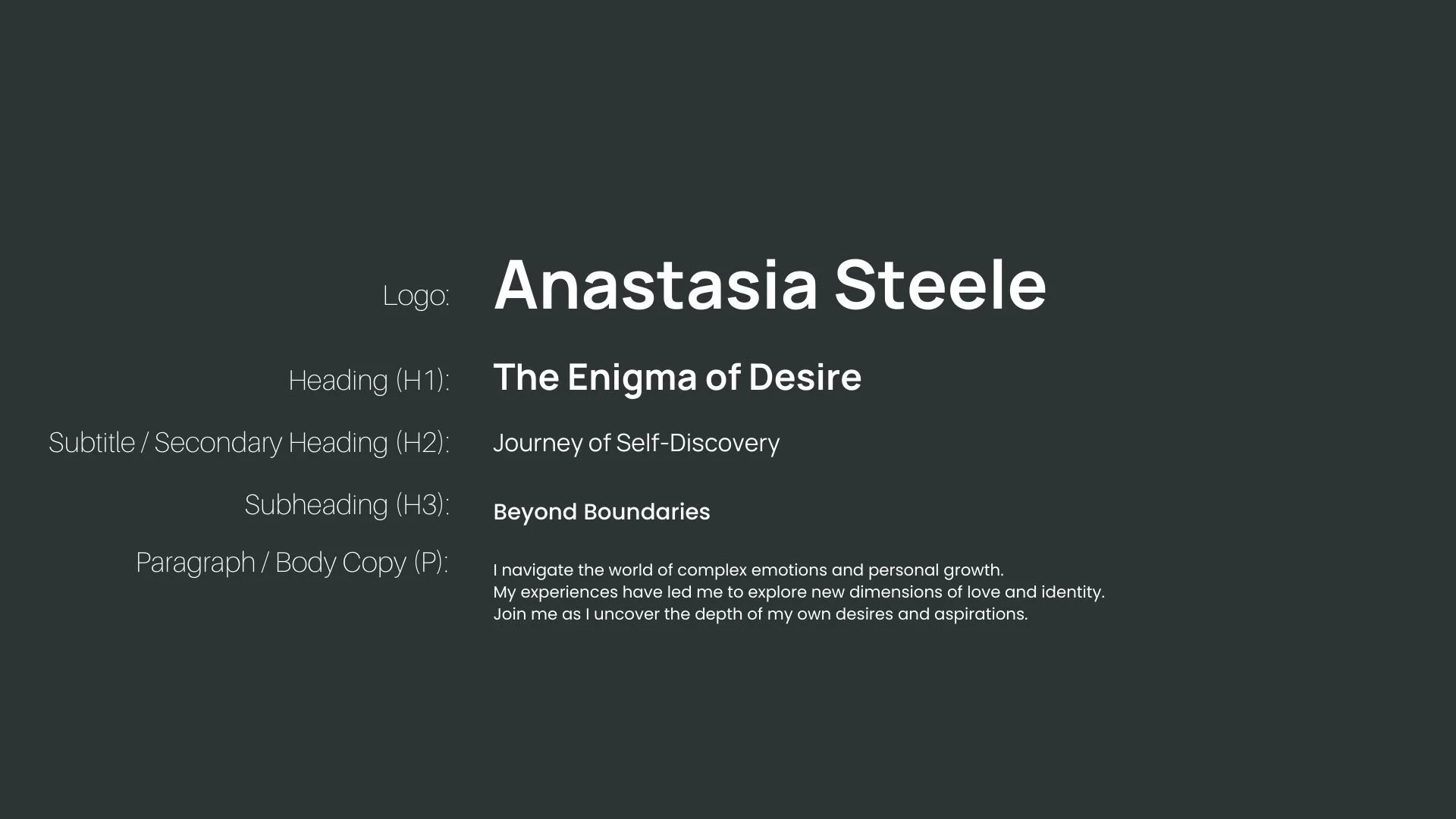
Font Hierarchy for Manrope and Poppins:
Logo
Usage: Primary logo text, initials, brand name
Manrope, Bold, 60-80 pt (Canva), 48-60 px (Squarespace)
Heading (H1)
Usage: Main headings on pages, prominent titles
Manrope, Bold, 36-48 pt (Canva), 30-36 px (Squarespace)
Subtitle / Secondary Heading (H2)
Usage: Section titles, important subtitles
Manrope, Regular, 24-30 pt (Canva), 20-24 px (Squarespace)
Subheading (H3)
Usage: Subsection headings, less prominent titles
Poppins, Medium, 18-24 pt (Canva), 16-20 px (Squarespace)
Paragraph / Body Copy (P)
Usage: Main body text, paragraphs, descriptions
Poppins, Regular, 12-16 pt (Canva), 14-16 px (Squarespace)