MEET YOUR FONT PAIRING MATCH
This page is your custom breakdown of the font pairing you were matched with from the Find Your Font Quiz. You’ll discover the history, personality, and style of each font—and see how they can come to life in your personal brand.
If you're a Personal Branding Studio member:
Bookmark this page. We’ll return to it in Part 2 when it’s time to use your font pairing to design your logo and create branded Canva graphics.
Not loving this particular combo? No problem. Explore all 100+ font pairings inside PBS - Part 1, Module 4: Design - to find one that feels just right. Click the button below to go there now.
Not yet a Personal Branding Studio member?
(And wondering what Personal Branding Studio even is?)
Start by scrolling through your results below. At the bottom of this page, you’ll find out how to go deeper with your personal brand through my full Personal Branding Studio program.
And your aligned font pairing match is…


HISTORY
-
HISTORY -
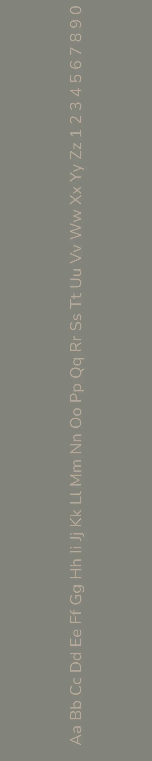
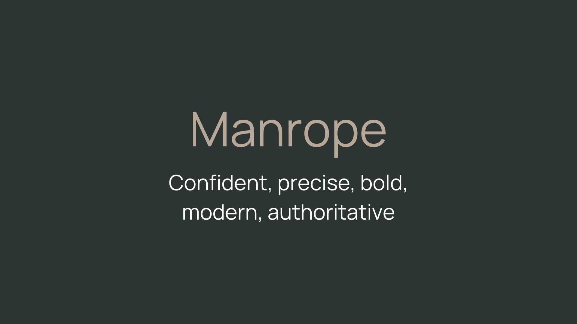
Manrope
Overview:
Manrope is a contemporary sans-serif typeface that combines geometric shapes with humanist influences. Its open, rounded letterforms and clean structure make it both modern and highly legible, ideal for use in digital design as well as print applications.
History:
Manrope was created by the Ukrainian designer Michael Tselishchev and released in 2019 under the Google Fonts library. Tselishchev designed Manrope as a versatile typeface that balances modernism and warmth, intended for use in a wide variety of design projects. Its creation was motivated by the need for a more functional and clean typeface suitable for user interfaces and digital environments, while also maintaining readability and personality.
Characteristics:
Design: Geometric with subtle humanist influences, featuring wide proportions and rounded terminals. The design strikes a balance between structure and warmth, making it approachable without sacrificing professionalism.
Usage: Perfect for UI/UX design, websites, headlines, and branding, where clarity and a contemporary aesthetic are crucial. Its clean and minimalist look also makes it suitable for large-scale prints and posters.
Attributes: Highly legible and versatile, with excellent readability on screens. Its neutral yet friendly appearance makes it a great choice for both formal and informal uses.

Nunito Sans
Overview:
Nunito Sans is a clean and modern sans-serif typeface characterized by its rounded, friendly appearance. Designed for excellent legibility, it’s a highly versatile font suitable for both digital and print media, offering a professional yet approachable style.
History:
Nunito Sans was designed by Vernon Adams and was first released in 2014 as part of the Google Fonts library. The typeface was created with the intent to offer a well-balanced and highly legible sans-serif family. Nunito Sans is a refinement of the original Nunito, which was created in 2010. Vernon Adams aimed to design a font that could work across a variety of devices and sizes while maintaining clarity, warmth, and legibility. The addition of the "Sans" version further expanded its functionality for web and user interface applications.
Characteristics:
Design: Nunito Sans has rounded terminals and a geometric structure, giving it a soft yet modern appearance. It strikes a balance between neutrality and warmth, making it friendly but still professional.
Usage: Ideal for use in user interfaces, websites, branding, and digital applications. Its legibility at small sizes and screen resolutions makes it perfect for mobile interfaces, while its clean design works well for both headlines and body text.
Attributes: Highly legible with a geometric design softened by its rounded shapes. It’s a versatile typeface, with excellent readability at various sizes and on digital screens. Its neutral tone allows for wide application in both formal and informal contexts.

FONT PERSONALITY
-
FONT PERSONALITY -

Why Manrope and Nunito Sans Are a Match Made in Heaven:
When Manrope and Nunito Sans come together, they create a balanced and harmonious design that exudes confidence and approachability. Manrope's bold, modern, and precise qualities make it the perfect choice for commanding headlines and establishing an authoritative tone. Its clean lines and sharp details convey professionalism with a contemporary edge. In contrast, Nunito Sans softens the overall aesthetic with its warm, friendly, and adaptable nature, making it ideal for body text or supportive messaging. The combination ensures that while the design feels strong and assured, it also remains inviting and easy to connect with—a perfect blend of formality and friendliness.
This pairing would resonate with a person who is authoritative yet approachable—a leader who values clarity but seeks to remain relatable. They might be a modern entrepreneur, a thought leader, or a mentor in a creative field, striving to project a sense of bold innovation while staying open and accessible to their audience. This individual appreciates precision and professionalism but understands the importance of warmth in building lasting connections.

CELEBRITY MATCH
-
CELEBRITY MATCH -

The font pairing of Manpole and Nunito Sans aligns perfectly with the character of Catwoman (Selina Kyle), as portrayed by Zoë Kravitz in the movie "The Batman (2022)".
Summary: Zoë Kravitz’s portrayal of Catwoman in The Batman captures the essence of the Manpole and Nunito Sans font pairing with remarkable accuracy. Manpole’s confident, precise, and bold characteristics reflect Catwoman’s sharp, modern presence, while Nunito Sans’s warmth, approachability, and adaptability echo Selina Kyle’s softer side and her ability to shift between different facets of her personality. Together, these fonts, like the character of Catwoman, create a perfect balance of impact and accessibility, making them ideal for designs that need both striking presence and welcoming, adaptable qualities.

HIERARCHY
-
HIERARCHY -
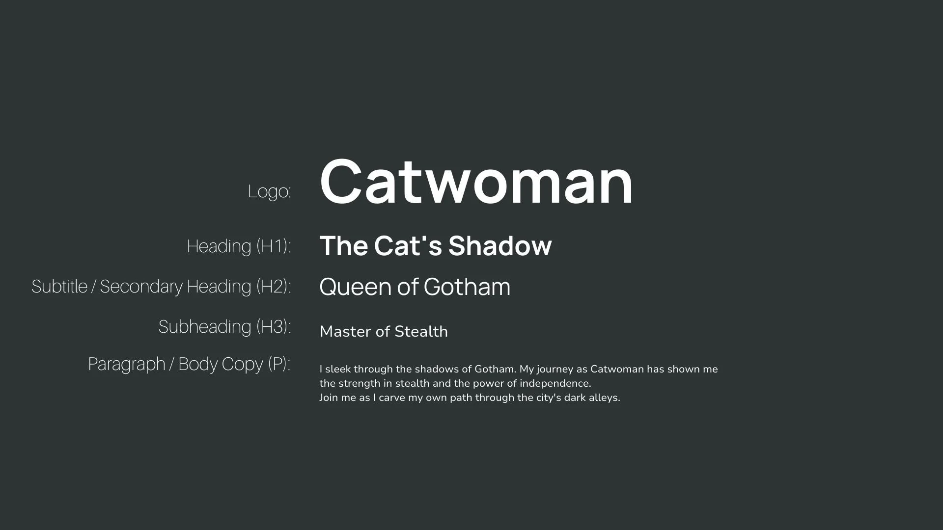
Font Hierarchy for Manrope and Nunito Sans:
Logo
Usage: Primary logo text, initials, brand name
Manrope, Bold, 48–72 pt (Canva), 36–48 px (Squarespace)
Heading (H1)
Usage: Main headings on pages, prominent titles
Manrope, Bold, 36–48 pt (Canva), 28–36 px (Squarespace)
Subtitle / Secondary Heading (H2)
Usage: Section titles, important subtitles
Manrope, Regular, 24–36 pt (Canva), 20–28 px (Squarespace)
Subheading (H3)
Usage: Subsection headings, less prominent titles
Nunito Sans, Regular, 18–24 pt (Canva), 16–20 px (Squarespace)
Paragraph / Body Copy (P)
Usage: Main body text, paragraphs, descriptions
Nunito Sans, Regular, 12–18 pt (Canva), 14–16 px (Squarespace)