MEET YOUR FONT PAIRING MATCH
This page is your custom breakdown of the font pairing you were matched with from the Find Your Font Quiz. You’ll discover the history, personality, and style of each font—and see how they can come to life in your personal brand.
If you're a Personal Branding Studio member:
Bookmark this page. We’ll return to it in Part 2 when it’s time to use your font pairing to design your logo and create branded Canva graphics.
Not loving this particular combo? No problem. Explore all 100+ font pairings inside PBS - Part 1, Module 4: Design - to find one that feels just right. Click the button below to go there now.
Not yet a Personal Branding Studio member?
(And wondering what Personal Branding Studio even is?)
Start by scrolling through your results below. At the bottom of this page, you’ll find out how to go deeper with your personal brand through my full Personal Branding Studio program.
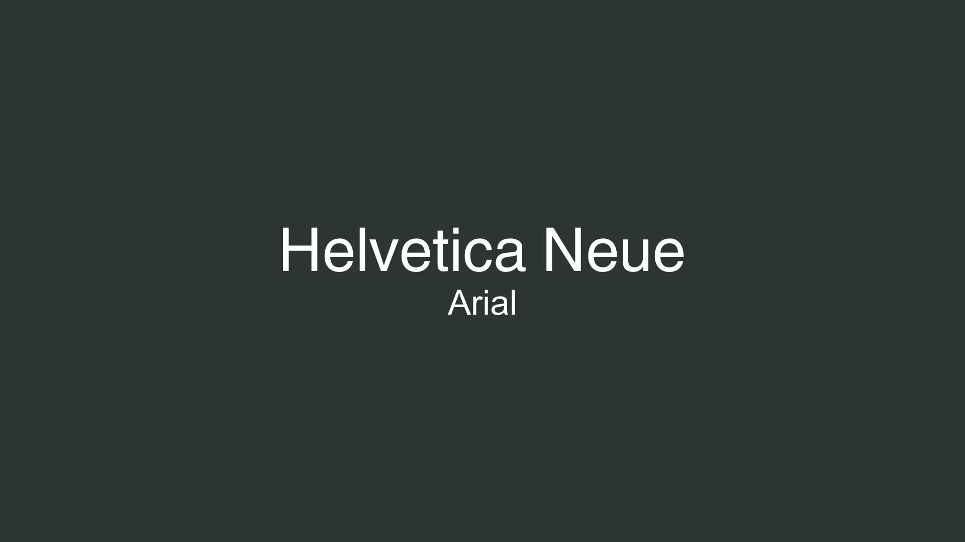
And your aligned font pairing match is…

HISTORY
-
HISTORY -
Helvetica Neue
Overview:
Helvetica Neue is a widely recognized, modernist sans-serif typeface that enhances the design versatility of the original Helvetica with updated weights and improved legibility. Known for its neutrality and clarity, Helvetica Neue is a favorite in both digital and print design, particularly in corporate branding and editorial layouts.
History:
Helvetica Neue was designed in 1983 by Swiss type designer Max Miedinger in collaboration with Eduard Hoffmann, building on the original Helvetica, which was created in 1957 by Miedinger and Hoffmann. The redesign aimed to refine Helvetica’s structure and expand its typographic utility by offering a consistent range of weights and widths. This update made Helvetica Neue even more adaptable, addressing criticisms of the original by making it more visually balanced and increasing its appeal for modern typesetting.
Characteristics:
Design: Helvetica Neue retains the clean, neutral qualities of the original Helvetica while introducing a more refined and consistent design across its weights. Its vertical terminals, low contrast, and compact letterforms make it easily recognizable. Helvetica Neue also features rounded strokes and squared dots, providing a harmonious, modern appearance.
Usage: Ideal for corporate branding, advertising, signage, and user interface design, Helvetica Neue’s legibility and neutrality allow it to communicate a message without imposing a specific personality. This makes it particularly popular in minimalist and modernist design contexts.
Attributes: Helvetica Neue offers a comprehensive family of weights, from thin to black, with regular, italic, and condensed styles. Its extended typographic flexibility is useful for multi-platform design projects, where consistency across different media is essential. Its versatility makes it a mainstay in corporate identities and editorial layouts where clarity and readability are paramount.

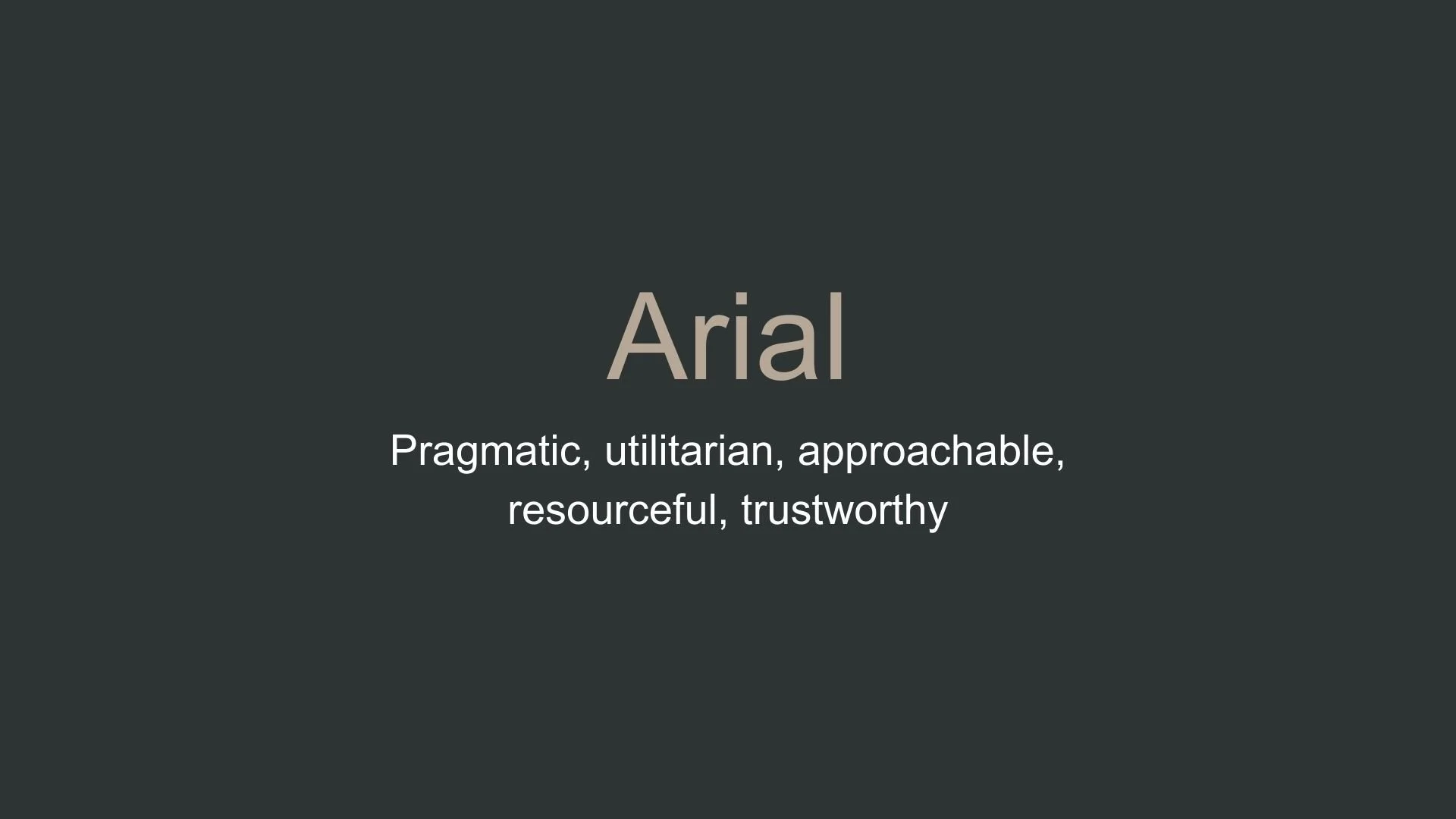
Arial
Overview:
Arial is a widely-used sans-serif typeface known for its readability and versatility across digital and print media. With its clean, straightforward letterforms, Arial has become a popular choice for both professional and casual uses, from documents to web design.
History:
Arial was created in 1982 by Robin Nicholas and Patricia Saunders for Monotype. It was initially designed to serve as a substitute for Helvetica, primarily for the IBM and Microsoft ecosystems. Arial’s design made it metrically compatible with Helvetica, allowing users to switch fonts without layout adjustments. As Microsoft adopted Arial as a core font in its Windows operating system, it gained immense popularity and became one of the most recognizable and accessible fonts worldwide.
Characteristics:
Design: Arial has a humanist style with rounded, open letterforms, distinguishing it slightly from Helvetica’s more mechanical feel. The shapes of characters like “a” and “t” have a softer, more rounded appearance, contributing to its friendliness and approachability.
Usage: Arial’s clarity and neutrality make it suitable for a broad range of applications, from body text in documents to website headers. Its ubiquity and legibility have made it a common choice in corporate branding, software interfaces, and educational materials.
Attributes: Arial is known for being highly readable at various sizes and screen resolutions. It offers a range of styles, including regular, italic, bold, and black, which enhances its adaptability across digital and print media. Its availability on nearly all operating systems and devices has made Arial a global standard for general-purpose typography.

FONT PERSONALITY
-
FONT PERSONALITY -

Why Helvetica Neue and Arial are a Match Made in Heaven:
When the refined elegance of Helvetica Neue meets the pragmatic reliability of Arial, they form a harmonious blend of sophistication and approachability. Helvetica Neue commands attention with its clean, modern aesthetic and refined versatility, making it an ideal choice for primary elements like headlines or logos that need to exude professionalism and timeless appeal. Arial, while simpler and more utilitarian, provides a grounded and trustworthy foundation. Its straightforward design complements Helvetica Neue’s sophistication without competing, ensuring readability and balance in secondary elements like body text or captions. Together, they strike the perfect balance between style and practicality.
This pairing would resonate with someone who values both class and functionality—perhaps a professional who navigates between high-level strategy and hands-on execution. Think of a minimalist entrepreneur, a corporate consultant, or a creative professional who wants their personal brand to communicate reliability, adaptability, and understated elegance. This person knows the power of making a strong yet unpretentious impression, embodying the balance of refinement and pragmatism that this pairing delivers.

CELEBRITY MATCH
-
CELEBRITY MATCH -

The font pairing of Helvetica Neue and Arial aligns perfectly with the character of Ann Darrow, as portrayed by Naomi Watts in the movie "King Kong (2005)".
Summary: Naomi Watts’ portrayal of Ann Darrow in King Kong perfectly matches the combination of Helvetica Neue and Arial fonts. The Helvetica Neue aspect of her character is embodied in Ann's grace, elegance, and ability to adapt to the terrifying and unknown world of Skull Island. Her inherent sophistication shines through in her moments of vulnerability and in her relationship with Kong. On the other hand, Arial reflects Ann's growth into a resourceful, practical, and dependable individual. Her ability to persevere through danger and find solutions in dire circumstances aligns with the approachable, pragmatic nature of Arial. Together, these fonts mirror Ann’s transformation from a frightened woman into a strong, resourceful survivor—demonstrating elegance alongside adaptability and pragmatism.

HIERARCHY
-
HIERARCHY -

Font Hierarchy for Helvetica Neue and Arial:
Logo
Usage: Primary logo text, initials, brand name
Helvetica Neue, Regular or Bold, 48-72pt (Canva), 36-48pt (Squarespace)
Heading (H1)
Usage: Main headings on pages, prominent titles
Helvetica Neue , Bold, 36pt (Canva), 28pt (Squarespace)
Subtitle / Secondary Heading (H2)
Usage: Section titles, important subtitles
Helvetica Neue, Regular, 24pt (Canva), 20pt (Squarespace)
Subheading (H3)
Usage: Subsection headings, less prominent titles
Arial, Regular, 18pt (Canva), 16pt (Squarespace)
Paragraph / Body Copy (P)
Usage: Main body text, paragraphs, descriptions
Arial, Regular, 14pt (Canva), 14pt (Squarespace)