MEET YOUR FONT PAIRING MATCH
This page is your custom breakdown of the font pairing you were matched with from the Find Your Font Quiz. You’ll discover the history, personality, and style of each font—and see how they can come to life in your personal brand.
If you're a Personal Branding Studio member:
Bookmark this page. We’ll return to it in Part 2 when it’s time to use your font pairing to design your logo and create branded Canva graphics.
Not loving this particular combo? No problem. Explore all 100+ font pairings inside PBS - Part 1, Module 4: Design - to find one that feels just right. Click the button below to go there now.
Not yet a Personal Branding Studio member?
(And wondering what Personal Branding Studio even is?)
Start by scrolling through your results below. At the bottom of this page, you’ll find out how to go deeper with your personal brand through my full Personal Branding Studio program.
And your aligned font pairing match is…


HISTORY
-
HISTORY -
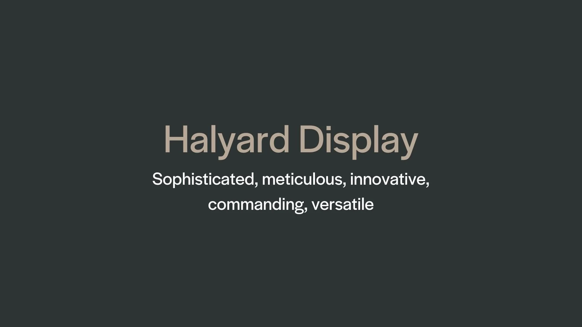
Halyard Display
Overview:
Halyard Display is a versatile sans-serif typeface known for its clarity, high contrast, and strong visual presence. Part of the broader Halyard superfamily, this display variant is specifically designed for impactful headings and high-visibility uses, where readability and style need to work together seamlessly.
History:
Halyard was designed by Joshua Darden and released in 2017 by Darden Studio. Darden created Halyard as a comprehensive typeface family that includes Display, Text, and Micro versions, each optimized for a different set of design needs. The Display variant focuses on expressive typographic qualities, leveraging high contrast to create a memorable, bold presence on large formats like headlines, posters, and billboards.
Characteristics:
Design: Halyard Display is distinguished by its clean lines and high contrast between thick and thin strokes, which adds drama to large text settings. Its geometric roots are balanced by subtle humanistic elements, giving it warmth and personality.
Usage: The font is ideal for headlines, logos, and other high-impact text settings that require a strong visual presence. It’s used frequently in editorial layouts, advertising, and branding due to its legibility and stylish aesthetic.
Attributes: Halyard Display includes a broad character set supporting multiple languages and offers stylistic alternates and OpenType features. It’s part of a larger superfamily, making it easy to pair with other Halyard versions like Text and Micro for cohesive designs across various text sizes and applications.


FONT PERSONALITY
-
FONT PERSONALITY -
Why Abel and Source Code Pro are a Match Made in Heaven:
When the personalities of Abel and Source Code Pro are combined, the result is a pairing that is both approachable and functional. Abel brings a modern and professional touch with a hint of warmth, making it suitable for headlines and logos that need to be both eye-catching and versatile. On the other hand, Source Code Pro’s precise and technical nature grounds the pairing, ensuring that the overall design remains clear and unambiguous, especially in detailed or complex content.
Together, these fonts would appeal to a person who is both practical and modern—a tech-savvy individual who values clarity and precision but also appreciates subtle design aesthetics. This person might be someone who works in a creative tech industry, blending innovation with functionality, such as a designer-developer hybrid who values both form and function in their work.

CELEBRITY MATCH
-
CELEBRITY MATCH -

The font Halyard Display aligns perfectly with the character of Annalise Keating, as portrayed by Viola Davis in the movie "How to Get Away with Murder".
Summary: Halyard Display is a sophisticated and contemporary typeface that shares remarkable traits with Annalise Keating, as portrayed by Viola Davis in How to Get Away with Murder. The font's commanding presence, elegance, and versatility closely mirror Annalise's powerful, sophisticated persona, as well as her ability to balance tradition and modernity. Just as Halyard Display creates a lasting impression in large-scale, high-impact applications, Annalise Keating leaves a powerful mark on everyone she encounters with her sharp intellect, authority, and nuanced understanding of the world.

HIERARCHY
-
HIERARCHY -
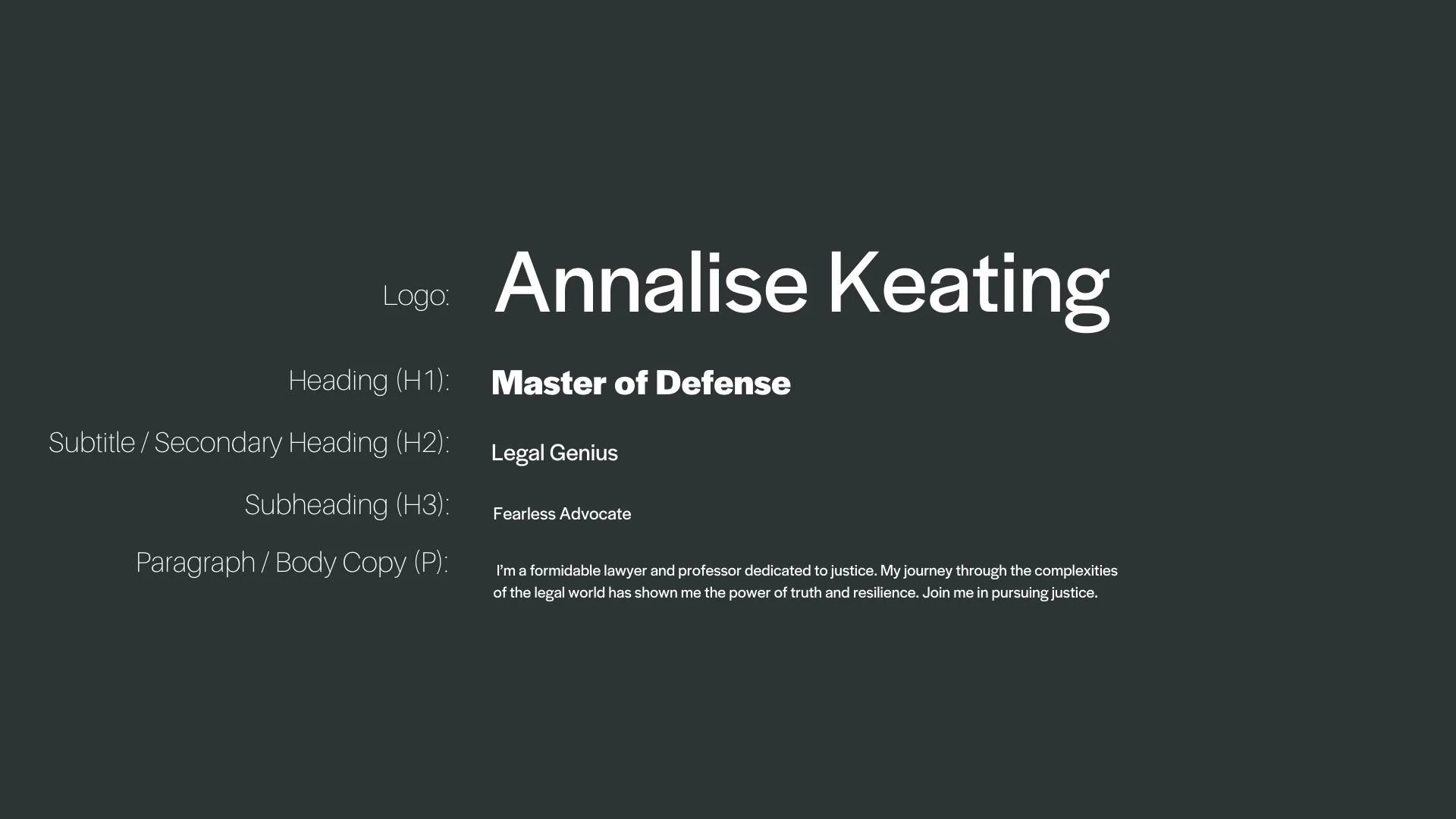
Font Hierarchy for Halyard Display:
Logo
Usage: Primary logo text, initials, brand name
Halyard Display, Regular, 120pt-150pt (Canva), 150px-200px (Squarespace)
Heading (H1)
Usage: Main headings on pages, prominent titles
Halyard Display, Bold, 36pt (Canva), 32px (Squarespace)
Subtitle / Secondary Heading (H2)
Usage: Section titles, important subtitles
Halyard Display, Regular, 24pt (Canva), 24px (Squarespace)
Subheading (H3)
Usage: Subsection headings, less prominent titles
Halyard Display, Regular, 18pt (Canva), 18px (Squarespace)
Paragraph / Body Copy (P)
Usage: Main body text, paragraphs, descriptions
Halyard Display, Regular, 16pt (Canva), 16px (Squarespace)