MEET YOUR FONT PAIRING MATCH
This page is your custom breakdown of the font pairing you were matched with from the Find Your Font Quiz. You’ll discover the history, personality, and style of each font—and see how they can come to life in your personal brand.
If you're a Personal Branding Studio member:
Bookmark this page. We’ll return to it in Part 2 when it’s time to use your font pairing to design your logo and create branded Canva graphics.
Not loving this particular combo? No problem. Explore all 100+ font pairings inside PBS - Part 1, Module 4: Design - to find one that feels just right. Click the button below to go there now.
Not yet a Personal Branding Studio member?
(And wondering what Personal Branding Studio even is?)
Start by scrolling through your results below. At the bottom of this page, you’ll find out how to go deeper with your personal brand through my full Personal Branding Studio program.
And your aligned font pairing match is…

HISTORY
-
HISTORY -
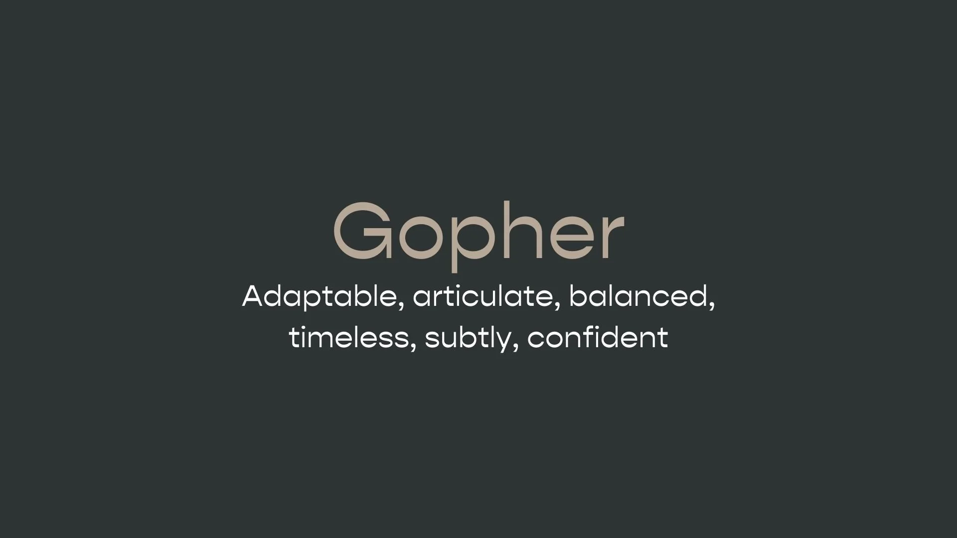
Gopher
Overview:
Gopher is a modern sans-serif typeface characterized by a unique reverse contrast, where horizontal strokes are thicker than vertical ones, creating a distinctive visual appeal. This geometric font is designed for versatility and stands out with its bold and striking design, making it suitable for branding, editorial, and display purposes.
History:
The Gopher font family was designed by Adam Ladd and released in 2019. Ladd sought to explore a fresh take on traditional sans-serifs through reverse contrast, where the weight contrast typically used in serif fonts is inverted, adding a contemporary twist. This design choice gives Gopher a unique look while maintaining readability, positioning it as a memorable option for both digital and print projects.
Characteristics:
Design: Gopher is a geometric sans-serif with reverse contrast, providing a bold, unconventional style. It includes 48 styles across various weights, from Hairline to Heavy, and has versions suited for text, normal, and display purposes. This makes it adaptable across different applications and sizes.
Usage: Ideal for branding, advertising, magazines, and packaging, Gopher’s visual impact works well for headlines, logos, and display text. Its multiple optical sizes and support for OpenType features like stylistic alternates and ligatures enhance its versatility for creative uses.
Attributes: With over 600 glyphs, Gopher supports extensive Latin-based languages, enabling broad usability. Its reverse contrast and wide range of styles give it a contemporary, bold, and playful feel, while still being highly functional and legible across various design contexts.


FONT PERSONALITY
-
FONT PERSONALITY -
Why Abel and Source Code Pro are a Match Made in Heaven:
When the personalities of Abel and Source Code Pro are combined, the result is a pairing that is both approachable and functional. Abel brings a modern and professional touch with a hint of warmth, making it suitable for headlines and logos that need to be both eye-catching and versatile. On the other hand, Source Code Pro’s precise and technical nature grounds the pairing, ensuring that the overall design remains clear and unambiguous, especially in detailed or complex content.
Together, these fonts would appeal to a person who is both practical and modern—a tech-savvy individual who values clarity and precision but also appreciates subtle design aesthetics. This person might be someone who works in a creative tech industry, blending innovation with functionality, such as a designer-developer hybrid who values both form and function in their work.

CELEBRITY MATCH
-
CELEBRITY MATCH -
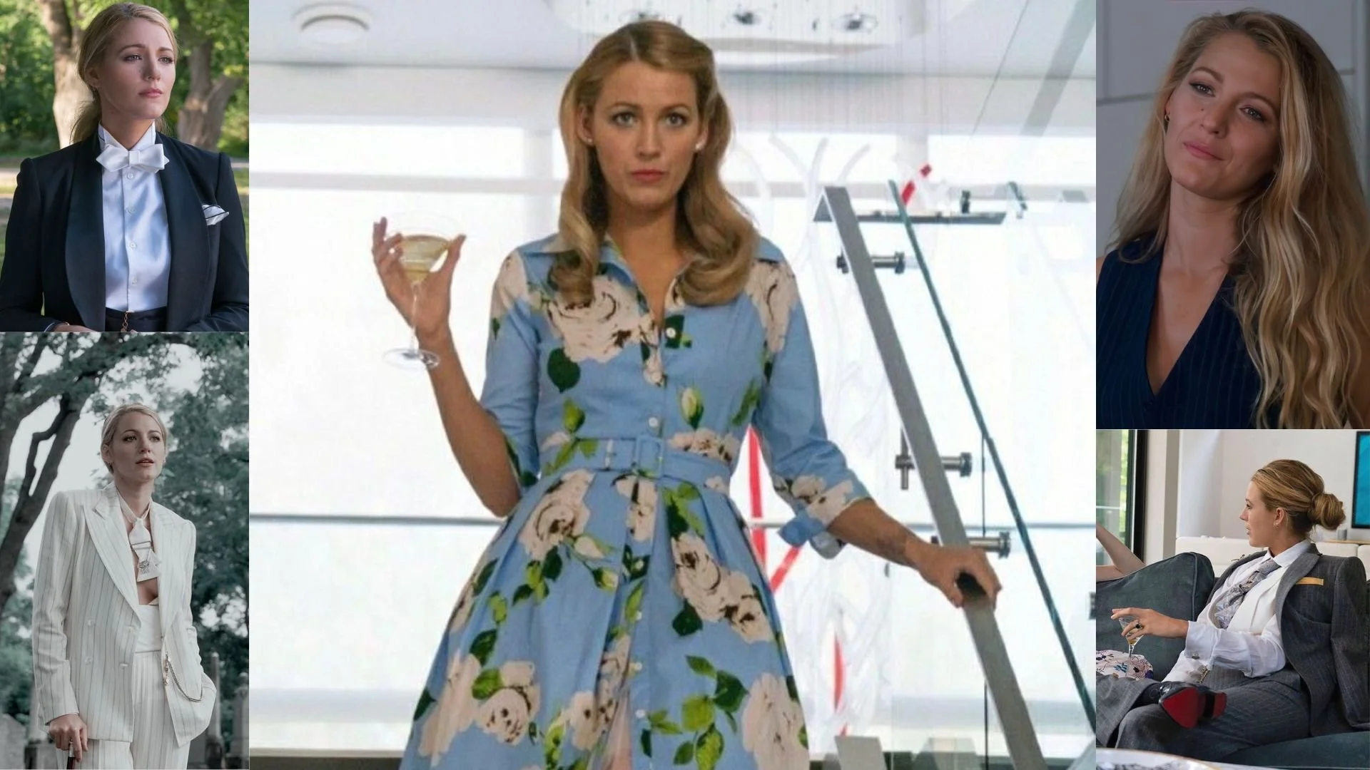
The font Gopher aligns perfectly with the character of Emily Nelson, as portrayed by Blake Lively in the movie "A Simple Favor (2018)".
Summary: Blake Lively’s portrayal of Emily Nelson in A Simple Favor perfectly mirrors the qualities of the Gopher font. Emily is adaptable, articulate, and strikes a perfect balance between tradition and modernity. Just as Gopher seamlessly blends timeless design with contemporary elements, Emily Nelson embodies a sophisticated elegance mixed with a contemporary edge. Her presence is distinct yet subtle, much like the nuanced personality of the Gopher font. Whether she's in a glamorous setting or revealing her darker secrets, Emily stands out in a quiet, confident way, just as the Gopher font quietly commands attention with its refined yet bold character.

HIERARCHY
-
HIERARCHY -
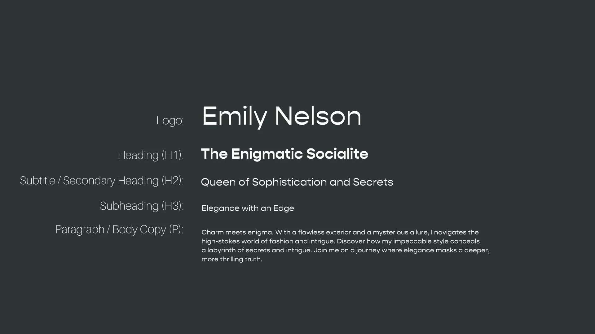
Font Hierarchy for Gopher:
Logo
Usage: Primary logo text, initials, brand name
Gopher, Regular, 72pt (Canva), 36px (Squarespace)
Heading (H1)
Usage: Main headings on pages, prominent titles
Gopher, Bold, 36pt (Canva), 24px (Squarespace)
Subtitle / Secondary Heading (H2)
Usage: Section titles, important subtitles
Gopher, Regular, 26pt (Canva), 18px (Squarespace)
Subheading (H3)
Usage: Subsection headings, less prominent titles
Gopher, Regular, 20pt (Canva), 16px (Squarespace)
Paragraph / Body Copy (P)
Usage: Main body text, paragraphs, descriptions
Gopher, Regular, 16 pt (Canva), 14px (Squarespace)