MEET YOUR FONT PAIRING MATCH
This page is your custom breakdown of the font pairing you were matched with from the Find Your Font Quiz. You’ll discover the history, personality, and style of each font—and see how they can come to life in your personal brand.
If you're a Personal Branding Studio member:
Bookmark this page. We’ll return to it in Part 2 when it’s time to use your font pairing to design your logo and create branded Canva graphics.
Not loving this particular combo? No problem. Explore all 100+ font pairings inside PBS - Part 1, Module 4: Design - to find one that feels just right. Click the button below to go there now.
Not yet a Personal Branding Studio member?
(And wondering what Personal Branding Studio even is?)
Start by scrolling through your results below. At the bottom of this page, you’ll find out how to go deeper with your personal brand through my full Personal Branding Studio program.
And your aligned font pairing match is…
HISTORY
-
HISTORY -
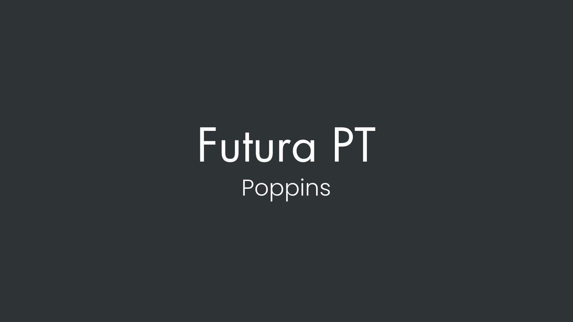
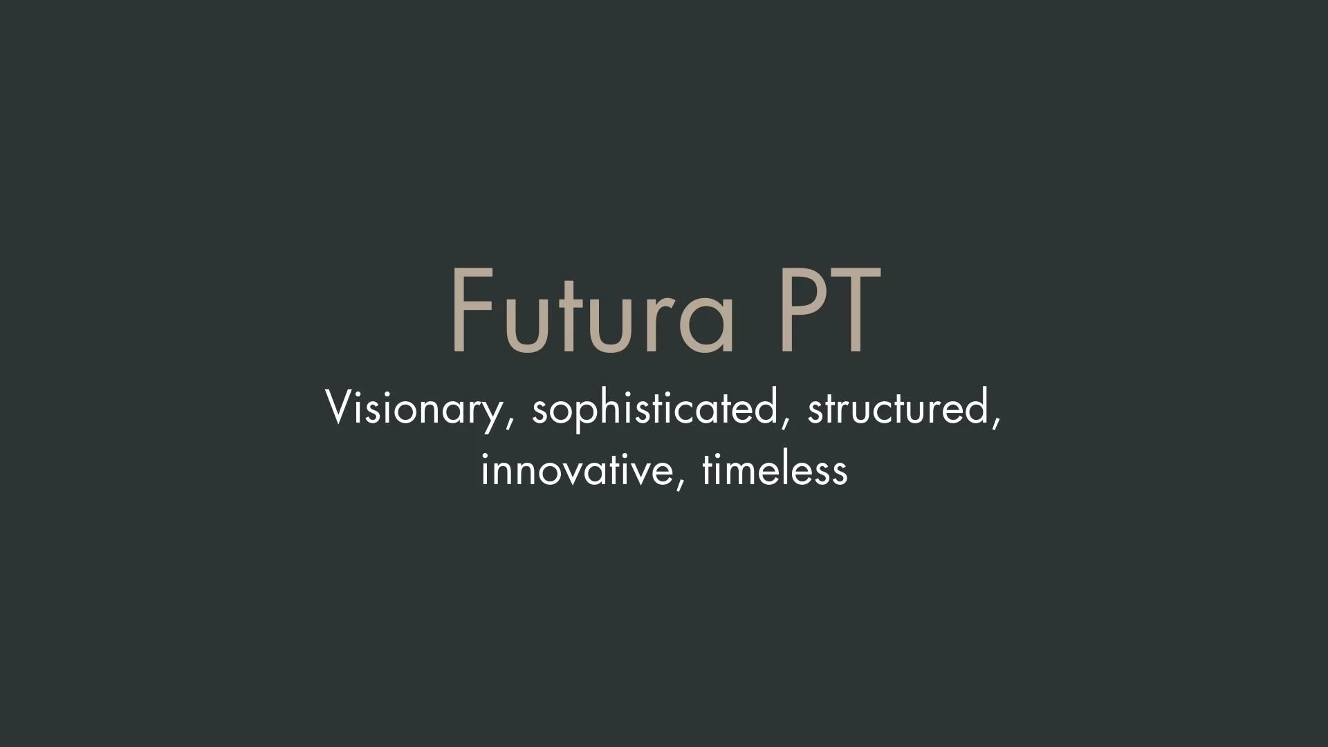
Futura PT
Overview:
Futura PT is a geometric sans-serif typeface that exemplifies modernist ideals with its clean, straightforward design. Originally developed for functionality and clarity, this font has maintained popularity for nearly a century and is frequently used in branding, editorial, and advertising due to its timeless appeal and versatility.
History:
Futura was first created by German type designer Paul Renner in 1927, embodying the Bauhaus principles of "form follows function." Renner aimed to create a typeface that would represent modernity through simplicity and geometric precision. In 1993, the Futura PT version was released by the Paratype foundry, making the font more accessible with expanded Cyrillic and Latin character sets, suitable for global use.
Characteristics:
Design: Futura PT features precise geometric shapes with perfect circles and a strong horizontal baseline. It has a balance of sharp, clean edges and a rounded letterform structure, giving it a sophisticated, yet approachable feel.
Usage: Ideal for headlines, logos, and large displays, Futura PT is known for adding a sense of professionalism and authority to designs. It’s also widely used in advertising, book covers, and digital media.
Attributes: Highly legible and neutral, Futura PT exudes a modern and sleek aesthetic. Its geometric construction gives it a rational, almost technical quality, often associated with trustworthiness and innovation.
Poppins
Overview:
Poppins is a modern, geometric sans-serif typeface known for its rounded, monolinear letterforms and clear readability. With a sleek, minimalist aesthetic, it is particularly well-suited for digital media and is popular for use in UI/UX design, branding, and headings in web and mobile applications.
History:
Poppins was designed by Indian Type Foundry (ITF) and released in 2015. The goal was to create a versatile, multi-weight typeface that could support both Latin and Devanagari scripts, reflecting a global and multicultural approach to design. Its creators sought to merge modernist design principles with support for multiple languages, aiming to meet the needs of diverse, digital-first audiences. It has since become a Google Font, increasing its accessibility and usage in web design.
Characteristics:
Design: Poppins is highly geometric, with a monolinear structure and a balanced, rounded appearance. The typeface features circular shapes and uniform stroke widths, lending it a clean, harmonious aesthetic. Its geometric simplicity aligns it with other popular modern sans-serifs while adding a touch of warmth through its rounded characters.
Usage: Due to its readability and adaptability across various screen sizes, Poppins is ideal for web design, UI/UX interfaces, and digital platforms. It’s commonly used for headlines and subheadings, as well as in branding and logos where a clean, contemporary look is desired.
Attributes: Poppins is characterized by its high legibility and versatile design, which make it effective in digital formats. Its approachable, polished look gives a professional yet friendly impression, making it suitable for corporate and creative applications alike.
FONT PERSONALITY
-
FONT PERSONALITY -
Why Futura PT and Poppins are a Match Made in Heaven:
Futura PT and Poppins create a harmonious balance of sophistication and approachability, making them an ideal font pairing. Futura PT, with its visionary and timeless structure, serves as a strong anchor for headlines or titles, delivering a sense of innovation and clarity. Poppins, with its modern and inclusive personality, complements Futura PT by softening its structured nature and adding warmth to the design. Together, these fonts exude a forward-thinking elegance while maintaining a welcoming tone, perfect for brands that aim to inspire while staying relatable.
This pairing would resonate with a person who is both polished and personable—a creative entrepreneur or lifestyle coach, perhaps. This individual values innovation and structure in their work while maintaining an inclusive and approachable demeanor. They are likely someone who aspires to lead with sophistication but ensures their messaging feels accessible and uplifting to their audience.
CELEBRITY MATCH
-
CELEBRITY MATCH -
The font pairing of Futura PT and Poppins aligns perfectly with the character of Sydney Bristow, as portrayed by Jennifer Garner in the movie "Alias (2001-2006)".
Summary: The combination of Futura PT and Poppins mirrors Sydney Bristow’s dual nature in Alias. Futura PT reflects her structured, sophisticated, and visionary side—always forward-thinking and grounded in a sense of purpose. Meanwhile, Poppins represents her more approachable, adaptable, and modern qualities, showcasing her warmth, relatability, and ease in navigating complex social and emotional dynamics. Both fonts together capture the balance Sydney strikes between being a professional agent and a deeply human character, constantly evolving and connecting with others while pushing boundaries in her quest for justice.
HIERARCHY
-
HIERARCHY -
Font Hierarchy for Futura PT and Poppins:
Logo
Usage: Primary logo text, initials, brand name
Futura PT, Regular, 48-72px (Canva), 32-48px (Squarespace)
Heading (H1)
Usage: Main headings on pages, prominent titles
Futura PT, Bold, 36-42px (Canva), 24-30px (Squarespace)
Subtitle / Secondary Heading (H2)
Usage: Section titles, important subtitles
Poppins, Regular, 24-30px (Canva), 18-24px (Squarespace)
Subheading (H3)
Usage: Subsection headings, less prominent titles
Poppins, Regular, 18-24px (Canva), 16-20px (Squarespace)
Paragraph / Body Copy (P)
Usage: Main body text, paragraphs, descriptions
Poppins, Regular, 14-18px (Canva), 14-16px (Squarespace)


