MEET YOUR FONT PAIRING MATCH
This page is your custom breakdown of the font pairing you were matched with from the Find Your Font Quiz. You’ll discover the history, personality, and style of each font—and see how they can come to life in your personal brand.
If you're a Personal Branding Studio member:
Bookmark this page. We’ll return to it in Part 2 when it’s time to use your font pairing to design your logo and create branded Canva graphics.
Not loving this particular combo? No problem. Explore all 100+ font pairings inside PBS - Part 1, Module 4: Design - to find one that feels just right. Click the button below to go there now.
Not yet a Personal Branding Studio member?
(And wondering what Personal Branding Studio even is?)
Start by scrolling through your results below. At the bottom of this page, you’ll find out how to go deeper with your personal brand through my full Personal Branding Studio program.
And your aligned font pairing match is…


HISTORY
-
HISTORY -
Familjen Grotesk
Overview:
Familjen Grotesk is a sans-serif typeface recognized for its balance of classical and modern design elements. It is highly versatile, supporting various design applications from digital interfaces to print layouts. With subtle details and well-proportioned forms, it appeals to a wide range of branding, editorial, and digital uses.
History:
Stefan Hattenbach, a Swedish designer, created Familjen Grotesk to capture the essence of traditional grotesque typefaces while incorporating modern aesthetics. Released in the early 21st century, Hattenbach's goal was to make a font that would be both timeless and adaptable, fitting different media types and purposes.
Characteristics:
Design: Familjen Grotesk blends a geometric structure with slightly condensed letterforms and a uniform stroke width. Its high x-height, slightly rounded shapes, and open apertures make it readable and visually approachable, even in smaller sizes. Sharp diagonal strokes in characters like "k" and "R" add a dynamic quality to its otherwise clean design.
Usage: Suitable for both text and display, Familjen Grotesk works well in branding, web design, and editorial settings. Its adaptability across various weights, from Light to Bold, makes it ideal for establishing visual hierarchy in typography, from headlines to body text.
Attributes: Familjen Grotesk’s open, legible structure minimizes visual fatigue, supporting readability on screens and in print. The typeface’s compatibility with multiple languages enhances its international usability. Its balance of clean geometry and nuanced details, such as large ink traps, contribute to its functionality and aesthetic appeal in diverse design environments.
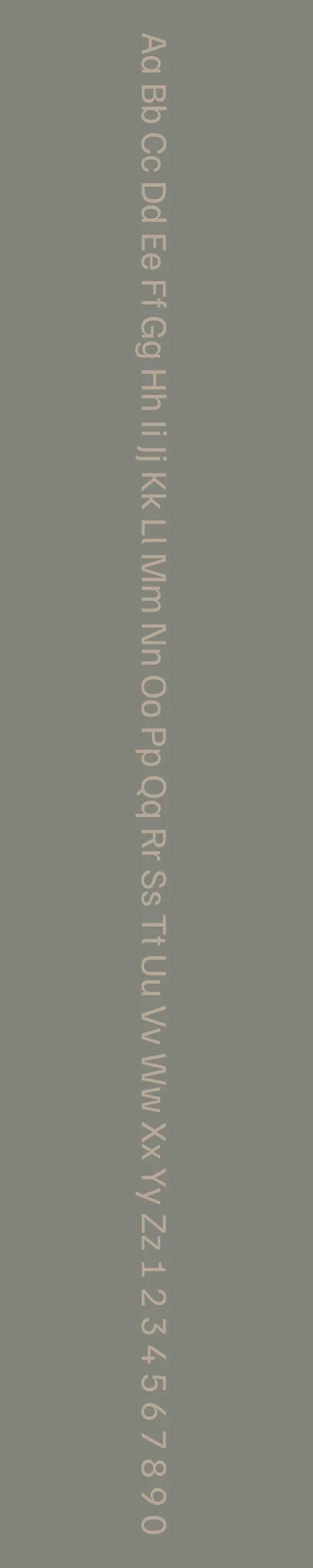
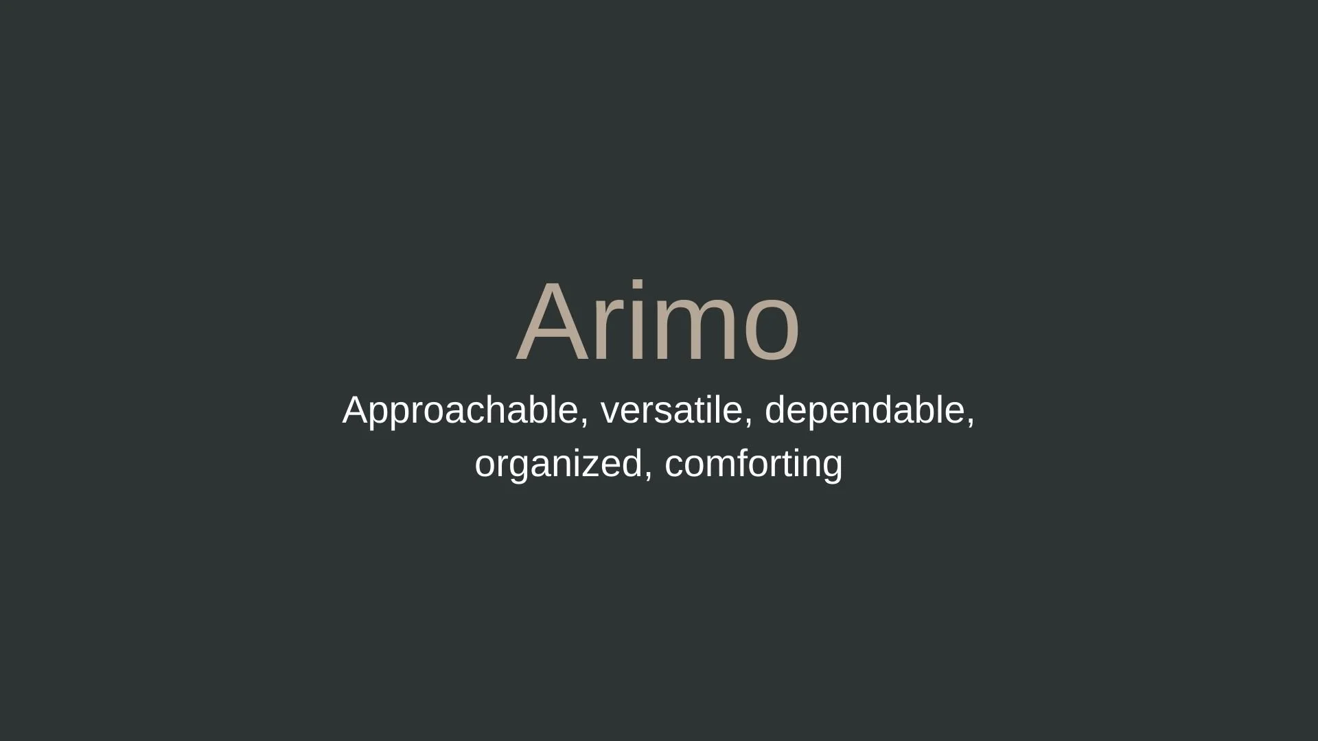
Arimo
Overview:
Arimo is a highly legible sans-serif font known for its modern, humanist design. Designed to offer an open and neutral aesthetic, it works effectively in digital and print formats, making it popular for interfaces and documents where clarity is key.
History:
Arimo was created by Steve Matteson for Ascender Corp and released in 2010 as part of Google’s open-source font library. Matteson designed Arimo as a metrically compatible alternative to Arial, allowing it to be used as a drop-in replacement without disrupting layout. Arimo was conceived to improve readability on digital screens, providing a refined and versatile option suited to a range of environments.
Characteristics:
Design: Arimo features a clean, geometric structure with consistent line weights and a slightly condensed letterform style. It includes a high x-height, balanced proportions, and open apertures, which together enhance readability across various screen sizes.
Usage: Arimo is well-suited for digital documents, websites, and user interfaces where a clear, modern look is needed. Its adaptability for both body text and headings makes it a flexible choice for digital and print applications alike.
Attributes: Arimo’s neutrality and readability make it versatile across different industries, from technology to publishing. As a metrically compatible Arial alternative, it is widely accessible and effective for layouts that require precise alignment. Arimo’s open-source availability through Google Fonts has solidified its popularity for web and mobile design, where it provides both reliability and style.


FONT PERSONALITY
-
FONT PERSONALITY -

Why Familjen Grotesk and Arimo are a Match Made in Heaven:
When Familjen Grotesk and Arimo come together, they create a pairing that exudes confidence, clarity, and approachability. Familjen Grotesk sets the tone with its sophisticated and modern essence, making a bold statement in headlines and branding materials while maintaining a crisp and impactful presence. Its refined, minimalist design draws the eye and delivers a strong impression. Arimo, on the other hand, complements this boldness by bringing warmth and dependability to the mix. Its approachable and organized nature ensures that the overall design feels grounded and user-friendly, making it ideal for body text or supporting content that needs to be both readable and welcoming. Together, they strike a balance between assertiveness and accessibility, ensuring the design feels both professional and personable.
This pairing would resonate with a person who is confident, modern, and values making meaningful connections. They are likely someone who combines ambition with warmth—perhaps an entrepreneur, consultant, or creative professional. This individual is polished and detail-oriented, yet they know the importance of relatability and trust in their personal brand. They are the type to make a strong first impression while ensuring their audience feels comfortable and engaged, perfectly reflecting the duality of Familjen Grotesk’s impact and Arimo’s charm.

CELEBRITY MATCH
-
CELEBRITY MATCH -

The font pairing of Familjen Grotesk and Arimo aligns perfectly with the character of Rachel Green, as portrayed by Jennifer Aniston in the movie "Friends".
Summary: Jennifer Aniston's portrayal of Rachel Green perfectly matches the characteristics of the Familjen Grotesk and Arimo font pairing. Rachel Green’s modern and bold style mirrors the assertiveness and sophistication of Familjen Grotesk, while her warm, supportive, and adaptable nature aligns with the approachable qualities of Arimo. This dynamic pairing encapsulates both the strong, impactful presence and the dependable, comforting reliability that define Rachel Green's character in Friends. The blend of confidence and warmth makes for a harmonious balance, much like the combination of Familjen Grotesk and Arimo in design.

HIERARCHY
-
HIERARCHY -
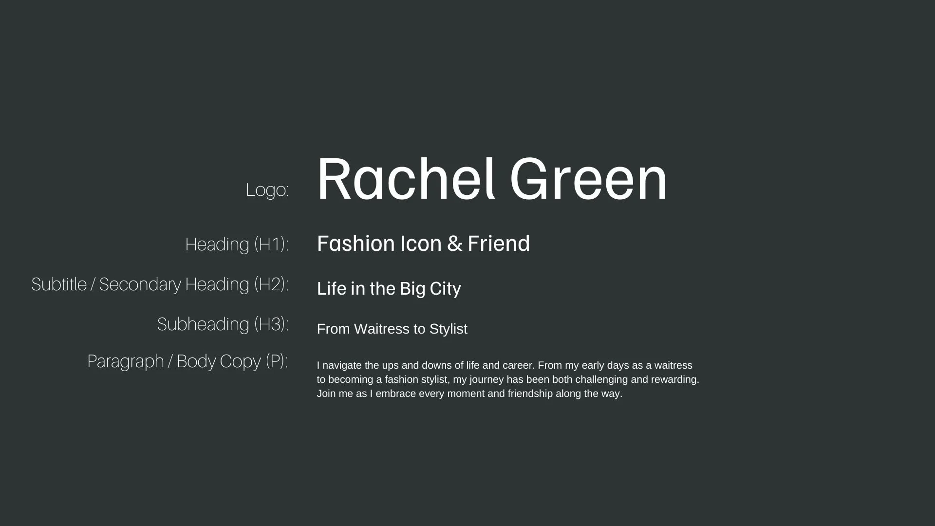
Font Hierarchy for Familjen Grotesk and Arimo:
Logo
Usage: Primary logo text, initials, brand name
Familjen Grotesk, Regular, 48-72 pt (Canva), 36-60 px (Squarespace)
Heading (H1)
Usage: Main headings on pages, prominent titles
Familjen Grotesk, Regular, 36-48 pt (Canva), 24-36 px (Squarespace)
Subtitle / Secondary Heading (H2)
Usage: Section titles, important subtitles
Familjen Grotesk, Regular, 24-36 pt (Canva), 18-24 px (Squarespace)
Subheading (H3)
Usage: Subsection headings, less prominent titles
Arimo, Regular, 18-24 pt (Canva), 16-20 px (Squarespace)
Paragraph / Body Copy (P)
Usage: Main body text, paragraphs, descriptions
Arimo, Regular, 12-16 pt (Canva), 14-16 px (Squarespace)