MEET YOUR FONT PAIRING MATCH
This page is your custom breakdown of the font pairing you were matched with from the Find Your Font Quiz. You’ll discover the history, personality, and style of each font—and see how they can come to life in your personal brand.
If you're a Personal Branding Studio member:
Bookmark this page. We’ll return to it in Part 2 when it’s time to use your font pairing to design your logo and create branded Canva graphics.
Not loving this particular combo? No problem. Explore all 100+ font pairings inside PBS - Part 1, Module 4: Design - to find one that feels just right. Click the button below to go there now.
Not yet a Personal Branding Studio member?
(And wondering what Personal Branding Studio even is?)
Start by scrolling through your results below. At the bottom of this page, you’ll find out how to go deeper with your personal brand through my full Personal Branding Studio program.
And your aligned font pairing match is…

HISTORY
-
HISTORY -
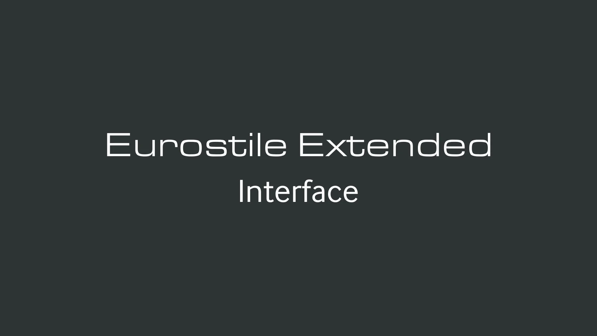
Eurostile Extended
Overview:
Eurostile Extended is a geometric sans-serif typeface that exudes a strong, futuristic presence. Its extended letterforms create a bold and distinctive look, making it a popular choice for design projects that require a modern and tech-forward aesthetic.
History:
Eurostile Extended was designed by the renowned Italian typographer Aldo Novarese in 1962. The typeface was a variation of his original Eurostile, which itself was designed in the late 1950s. Eurostile was intended to capture the spirit of technological advancement during the post-World War II era, reflecting the optimism and progress of modernity. The "Extended" version was introduced to offer a wider, more dynamic version of the original font, lending itself well to advertising, signage, and branding that needed a bold, impactful appearance.
Characteristics:
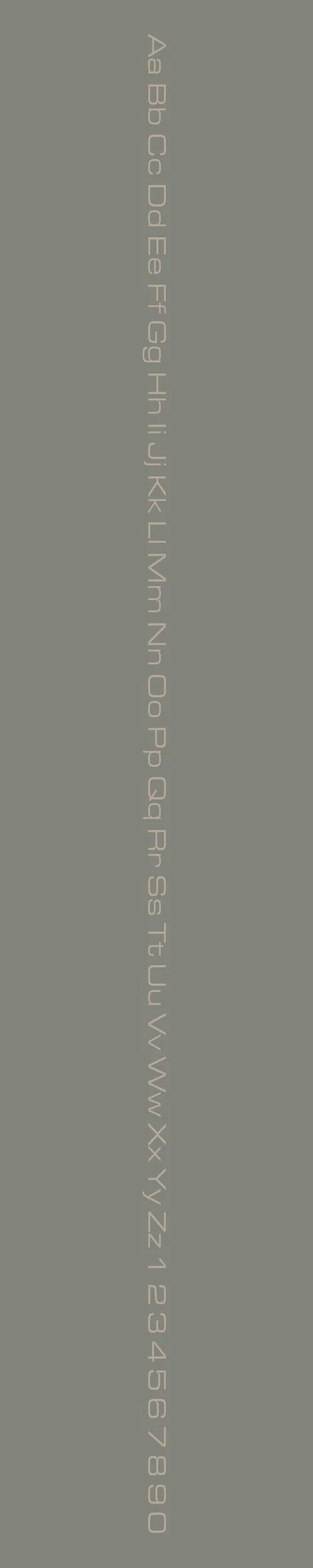
Design: Eurostile Extended features broad, squared letterforms with rounded corners, which give it a clean and mechanical appearance. The extended width of the characters makes it highly legible and visually commanding, while the geometric shapes ensure a contemporary, futuristic style.
Usage: This typeface is frequently used in technology-related branding, signage, and display graphics. It is ideal for projects that need to evoke a sense of modernity, innovation, or even sci-fi aesthetics. Eurostile Extended works well in large sizes, making it suitable for headlines, logos, and posters.
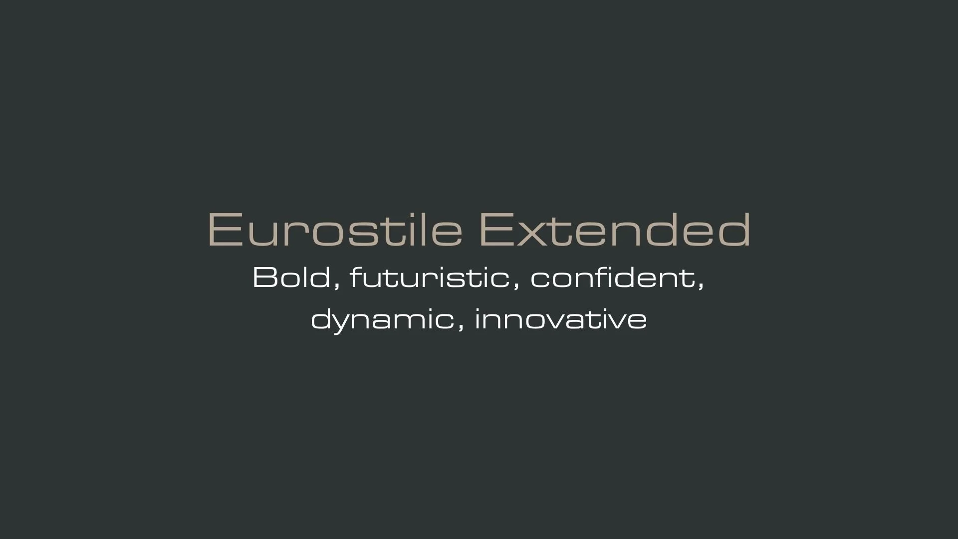
Attributes: Strong, bold, and modern with a mechanical yet approachable feel. Eurostile Extended is designed to stand out, making it perfect for high-impact and high-visibility applications. Its geometric structure provides excellent legibility, even at smaller sizes, while its extended width offers a more dramatic presence.
Interface
Overview:
Interface is a modern, highly legible sans-serif typeface designed specifically for user interfaces. With its simple and clean design, it is optimized for both readability and visual clarity, making it perfect for digital applications, especially in software and web design.
History:
Interface was created by the type designer David Jonathan Ross and released in 2017. The font was developed with the specific goal of enhancing readability on screens, especially at small sizes, while also offering a modern and neutral look. Ross's aim was to create a typeface that would function across a wide range of devices and platforms, maintaining high legibility and consistency in diverse digital environments.
Characteristics:
Design: Interface is characterized by its minimalist and functional design. The letterforms are clean, with open apertures and balanced proportions that enhance legibility. It has a slightly condensed structure, which helps it work well in tight spaces, making it especially suitable for UI design.
Usage: Ideal for user interfaces, web applications, mobile apps, and other digital media, Interface excels in contexts where clarity and readability are paramount. It is also used in branding and display typography, particularly in tech-oriented designs that need a contemporary yet approachable typeface.
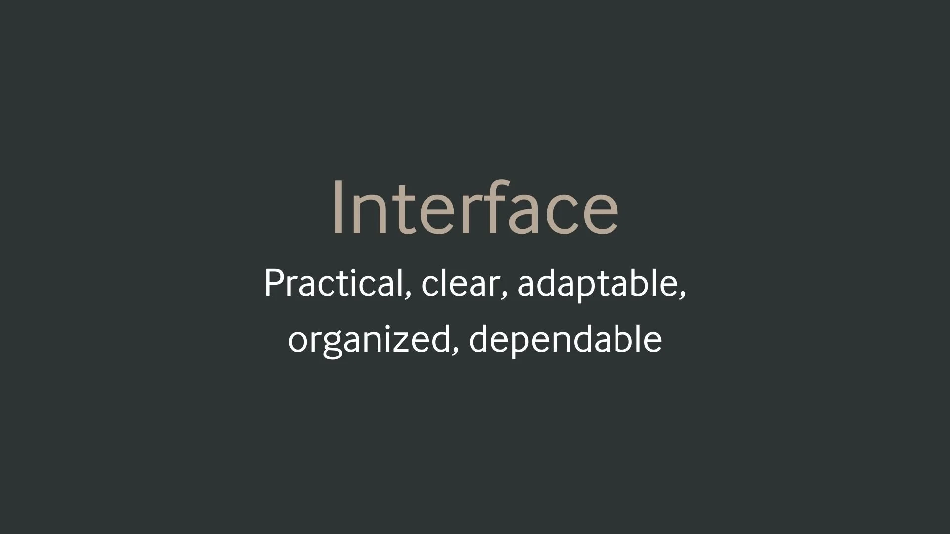
Attributes: Highly legible, functional, and versatile, with a modern, neutral aesthetic that works well in a variety of digital environments. Its open apertures and subtle curves provide a friendly yet professional feel, making it a popular choice for tech products and services.


FONT PERSONALITY
-
FONT PERSONALITY -
Why Eurostile Extended and Interface are a Match Made in Heaven:
When Eurostile Extended and Interface come together, they create a pairing that is both bold and balanced, futuristic yet practical. Eurostile Extended makes a striking first impression with its wide, confident letterforms that demand attention and suggest innovation and forward-thinking. As the main font, it sets the tone for a brand that isn’t afraid to push boundaries. Interface, on the other hand, complements this energy with its clean, highly readable forms, offering a grounding sense of clarity and dependability. Together, they strike a perfect balance between high-impact visuals and usability, making the pairing ideal for modern, dynamic brands that need to exude authority while staying approachable.
This pairing would resonate with someone who is both visionary and pragmatic—a go-getter who is unafraid to make bold moves but ensures their plans are backed by thoughtful execution. This person could be an entrepreneur in a cutting-edge industry, such as tech or sustainability, who values sleek design and functional efficiency in their personal brand. They likely project confidence and innovation while remaining grounded and organized, embodying a harmonious blend of creativity and practicality.

CELEBRITY MATCH
-
CELEBRITY MATCH -

The font pairing of Eurostile Extended and Interface aligns perfectly with the character of Ellen Ripley, as portrayed by Sigourney Weaver in the movie "Alien(1979)" .
Summary: Sigourney Weaver's performance as Ellen Ripley in Alien (1979) is a perfect embodiment of the qualities that Eurostile Extended represents: boldness, innovation, confidence, and dynamism. Ripley as the central hero in a sci-fi horror setting, and Eurostile Extended as a striking, futuristic typeface that demands attention. The film’s tension, Ripley’s courage, and her transformation all align with the font’s powerful, futuristic design that pushes the boundaries of traditional type design. In conclusion, Ripley’s character in Alien is a reflection of Eurostile Extended essence—fearless, forward-thinking, and impossibly cool under pressure. Just as Eurostile Extended makes a bold, unyielding statement in any design, Ripley stands strong against the horror that surrounds her, embracing her leadership role and confronting the alien with no hesitation.

HIERARCHY
-
HIERARCHY -
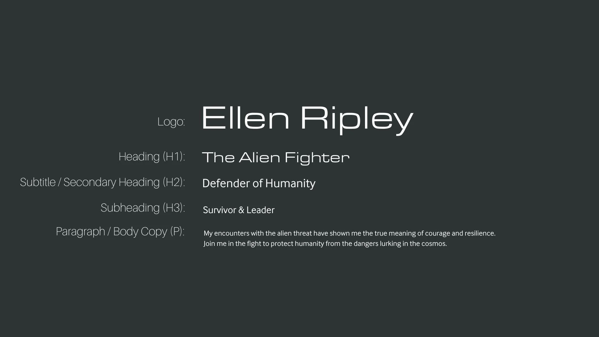
Font Hierarchy for Eurostile Extended and Interface:
Logo
Usage: Primary logo text, initials, brand name
Eurostile Extended, Regular, 60-80 pt (Canva), 36-48 px (Squarespace)
Heading (H1)
Usage: Main headings on pages, prominent titles
Eurostile Extended, Regular, 36 pt (Canva), 24-30 px (Squarespace)
Subtitle / Secondary Heading (H2)
Usage: Section titles, important subtitles
Interface, Regular, 30 pt (Canva), 18-24 px (Squarespace)
Subheading (H3)
Usage: Subsection headings, less prominent titles
Interface, Regular, 24 pt (Canva), 16-20 px (Squarespace)
Paragraph / Body Copy (P)
Usage: Main body text, paragraphs, descriptions
Interface, Regular, 18 pt (Canva), 14-16 px (Squarespace)