MEET YOUR FONT PAIRING MATCH
This page is your custom breakdown of the font pairing you were matched with from the Find Your Font Quiz. You’ll discover the history, personality, and style of each font—and see how they can come to life in your personal brand.
If you're a Personal Branding Studio member:
Bookmark this page. We’ll return to it in Part 2 when it’s time to use your font pairing to design your logo and create branded Canva graphics.
Not loving this particular combo? No problem. Explore all 100+ font pairings inside PBS - Part 1, Module 4: Design - to find one that feels just right. Click the button below to go there now.
Not yet a Personal Branding Studio member?
(And wondering what Personal Branding Studio even is?)
Start by scrolling through your results below. At the bottom of this page, you’ll find out how to go deeper with your personal brand through my full Personal Branding Studio program.
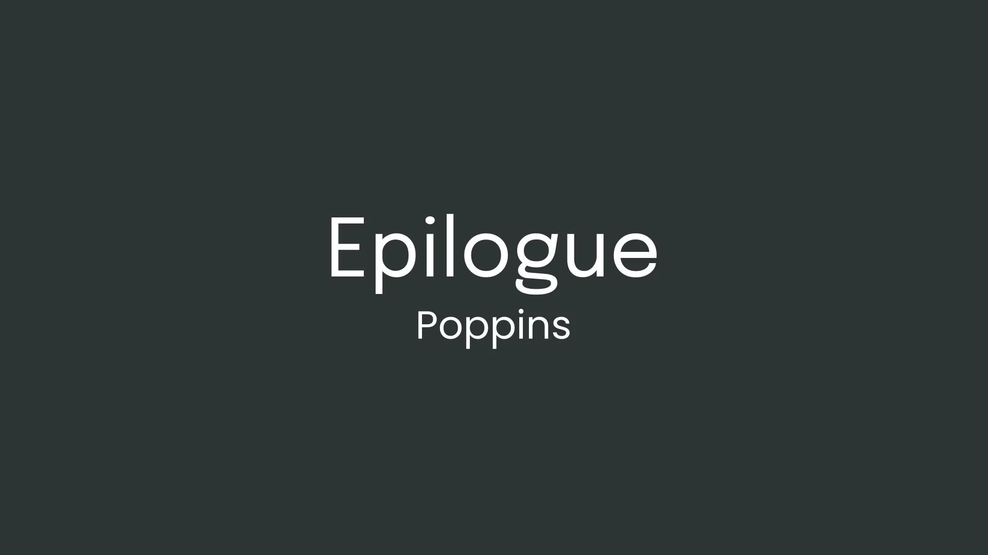
And your aligned font pairing match is…

HISTORY
-
HISTORY -
Epilogue
Overview:
Epilogue is a flexible, modern sans-serif typeface featuring a clean and minimalist design with variable weights. Designed to be versatile and highly legible, it works well for both body text and headlines, making it ideal for a wide array of applications across digital and print media.
History:
Epilogue was created by type designer Tyler Finck, who runs Etcetera Type Co. in Ithaca, New York. The font was released as part of Google Fonts, with an aim to deliver a high-quality, adaptable typeface for various uses. Epilogue is available as an open-source font, making it freely accessible and ideal for both personal and commercial projects. It offers 18 styles across nine weights, each with corresponding italics, allowing for a broad range of visual expressions.
Characteristics:
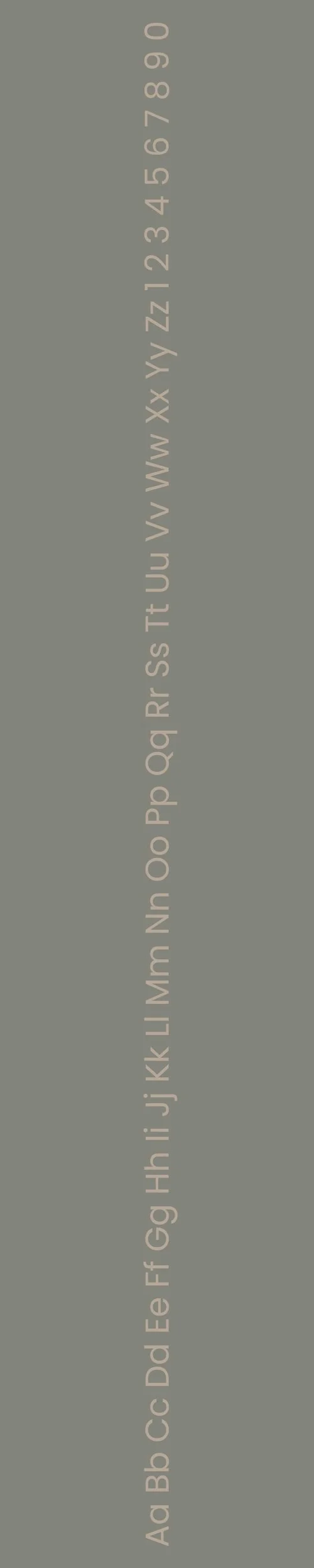
Design: Epilogue’s style is clean and humanistic with a geometric influence. It supports a wide variety of languages in the Latin script and features rounded letterforms with smooth transitions, which add a soft yet contemporary feel.
Usage: Due to its high readability and modern design, Epilogue is suited for websites, apps, editorial design, and branding. Its range of weights and italics make it adaptable for both large-scale headings and body text.
Attributes: Epilogue’s neutral and accessible style, combined with its open-source availability, make it an attractive choice for designers seeking a versatile, professional-looking sans-serif font.

Poppins
Overview:
Poppins is a modern, geometric sans-serif font known for its clean, rounded shapes and versatility. Designed to be highly legible and visually appealing, it has become a popular choice for both digital and print applications, especially in modern branding and user interfaces.
History:
Poppins was created by the Indian type foundry, Indian Type Foundry (ITF), and released in 2014. The font was designed with a specific aim: to offer a typeface that embodies both a functional and contemporary style, while remaining versatile for different uses in both print and web design. Poppins belongs to the geometric sans-serif family, drawing influence from early 20th-century typefaces like Futura, with a more rounded and softer aesthetic.
Characteristics:
Design: Poppins has a geometric structure, with clean lines and circular forms, but it also includes humanist touches, making it feel friendly and approachable. The rounded terminals and even stroke weight contribute to its modern, neutral feel. The font family comes in several weights, from Thin to Black, providing great flexibility in usage.
Usage: Poppins works well in both large headlines and body text, making it an excellent choice for websites, apps, and branding materials. It pairs nicely with both serif and sans-serif fonts, making it a versatile component in any typographic hierarchy.
Attributes: The font is highly legible, modern, and clean, with a geometric yet friendly appearance. Its balanced design ensures clarity in all sizes, making it ideal for everything from signage and packaging to editorial and digital designns is available for free on Google Fonts and has been widely adopted in the design community for its accessibility and clean aesthetic.

FONT PERSONALITY
-
FONT PERSONALITY -


Why Epilogue and Poppins are a Match Made in Heaven:
Epilogue and Poppins form a harmonious pairing that balances modern sophistication with approachable warmth. Epilogue, with its sharp, geometric lines and refined elegance, anchors the design in a sense of precision and contemporary style, making it perfect for headlines that need to command attention with subtle authority. Poppins, on the other hand, complements this with its friendly and versatile nature, offering clarity and warmth in body text or secondary elements. Together, they create a visual language that is both polished and inviting, ideal for brands or projects that seek to merge innovation with accessibility. The reserved elegance of Epilogue is softened by Poppins’ approachable charm, resulting in a combination that feels both professional and personable.
This font pairing would resonate with someone who blends sophistication and warmth in their personal brand—perhaps a modern entrepreneur, a creative consultant, or a tech-driven professional with a human touch. This person likely values precision and forward-thinking ideas but is equally invested in fostering genuine connections and an approachable presence. They would use this pairing to convey a brand image that is innovative yet relatable, appealing to clients who appreciate both excellence and authenticity.

CELEBRITY MATCH
-
CELEBRITY MATCH -

The font pairing of Epilogue and Poppins aligns perfectly with the character of Margaery Tyrell, as portrayed by Natalie Dormer in the movie "Game of Thrones".
Summary: Natalie Dormer’s portrayal of Margaery Tyrell in Game of Thrones is a flawless embodiment of the Epilogue and Poppins font pairing. Epilogue mirrors Margaery's sophisticated, precise, and innovative strategies, while Poppins captures her warmth, friendliness, and approachability. Together, these fonts form a balanced dynamic that mirrors Margaery's blend of charm, strategic brilliance, and subtle authority, making them an ideal match for any design requiring a mixture of modernity, warmth, and professionalism.

HIERARCHY
-
HIERARCHY -

Font Hierarchy for Epilogue and Poppins:
Logo
Usage: Primary logo text, initials, brand name
Epilogue, Regular, 48-60 pt (Canva), 48–60 px (Squarespace)
Heading (H1)
Usage: Main headings on pages, prominent titles
Epilogue, Semi-Bold, 36–48 pt (Canva), 36–48 px (Squarespace)
Subtitle / Secondary Heading (H2)
Usage: Section titles, important subtitles
Epilogue, Regular, 24–36 pt (Canva), 24–36 px (Squarespace)
Subheading (H3)
Usage: Subsection headings, less prominent titles
Poppins, Semi-Bold, 18–24 pt (Canva), 18–24 px (Squarespace)
Paragraph / Body Copy (P)
Usage: Main body text, paragraphs, descriptions
Poppins, Regular, 12–18 pt (Canva), 14–18 px (Squarespace)