MEET YOUR FONT PAIRING MATCH
This page is your custom breakdown of the font pairing you were matched with from the Find Your Font Quiz. You’ll discover the history, personality, and style of each font—and see how they can come to life in your personal brand.
If you're a Personal Branding Studio member:
Bookmark this page. We’ll return to it in Part 2 when it’s time to use your font pairing to design your logo and create branded Canva graphics.
Not loving this particular combo? No problem. Explore all 100+ font pairings inside PBS - Part 1, Module 4: Design - to find one that feels just right. Click the button below to go there now.
Not yet a Personal Branding Studio member?
(And wondering what Personal Branding Studio even is?)
Start by scrolling through your results below. At the bottom of this page, you’ll find out how to go deeper with your personal brand through my full Personal Branding Studio program.
And your aligned font pairing match is…

HISTORY
-
HISTORY -
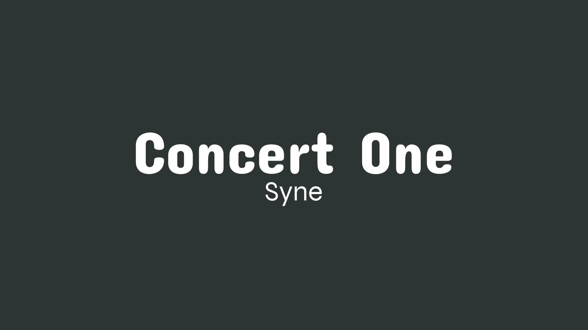
Concert One
Overview:
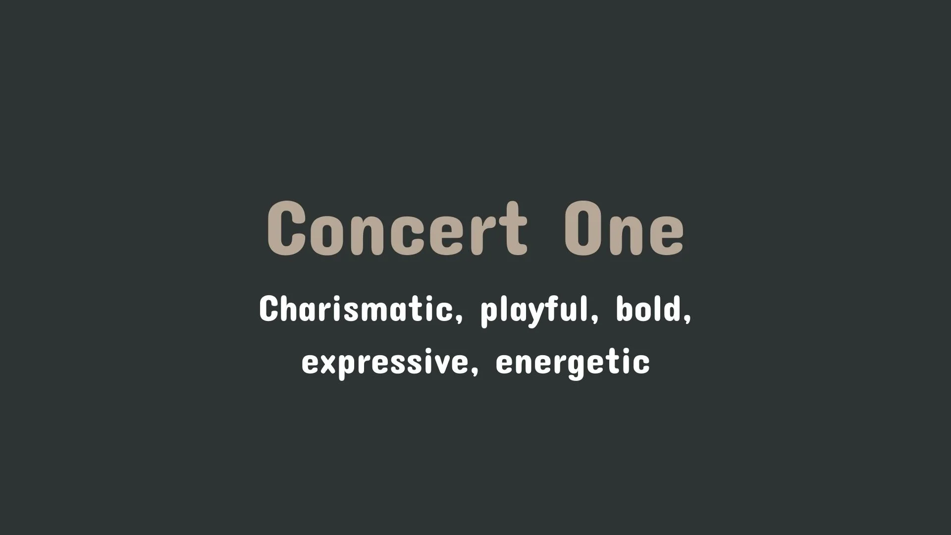
Concert One is a display sans-serif typeface that captures a friendly and quirky style. Its rounded letterforms and slightly condensed appearance make it approachable and inviting, well-suited for branding, logos, and informal content that seeks a casual yet distinct look.
History:
Concert One was developed by Johan Kallas, drawing inspiration from the ornate 3D lettering often seen on 19th-century concert advertisements. This historical reference gives the font its characteristic rounded edges and a touch of old-world charm, while its modern design updates it for today’s digital landscape. The font is free for both personal and commercial use, making it accessible to a wide range of users.
Characteristics:
Design: The typeface is rounded with smooth edges and a condensed structure. This design balances readability with a touch of playfulness, lending an inviting, warm tone.
Usage: Concert One is ideal for headlines, titles, posters, and branding projects that benefit from a friendly and engaging aesthetic. It’s particularly effective in applications where a casual, less formal tone is appropriate.
Attributes: The font is versatile across platforms, supporting multilingual text, and is available in TTF format, making it compatible with various design software on both Windows and Mac.
Syne
Overview:
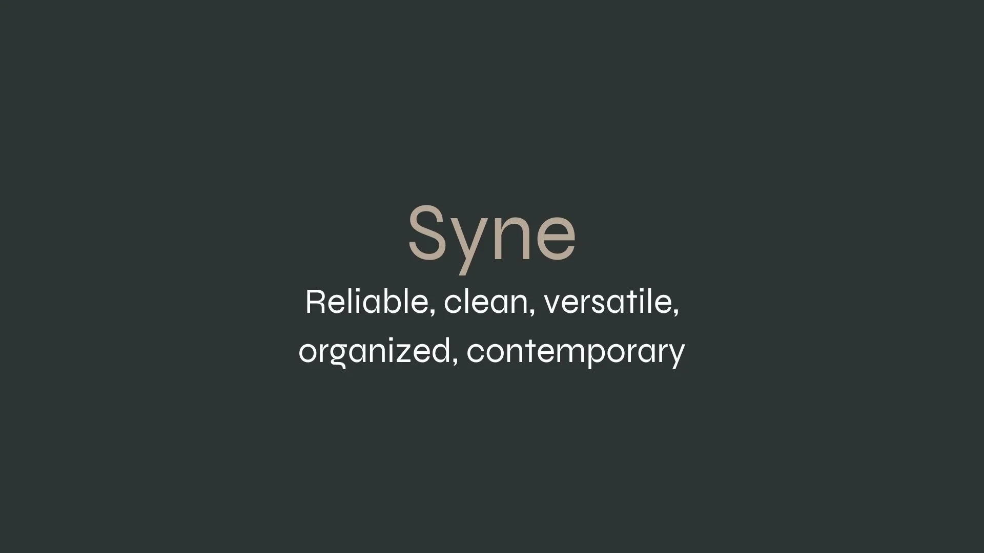
Syne is a bold and unconventional typeface family, recognized for its distinct, modern character and high visual impact. Originally crafted as a display typeface, Syne’s design blends geometric precision with artistic flair, making it versatile for branding and creative projects.
History:
Created in 2017 by designer Lucas Descroix in collaboration with the design studio Bonjour Monde, Syne was commissioned for the Synesthésie art center in Paris. This unique, open-source typeface was later released for public use in 2018 under the SIL Open Font License. Its development incorporated DataFace software for the Mono variant, introducing intentional distortions that amplify its avant-garde feel. Syne reflects the ethos of Synesthésie, embodying a playful, almost rebellious spirit through its atypical styles and weights.
Characteristics:
Design: Syne has five distinct styles: Regular, Bold, Extra Bold, Italic, and Mono. The Regular style is a condensed geometric sans-serif with minimal diacritic marks, while the Bold and Extra Bold styles expand Syne’s presence for impactful headlines. The Italic style combines modern structure with classic Renaissance flourishes, and the Mono variant incorporates a distorted, experimental touch.
Usage: Due to its unique appearance, Syne is ideal for display purposes, especially in branding, posters, and experimental web designs. The font’s bold styles command attention, making it popular in projects requiring a statement-making visual.
Attributes: Known for its brutalist and display qualities, Syne blends structure with artistic distortion, resulting in a typeface both versatile and unconventional. Its high contrast, large x-height, and chunky design make it highly legible and memorable for diverse applications.


FONT PERSONALITY
-
FONT PERSONALITY -
Why Concert One and Syne are a Match Made in Heaven:
The combination of Concert One and Syne brings together two contrasting yet complementary personalities that create a dynamic and balanced design. Concert One’s bold, expressive, and playful nature makes it perfect for capturing attention in headlines and key design elements. Its charisma and energy inject excitement into any project. Syne, on the other hand, offers a reliable and professional counterpoint with its clean, geometric design and modern sensibility. Together, they form a pairing that balances boldness with clarity, creating a harmonious design that is both striking and functional.
This font pairing would appeal to a person who is lively and confident, yet organized and dependable—someone who loves to stand out but values structure and professionalism. A creative entrepreneur or a brand strategist might gravitate toward this combination, as it reflects their ability to fuse creativity with a strong, dependable presence. This person is likely someone in a leadership role who is confident, approachable, and values making an impact while maintaining an efficient, organized approach in their work.

CELEBRITY MATCH
-
CELEBRITY MATCH -

The font pairing of Concert One and Syne aligns perfectly with the character of Becky Bloomwood, as portrayed by Isla Fisher in the movie "Confessions of a Shopaholic (2009)".
Summary: The font pairing Concert One and Syne mirrors the contrasting yet complementary personality traits of Isla Fisher's character Becky Bloomwood in Confessions of a Shopaholic . Concert One embodies her lively, spirited, and playful nature—bold and expressive in the same way Becky’s personality makes a statement wherever she goes. Meanwhile, Syne offers the professional, organized foundation that balances out her more chaotic tendencies, reflecting how Becky ultimately finds a way to combine her fun-loving side with a more structured approach to solving her problems. Together, these fonts create a dynamic pairing that reflects Becky’s multifaceted character.

HIERARCHY
-
HIERARCHY -
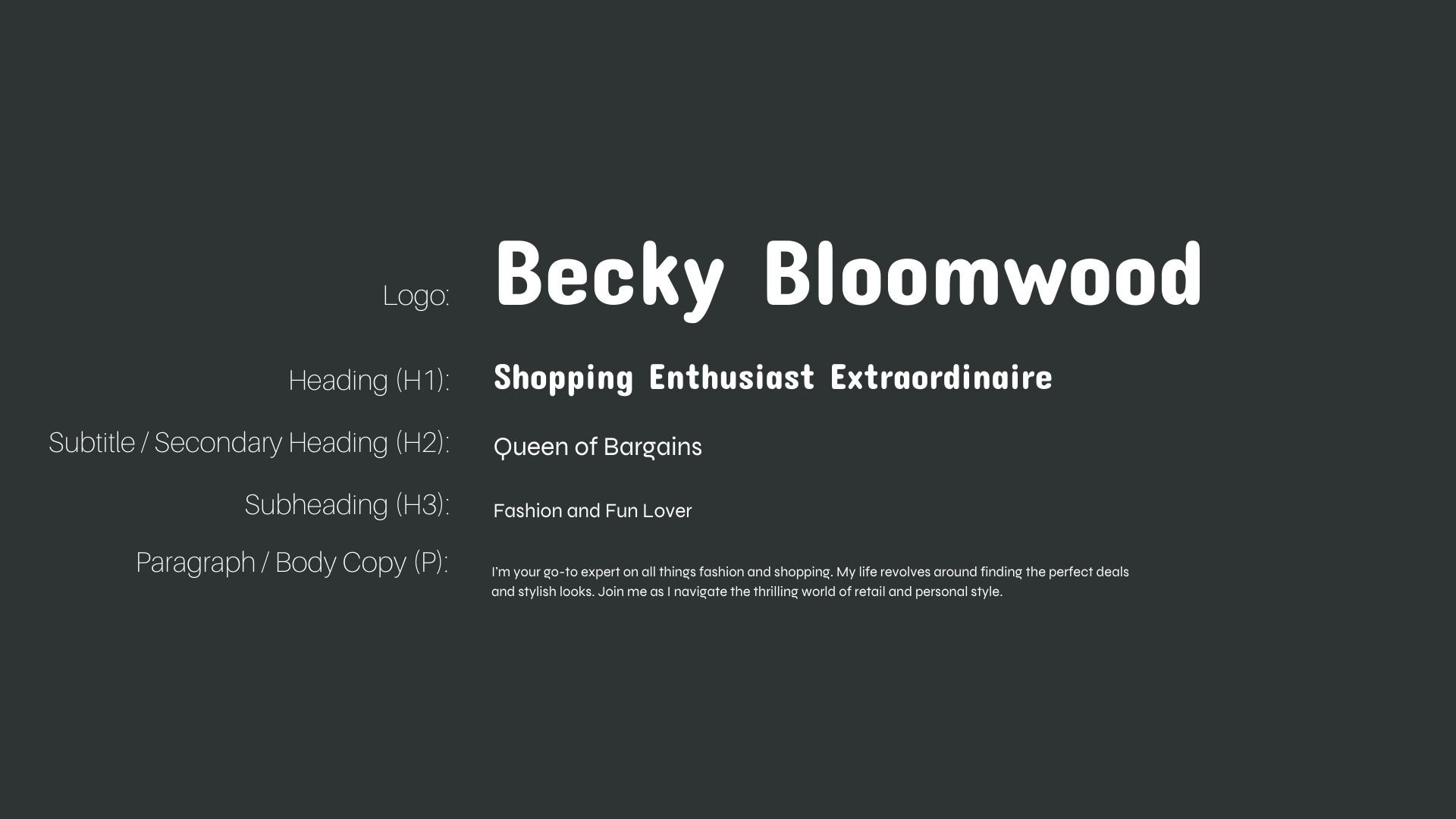
Font Hierarchy for Concert One and Syne:
Logo
Usage: Primary logo text, initials, brand name
Concert One, Regular, 48-72 pt (Canva), 60-80 px (Squarespace)
Heading (H1)
Usage: Main headings on pages, prominent titles
Concert One, Reguular, 36-48 pt (Canva), 40-56 px (Squarespace)
Subtitle / Secondary Heading (H2)
Usage: Section titles, important subtitles
Syne, Regular, 24-36 pt (Canva), 28-40 px (Squarespace)
Subheading (H3)
Usage: Subsection headings, less prominent titles
Syne, Regular, 18-24 pt (Canva), 20-28 px (Squarespace)
Paragraph / Body Copy (P)
Usage: Main body text, paragraphs, descriptions
Syne, Regular, 12-16 pt (Canva), 14-18 px (Squarespace)