MEET YOUR FONT PAIRING MATCH
This page is your custom breakdown of the font pairing you were matched with from the Find Your Font Quiz. You’ll discover the history, personality, and style of each font—and see how they can come to life in your personal brand.
If you're a Personal Branding Studio member:
Bookmark this page. We’ll return to it in Part 2 when it’s time to use your font pairing to design your logo and create branded Canva graphics.
Not loving this particular combo? No problem. Explore all 100+ font pairings inside PBS - Part 1, Module 4: Design - to find one that feels just right. Click the button below to go there now.
Not yet a Personal Branding Studio member?
(And wondering what Personal Branding Studio even is?)
Start by scrolling through your results below. At the bottom of this page, you’ll find out how to go deeper with your personal brand through my full Personal Branding Studio program.
And your aligned font pairing match is…

HISTORY
-
HISTORY -
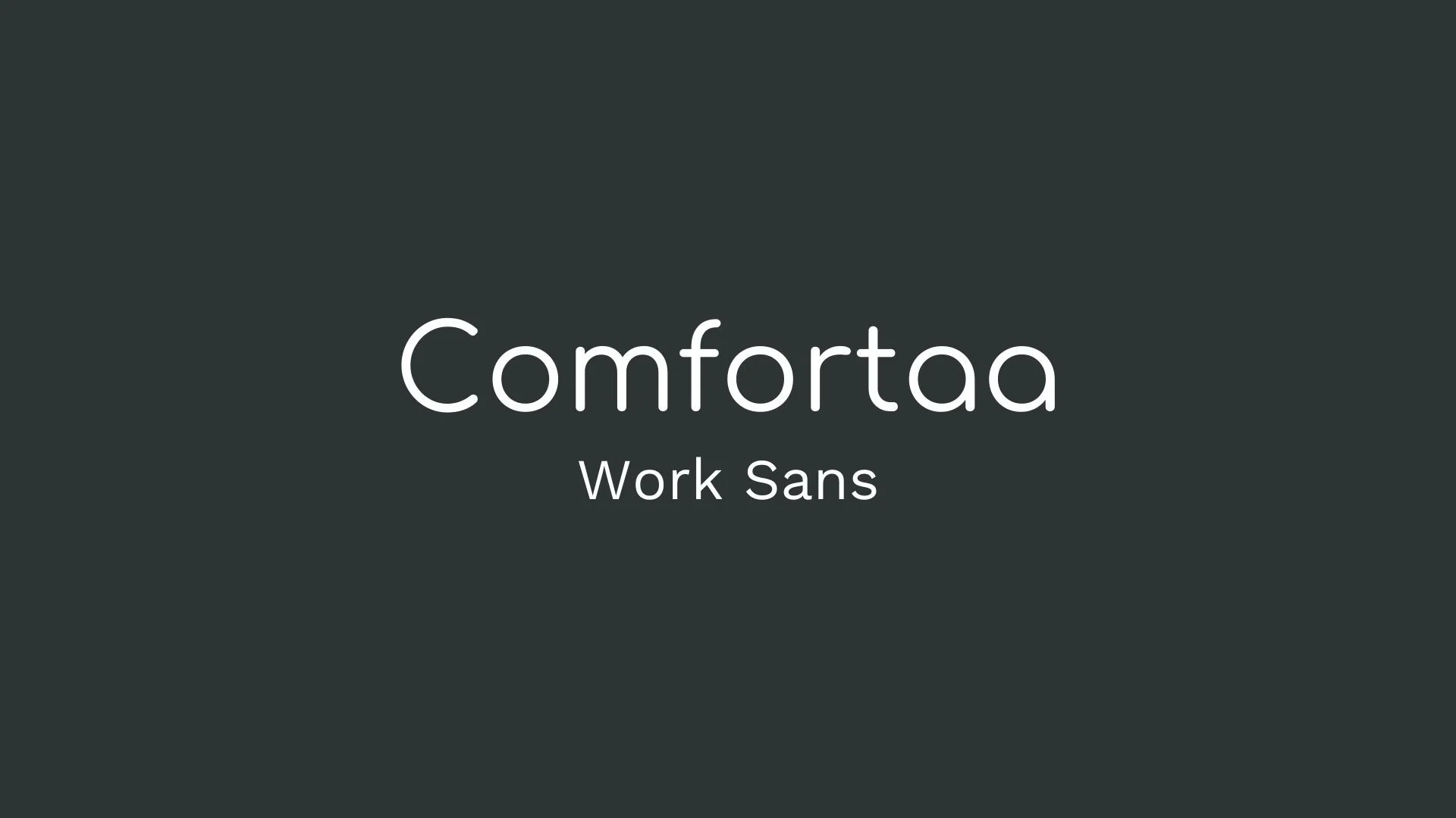
Comfortaa
Overview:
Comfortaa is a rounded, geometric sans-serif font that blends a modern aesthetic with an inviting and playful feel. It was designed with versatility in mind, making it suitable for various design contexts, especially those that benefit from a friendly and approachable look.
History:
Comfortaa was created by Johan Aakerlund, a self-taught designer from Denmark, in 2008. Initially a personal project, Aakerlund developed the font as a modern, open-source typeface that anyone could use freely. It has since been updated and is available in three weights: Light, Regular, and Bold. The font is licensed under the SIL Open Font License, ensuring its accessibility for both personal and commercial use.
Characteristics:
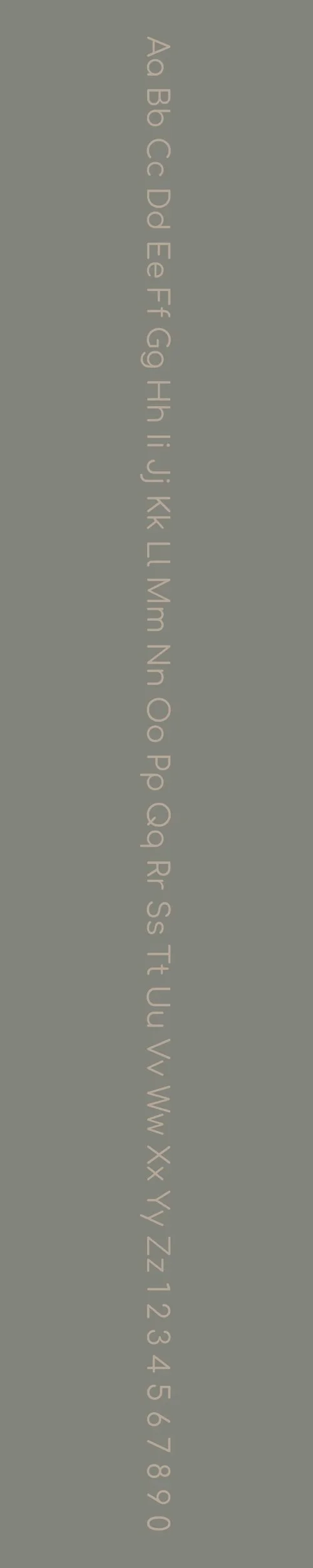
Design: Comfortaa is known for its clean, rounded lines and geometric structure, with rounded terminals that create a smooth, bubbly look. It’s a "circle font," where the geometric shapes give it a balanced and consistent appearance, appealing especially in minimalist and contemporary designs.
Usage: This font is particularly effective for headlines, logos, posters, and digital interfaces where readability is essential. Its rounded shapes and clean design also make it popular in branding and UI elements like buttons and icons.
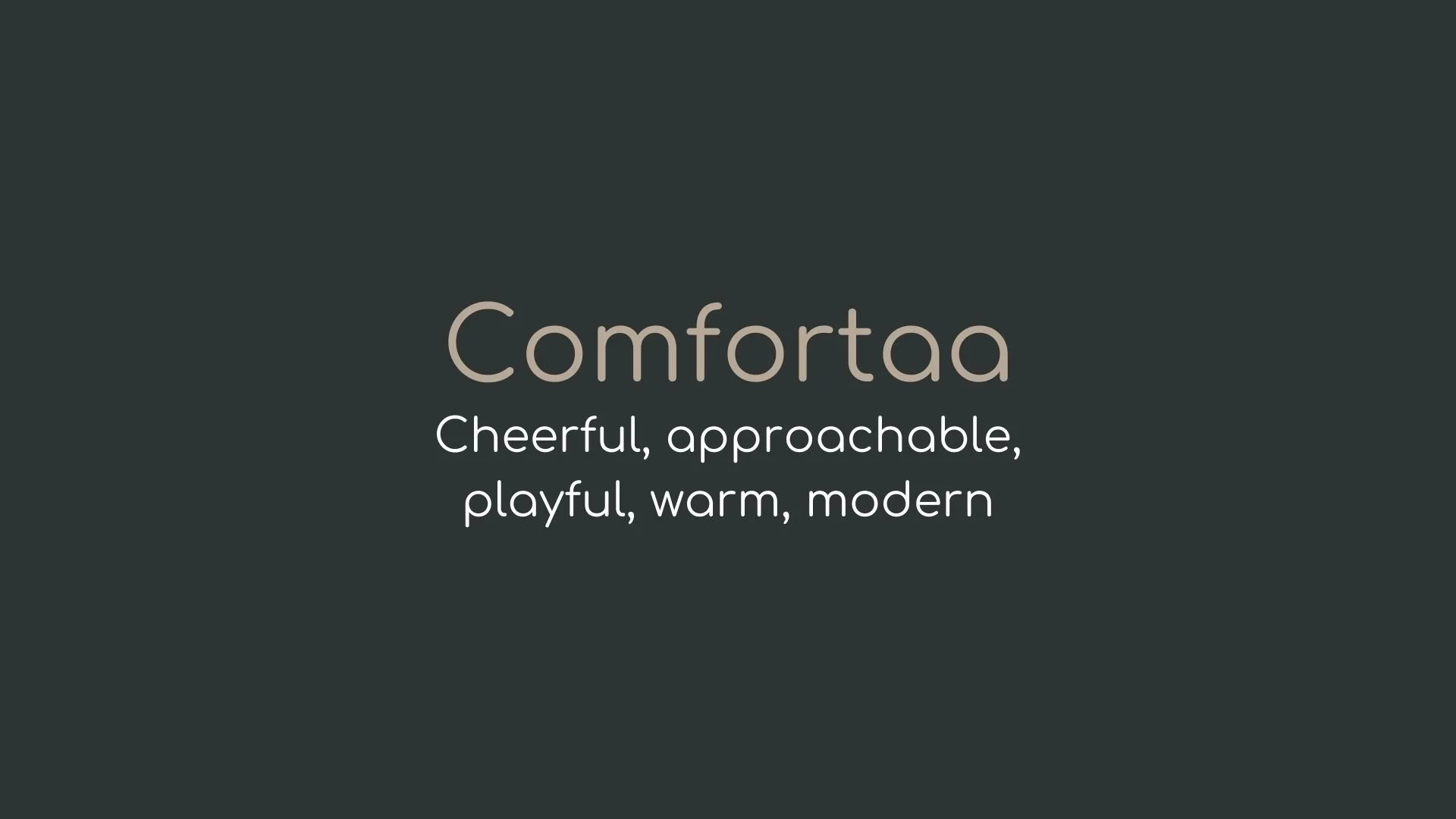
Attributes: Comfortaa stands out for its blend of elegance and playfulness. Its geometric, rounded design adds a warmth and approachability while maintaining modernity, which has made it a popular choice for projects seeking an inviting tone.
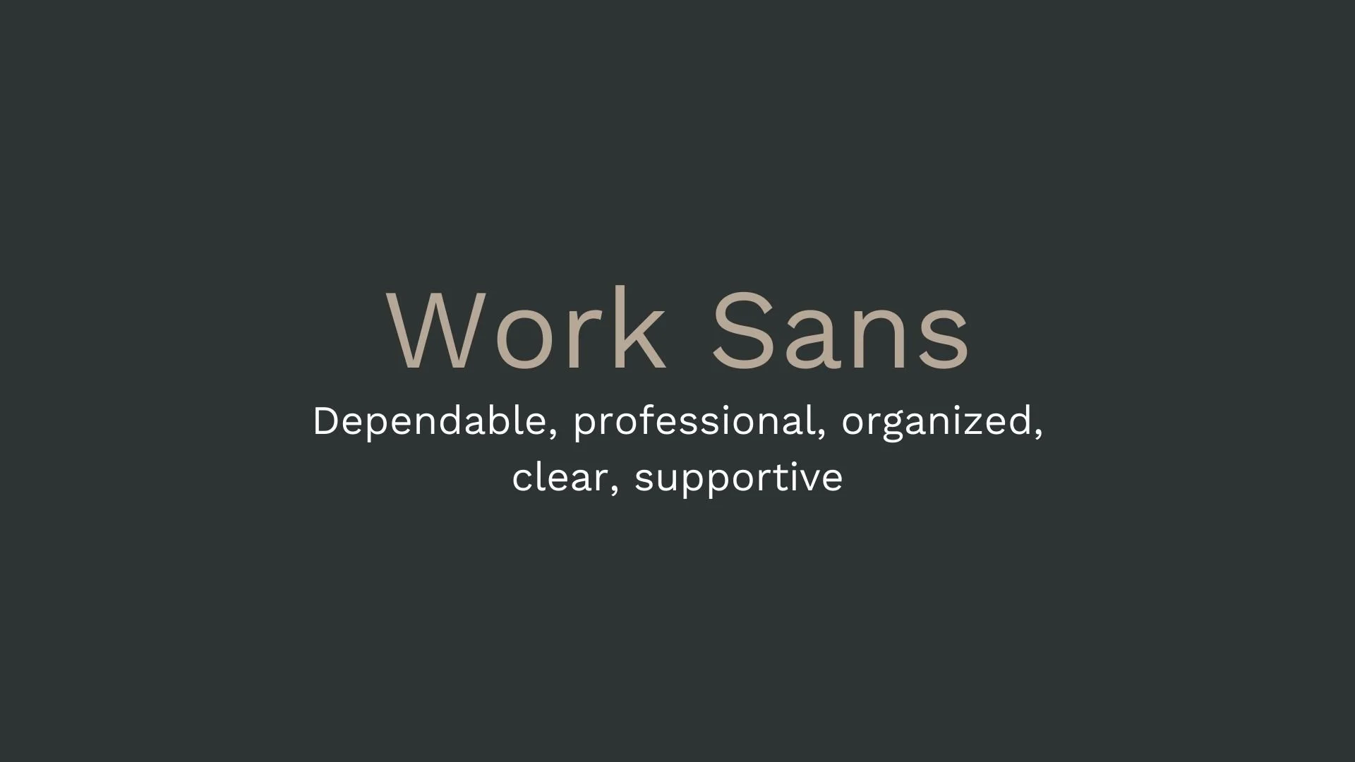
Work Sans
Overview:
Work Sans is a versatile, modern sans-serif typeface designed for both display and text use. It is characterized by its open and clean letterforms, offering high readability and a contemporary aesthetic. The font is well-suited for digital media, making it a popular choice for user interfaces and websites.
History:
Work Sans was created by Australian designer Wei Huang and released in 2016. Inspired by early 20th-century grotesque sans-serifs, Work Sans was designed to provide a modern, web-friendly alternative for both headings and body text. The design aims to offer a balanced approach to legibility across different screen sizes, making it particularly suited to the needs of responsive web design.
Characteristics:
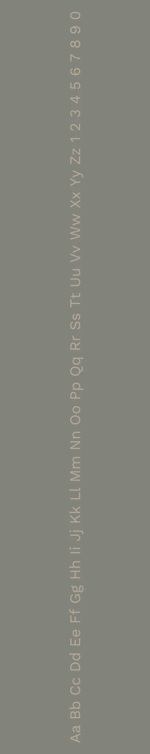
Design: Work Sans has a geometric, slightly humanist structure with open apertures and simple, clean lines. The design strikes a balance between modern minimalism and traditional sans-serif elements, making it both approachable and professional.
Usage: Its high legibility at small sizes and clean design make Work Sans ideal for websites, mobile interfaces, and digital applications. It works well for headlines, body text, and UI elements, and its simplicity makes it suitable for a wide range of design projects.
Attributes: Work Sans is clean, modern, and versatile. It features a balanced design with a neutral tone, making it highly adaptable to various contexts. Its clarity at small sizes and bold presence at larger sizes make it a practical choice for both web and print.

FONT PERSONALITY
-
FONT PERSONALITY -
Why Comfortaa and Work Sans are a Match Made in Heaven:
When Comfortaa and Work Sans come together, they create a pairing that blends playfulness with professionalism in a seamless way. Comfortaa’s cheerful and modern design brings a lighthearted, welcoming energy that grabs attention with its rounded, friendly letterforms. This playful font evokes warmth and creativity, making it perfect for headlines or brand names that want to stand out. On the other hand, Work Sans brings a grounded, professional touch to the combination. Its clear and dependable nature ensures that the design remains clean, structured, and legible, providing the perfect contrast to Comfortaa’s lively character. The two fonts balance each other beautifully, with Comfortaa offering creativity and Work Sans adding the necessary reliability and clarity.
This pairing would appeal to a person who is both approachable and professional, someone who knows how to blend creativity with structure. They are likely to be a modern, forward-thinking individual who values clarity and dependability but also enjoys infusing personality and charm into their brand. This person could be a designer, entrepreneur, or creative professional who wants their brand to communicate trustworthiness while still feeling friendly and engaging.

CELEBRITY MATCH
-
CELEBRITY MATCH -

The font pairing of Comfortaa and Work Sans aligns perfectly with the character of Leslie Knope, as portrayed by Amy Poehler in the movie "Parks and Recreation" .
Summary: Amy Poehler’s portrayal of Leslie Knope in Parks and Recreation perfectly embodies the font pairing of Comfortaa and Work Sans. Leslie Knope’s cheerful, creative, and engaging personality reflects Comfortaa’s friendly and modern nature, while her professional, dependable demeanor aligns with Work Sans’s clarity and structure. This combination of traits mirrors the complementary dynamics of Comfortaa and Work Sans, making Leslie Knope an ideal representation of this balanced, dynamic font pairing.

HIERARCHY
-
HIERARCHY -

Font Hierarchy for Comfortaa and Work Sans:
Logo
Usage: Primary logo text, initials, brand name
Comfortaa, Bold, 48-60 pt (Canva), 36-48 px (Squarespace)
Heading (H1)
Usage: Main headings on pages, prominent titles
Comfortaa, Bold, 36-48 pt (Canva), 30-36 px (Squarespace)
Subtitle / Secondary Heading (H2)
Usage: Section titles, important subtitles
Comfortaa, Regular, 24-36 pt (Canva), 24-30 px (Squarespace)
Subheading (H3)
Usage: Subsection headings, less prominent titles
Work Sans, Semi Bold, 18-24 pt (Canva), 18-24 px (Squarespace)
Paragraph / Body Copy (P)
Usage: Main body text, paragraphs, descriptions
Work Sans, Regular, 12-18 pt (Canva), 14-18 px (Squarespace)