MEET YOUR FONT PAIRING MATCH
This page is your custom breakdown of the font pairing you were matched with from the Find Your Font Quiz. You’ll discover the history, personality, and style of each font—and see how they can come to life in your personal brand.
If you're a Personal Branding Studio member:
Bookmark this page. We’ll return to it in Part 2 when it’s time to use your font pairing to design your logo and create branded Canva graphics.
Not loving this particular combo? No problem. Explore all 100+ font pairings inside PBS - Part 1, Module 4: Design - to find one that feels just right. Click the button below to go there now.
Not yet a Personal Branding Studio member?
(And wondering what Personal Branding Studio even is?)
Start by scrolling through your results below. At the bottom of this page, you’ll find out how to go deeper with your personal brand through my full Personal Branding Studio program.
And your aligned font pairing match is…


HISTORY
-
HISTORY -
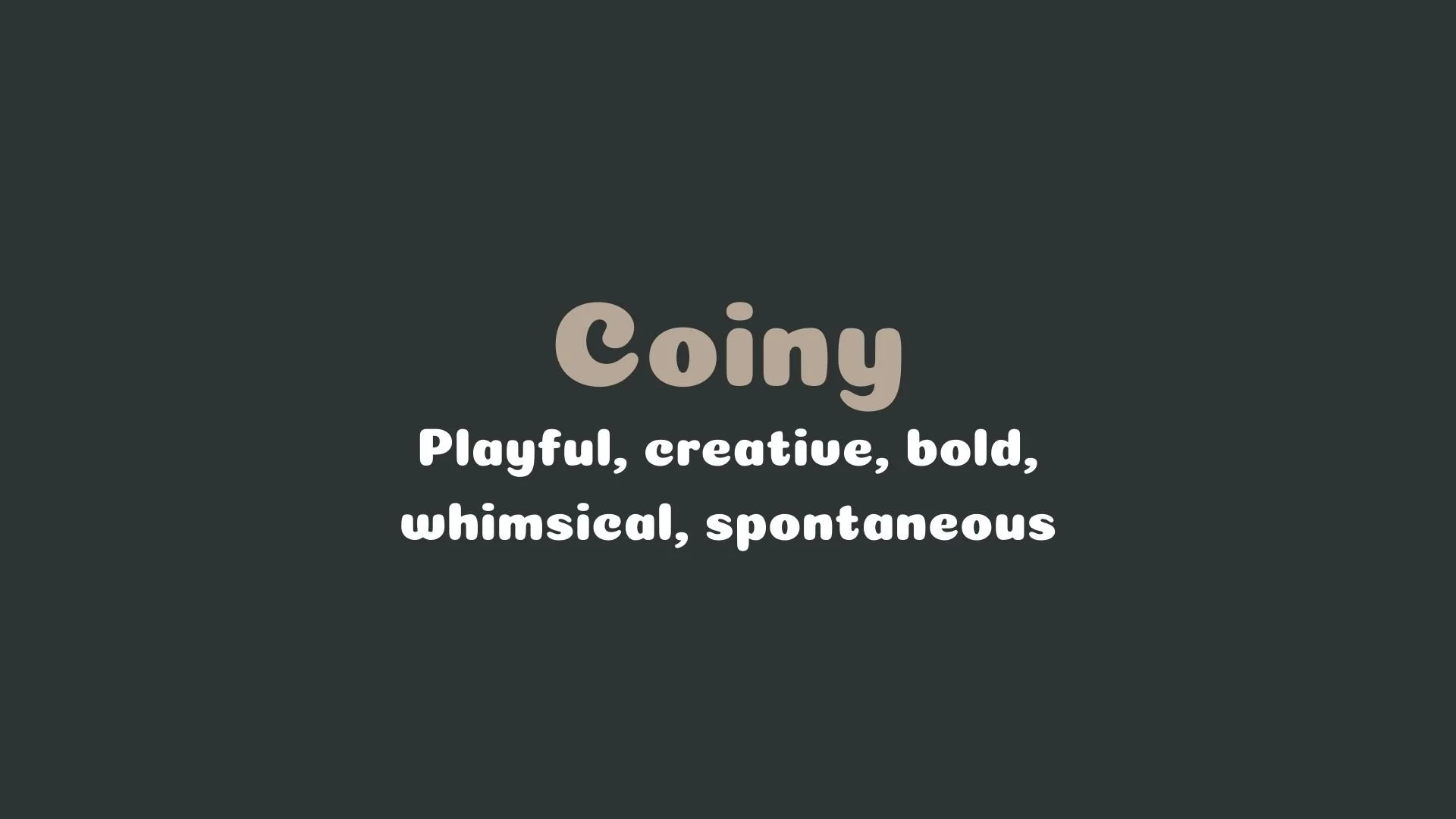
Coiny
Overview:
Coiny is a unique display typeface that brings a playful, puffy aesthetic with rounded shapes, making it an eye-catching option for informal and expressive design projects. Its bold, rounded forms give it a casual feel, ideal for grabbing attention in larger text applications, like headlines and logos.
History:
Coiny was designed by Marcelo Magalhães and made available on Google Fonts. Created to add personality to the text, Coiny’s style is inspired by retro and comic book aesthetics, combining a friendly tone with wide, plump letterforms. The font’s distinctive characteristics make it particularly suitable for fun and youth-oriented projects, standing out for its unusual, lively appearance.
Characteristics:
Design: Coiny features broad, geometric letterforms with short ascenders and descenders, giving it a compact look. It uses rounded strokes that add a soft, inviting quality, and the slightly playful, "puffy" feel makes it an excellent choice for designs aiming for a whimsical or lighthearted tone.
Usage: With its bold and informal style, Coiny is perfect for headlines, posters, logos, and any application where a cheerful and impactful text presence is needed. However, its distinct personality can be overpowering in long-form text, so it’s best reserved for short phrases or single lines.
Attributes: Coiny’s style resonates with street culture and urban influences, balancing a comic touch with a modern, approachable vibe. Its readability and distinctive flair make it a popular choice in branding, children’s content, and creative design.

Varela Round
Overview:
Varela Round is a modern sans-serif font that combines a clean, geometric structure with rounded forms, making it approachable and visually friendly. Its design is well-suited for both digital and print environments, where a smooth and casual appearance is desired.
History:
Designed by Joe Prince in 2011, Varela Round is a refined version of the Varela font, with rounded edges that enhance its warmth and accessibility. Created with readability in mind, Varela Round aims to be versatile enough for a wide range of media, particularly in UI/UX design where ease of reading is key.
Characteristics:
Design: Varela Round features rounded corners on each letterform, giving it a soft and inviting quality. It combines a high x-height and uniform stroke weight, which enhances its legibility even at small sizes. The geometric and slightly condensed structure ensures that text remains clear and accessible across formats.
Usage: It works effectively for headlines, subheadings, and body text in digital interfaces, including apps and websites, due to its readability and modern look. Varela Round is also a popular choice in branding, where an approachable, friendly aesthetic is desired.
Attributes: Known for its versatility, Varela Round pairs well with other fonts, especially for applications requiring a warm yet polished look. Its open counters and carefully balanced spacing contribute to excellent readability, making it suitable for long passages of text as well as bold, minimalist layouts.


FONT PERSONALITY
-
FONT PERSONALITY -

Why Coiny and Varela Round are a Match Made in Heaven:
The combination of Coiny and Varela Round is a perfect harmony of playfulness and reliability, creating a dynamic yet approachable visual experience. Coiny, with its bold, whimsical, and spontaneous nature, injects an element of fun and creativity into any design. Its bold strokes demand attention, making it ideal for headlines and branding elements that want to stand out with personality. Meanwhile, Varela Round offers a balanced contrast, with its friendly and modern demeanor providing a sense of stability and trustworthiness. Its rounded edges and clean lines make it versatile and easy to read, seamlessly grounding Coiny’s playful exuberance while maintaining a harmonious, well-rounded design.
This pairing would be perfect for someone who is creative, energetic, and has a strong sense of individuality, but also values approachability and dependability. The ideal user might be a brand or individual in a creative industry, such as a designer, artist, or entrepreneur, who wants to convey both a sense of fun and professionalism. This person would likely appeal to an audience that values innovation and creativity, yet also seeks the reliability and accessibility that comes with a trustworthy and modern image.

CELEBRITY MATCH
-
CELEBRITY MATCH -

The font pairing of Coiny and Varela Round aligns perfectly with the character of Joy, as portrayed by Amy Poehler in the movie "Inside Out (2015)".
Summary: Amy Poehler’s portrayal of Joy in Inside Out perfectly embodies the dynamic combination of Coiny and Varela Round fonts. Coiny reflects Joy’s bold, whimsical, and spontaneous personality, while Varela Round represents her warmth, adaptability, and the eventual understanding of emotional balance. Just as Joy drives the emotional narrative with both exuberance and depth, these fonts work together to create a visually engaging and harmonious partnership.

HIERARCHY
-
HIERARCHY -

Font Hierarchy for Coiny and Varela Round:
Logo
Usage: Primary logo text, initials, brand name
Coiny, Regular, 60-80 pt (Canva), 50-70 px (Squarespace)
Heading (H1)
Usage: Main headings on pages, prominent titles
Coiny, Regular, 36-48 pt (Canva), 30-40 px (Squarespace)
Subtitle / Secondary Heading (H2)
Usage: Section titles, important subtitles
Varela Round, Regular, 28-36 pt (Canva), 24-30 px (Squarespace)
Subheading (H3)
Usage: Subsection headings, less prominent titles
Varela Round, Regular, 20-24 pt (Canva), 18-24 px (Squarespace)
Paragraph / Body Copy (P)
Usage: Main body text, paragraphs, descriptions
Varela Round, Regular, 12-14 pt (Canva), 14-16 px (Squarespace)