MEET YOUR FONT PAIRING MATCH
This page is your custom breakdown of the font pairing you were matched with from the Find Your Font Quiz. You’ll discover the history, personality, and style of each font—and see how they can come to life in your personal brand.
If you're a Personal Branding Studio member:
Bookmark this page. We’ll return to it in Part 2 when it’s time to use your font pairing to design your logo and create branded Canva graphics.
Not loving this particular combo? No problem. Explore all 100+ font pairings inside PBS - Part 1, Module 4: Design - to find one that feels just right. Click the button below to go there now.
Not yet a Personal Branding Studio member?
(And wondering what Personal Branding Studio even is?)
Start by scrolling through your results below. At the bottom of this page, you’ll find out how to go deeper with your personal brand through my full Personal Branding Studio program.
And your aligned font pairing match is…


HISTORY
-
HISTORY -
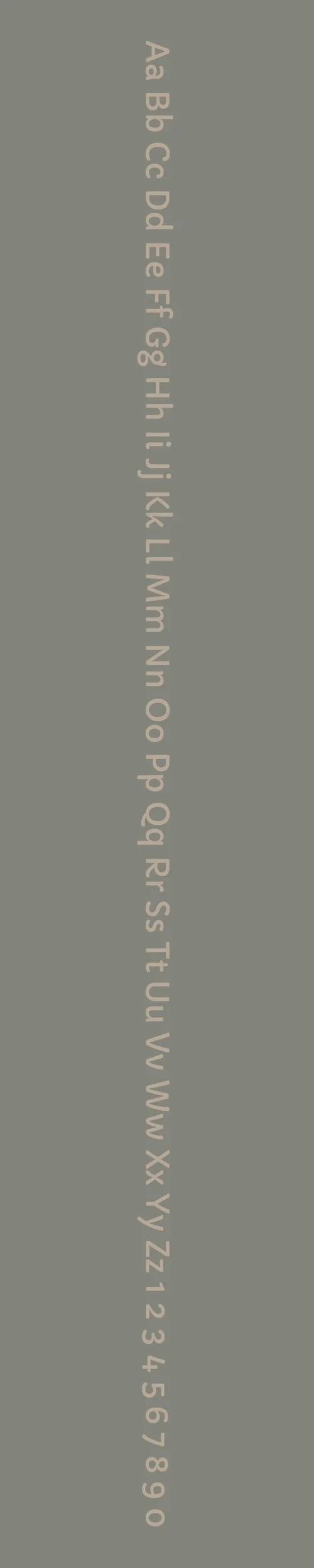
Capriola
Overview:
Capriola is a soft and contemporary sans-serif typeface that blends the elegance of classic letterforms with modern, clean aesthetics. Its rounded edges and humanist influence create a friendly and approachable design, making it a versatile font suitable for both casual and professional applications.
History:
Capriola was designed by the Indian type designer Rajesh Rajput and released in 2010. Inspired by traditional calligraphy and the fluidity of handwritten forms, Capriola was created to provide a more organic, yet legible alternative to other geometric sans fonts. It was designed to be highly readable at both large and small sizes, making it suitable for a wide range of uses in both digital and print formats. The font aims to combine functionality with a pleasant, modern look, offering a balance of structure and softness.
Characteristics:
Design: Capriola features rounded terminals and open apertures, with a subtle humanist influence that gives it warmth and approachability. Its letterforms are clean, open, and contemporary, offering excellent legibility while maintaining a friendly and inviting feel.
Usage: This typeface is ideal for body text, headlines, branding, and logos. Its clarity and approachable design make it a good choice for websites, presentations, and any application where readability and modernity are key.
Attributes: Capriola is versatile, highly legible, and neutral, yet warm and inviting due to its rounded details. It works well across various digital and print applications, especially when a modern, friendly tone is desired.
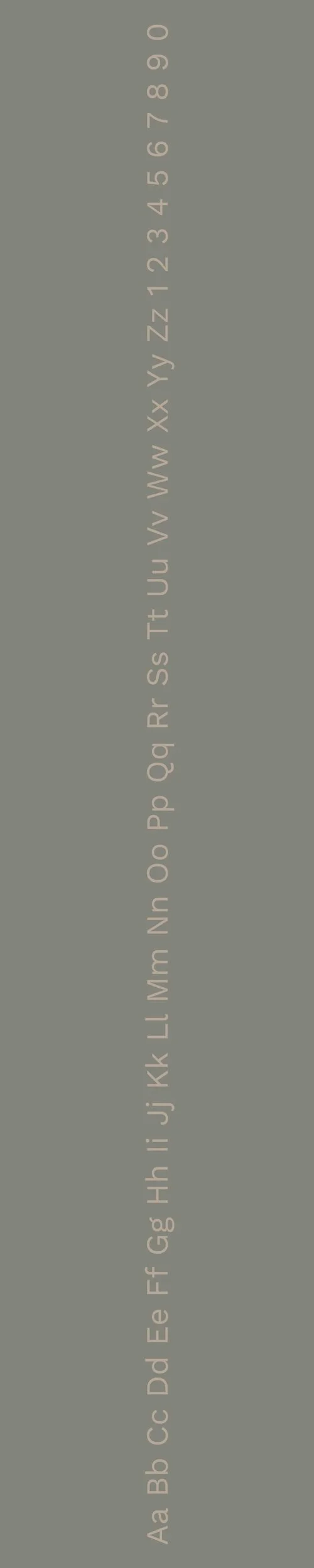
Work Sans
Overview:
Work Sans is a versatile, modern sans-serif typeface designed for both display and text use. It is characterized by its open and clean letterforms, offering high readability and a contemporary aesthetic. The font is well-suited for digital media, making it a popular choice for user interfaces and websites.
History:
Work Sans was created by Australian designer Wei Huang and released in 2016. Inspired by early 20th-century grotesque sans-serifs, Work Sans was designed to provide a modern, web-friendly alternative for both headings and body text. The design aims to offer a balanced approach to legibility across different screen sizes, making it particularly suited to the needs of responsive web design.
Characteristics:
Design: Work Sans has a geometric, slightly humanist structure with open apertures and simple, clean lines. The design strikes a balance between modern minimalism and traditional sans-serif elements, making it both approachable and professional.
Usage: Its high legibility at small sizes and clean design make Work Sans ideal for websites, mobile interfaces, and digital applications. It works well for headlines, body text, and UI elements, and its simplicity makes it suitable for a wide range of design projects.
Attributes: Work Sans is clean, modern, and versatile. It features a balanced design with a neutral tone, making it highly adaptable to various contexts. Its clarity at small sizes and bold presence at larger sizes make it a practical choice for both web and print.

FONT PERSONALITY
-
FONT PERSONALITY -
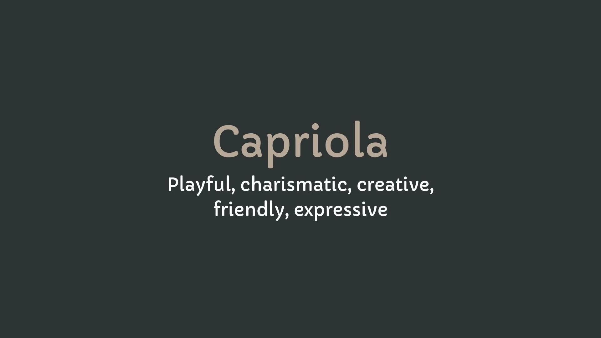

Why Capriola and Work Sans are a Match Made in Heaven:
When Capriola and Work Sans come together, they create a dynamic and harmonious contrast that makes for a compelling font pairing. Capriola’s playful, charismatic, and creative nature infuses the design with an upbeat energy, making it perfect for headlines or key brand messages that need to capture attention. Meanwhile, Work Sans adds a reliable, professional, and clear foundation to the pairing, ensuring that the content is easy to read and organized. The two fonts balance each other beautifully—Capriola’s expressive energy is grounded by Work Sans’ structured simplicity, creating a combination that is both engaging and functional.
This font pairing would be ideal for someone who is creative yet values professionalism and clarity—an individual who thrives on making meaningful connections while presenting themselves as dependable and polished. They might be a creative entrepreneur, a brand strategist, or someone in a leadership position within the creative industry, where imagination and structure must coexist to achieve success. Their personal brand would be one that is approachable and friendly, yet consistently reliable, appealing to clients who seek both creativity and professionalism in a partnership.

CELEBRITY MATCH
-
CELEBRITY MATCH -

The font pairing of Capriola and Work Sans aligns perfectly with the character of Nancy Callahan, as portrayed by Jessica Alba in the movie "Sin City".
Summary: Jessica Alba’s portrayal of Nancy Callahan in Sin City is a perfect match for the font pairing of Capriola and Work Sans. Capriola’s playful, expressive, and charismatic personality matches Nancy’s alluring presence and her ability to draw attention and connect with others effortlessly. Meanwhile, Work Sans represents the more structured, dependable side of Nancy, reflecting her resilience, professionalism, and clarity in the midst of chaos. The combination of these two fonts mirrors the balance of lightness and strength, charm and pragmatism, that defines Nancy Callahan's character.

HIERARCHY
-
HIERARCHY -
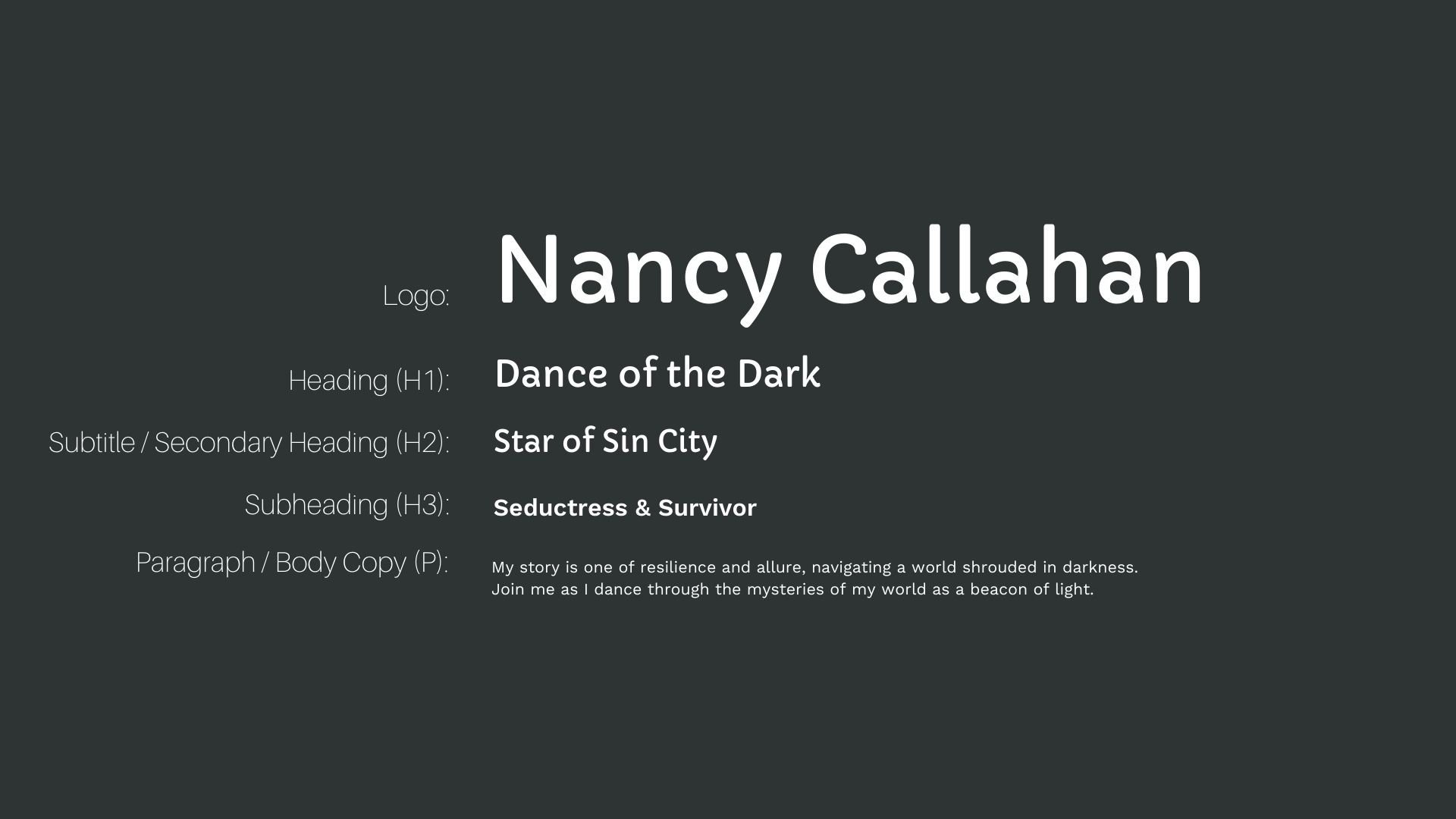
Font Hierarchy for Capriola and Work Sans:
Logo
Usage: Primary logo text, initials, brand name
Capriola, Regular, 48-60 px (Canva), 36-48 px (Squarespace)
Heading (H1)
Usage: Main headings on pages, prominent titles
Capriola, Regular, 36-48 px (Canva), 28-36 px (Squarespace)
Subtitle / Secondary Heading (H2)
Usage: Section titles, important subtitles
Capriola, Regular, 30-36 px (Canva), 24-28 px (Squarespace)
Subheading (H3)
Usage: Subsection headings, less prominent titles
Work Sans, Semi-Bold, 24-30 px (Canva), 20-24 px (Squarespace)
Paragraph / Body Copy (P)
Usage: Main body text, paragraphs, descriptions
Work Sans, Regular, 14-18 px (Canva), 14 px (Squarespace)