MEET YOUR FONT PAIRING MATCH
This page is your custom breakdown of the font pairing you were matched with from the Find Your Font Quiz. You’ll discover the history, personality, and style of each font—and see how they can come to life in your personal brand.
If you're a Personal Branding Studio member:
Bookmark this page. We’ll return to it in Part 2 when it’s time to use your font pairing to design your logo and create branded Canva graphics.
Not loving this particular combo? No problem. Explore all 100+ font pairings inside PBS - Part 1, Module 4: Design - to find one that feels just right. Click the button below to go there now.
Not yet a Personal Branding Studio member?
(And wondering what Personal Branding Studio even is?)
Start by scrolling through your results below. At the bottom of this page, you’ll find out how to go deeper with your personal brand through my full Personal Branding Studio program.
And your aligned font pairing match is…


HISTORY
-
HISTORY -
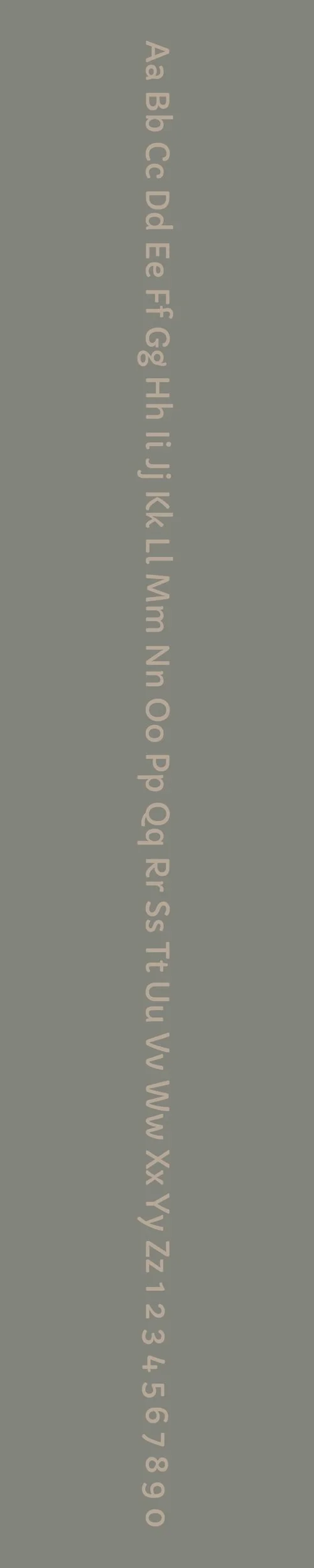
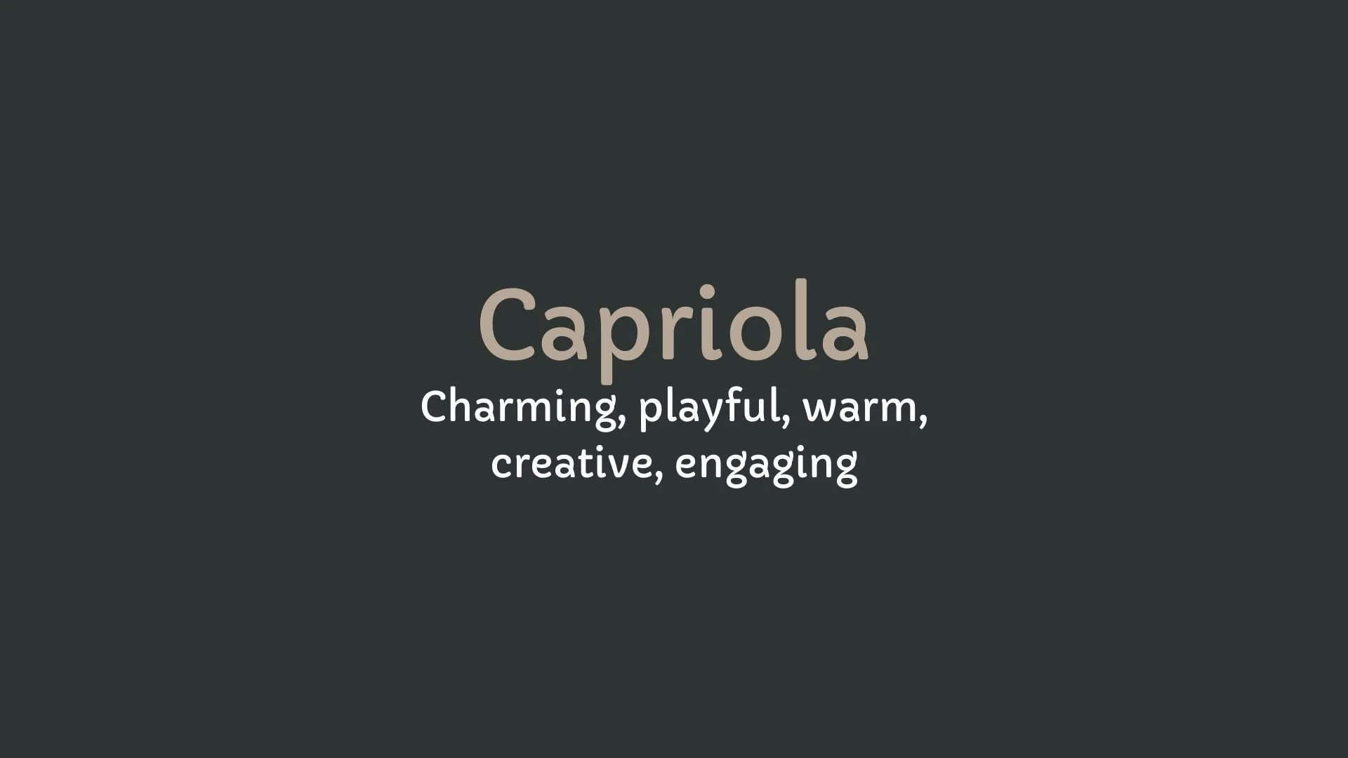
Capriola
Overview:
Capriola is a soft and contemporary sans-serif typeface that blends the elegance of classic letterforms with modern, clean aesthetics. Its rounded edges and humanist influence create a friendly and approachable design, making it a versatile font suitable for both casual and professional applications.
History:
Capriola was designed by the Indian type designer Rajesh Rajput and released in 2010. Inspired by traditional calligraphy and the fluidity of handwritten forms, Capriola was created to provide a more organic, yet legible alternative to other geometric sans fonts. It was designed to be highly readable at both large and small sizes, making it suitable for a wide range of uses in both digital and print formats. The font aims to combine functionality with a pleasant, modern look, offering a balance of structure and softness.
Characteristics:
Design: Capriola features rounded terminals and open apertures, with a subtle humanist influence that gives it warmth and approachability. Its letterforms are clean, open, and contemporary, offering excellent legibility while maintaining a friendly and inviting feel.
Usage: This typeface is ideal for body text, headlines, branding, and logos. Its clarity and approachable design make it a good choice for websites, presentations, and any application where readability and modernity are key.
Attributes: Capriola is versatile, highly legible, and neutral, yet warm and inviting due to its rounded details. It works well across various digital and print applications, especially when a modern, friendly tone is desired.
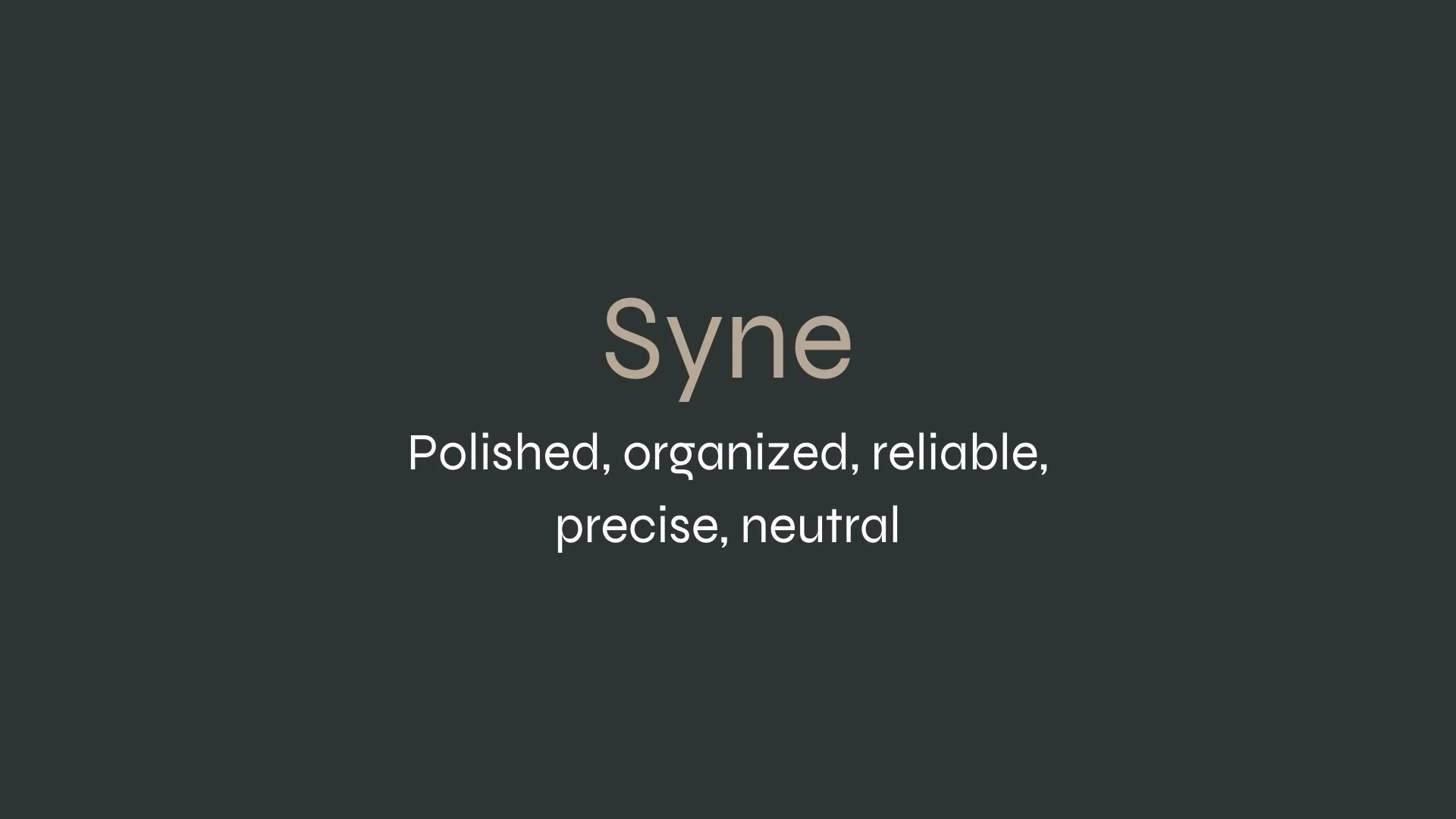
Syne
Overview:
Syne is a modern and distinctive sans-serif typeface that stands out with its bold, geometric design and unique proportions. It combines sharp edges with rounded details, offering a sleek and futuristic appearance, while remaining highly legible and versatile for a variety of uses.
History:
Syne was designed by the Indian type designer Rajesh Rajput and released in 2019. The goal behind Syne was to create a modern sans-serif typeface that would offer a clean, bold alternative to traditional geometric fonts, while retaining an open and approachable feel. Rajput drew inspiration from contemporary design trends and the needs of digital interfaces, making it especially suitable for modern web and print applications.
Characteristics:
Design: Syne has a distinctive geometric structure, with sharp corners and wide, rounded terminals. Its clean, modern letterforms feature slightly condensed proportions, giving the font a strong, dynamic presence without sacrificing legibility.
Usage: Syne is highly effective for use in headers, branding, and logo design, as well as digital applications such as websites and mobile interfaces. Its bold and unique appearance makes it perfect for high-impact design, while still being readable in smaller sizes for text-heavy uses.
Attributes: The font is bold, geometric, and modern, with a slightly futuristic vibe. It maintains excellent legibility even at smaller sizes and offers a distinctive visual identity, making it ideal for projects that require a contemporary, attention-grabbing typeface.


FONT PERSONALITY
-
FONT PERSONALITY -
Why Capriola and Syne are a Match Made in Heaven:
The pairing of Capriola and Syne is a harmonious blend of charm and professionalism, creating a dynamic combination that balances warmth with precision. Capriola’s playful and inviting curves add an engaging, creative flair to the design, making it perfect for grabbing attention in headlines or logos. Syne, with its polished, geometric lines and neutral demeanor, grounds the pairing with a sense of organization and reliability. Together, they create a design that is both visually captivating and functionally clear, making it ideal for a brand that wants to be approachable yet trustworthy.
This font pairing would resonate with a person who is both creative and dependable—someone who values aesthetics but also wants their brand to project professionalism and clarity. This person might be an entrepreneur or a creative professional, such as a designer, consultant, or artist, who blends imaginative flair with a methodical, no-nonsense approach to their work. They are likely to be someone who is approachable, yet always delivers with precision and reliability, appealing to both their audience’s emotions and their rational side.

CELEBRITY MATCH
-
CELEBRITY MATCH -
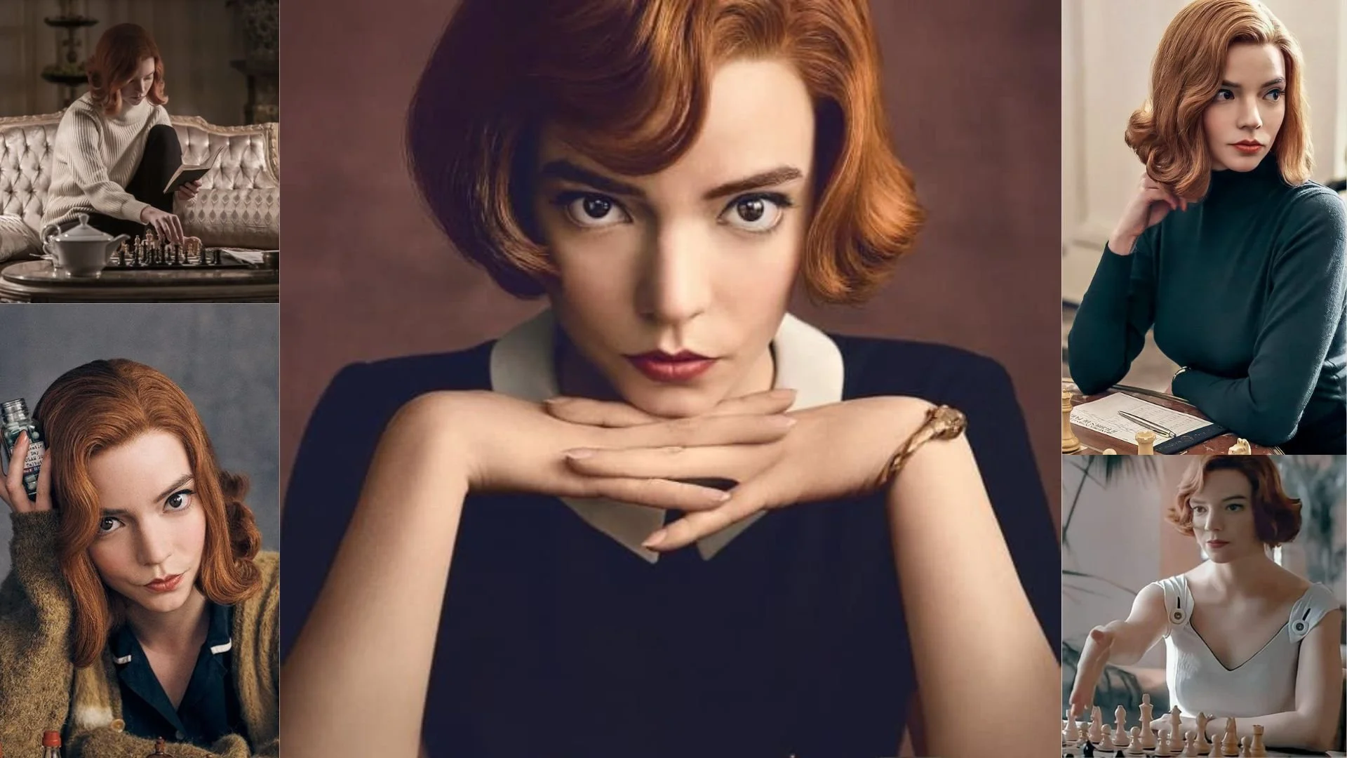
The font pairing of Capriola and Syne aligns perfectly with the character of Beth Harmon, as portrayed by Anya Taylor-Joy in the movie "The Queen's Gambit" .
Summary: Anya Taylor-Joy's portrayal of Beth Harmon in The Queen's Gambit embodies the dynamic balance found in the Capriola and Syne font pairing. Beth’s character demonstrates a harmonious blend of creativity and precision, similar to how Capriola's playful warmth is balanced by Syne's professional structure. This pairing is a perfect reflection of Beth’s personality—engaging, charismatic, and creative, yet deeply strategic, organized, and calculated in her mastery of chess.

HIERARCHY
-
HIERARCHY -
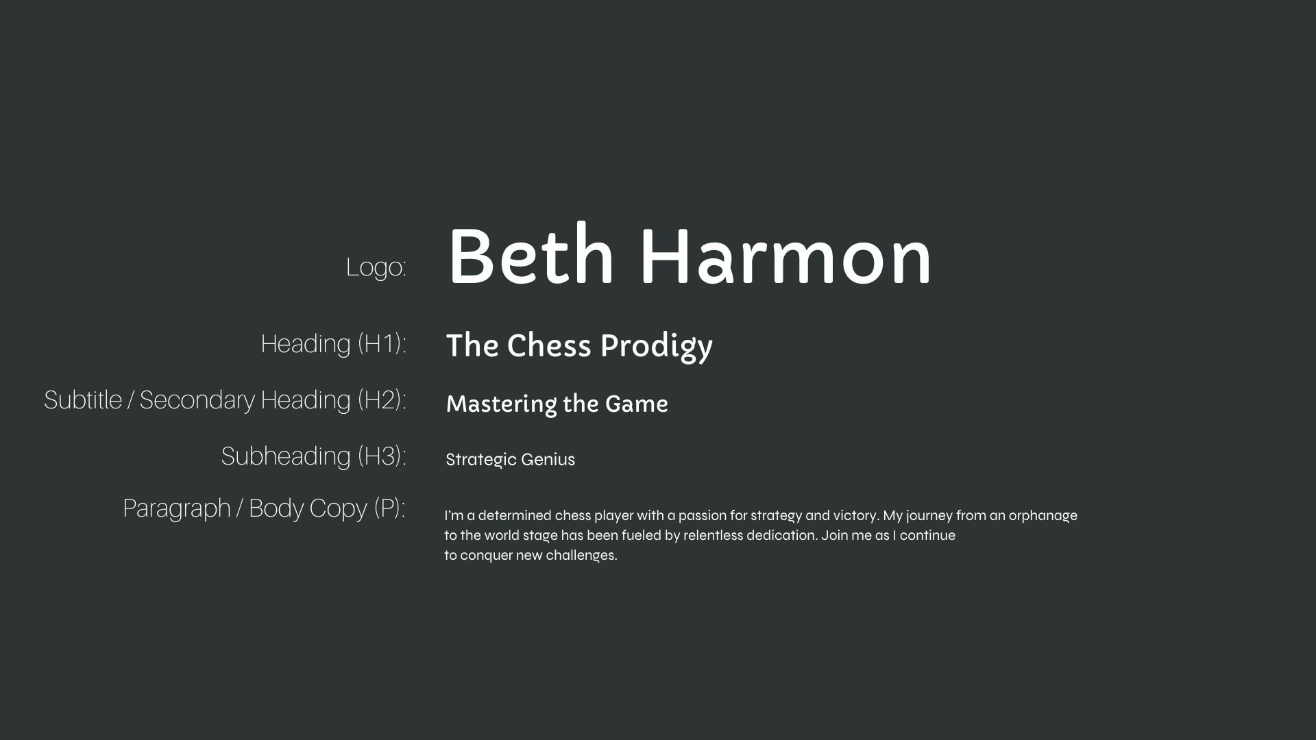
Font Hierarchy for Capriola and Syne:
Logo
Usage: Primary logo text, initials, brand name
Capriola, Regular, 36-48 pt (Canva), 40-50 px (Squarespace)
Heading (H1)
Usage: Main headings on pages, prominent titles
Capriola, Regular or Bold, 28-36 pt (Canva), 32-40 px (Squarespace)
Subtitle / Secondary Heading (H2)
Usage: Section titles, important subtitles
Capriola, Regular, 22-28 pt (Canva), 24-32 px (Squarespace)
Subheading (H3)
Usage: Subsection headings, less prominent titles
Syne, Regular or Semi-Bold, 18-22 pt (Canva), 20-24 px (Squarespace)
Paragraph / Body Copy (P)
Usage: Main body text, paragraphs, descriptions
Syne, Regular, 14-18 pt (Canva), 16-18 px (Squarespace)