MEET YOUR FONT PAIRING MATCH
This page is your custom breakdown of the font pairing you were matched with from the Find Your Font Quiz. You’ll discover the history, personality, and style of each font—and see how they can come to life in your personal brand.
If you're a Personal Branding Studio member:
Bookmark this page. We’ll return to it in Part 2 when it’s time to use your font pairing to design your logo and create branded Canva graphics.
Not loving this particular combo? No problem. Explore all 100+ font pairings inside PBS - Part 1, Module 4: Design - to find one that feels just right. Click the button below to go there now.
Not yet a Personal Branding Studio member?
(And wondering what Personal Branding Studio even is?)
Start by scrolling through your results below. At the bottom of this page, you’ll find out how to go deeper with your personal brand through my full Personal Branding Studio program.
And your aligned font pairing match is…


HISTORY
-
HISTORY -
Archivo Black
Overview:
Archivo Black is a bold, condensed sans-serif typeface with a modern and geometric design. Known for its strong presence and high legibility, it is commonly used for attention-grabbing headlines and display text in both print and digital media.
History:
Archivo Black was designed by Héctor Gatti and released in 2014 as part of the Archivo family. The typeface was created as a response to the growing need for robust fonts that work well in both digital and print environments. It was designed to complement the Archivo family, which includes a range of weights and styles. Archivo Black was specifically intended to provide a powerful, striking appearance for use in display contexts where legibility at large sizes is essential.
Characteristics:
Design: Archivo Black features tight letter spacing and thick, solid strokes that give it a strong, impactful look. The font has a geometric foundation with slight humanist influences, ensuring a balance between boldness and readability.
Usage: This typeface is ideal for headlines, logos, posters, and other applications where emphasis is needed. Its condensed nature makes it perfect for use in limited space while still maintaining its clarity.
Attributes: Highly legible at large sizes, Archivo Black is bold, modern, and assertive. It works well in both web and print environments and is particularly effective for projects that need to make a strong visual statement.
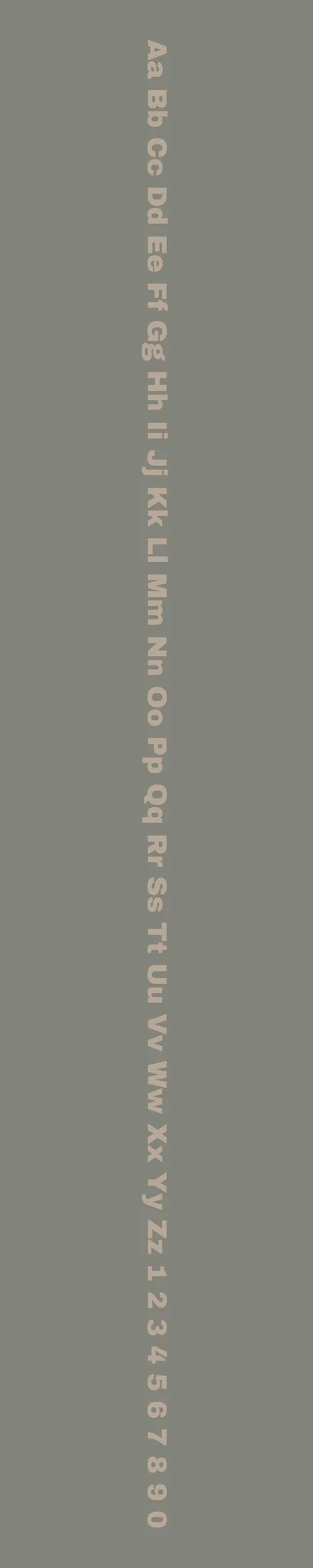
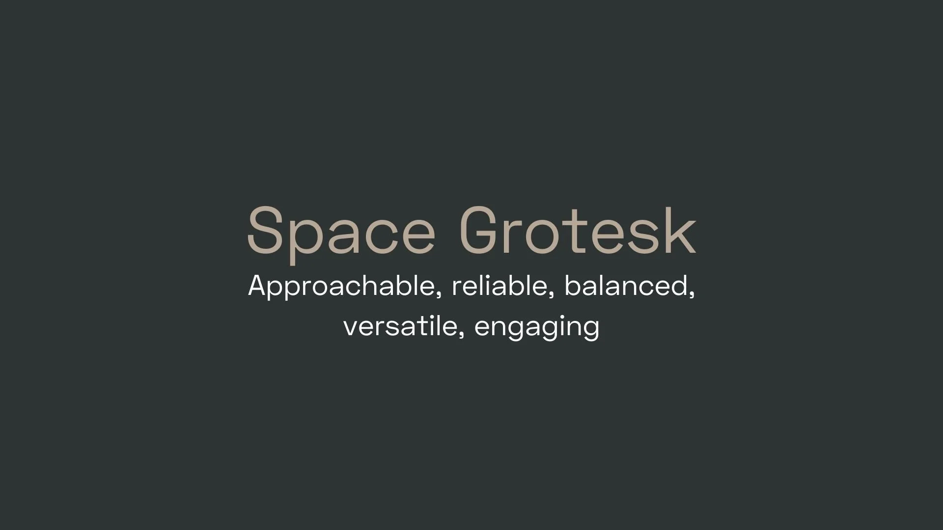
Space Grotesk
Overview:
Space Grotesk is a contemporary sans-serif typeface with a geometric and minimalist design. It is known for its sleek, modern appearance and excellent legibility, making it a versatile choice for both digital and print projects.
History:
Space Grotesk was created by Florian Wendt, a German type designer, and was first released in 2018. Inspired by the 20th-century grotesque styles, Space Grotesk was designed to offer a balanced blend of modernity and familiarity, with a clean, approachable feel. The goal was to create a versatile sans-serif typeface that could be used for a variety of applications, from branding to UI design, with a strong emphasis on legibility in both small and large sizes.
Characteristics:
Design: Space Grotesk features geometric letterforms with open apertures and slightly rounded edges. The font has a neutral and contemporary feel, offering a strong visual presence while maintaining clarity. Its proportions are well-balanced, with even stroke widths and a slight humanist touch that adds warmth to its otherwise sharp and structured design.
Usage: This font excels in branding, web design, user interfaces, and editorial applications. It works well in both body text and display sizes, making it highly adaptable. Its clean lines and modern aesthetic make it ideal for tech companies, startups, and digital-focused projects.
Attributes: Space Grotesk is highly legible, versatile, and modern, with an approachable warmth due to its subtle curves. It balances geometric precision with humanistic softness, making it both functional and stylish. The font's neutral and timeless design ensures it can work across a wide range of industries and design styles.


FONT PERSONALITY
-
FONT PERSONALITY -

Why Archivo Black and Space Grotesk are a Match Made in Heaven:
The combination of Archivo Black and Space Grotesk creates a dynamic and balanced typography duo that excels in both presence and approachability. Archivo Black’s bold, assertive, and charismatic personality commands attention, making it perfect for headlines, logos, and other key design elements that need to stand out. Space Grotesk, with its approachable, reliable, and balanced nature, complements Archivo Black beautifully by adding a sense of calm and clarity. Its clean, rounded lines provide a sense of harmony, ensuring that the pairing remains readable and inviting even when the design incorporates more detailed or complex content. Together, they strike a perfect balance between high-energy impact and understated elegance.
This font pairing would be ideal for someone whose personal brand is confident, yet approachable. A person using this combination would likely value boldness and clarity in their message but also want to connect with others on a deeper level. They might be a leader in a creative industry—perhaps a business owner or a consultant—who strives to make a powerful impact while maintaining a sense of reliability and warmth. Their personal brand would exude confidence and dynamism while ensuring that their message is always clear, accessible, and engaging.

CELEBRITY MATCH
-
CELEBRITY MATCH -

The font pairing of Archivo Black and Space Grotesk aligns perfectly with the character of Frida Kahlo, as portrayed by Salma Hayek in the movie "Frida (2002)".
Summary: Salma Hayek’s portrayal of Frida Kahlo in Frida is a perfect embodiment of the Archivo Black and Space Grotesk pairing. The combination of boldness and clarity in these fonts reflects Kahlo’s ability to stand out while staying deeply connected to her emotions and audience. Together, they celebrate a harmonious blend of strength and vulnerability—just like Kahlo’s life and legacy.

HIERARCHY
-
HIERARCHY -

Font Hierarchy for Archivo Black and Space Grotesk:
Logo
Usage: Primary logo text, initials, brand name
Archivo Black, ALL CAPS, 48px (Canva), 36px (Squarespace)
Heading (H1)
Usage: Main headings on pages, prominent titles
Archivo Black, ALL CAPS, 36px (Canva), 30px (Squarespace)
Subtitle / Secondary Heading (H2)
Usage: Section titles, important subtitles
Space Grotesk, Bold, 24px (Canva), 20px (Squarespace)
Subheading (H3)
Usage: Subsection headings, less prominent titles
Space Grotesk, Regular, 18px (Canva), 16px (Squarespace)
Paragraph / Body Copy (P)
Usage: Main body text, paragraphs, descriptions
Space Grotesk, Regular, 14px (Canva), 12px (Squarespace)