MEET YOUR FONT PAIRING MATCH
This page is your custom breakdown of the font pairing you were matched with from the Find Your Font Quiz. You’ll discover the history, personality, and style of each font—and see how they can come to life in your personal brand.
If you're a Personal Branding Studio member:
Bookmark this page. We’ll return to it in Part 2 when it’s time to use your font pairing to design your logo and create branded Canva graphics.
Not loving this particular combo? No problem. Explore all 100+ font pairings inside PBS - Part 1, Module 4: Design - to find one that feels just right. Click the button below to go there now.
Not yet a Personal Branding Studio member?
(And wondering what Personal Branding Studio even is?)
Start by scrolling through your results below. At the bottom of this page, you’ll find out how to go deeper with your personal brand through my full Personal Branding Studio program.
And your aligned font pairing match is…


HISTORY
-
HISTORY -
Archivo Black
Overview:
Archivo Black is a bold, condensed sans-serif typeface with a modern and geometric design. Known for its strong presence and high legibility, it is commonly used for attention-grabbing headlines and display text in both print and digital media.
History:
Archivo Black was designed by Héctor Gatti and released in 2014 as part of the Archivo family. The typeface was created as a response to the growing need for robust fonts that work well in both digital and print environments. It was designed to complement the Archivo family, which includes a range of weights and styles. Archivo Black was specifically intended to provide a powerful, striking appearance for use in display contexts where legibility at large sizes is essential.
Characteristics:
Design: Archivo Black features tight letter spacing and thick, solid strokes that give it a strong, impactful look. The font has a geometric foundation with slight humanist influences, ensuring a balance between boldness and readability.
Usage: This typeface is ideal for headlines, logos, posters, and other applications where emphasis is needed. Its condensed nature makes it perfect for use in limited space while still maintaining its clarity.
Attributes: Highly legible at large sizes, Archivo Black is bold, modern, and assertive. It works well in both web and print environments and is particularly effective for projects that need to make a strong visual statement.

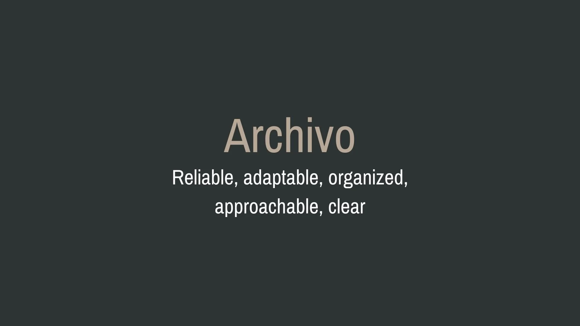
Archivo
Overview:
Archivo is a contemporary sans-serif typeface designed for high legibility and versatile usage in both digital and print environments. It is a balanced and practical typeface with a strong presence, making it ideal for both body text and headlines.
History:
Archivo was created by Héctor Gatti and released by Omnibus-Type in 2010. The typeface was specifically designed to address the need for a highly readable, functional font family that works well across different media. It was built with digital interfaces in mind, but its clear and open letterforms also make it suitable for traditional print applications. Archivo quickly became a popular choice for a wide range of design projects, from websites to editorial layouts.
Characteristics:
Design: Archivo features a geometric design with slight humanist elements. Its clean, straight lines, open counters, and uniform stroke weights contribute to its clarity and modern appeal. The design is well-balanced, giving the font a neutral, professional feel.
Usage: Ideal for both display and text, Archivo excels in editorial design, websites, and branding. Its legibility at small sizes and strong presence at larger sizes make it a versatile choice for headers, body copy, and user interfaces.
Attributes: Neutral, functional, and legible with a modern look. Archivo provides a high degree of versatility across a variety of weights, making it adaptable to many different design contexts. Its straightforward design ensures readability without unnecessary ornamentation.


FONT PERSONALITY
-
FONT PERSONALITY -

Why Archivo Black and Archivo are a Match Made in Heaven:
When Archivo Black and Archivo come together, they create a pairing that is both bold and grounded, offering a dynamic balance between assertiveness and reliability. Archivo Black’s magnetic presence commands attention with its modern, bold, and confident nature, making it ideal for impactful headlines or logos that need to make a statement. In contrast, Archivo brings a sense of reliability and clarity, providing the perfect counterpoint with its approachable, adaptable, and organized personality. This pairing ensures a design that is both eye-catching and easy to understand, giving it a harmonious balance of power and approachability.
This font pairing would appeal to a person who values both authority and approachability in their personal brand. They might be a professional who’s confident in their field, such as a consultant, entrepreneur, or executive, but who also wants to come across as friendly, dependable, and communicative. The individual using this pairing likely balances a strong, assertive leadership style with a genuine desire to connect with others, making them someone who is both commanding and welcoming—someone who leads with confidence but values trust and collaboration.

CELEBRITY MATCH
-
CELEBRITY MATCH -

The font pairing of Archivo Black and Archivo aligns perfectly with the character of Valkyrie, as portrayed by Tessa Thompson in the movie "Thor: Ragnarok (2017)".
Summary: Tessa Thompson’s portrayal of Valkyrie in Thor: Ragnarok embodies the complementary traits of Archivo Black and Archivo. The bold, commanding energy of Archivo Black reflects Valkyrie’s powerful leadership, while the reliability and versatility of Archivo mirror her adaptability and strategic mindset. Together, these fonts and this character showcase a balance of strength and support, creating a harmonious yet dynamic presence on screen and in design.

HIERARCHY
-
HIERARCHY -

Font Hierarchy for Archivo Black and Archivo:
Logo
Usage: Primary logo text, initials, brand name
Archivo Black, ALL CAPS, 48-72 pt (Canva), 36-48 px (Squarespace)
Heading (H1)
Usage: Main headings on pages, prominent titles
Archivo Black, ALL CAPS, 36-48 pt (Canva), 30-36 px (Squarespace)
Subtitle / Secondary Heading (H2)
Usage: Section titles, important subtitles
Archivo, Bold, 24-30 pt (Canva), 20-24 px (Squarespace)
Subheading (H3)
Usage: Subsection headings, less prominent titles
Archivo, Regular, 18-24 pt (Canva), 16-20 px (Squarespace)
Paragraph / Body Copy (P)
Usage: Main body text, paragraphs, descriptions
Archivo, Regular, 12-14 pt (Canva), 14-16 px (Squarespace)