MEET YOUR FONT PAIRING MATCH
This page is your custom breakdown of the font pairing you were matched with from the Find Your Font Quiz. You’ll discover the history, personality, and style of each font—and see how they can come to life in your personal brand.
If you're a Personal Branding Studio member:
Bookmark this page. We’ll return to it in Part 2 when it’s time to use your font pairing to design your logo and create branded Canva graphics.
Not loving this particular combo? No problem. Explore all 100+ font pairings inside PBS - Part 1, Module 4: Design - to find one that feels just right. Click the button below to go there now.
Not yet a Personal Branding Studio member?
(And wondering what Personal Branding Studio even is?)
Start by scrolling through your results below. At the bottom of this page, you’ll find out how to go deeper with your personal brand through my full Personal Branding Studio program.
And your aligned font pairing match is…


HISTORY
-
HISTORY -
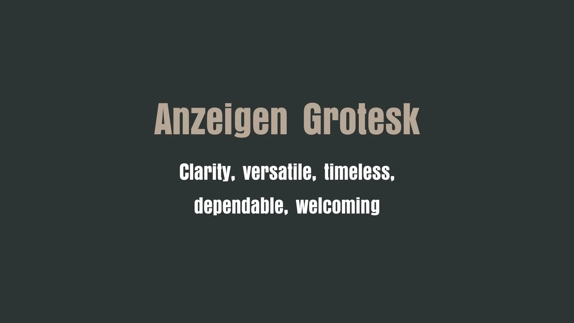
Anzeigen Grotesk
Overview:
Anzeigen Grotesk is a classic sans-serif typeface known for its clean, simple, and functional design. It embodies the essence of modernist typography, offering a timeless look that remains highly legible across different formats. Its versatility makes it suitable for a variety of applications, from print to digital environments.
History:
Anzeigen Grotesk was designed by the German type designer Hans Eduard Meier in the early 20th century. Released in the 1930s by the German type foundry D. Stempel AG, it was originally intended as a highly readable typeface for advertising and display purposes, hence the name "Anzeigen" (meaning "advertisements" in German). The font was inspired by the growing trend for "Grotesk" or sans-serif designs, which were becoming increasingly popular in Germany and Europe during the era. Anzeigen Grotesk was one of the early examples of this style that emphasized clarity and legibility for advertising, which was essential in an era of burgeoning mass communication.
Characteristics:
Design: Anzeigen Grotesk is characterized by its geometric structure with minimal contrast between thick and thin strokes, and simple, functional letterforms. The typeface has a robust and straightforward appearance, making it highly legible even at smaller sizes. Its design features slightly rounded corners, offering a softer feel compared to more rigid sans-serif fonts of the period.
Usage: Ideal for use in advertising, headlines, and display text, Anzeigen Grotesk excels in environments where clarity and impact are key. Its clean and straightforward design makes it highly adaptable for both print and digital mediums, particularly when a modernist aesthetic is desired.
Attributes: Highly legible with a neutral and straightforward appearance, this typeface carries a sense of reliability and efficiency. Its versatile design works well across various sizes and contexts, offering a timeless solution for many typographic needs.

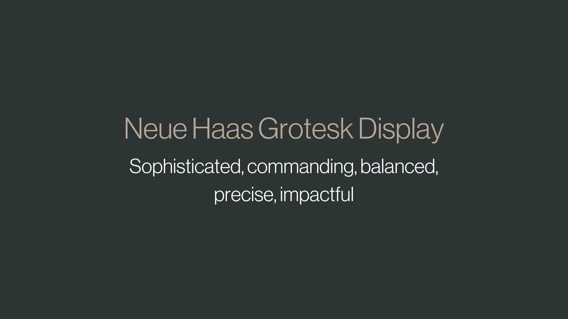
Neue Haas Grotesk Display
Overview:
Neue Haas Grotesk Display is a modern interpretation of the classic Helvetica typeface, specifically optimized for larger sizes. It retains the clean, neutral aesthetic of its predecessor while incorporating subtle design refinements to enhance its performance in high-impact settings like headlines, posters, and branding.
History:
Neue Haas Grotesk Display was developed by the Swiss type foundry, Helvetica Now (also known as Linotype), and designed by Christian Schwartz. Released in 2019, it is part of a larger family that reinterprets the iconic Helvetica font, which was originally created by Max Miedinger and Eduard Hoffmann in 1957. The goal of Neue Haas Grotesk Display was to adapt the classic font for contemporary design needs, optimizing it for digital environments while maintaining the historical roots of the Helvetica design. The "Display" version was specifically crafted for use in larger sizes, where its precision and neutrality shine.
Characteristics:
Design: Neue Haas Grotesk Display retains the geometric, neutral structure of Helvetica, but with slightly more open apertures and refined proportions to improve legibility at larger sizes. It features consistent stroke widths and crisp, clean lines, with subtle humanist influences that soften its otherwise mechanical design. These adjustments make it highly readable in print and digital media, especially in display contexts.
Usage: This version of Neue Haas Grotesk is ideal for large-scale applications such as headlines, signage, and branding. Its enhanced design for display text makes it perfect for high-visibility settings like advertisements, packaging, and websites where clarity is crucial at a distance.
Attributes: With its clean and neutral appearance, Neue Haas Grotesk Display exudes professionalism and modernity. It balances the timeless quality of Helvetica with contemporary improvements that make it suitable for a broad range of visual communication needs, offering high legibility, versatility, and a contemporary feel.


FONT PERSONALITY
-
FONT PERSONALITY -
Why Anzeigen Grotesk and Neue Haas Grotesk Display are a Match Made in Heaven:
The pairing of Anzeigen Grotesk and Neue Haas Grotesk Display brings together clarity and sophistication in a way that creates both stability and impact. Anzeigen Grotesk’s timeless, dependable, and approachable nature offers a solid foundation for the design, making it versatile enough for a wide range of applications. Its clarity and welcoming feel provide a grounded, reliable presence. In contrast, Neue Haas Grotesk Display adds a layer of elegance and authority, infusing the pairing with a sense of refinement and command. Together, they create a harmonious balance—Anzeigen Grotesk’s reliability is complemented by Neue Haas Grotesk Display’s impactful and sophisticated style, creating a visual identity that is both functional and memorable.
This pairing would be ideal for someone who values both elegance and practicality in their personal brand—an individual who strives for excellence and sophistication but also appreciates the importance of reliability and clarity. The person using this font combination may be a professional in a leadership role, such as an executive, consultant, or entrepreneur, who wishes to project both authority and approachability. Their personal brand is built on trust and expertise, yet they aim to connect with their audience on a human level, offering a blend of sophistication and warmth that resonates across a variety of professional environments.

CELEBRITY MATCH
-
CELEBRITY MATCH -

The font pairing of Anzeigen Grotesk and Neue Haas Grotesk Display aligns perfectly with the character of Clarice Starling, as portrayed by Jodie Foster in the movie "The Silence of the Lambs (1991)".
Summary: Jodie Foster’s portrayal of Clarice Starling in The Silence of the Lambs aligns seamlessly with the personality traits of the font pairing of Anzeigen Grotesk and Neue Haas Grotesk Display. Clarice’s clarity, adaptability, and timeless composure reflect Anzeigen Grotesk, while her refined sophistication, commanding presence, and precision are mirrored in Neue Haas Grotesk Display. Together, these fonts represent the duality of Clarice’s character—a blend of approachable strength and polished intelligence—making her a timeless and impactful figure in cinematic history.

HIERARCHY
-
HIERARCHY -
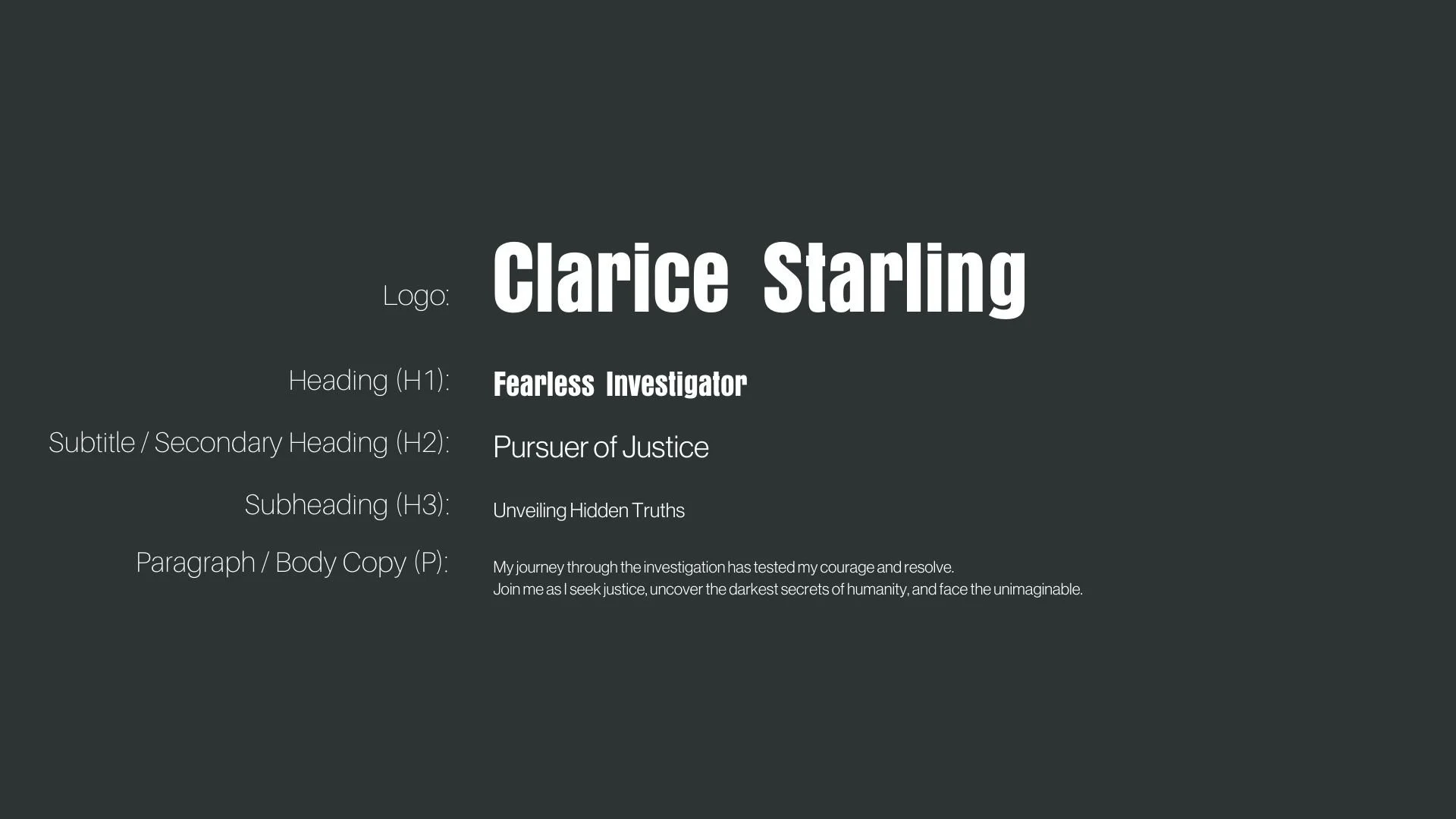
Font Hierarchy for Anzeigen Grotesk and Neue Haas Grotesk Display:
Logo
Usage: Primary logo text, initials, brand name
Anzeigen Grotesk, Regular, 24-48pt (Canva)
Heading (H1)
Usage: Main headings on pages, prominent titles
Anzeigen Grotesk, Regular, 36-48 pt (Canva), 32-40 px (Squarespace)
Subtitle / Secondary Heading (H2)
Usage: Section titles, important subtitles
Neue Haas Grotesk Display, Regular, 24-30 pt (Canva), 28-32 px (Squarespace)
Subheading (H3)
Usage: Subsection headings, less prominent titles
Neue Haas Grotesk Display, Regular, 18-24 pt (Canva), 24-28 px (Squarespace)
Paragraph / Body Copy (P)
Usage: Main body text, paragraphs, descriptions
Neue Haas Grotesk Display, Regular, 12-18 pt (Canva), 16-18 px (Squarespace)